30 Beautiful Examples of Websites Built with Webflow Site Builder (2024)
Webflow is a visual in-browser web design tool that enables users to build websites without any coding using a drag-and-drop interface that will look familiar to Photoshop users. Websites made in Webflow work like any custom-built website and can be created from a pre-existing template or designed from scratch.
Website builders like Squarespace and Wix are useful for complete beginners but they’re restrictive for people who have the design skills to create a great website but lack the coding skills. Most drag-and-drop website builders also lack the CMS capabilities of platforms like WordPress. Webflow is an ambitious attempt to bridge the gap between these different tools.
Webflow is a visual tool that produces websites that are properly coded in a way that is clean, fast-loading, and responsive. This is unusual as drag-and-drop visual site builders are notorious for producing bloated code and websites that are slow to load.
Additionally, Webflow offers hosting for your website including staging areas and SSL so all you need to get your site online is a domain name.
Want to give Webflow a try? You can use the platform for free for as long as you like and only pay when you’re ready to launch your site. You can sign up here.
The best way to see what’s possible is by looking at some examples of websites built in Webflow. The following 30 websites were specially chosen by us to demonstrate the flexibility, power, and creativity of the Webflow platform.
1. Water is a Human Right
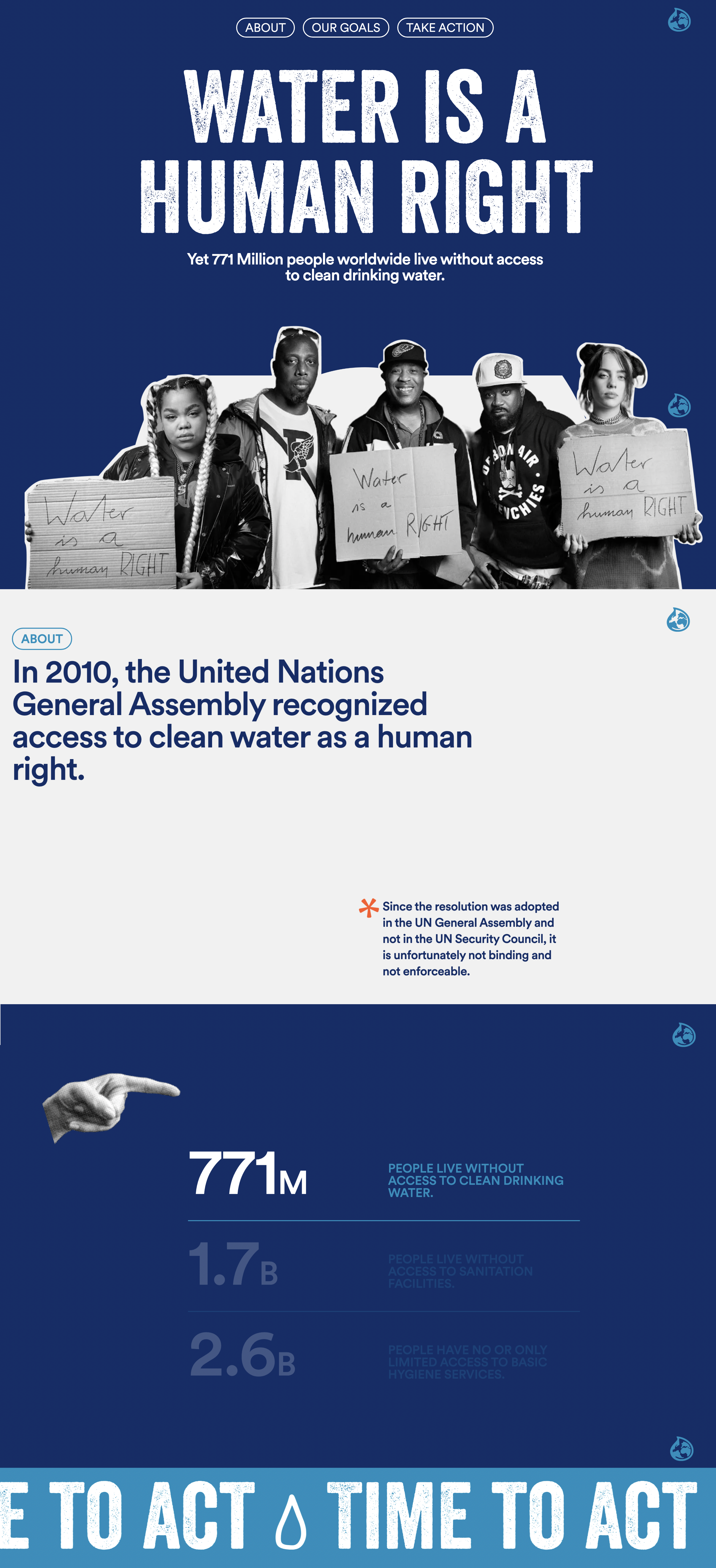
This campaign page launched on World Water Day uses bold animation effects to draw the eye to facts and figures in a much more effective way than a static design would.
2. Circle
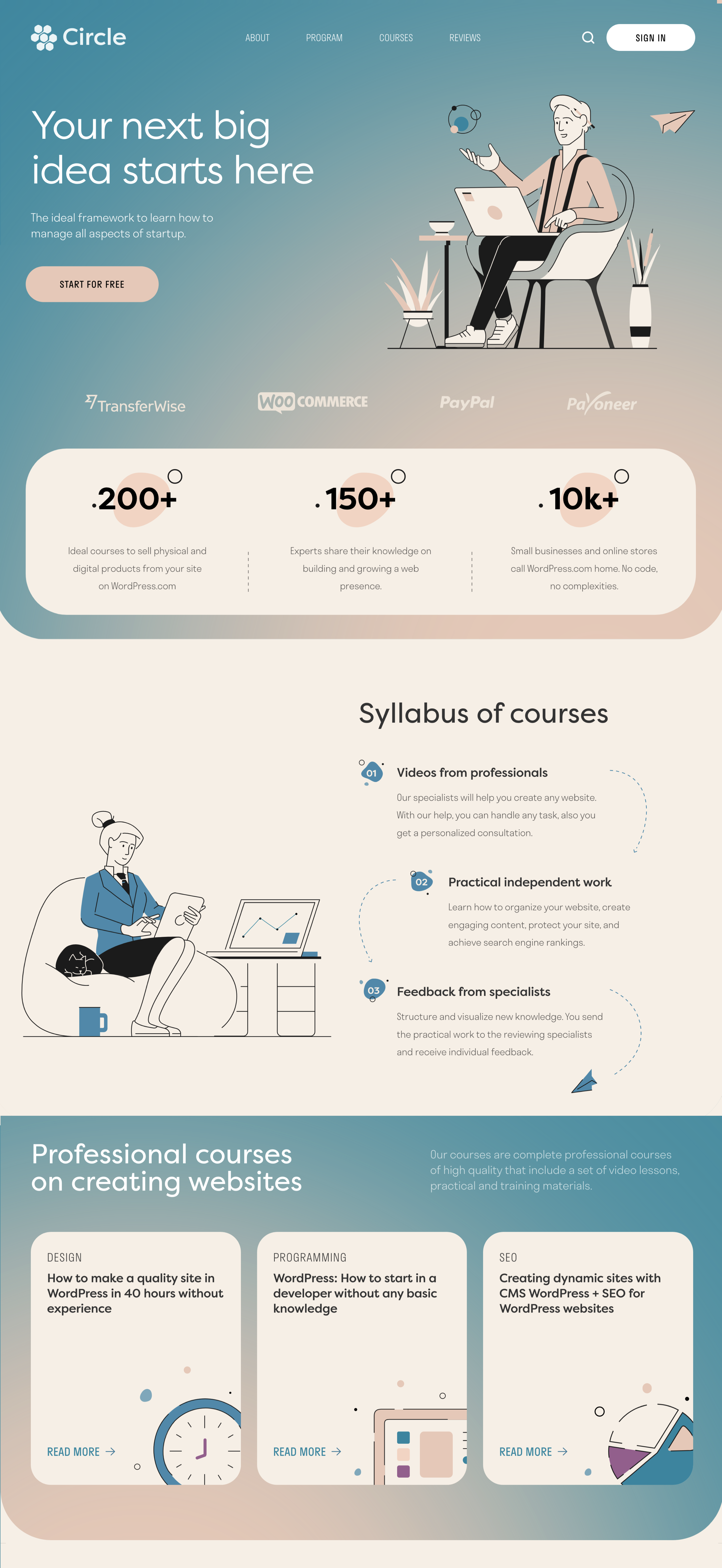
Circle is an online learning platform that helps small businesses and solopreneurs learn about WordPress and Ecommerce. The pastel colour scheme and attractive illustrations give the site a welcoming, accessible feel.
3. Zyrkle
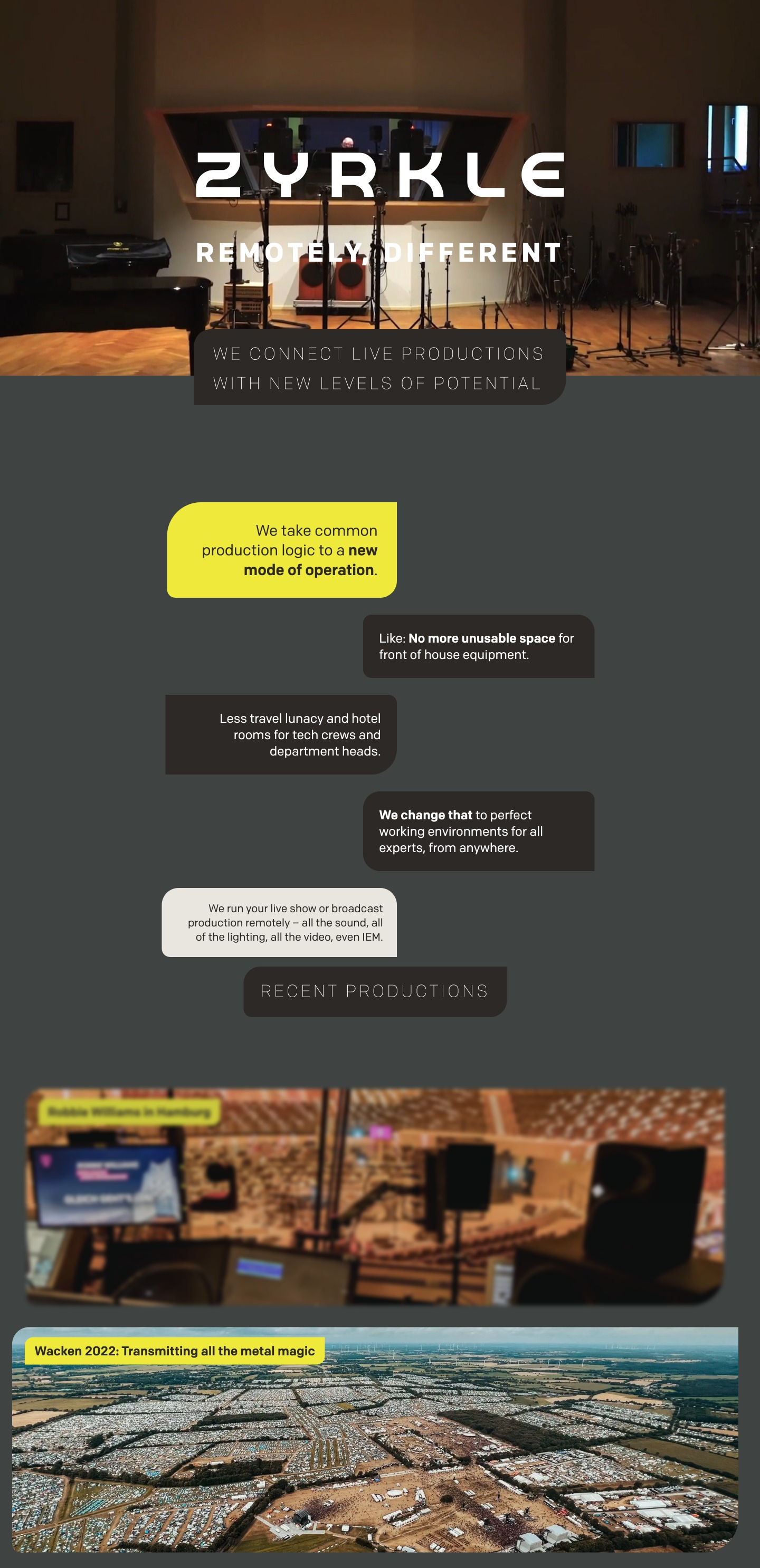
Webflow is the ideal website platform to showcase Zyrkle’s sound and lighting production work. The simple design has a big impact with fullscreen video and eye-catching scroll effects.
3. Matteo Fabbiani
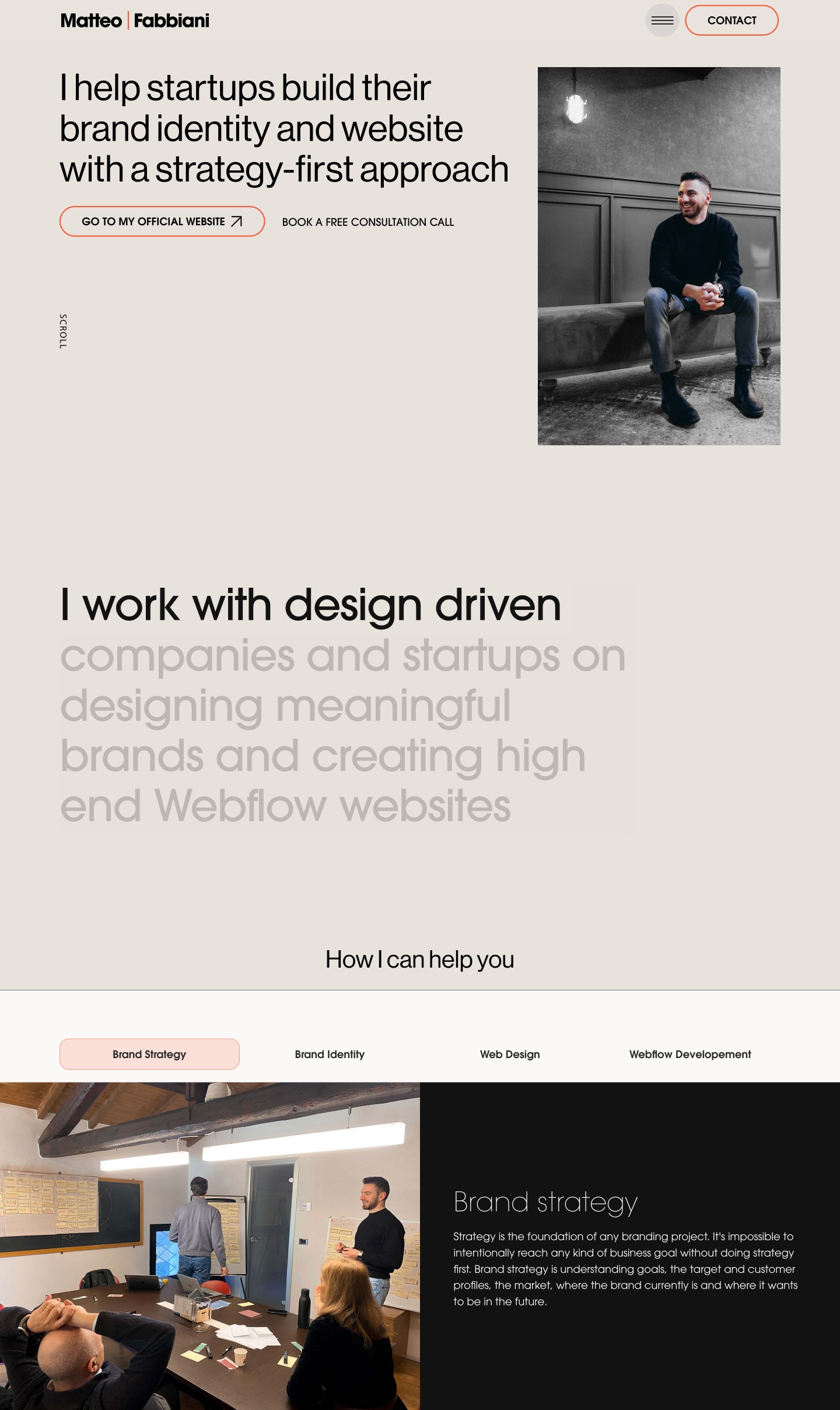
Italian brand designer Matteo Fabbiani uses dynamic design elements of his website made in Webflow to mirror his own work processes. His “about” page is definitely worth a look, with an impressive visual timeline of his career history.
4. Mermarche
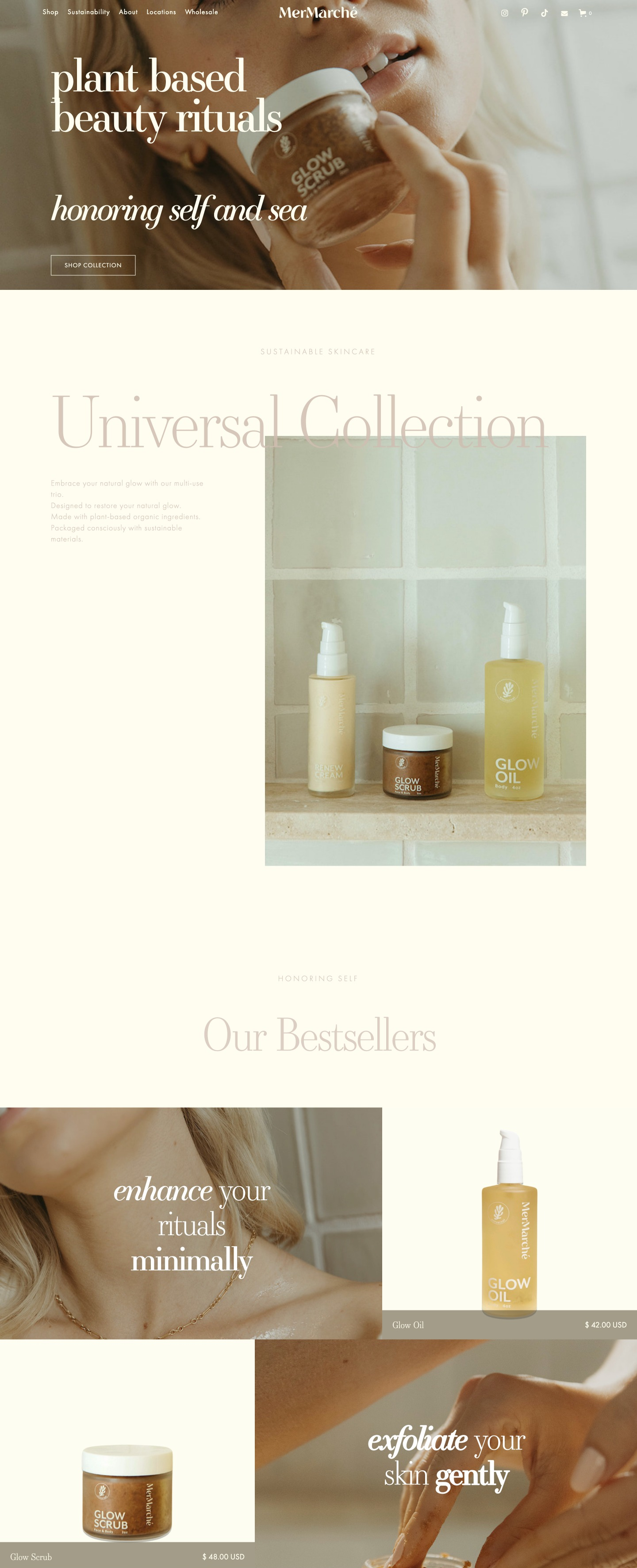
Showing off Webflow’s capabilities for ecommerce sites, beauty brand Mermarché sticks to an earthy color pallette and focuses on typography for an overall look that’s classic and feminine.
5. Tennessee Cider Company
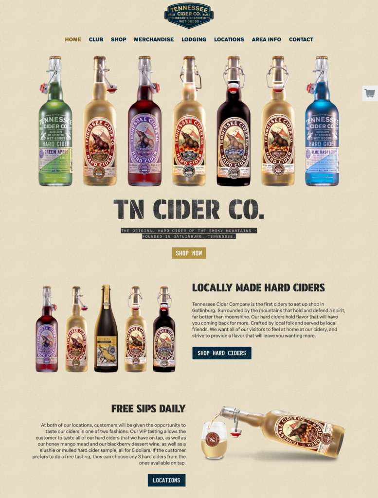
It may seem that all Webflow sites are filled with fancy animations and special effects, but the Tennessee Cider Company website is a great example of a simple branded website that really works. An easy-to-use shopping cart and map showing shipping locations makes it a breeze to shop online.
6. Youth Logic
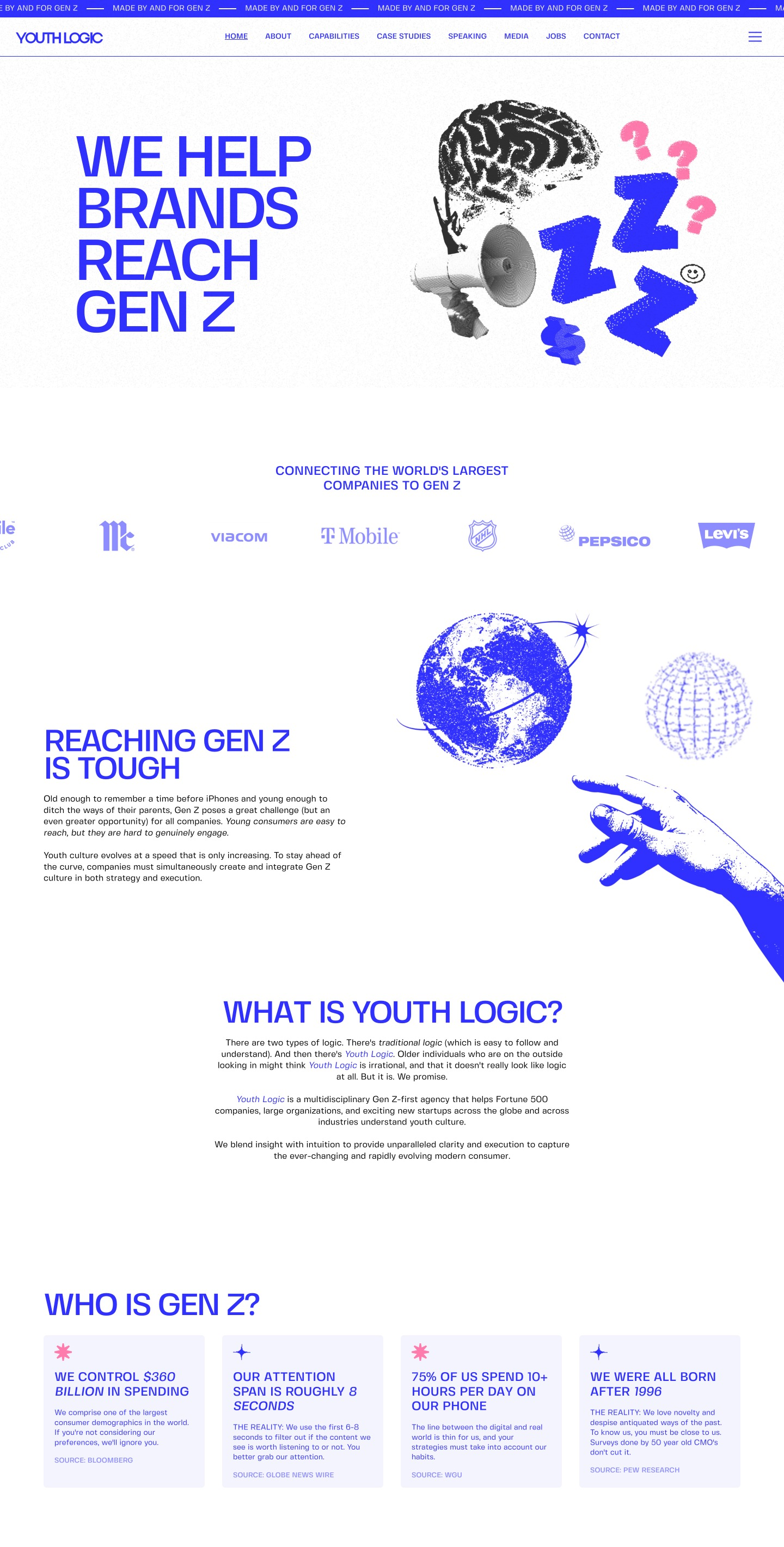
Gen Z agency Youth Logic uses a simple color scheme and retro graphics to stand out from its competitors. Subtle scroll effects encourages the reader to stay on the page. A blue slide screen on each page loading empasizes the branding to make it more memorable.
7. Plantible
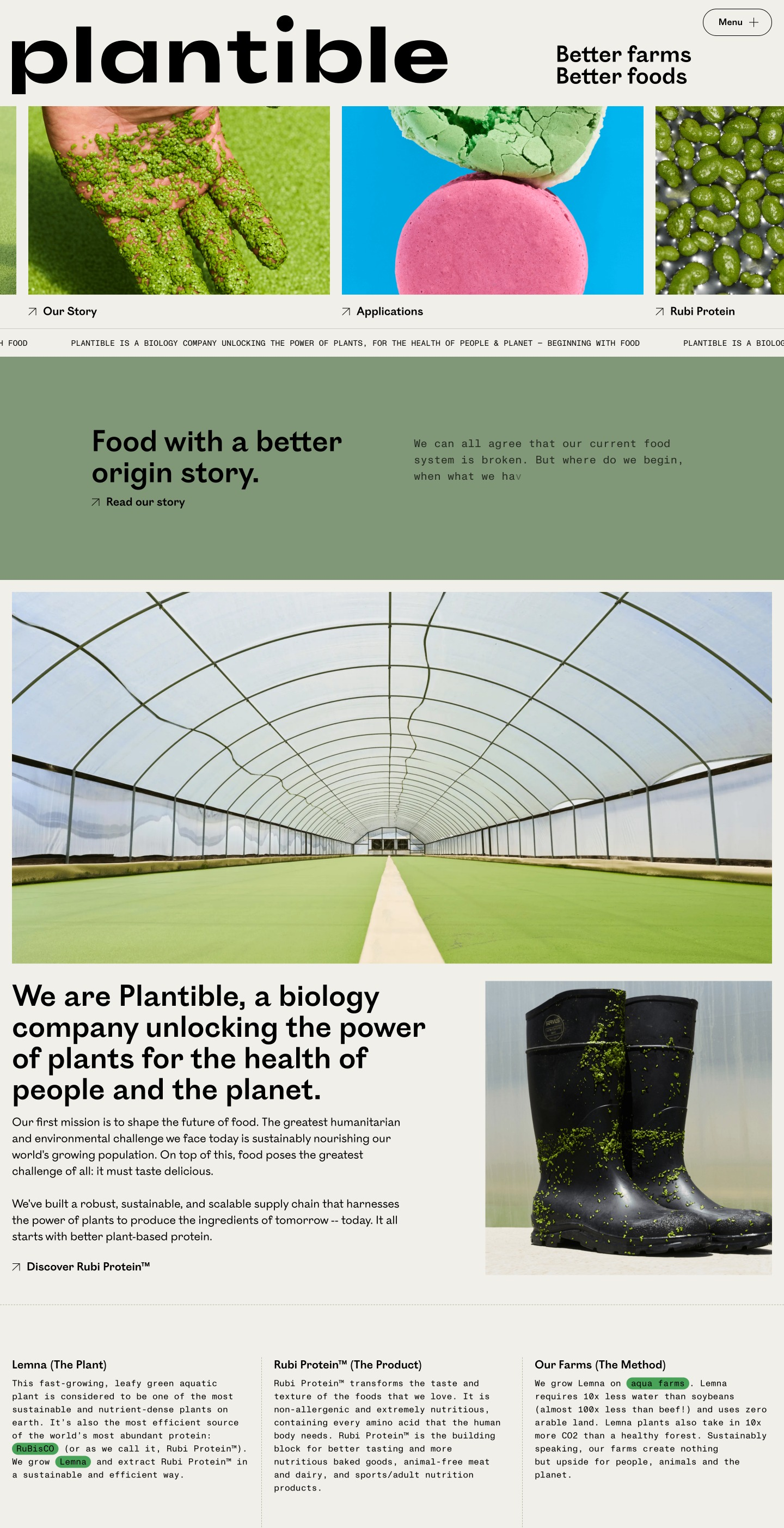
Plantible is a biology company with a mission to improve the health and longevity of the human race through plant-based foods. The fresh color scheme and clean imagery gives a modern, progressive feel to the site that’s anything but dull to browse
8. Meter

Webflow is a design tool but it works as well for business websites as it does for creative sites. The long scrolling design used by internet company Meter shows off Webflow’s animation effects with a clean, easy-to-navigate design.
9. Emma.ca
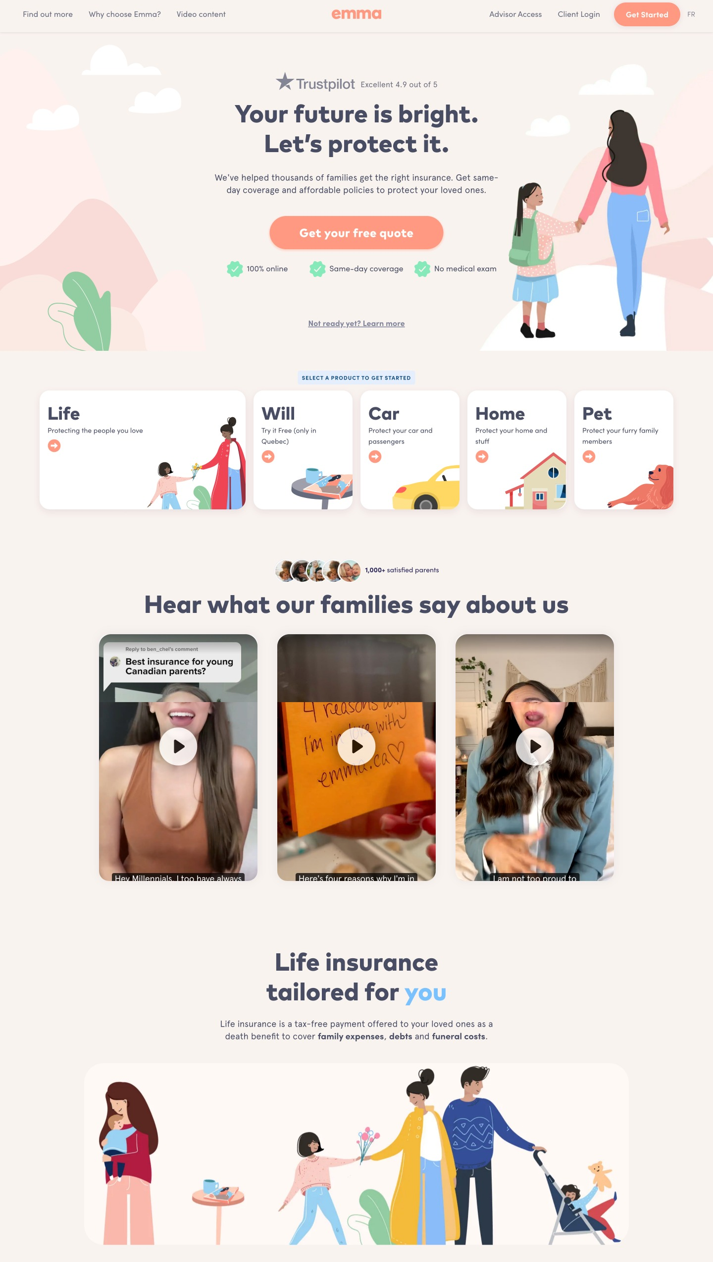
Emma is a Canadian life insurance company that uses Webflow to build and host their website in both English and French versions. The site includes a database of baby names built on the Webflow CMS to attract search engine traffic from their main customer base – new and expectant mothers.
10. Unusual Ventures
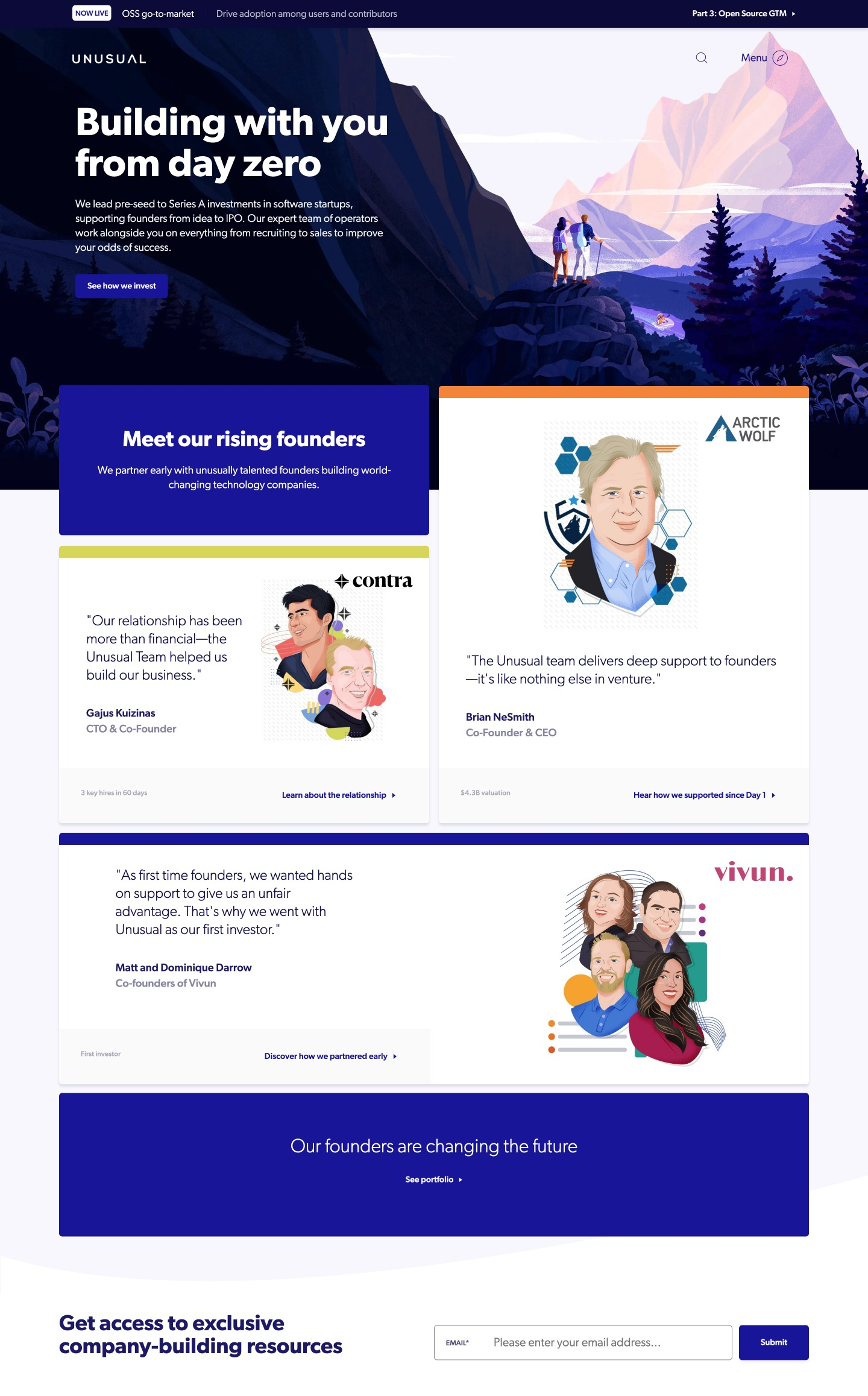
Venture capital firm Unusual Ventures uses unique illustrations and animated effects to stand out from its competitors with a memorable website that also delivers a great user experience.
11. Ollivere

This unique and fun portfolio Webflow site uses animation scrolling effects in a storytelling format to keep on-page time high and stand out from the competition.
12. Mack & Pouya Photography

Wedding photographer websites often follow a formulaic design, but not this one! Everyone wants their wedding to be unique and by highlighting their quirky brand with this bright and retro design, Mack & Pouya distinguish themselves from other photographers. This Webflow site also features an innovative interactive pricing calculator.
13. Webflow in 2022
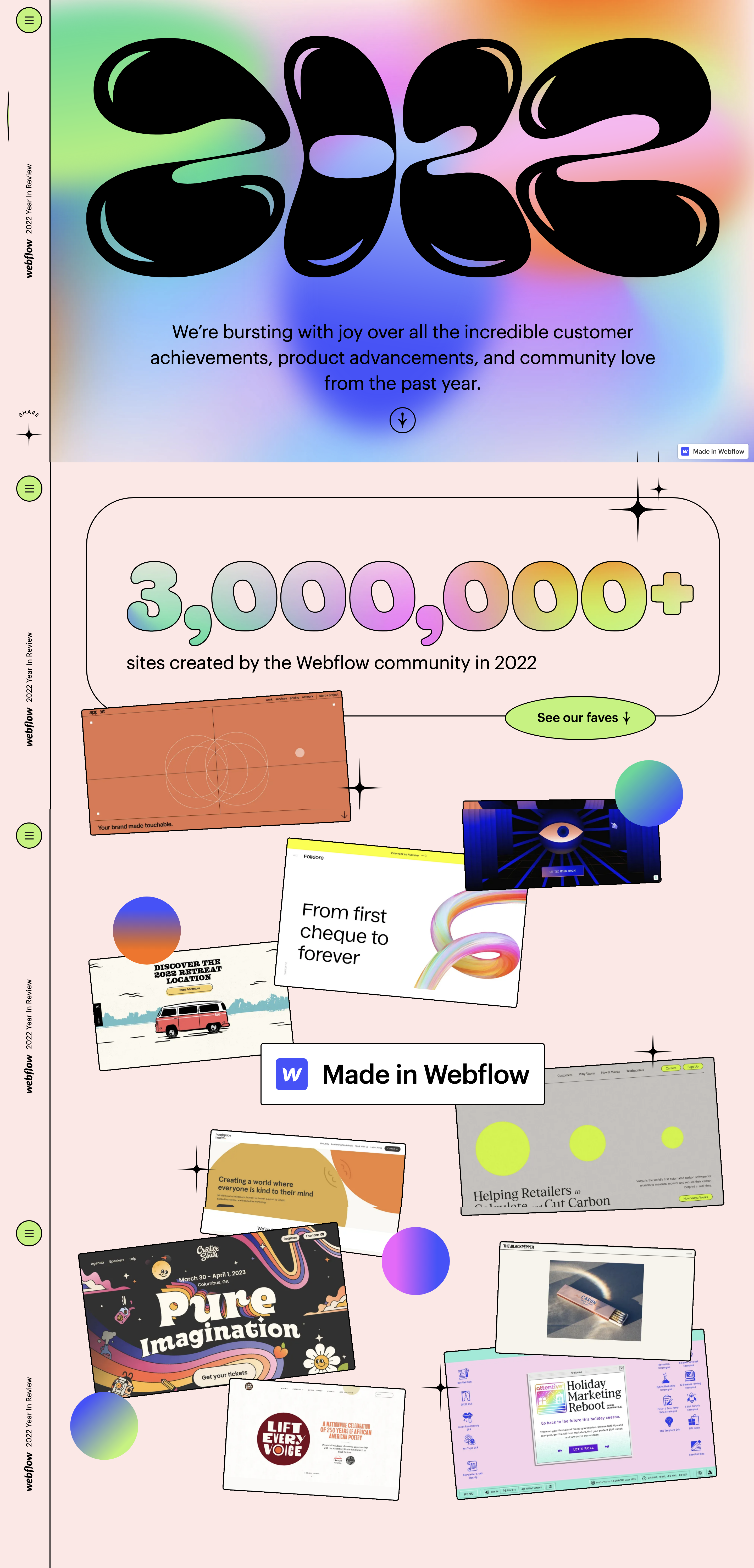
If you want to get a good overview of what’s possible in Webflow, it’s worth checking out this 2022 review site by the Webflow team complete with recent websites made in Webflow, psychedelic colors, hover effects, scroll-activated animated graphics, and statistics aplenty.
14. Oreo The Playful Network

At the start of the lockdown due to the COVID-19 pandemic, Oreo launched a parody ad campaign that poked fun at the claims made by telcos. The website, made in Webflow, is effective in reinforcing the Oreo brand and building social traffic with fun games and recipes.
15. The Crown District

The Crown District utilizes full-screen video and animated text blocks to create a website that’s attractive and inviting to explore. The whole website can be opened in Webflow backend so you can see how it’s put together.
16. Michael Kors
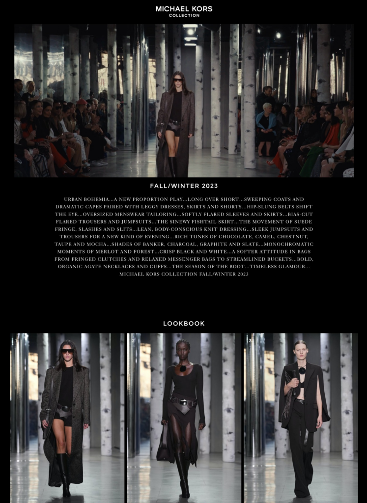
Michael Kors is one of several big-name brands that is using Webflow for its official website. The site features several styles of image galleries and a full-screen video banner.
17. Dwellito

Dwellito is an online marketplace for prefab homes. The site design uses a full-screen image to show off their product, with a clear and simple grid-based layout for browsing and shopping.
18. The Pen Tool

The Pen tool jazzes up a simple and static layout with bold colors and typography, a custom animated cursor, and hover effects. The result is a perfect fit for its target market of creatives.
19. By Alice Lee

Illustrator Alice Lee uses a minimal site design to keep the attention on her whimsical portfolio. A parallax hover effect on the hero image keeps the user’s attention for longer.
20. Emma Rose Photography

This Webflow portfolio design uses layered images and parallax scrolling effects to bring life to the work of photographer Emma Rose. A subtle menu links to informational pages while the portfolio categories are displayed in bold blocks of color.
22. Ujet

Webflow’s animations and scrolling effects are perfect for the website of innovative scooter brand Ujet. Meanwhile, navigation is clear, easy to use, and visible at all times.
22. Kubo Patisserie

Kubo Patisserie uses clean, bright photography and a minimal site design to create an inviting website that showcases the brand’s delicious cakes perfectly. There’s a lot of thought that’s gone into each individual product page on this eCommerce site.
23. The Goonies

This fan site dedicated to the movie The Goonies uses animation and scrolling effects to create a fully immersive experience for the user.
24. Call On Courage

Call On Courage is part portfolio, part online store, with a clever use of video to draw attention to different elements. Particularly effective is the “Talk to me” button with a background video of the site owner talking.
25. Digital China

Pushing the boundaries of web design, this mini-site advertising a business program at the Utrecht University of Applied Sciences uses video game-style illustrations and hover effects to bring fun and interest to the type of information that would normally be displayed in a standard corporate layout.
26. Thick and Thin
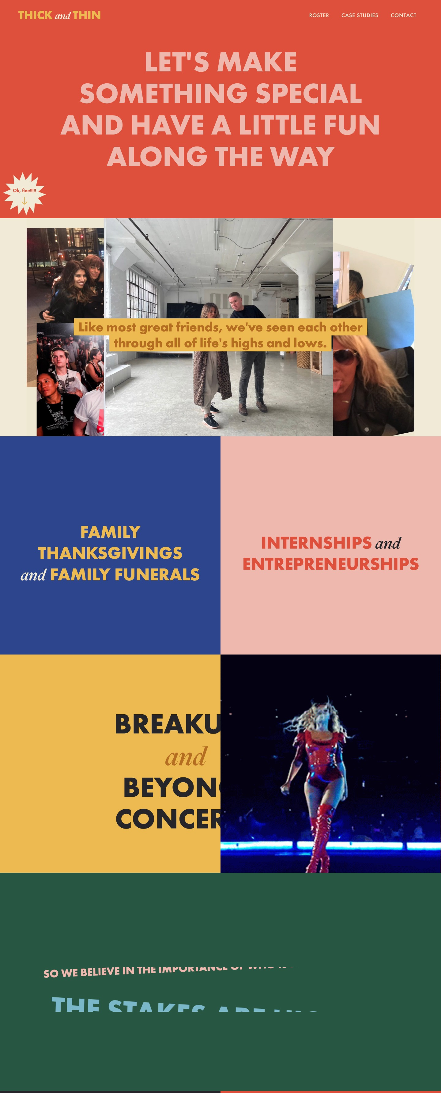
This playful and colorful site loads full-screen sections on loading, making the experience of browsing the site similar to flipping through a magazine. Fun animations and videos also make for a more interactive and engaging experience.
27. Ls Graphics
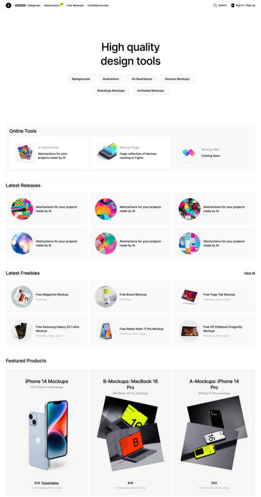
This digital marketplace for mockups and illustrations uses a clean grid-based design to showcase its products with no distracting animations or scrolling effects.
28. Serve

The website of this print and web design agency uses illustrations with subtle parallax scrolling effects to draw the eye down the page to their featured content. A minimal web design keeps the focus on the work.
29. Disco
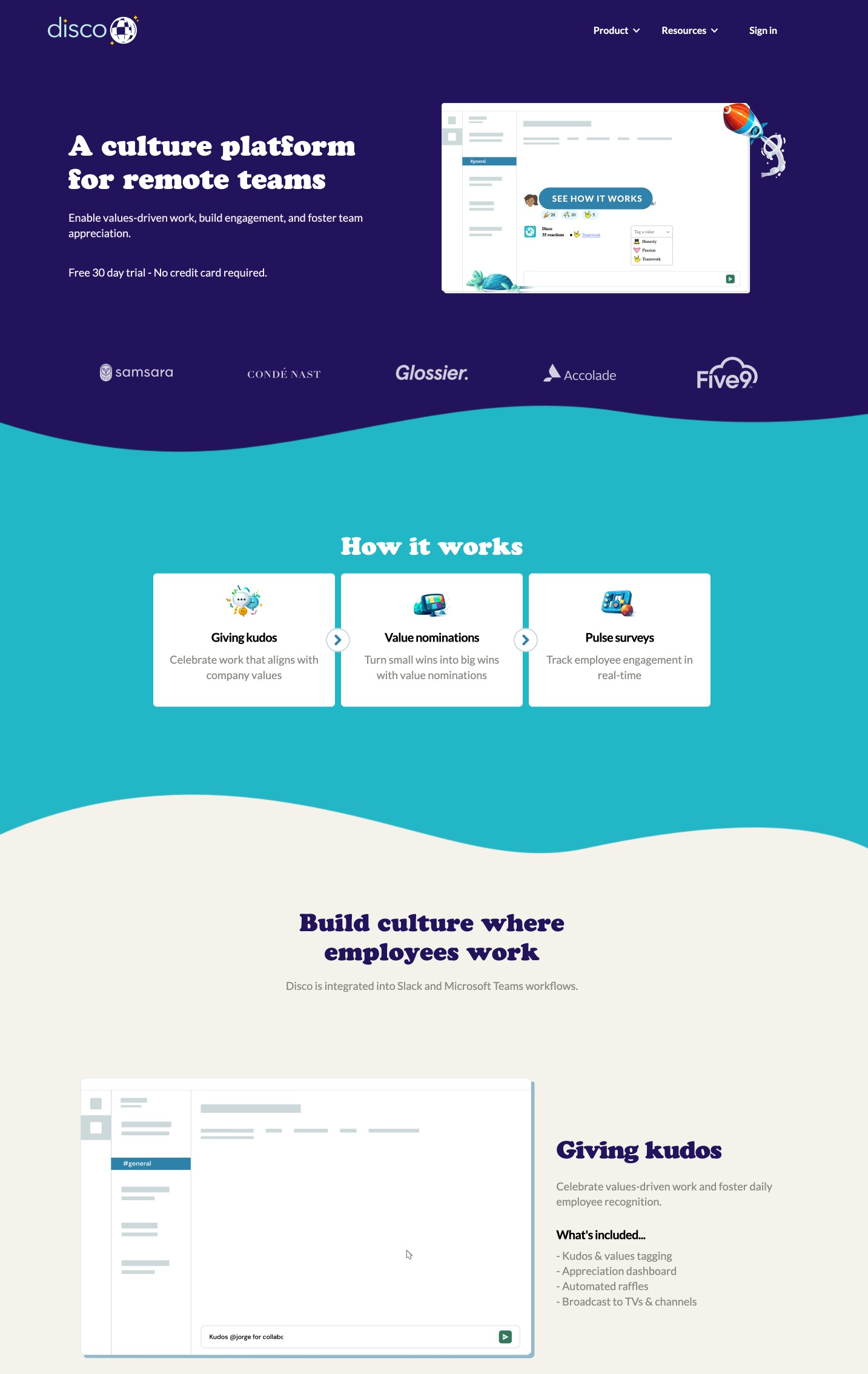
Corporate culture platform Disco uses fun illustrations and transition effects to bring life to its website. The reserved blue and white color scheme and no-nonsense layout balance things out so it doesn’t appear immature.
30. Dayflow

The Dayflow website is another example of how Webflow is a perfect match for illustrators and other creatives, giving them the power to create websites that show off their work without needing coding skills.


Leave a Reply