
22 Examples of Unique Sites Using Squarespace (2024)
Squarespace is by far one of the newest website building platforms out there, but that doesn’t mean the company hasn’t made waves when it comes to helping out customers who would like to launch online stores, blogs and business websites.
Overall, Squarespace has made its name by providing some of the most beautiful templates on the market. They’re really that good. Each of the themes come with essentials like social media, blogging, sliders, and more. You can upgrade to run a complete online store, and did we mention the designs are incredible?
As a media-focused website design platform, it’s no wonder that thousands of companies have turned to Squarespace for their website building needs. From schools to online magazines, and tech companies to food bloggers, Squarespace has just about everything you could want. The best part is that the interface, both front and back, is the sleekest out there.
Therefore, we wanted to take a moment to look at some of the best examples of unique sites using Squarespace. Feel free to bookmark these for inspiration, and come back to these when you come across a feature that you’re not sure works with Squarespace. It just might surprise you with how much functionality is included.
1. Scott Snyder
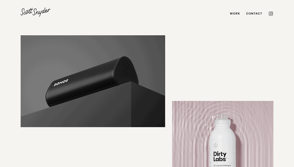
Template: Custom
Scott Snyder’s website features a minimalist design that puts the focus on the photographer’s work. The homepage uses a near full-screen slideshow which draws attention. Also, the well-organized portfolio section lets users browse through the different categories of work without fuss. Overall, the website is easy to navigate, slick in looks, and offers fantastic readability.
3. Studio Bramble
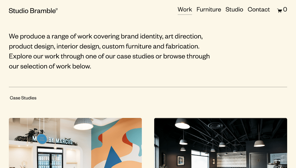
Template: Custom
This website has a clean and modern design, with the agency’s work at the center. The homepage uses a grid of high-quality images, with a brief introduction. The site’s typography is clean and easy to read, with simple navigation. We like how the site splits work into case studies and a general gallery, as this gives visitors a quick portfolio overview and in-depth detail too.
4. BackBIPoC
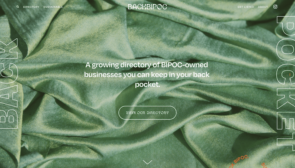
Template: Brine Family
The BackBIPoC website uses the Brine family of templates to offer a simple yet impactful design with a focus on the organization’s mission. The homepage features bold typography with a prominent Call To Action (CTA.) Animations and dynamic elements shape this site, with images that display once you mouse over navigation elements. This site doesn’t follow the typical rules of web design, but does deliver a super experience.
5. Ryu Creative
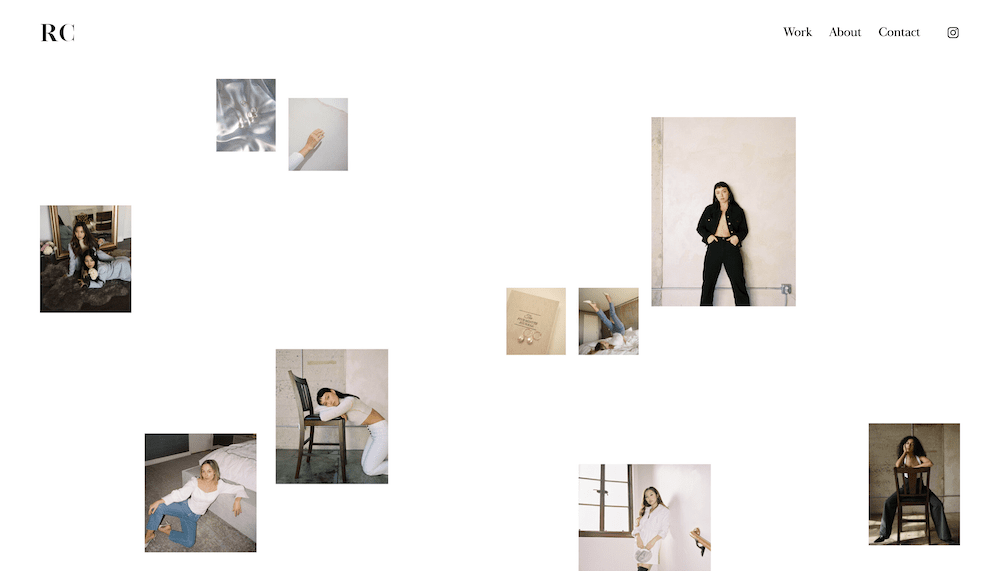
Template: Custom
The RyuCreative website’s sleek and modern design showcases the agency’s branding expertise. What looks like individual images on the homepage is actually a full-screen composite header, which follows up with information on what the agency does. The site’s typography is elegant and easy to read, with minimalist navigation. However, writing is also minimal here.
7. Soilboy
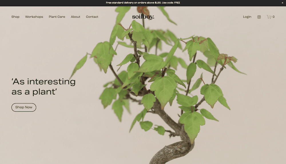
Template: Custom
Soilboy’s charming and rustic design is a near-perfect complement the brand’s identity. The homepage provides clarity and focus, with a muted color palette to evoke a sense of nature and sustainability. We like the playful yet readable typography too. What’s more, almost every link on the page leads to the online shop. This a fantastic way to lead the visitor to the most impactful areas of your site.
11. Ash Owens
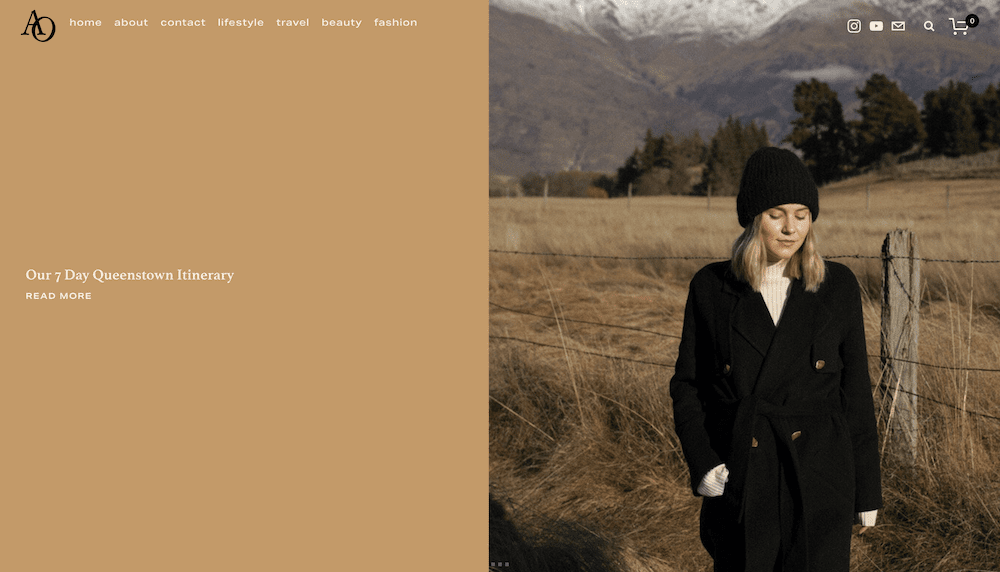
Template: Brine Family
Ash Owen’s website is elegant and straightforward, The homepage features a full-screen slideshow of featured blog posts, and uses a muted color palette to let the images stand out. The site’s typography could look dated or too formal in another setting, but here it works to offer some legitimacy and authority. Regardless, there’s plenty of blog links wherever you turn, which is similar to the Soilboy website.
12. Wildheart
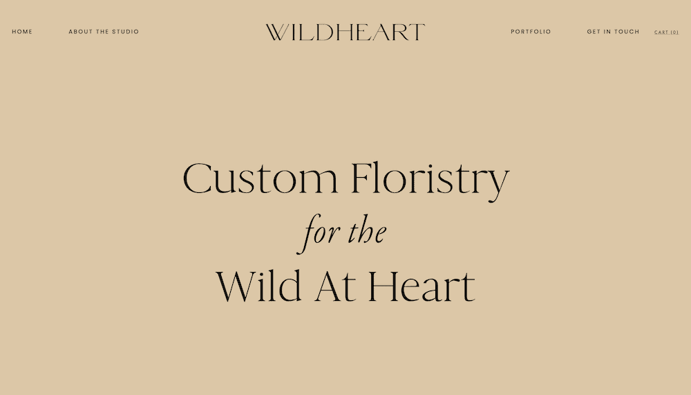
Template: Brine Family
Wildheart presents a beautiful and whimsical design that uses tasteful image placement for their floral arrangements. The soft and muted color palette evokes a sense of romance and nostalgia. The portfolio section is also superb, as it presents almost a story of how and why particular arrangements came to be.
16. Artips
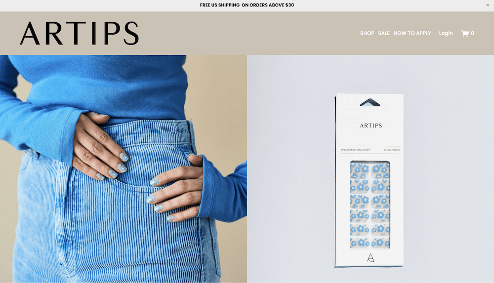
Template: Custom
The Artips Studio website is short, which isn’t an adjective we use too much. However, after you look at the huge full-screen header images of the product, you get a quick testimonial section and an Instagram feed. Once this is over, there are a few more words, and you reach the end of the home page. This isn’t a problem though, as the modern and elegant design showcases the studio’s expertise. On the whole, this is a good example of a site that doesn’t need to do too much to succeed.
17. Legue
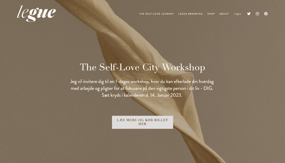
Template: Custom.
Legue centers all of its site on what it can offer – a good tactic in our opinion. Its sleek and minimalist design uses plenty of CTAs to lead visitors around the various pages. In fact, the most activity is at the bottom of the site. There’s a newsletter signup form, navigation with greater depth, and an Instagram feed. It’s a great approach to lead with the important elements, and follow it up with everything else in order of priority.
20. Minaa B.
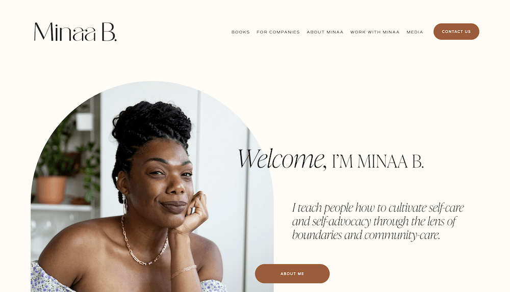
Template: Custom
Minaa Bs website shows how you can achieve a good balance between a personal touch and business focus. It leads with a hero image, along with text in the first person. Later on, there are links to purchase books or other services. You’ll also find other elements peppered throughout, such as client lists and how Minaa can help. This home page offers a lot, but it never feels like too much.
21. Melula
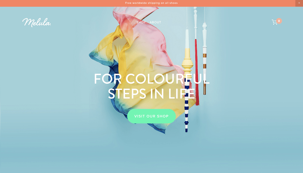
Template: Brine Family
Much like Soliboy, Melula’s website doesn’t give you much in the way of text, and it seems as though every images links to a shop. This fashion brand leads with its products, which is a clear winner of a tactic. Like its product images, the color scheme is bold too. This bright and captivating website gets you to browse through a willingness to explore the product catalog, and it does it well.
22. Pierre Thiam
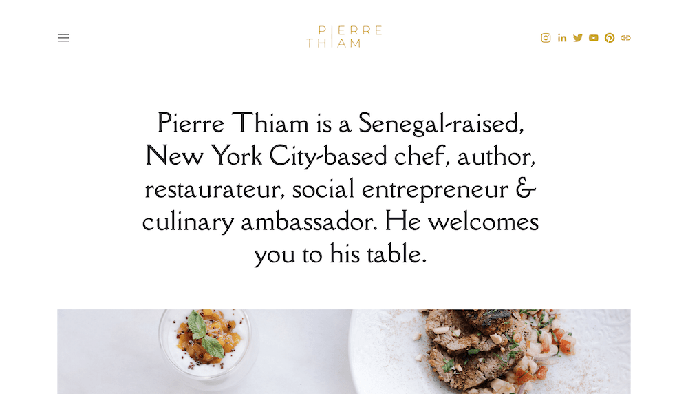
Template: Ready
This site does a lot of things well, but we love the header. Almost the only content you see above the fold is a quick blurb on Pierre himself. From there, you get a longer bio and some choice images. It’s clear to see that this site is a calling card, and looks to showcase what Pierre does, rather than include links to products. Also, a special note should go to the typography, which is fitting and exquisite.
Conclusion
Now that you’ve had a chance to look at some of the coolest Squarespace examples online, let us know if you’re aware of any other beautiful designs built off the same platform. Feel free to drop a line in the comments!
What template does Lyft use on their blog?
I am wondering the same thing
I think they are using a custom template.
What was the theme name of the Squarespace template used to generate “The Collective Quarterly” website example? It might have helped if your copy also mentioned what template was used to generate each of these different website styles which have been highlighted for being unique.
I would also like to know the templates that were used.
Can you provide any examples of squarespace pages used for podcasts?
Marc Maron’s WTF podcast uses Squarespace.
Nice list!
Do you have a list of drupal website for inspiration? I really curious about it, but it’s very rare to find a website using Drupal.
What theme did LAICALE use?
What template is Freemans using?
Pacific Family Template
#2 was built in Word Press… How are you determining which sites are using squarespace?
#6 is WordPress
Quite a few of the sites are built actually with wordpress, not squarespace. I guess they switched after you built this page. You can see it from the “page source” of the sites.
What template does the Alder site use?
Hey Brandon,
The site is using Momentum template.
What template does Laura Berger use?