
20 Best Google Fonts & How To Use Them
Are you planning on using Google Fonts on your website? Then this guide will help you not only pick the right font for your design but also learn how to install them on your website.
In this post, we feature some of the most creative Google Fonts that offer the best user experience in terms of readability. We’ll also give you a few tips on how to use Google Fonts.
You should never use a font just because some poll or statistics show it to be popular. When choosing a font, you should first think about your users, your brand, and your target audience.
Instead of looking at the download counts and random polls, let’s learn how to find a great font that fits your website design.
Why Use Google Fonts?
When it comes to web fonts, Google Fonts is a resource web designers can’t live without. It allows you to add custom typefaces to all kinds of websites and web apps quite easily.
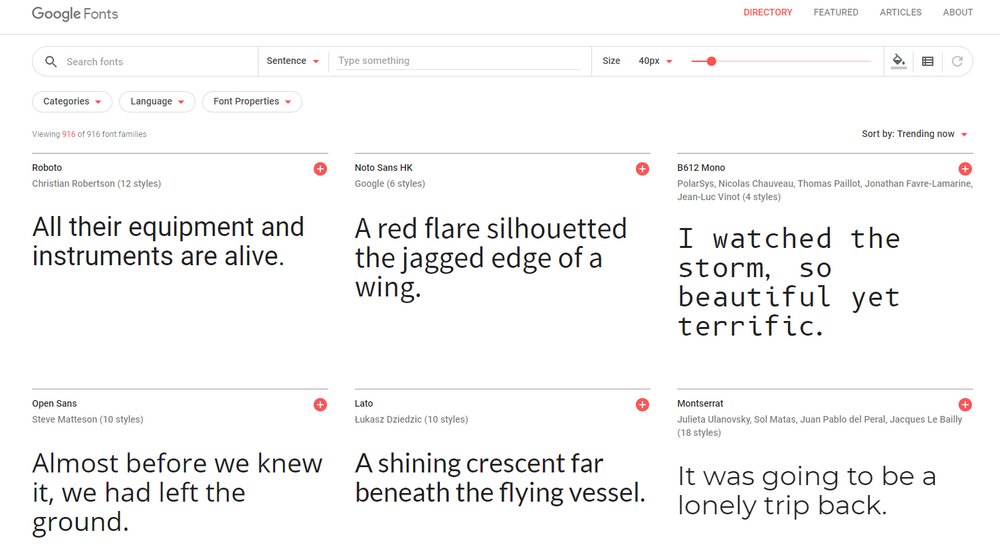
With a collection of more than 900 fonts that support over 135 different languages, Google Fonts offers access to a large library of web fonts completely free of charge.
In addition to hosting and regularly updating the fonts, Google Fonts also allows you to use the fonts for free with personal and commercial projects without even having to add attribution.
Given the pricing and licensing complications that come with most premium fonts, Google Fonts is a resource that you simply can’t put a price on.
4 Tips To Use Google Fonts More Effectively
Google Fonts library includes lots of beautiful font designs. At first glance, you’ll probably want to use all of them at once. Follow these tips to avoid making such mistakes.
#1 Don’t Use More Than Two Fonts
Use one font for titles and another font for body text or paragraphs. This is a very common rule of thumb all designers, both web and graphic designers, follow when designing all types of projects.
Using more than two fonts may interfere with the user experience and even break the consistency of the design. It will also affect website loading times.
This puts more pressure on you when choosing fonts, but thankfully you can test different font combinations using Google Fonts to find the right pair free of charge.
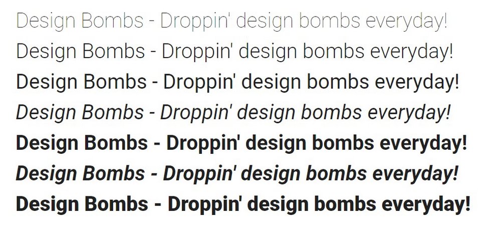
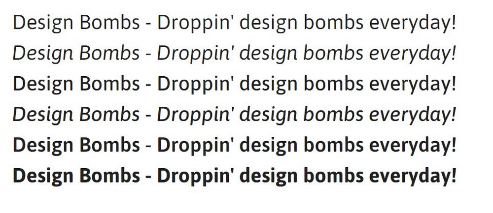
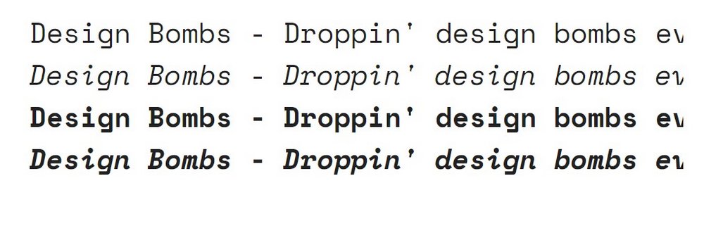
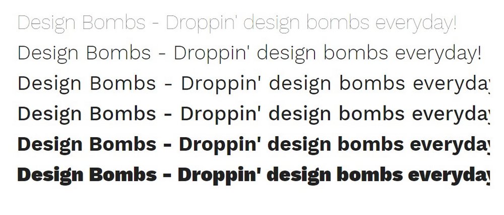
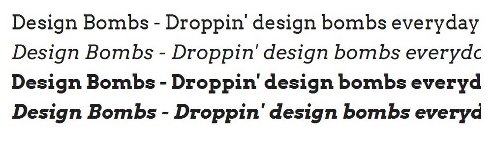
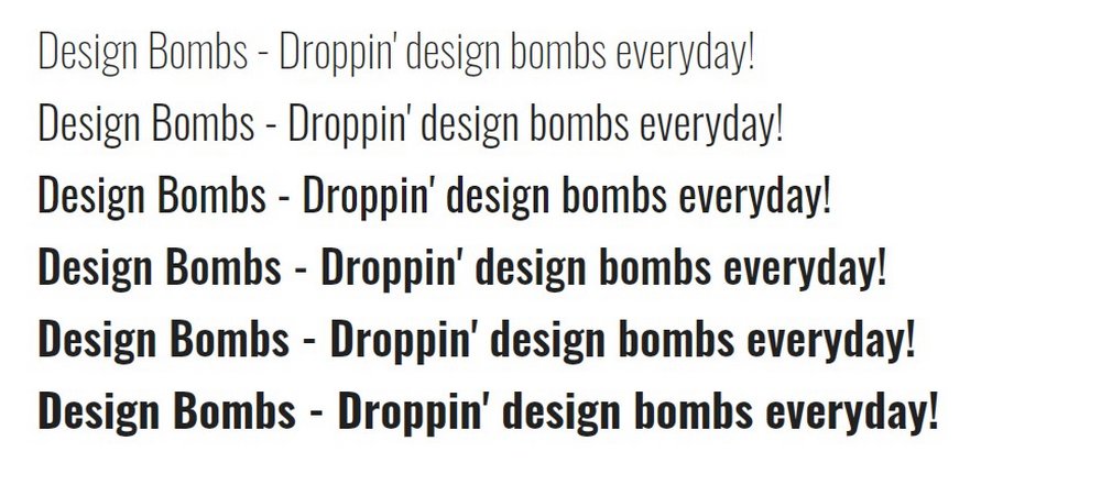
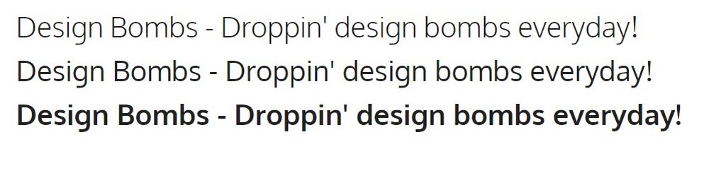
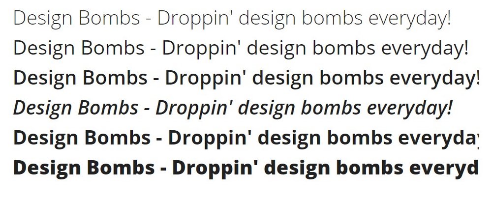
#2 Use Fewer Font Weights
Using too many font weights can also impact your website or app performance. Since the website has to pull too many typefaces from Google servers each time a page loads, it can slow down your website.
Depending on the type of website or app you’re making, go with just 2 to 3 font weights. One for regular text and another for bold text as well as the italic version.
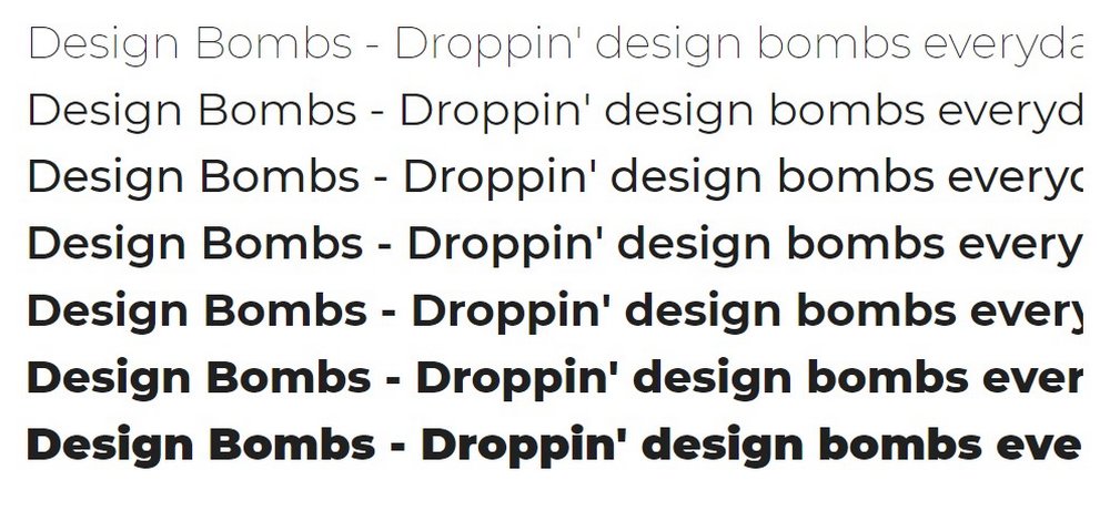
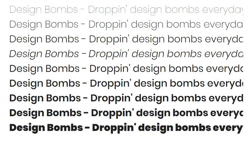
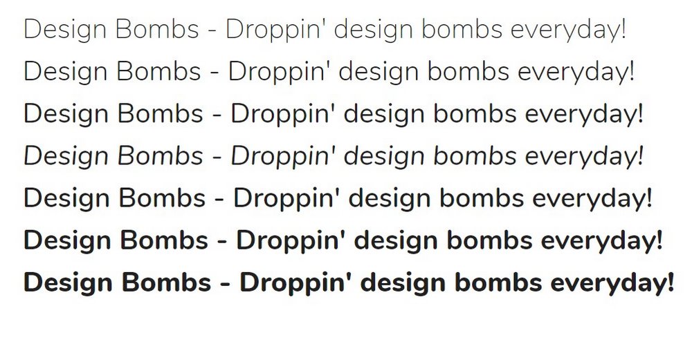
#3 Consider Point Size
Point size is the font size you use in designs. For example, 16pt to 24pt is a common size used for body text in website designs and blogs. When choosing a web font, remember to account for the point size.
Depending on how you use the web font, the point size will determine how the text looks in your design. Some fonts look better in large titles and some work better for paragraph text.
#4 Multilingual Support Is Important
According to Internet World Stats, only 25% of internet users use the English language. There are billions of people who use other languages.
Even if your website is written in English, Google now allows users to easily translate websites text into different languages. However, it will only work if the font you use supports the user’s language. So make sure to pick a font that supports the languages of your target audience.
How To Create Google Fonts Pairings
A font pair is the two (or more) fonts you choose from Google Fonts collections to use in your design. The platform makes it easier to pick the fonts you want while browsing the collection and also to easily manage the font weights as well.
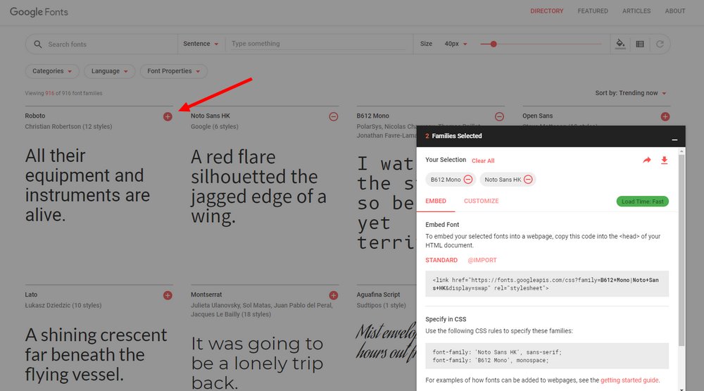
To pick a font pair, all you have to do is click on the plus (+) icon next to a font and it will automatically be added as a selection. Then you can click on the floating panel on the right-hand side to remove fonts from the selection, copy the embed code to install the font on your website, and choose the weights for the fonts.
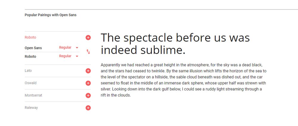
When you select a font, Google Fonts will suggest matching fonts to pair with your selected font. This makes it easier to create a font pair. You can also use tools like FontPair and Fontjoy to easily find great font pairs with a few clicks.
How To Install Google Fonts In Your Website
Once you pick a font and its font weights on Google Fonts, you can install it on your website using the embed code.
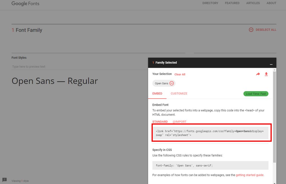
Copy the code in the Embed Font section and then paste it in your website’s head section. Include it right after the <head> tag for best performance.
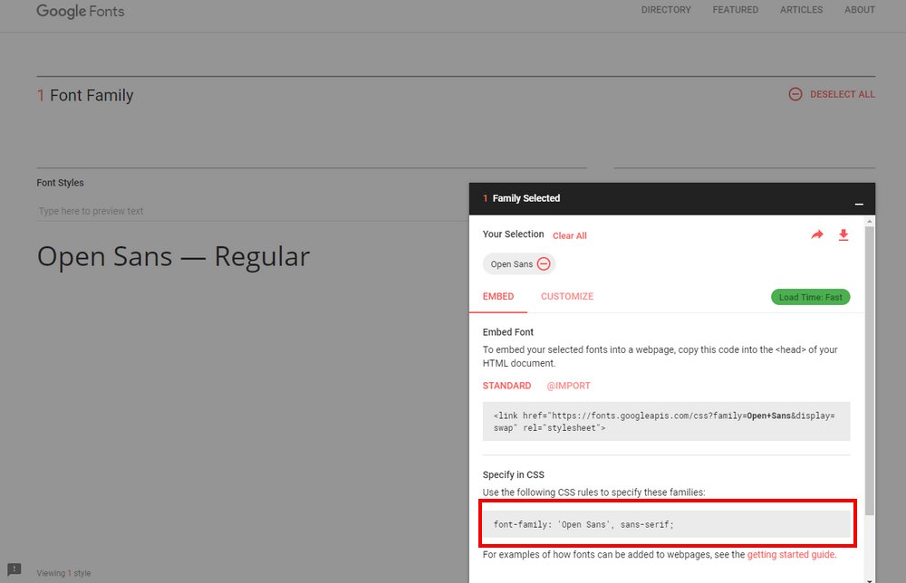
Then copy the code in the Specify in CSS section and paste it in your website stylesheet CSS document.
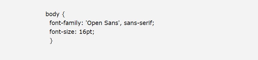
For example, if you want your body text and H1 titles to use different fonts, you’ll need to specify each font separately in the CSS file.
How To Use Google Fonts In WordPress
While most premium WordPress themes include built-in support for custom Google Fonts, some themes have limited selections of fonts. If you want to use Google Fonts in WordPress, you can still follow the method we described above. But, the easiest way is to install a plugin.
Installing the free plugin Easy Google Fonts will allow you to access the Google Fonts library by going over to Appearance >> Customize and then through the Typography menu.
Follow this guide for step by step instructions on adding Google Fonts in WordPress and other websites.
Top Google Fonts For Websites & Web Apps
1. Roboto
- Font Type: Sans-Serif
- Best For: Body text
Roboto is one of the most popular web fonts in Google Fonts library that’s being used by over 26 million websites. It features a smooth sans-serif design that makes it a great choice for long paragraphs and other body text.
2. Montserrat
- Font Type: Sans-Serif
- Best For: Body text & headings
Montserrat is a unique font that can be used for both headings and body text. It comes in various styles ranging from thin weights to extra-bold and black. The font also goes well together with Roboto as well.
3. Playfair Display
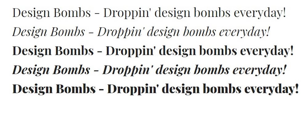
- Font Type: Serif
- Best For: Headings
Playfair Display is a stylish serif font that’s used by more than 5 million websites on the Internet. The font is most suitable for designing large titles and headings. It’s available in 3 different weights.
4. Lora
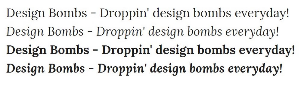
- Font Type: Serif
- Best For: Body text
Lora is one of the best serif web fonts available in Google Fonts. It’s a great choice for the body text of news websites and corporate websites. Although the font only includes 2 weights and italics.
5. Karla
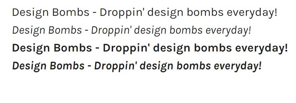
- Font Type: Sans-Serif
- Best For: Body text
Karla also features a smooth sans-serif design with a grotesque vibe. The font’s minimalist character design will improve your website redability when used for body text. It also comes in regular and bold weights as well as italics.
6. Merriweather
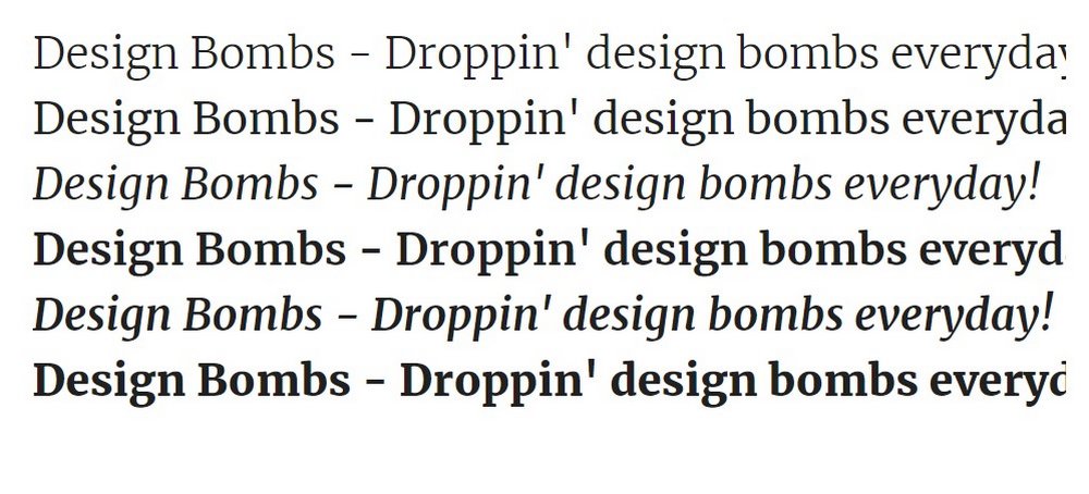
- Font Type: Serif
- Best For: Body text & headings
Merriweather is another elegant serif font commonly used paired with the Lora font. This font is perfect for both headings and body text, especially for professional and business websites.
7. Ubuntu
- Font Type: Sans-Serif
- Best For: Headings
Ubuntu is the default font used in the popular Linux-based operating system of the same name. This font is a great choice for titles and headings, especially for blogs and magazine. But it’s not a good choice for body text.
8. Rubik
- Font Type: Sans-Serif
- Best For: Headings
Rubik features a set of characters with stylish rounded edges. This font is ideal for titles and headings on your website. It’s available in 5 weights and 5 styles.
9. Source Sans Pro
- Font Type: Sans-Serif
- Best For: Body text
Source Sans Pro is a professional font family designed and released by Adobe with an open-source license. In terms of design, this font is simply perfect and it looks great in body text.
10. Archivo
- Font Type: Sans-Serif
- Best For: Headings
Archivo is a sans-serif font featuring a design inspired by nineteenth-century American fonts. It comes in 4 different weights and italics. The font is most suitable for titles and headings.
11. Asap
- Font Type: Sans-Serif
- Best For: Body text & headings
Asap is font designed by a pair of professional designers and it has a creative sans-serif design with slightly rounded character design. This font comes in 4 styles and it’s suitable for both headings and body text.
12. Domine
- Font Type: Serif
- Best For: Headings
Domine is one of the few stylish serif fonts available on Google Fonts. The font only has regular and bold weights so it’s better used only in headings and title designs. The font pairs well with Montserrat as well.
13. Space Mono
- Font Type: Serif
- Best For: Headings
Space Mono is the type of font that you normally see on technology startup and programming websites. The design is inspired by fonts used in the 1960s. It’s most suitable for titles and headings.
14. Poppins
- Font Type: Sans-Serif
- Best For: Body text & headings
Poppins is a geometric sans-serif font that features an elegant monolinear design. The accurate geometric design of its characters makes it suitable for both headings and body text. The font is available in 9 different weights as well.
15. Work Sans
- Font Type: Sans-Serif
- Best For: Headings
Work Sans is a sans-serif font that works best as a headings font. Its bold and extra-bold weights are the best-looking typefaces in the font family. The only downside to using this font is it doesn’t include italic style typefaces.
16. Nunito
- Font Type: Sans-Serif
- Best For: Body text & headings
Nunito is the perfect web font for creative projects as it comes with a unique rounded character design. The font includes 7 different weights and it pairs well as both body text and headings.
17. Arvo
- Font Type: Serif
- Best For: Body text & headings
Arvo is a serif font that can be used in professional website designs. The font comes in 2 styles and it works for both body text and titles. The font also pairs best with Open Sans.
18. Oswald
- Font Type: Sans-Serif
- Best For: Headings
Oswald features a narrow (or condensed) design and it comes in 6 different weights. It’s best for designing headings and titles for modern websites.
19. Oxyen
- Font Type: Sans-Serif
- Best For: Headings
Oxygen is a sans-serif font that features a set of unique characters. This font doesn’t include italic typefaces, which makes it a better option for titles and headings.
20. Open Sans
- Font Type: Sans-Serif
- Best For: Body text
Open Sans is another popular font used by more than 25 million websites. Its generic style of character design may not help make your designs stand out from the crowd, but it’s one of the best when it comes to offering better user experience and improving readability.
In Conclusion
Many decisions are involved in choosing a pair of fonts for a web design. So take your time and test different fonts to find the right font for your website or app. Hopefully, our list will help you narrow your search and speed up that process.
If you’re looking for a font for a print or digital graphic design, check out our collection of the best free and premium designer fonts. And our how to make a website guide will also prove useful if you’re new to web design.
Leave a Reply