How To Start Working With Underscores (_s) As A Beginner WP Developer
For someone who wants to get into WordPress development, just knowing where to start can already be hard. In a previous article, we covered 8 starter themes and frameworks that might be a good choice. In this tutorial we’ll go over how to start working with Underscores, the consensus first pick for beginner developers.
First off, we’re going to start by obviously downloading Underscores. Before you download it, it will ask you to put in a name for your theme. You don’t need to think of anything too amazing, as this can be changed at any point later. If you want you can also fill out a few more fields by clicking advanced. But again you can fill out that information easily later.
Now move extract the zip file into the wp-content/theme folder of your local development version of WordPress. (You can read more about using Local to set up a local development environment here.)
Not very familiar with how WordPress actually works?
Now is a good time to familiarize yourselves with the different working parts of WordPress. We’ve covered some of the basics here, in the first part of a series on creating a WordPress theme from scratch. But you can also look up everything unfamiliar you come across in the WordPress codex or developers handbook as you go along.
The Main Files In Underscores
As you can see after extracting, there are quite a few files included in the Underscores starter theme. We’re going to take a closer look at the most important ones for making significant changes to the theme, and just how to do that.
Header.php
Let’s take a look at the code in the header.php file:
<?php
/**
 * The header for our theme
 *
 * This is the template that displays all of the <head> section and everything up until
<div id="content">
 *
 * @link https://developer.wordpress.org/themes/basics/template-files/#template-partials
 *
 * @package That_Theme
 */

?><!doctype html>
<html <?php language_attributes(); ?>>
<head>
<meta charset="<?php bloginfo( 'charset' ); ?>">
<meta name="viewport" content="width=device-width, initial-scale=1">
<link rel="profile" href="http://gmpg.org/xfn/11">

<?php wp_head(); ?>
</head>

<body <?php body_class(); ?>>

<div id="page" class="site">
	<a class="skip-link screen-reader-text" href="#content"><?php esc_html_e( 'Skip to content', 'that-theme' ); ?></a>


<header id="masthead" class="site-header">

<div class="site-branding">
			<?php the_custom_logo(); if ( is_front_page() && is_home() ) : ?>

<h1 class="site-title"><a href="<?php echo esc_url( home_url( '/' ) ); ?>" rel="home"><?php bloginfo( 'name' ); ?></a></h1>

			<?php else : ?>


<a href="<?php echo esc_url( home_url( '/' ) ); ?>" rel="home"><?php bloginfo( 'name' ); ?></a>

			<?php endif; $description = get_bloginfo( 'description', 'display' ); if ( $description || is_customize_preview() ) : ?>


<?php echo $description; /* WPCS: xss ok. */ ?>

			<?php endif; ?>
		</div>

<!-- .site-branding -->


<nav id="site-navigation" class="main-navigation">
			<button class="menu-toggle" aria-controls="primary-menu" aria-expanded="false"><?php esc_html_e( 'Primary Menu', 'that-theme' ); ?></button>
			<?php wp_nav_menu( array( 'theme_location' => 'menu-1',
					'menu_id'        => 'primary-menu',
				) );
			?>
		</nav>

<!-- #site-navigation -->
	</header>

<!-- #masthead -->


<div id="content" class="site-content">
As you can see, other than the extensive comment at the top, it’s very basic WordPress. All things you’d expect from a starter theme meant to be built on.
In general there’s not too much to mess around with here as you’re first starting out. Of course there are still some things you can edit in the header; you might for example add an tag wrapped around the logo and add the option to change the link from the customizer.
If you want to add the header function to underscores, you need to call the the_custom_header_markup(); function if you want to have the option for a video header, or just the_custom_header(); if you only want to support images. You’ll probably want to include it above the logo on the first line after the site-branding div is opened. Like this:
<div id="site-branding">
<?php the_custom_header_markup(); ?>
Obviously there’s other things you can change, but for the most part, underscores comes with a fairly complete header file.
Footer.php
</div>

<!-- #content -->


<footer id="colophon" class="site-footer">

<div class="site-info">
			<a href="<?php echo esc_url( __( 'https://wordpress.org/', 'that-theme' ) ); ?>"><?php /* translators: %s: CMS name, i.e. WordPress. */ printf( esc_html__( 'Proudly powered by %s', 'that-theme' ), 'WordPress' ); ?></a>
			<span class="sep"> | </span>
			<?php
				/* translators: 1: Theme name, 2: Theme author. */
				printf( esc_html__( 'Theme: %1$s by %2$s.', 'that-theme' ), 'that-theme', '<a href="https://YOURURL.com/">YOUR NAME</a>' );
			?>
		</div>

<!-- .site-info -->
	</footer>

<!-- #colophon -->
</div>

<!-- #page -->

<?php wp_footer(); ?>

</body>
</html>
In underscores, basically the only thing the footer does is credit WordPress and the theme. (It also allows for translation, which makes the code a bit different from what you might have seen before.)
One of the things you might want to do here, is include a widget area for sponsors, or other things, add a copyright statement, or things along those lines.
If you want to add a widget area, you can either directly add the dynamic_sidebar function along with any divs you’d want to wrap it in to your footer.php file like so:
<div id="footer-widget-area"> <?php dynamic_sidebar( 'NAME-OF-WIDGET_AREA' ); ?></div>
Or, create a separate sidebar file, for example sidebar-footer.php where you include that code, and then call that into the footer like so:
<?php get_sidebar('footer'); ?>
But still fairly standard, straight forward stuff.
Functions.php
The functions file is a bit long to include line by line in this tutorial, but luckily it is well commented and easy to understand.
If you’ve ever worked with WordPress themes before, you should easily be able to find your way around.
Notice that underscores is fairly light on custom theme functions that can be enabled easily using add_theme_support. For example the header function has not been enabled. If you want to enable the header with the ability for video, you can add this snippet inside the THEMENAME_setup() function:
add_theme_support( 'custom-header', array(
  'video' => true
));
If you decided to include a widget area in your footer, you’ll also need to create another widget here.
Just look at the register_sidebar() function and create another one with different information that matches what you want from your sidebar. For example:
register_sidebar( array(
		'name'          => esc_html__( 'Footer sponsor area', 'that-theme' ),
		'id'            => 'sidebar-footer',
		'description'   => esc_html__( 'Add sponsors here.', 'that-theme' ),
		'before_widget' => '
<section id="%1$s" class="widget %2$s">',
		'after_widget'  => '</section>

',
		'before_title'  => '
<h2 class="widget-title">',
		'after_title'   => '</h2>

',
	) );
If needed, you can read more about the functions.php file and WordPress functions in the codex.
Sidebar.php
if ( ! is_active_sidebar( 'sidebar-1' ) ) {
	return;
}
?>


<aside id="secondary" class="widget-area">
	<?php dynamic_sidebar( 'sidebar-1' ); ?>
</aside>

<!-- #secondary -->
Very simple, a statement wrapping what to do if there is no sidebar, and the sidebar itself.
For the most part, no need to edit this file.
Index.php
get_header(); ?>


<div id="primary" class="content-area">
		<main id="main" class="site-main">

		<?php if ( have_posts() ) : if ( is_home() && ! is_front_page() ) : ?>

<header>

<h1 class="page-title screen-reader-text"><?php single_post_title(); ?></h1>

				</header>


			<?php endif; /* Start the Loop */ while ( have_posts() ) : the_post(); /* * Include the Post-Format-specific template for the content. * If you want to override this in a child theme, then include a file * called content-___.php (where ___ is the Post Format name) and that will be used instead. */ get_template_part( 'template-parts/content', get_post_format() ); endwhile; the_posts_navigation(); else : get_template_part( 'template-parts/content', 'none' ); endif; ?>

		</main><!-- #main -->
	</div>

<!-- #primary -->

<?php
get_sidebar();
get_footer();
As you can see, Underscores uses template parts in the loop. This means that if you want to make separate designs for video content, or galleries, you don’t need to mess with the index.php file at all, you just need to make a content-gallery.php or content-video.php file. You can also do exactly the same for custom post types that you might want to add. Let’s look at the basic content layout for posts:
Content.php
<article id="post-<?php the_ID(); ?>" <?php post_class(); ?>>

<header class="entry-header">
		<?php
		if ( is_singular() ) :
			the_title( '
<h1 class="entry-title">', '</h1>

' );
		else :
			the_title( '
<h2 class="entry-title"><a href="' . esc_url( get_permalink() ) . '" rel="bookmark">', '</a></h2>

' );
		endif;

		if ( 'post' === get_post_type() ) : ?>

<div class="entry-meta">
			<?php that_theme_posted_on(); ?>
		</div>

<!-- .entry-meta -->
		<?php endif; ?>
	</header>

<!-- .entry-header -->


<div class="entry-content">
		<?php
			the_content( sprintf(
				wp_kses(
					/* translators: %s: Name of current post. Only visible to screen readers */
					__( 'Continue reading<span class="screen-reader-text"> "%s"</span>', 'that-theme' ),
					array(
						'span' => array(
							'class' => array(),
						),
					)
				),
				get_the_title()
			) );

			wp_link_pages( array(
				'before' => '
<div class="page-links">' . esc_html__( 'Pages:', 'that-theme' ),
				'after'  => '</div>

',
			) );
		?>
	</div>

<!-- .entry-content -->


<footer class="entry-footer">
		<?php that_theme_entry_footer(); ?>
	</footer>

<!-- .entry-footer -->
</article>

<!-- #post-<?php the_ID(); ?> -->
Underscores doesn’t include the featured image by default, so if you want to include that in your theme, simply add the post_thumbnail function somewhere either above the entry header or below it, wrapped as you please. Could look like this:
</header>


<div class="entry-thumbnail"><?php the_post_thumbnail(); ?></div>
As you can see, Underscores uses a custom theme function to display the date something was posted, so if you want to edit that part, you need to head over to the inc/template-tags.php file.
Changing The Design of Underscores
 All in all, the basic functionality included in Underscores usually goes a long way for most basic website projects. Which means for simple projects, we can get away with just changing the CSS.
Style.css
The bulk of the meat of the styles in the style.css file deal with margins and applying generic styles to different content types like buttons, etc.
Things like the entry headers, widget areas, header area, is left largely untouched. This means you can easily style them simply by using the correct selectors.
But some things are a bit more tricky.
Menu
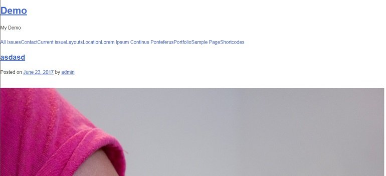
The menu is already styled quite a bit to for example, hide child items until the parent is hovered over, and there’s even a jquery function to add a toggle button on smaller screens. This unstyled button doesn’t look very good however. It’s just a generic button hanging out to the left:

So you should probably style it to fit your design. You can style said button by using the .menu-toggle class selector, but you need to wrap it in a media query, as it is set to display:none; by default.
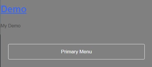
If you’ve chosen to change the background color of the header area, you could for example make the button’s background transparent with a solid border. With a bit of extras added, this is what that code could look like:
@media screen and (max-width: 37.5em) {
	.menu-toggle:hover {
    background-color: #000;
}


.menu-toggle {
    float: middle;
    width: 90%;
    margin-right: auto;
    margin: 5%;
    background-color: transparent;
    -moz-border-radius: 4px;
    -webkit-border-radius: 4px;
    border-radius: 4px;
    border: 1px solid #FFF;
    display: inline-block;
    cursor: pointer;
    color: #fff;
    font-size: 17px;
    padding: 1em 2em;
}
}
And the result:

Obviously you can go other directions with the design, but this is an example of what you can do in just a few lines of CSS.
Breakpoints For Responsive Design
The only breakpoint included in the stylesheet by default is the 37.5em breakpoint for showing the toggle button for the menu. You can either choose to work with this breakpoint, or change it and work with the ones you are used to. If you are a beginner and don’t have a set of breakpoints that you use, you can default to more widespread ones like the bootstrap breakpoints.
Layouts
Underscores comes with two layout options which are not enqueued by default, content-sidebar, and side-bar content. (Meaning sidebar to the right and sidebar to the left.)
Because the code is unresponsive, it’s more of an example showing how to divide the content into 75% content and 25% sidebar, than a perfect implementation of it.
Instead of enqueing the files, you can choose to include them into the stylesheet wrapped in appropriate media queries. If you’re going mobile first using bootstrap queries, you might use this:
@media only screen and (min-width : 992px) {
.content-area {
	float: left;
	margin: 0 -25% 0 0;
	width: 100%;
}
.site-main {
	margin: 0 25% 0 0;
}
.site-content .widget-area {
	float: right;
	overflow: hidden;
	width: 25%;
}
.site-footer {
	clear: both;
	width: 100%;
}
}
If you’re designing full width first, you’d include code setting the sidebar and content area to 100% in a max-width query, and then have that code outside of media queries.
Conclusion
Underscores is a very organized, well commented starter theme that is great for any beginner to work with. We hope these few pointers help you create your own amazing theme using Underscores.
If you have any questions or comments about this post, please leave them below.


Hi, I’m a newbie using the built in CSS editor to tweak a version of Underscores theme.
My menu is a horizontal drop-down, 3 levels.
When I reduce the width of the 2nd- and 3rd-level lists a gap appears between them.
How do I modify the CSS to keep the 3rd-level list adjacent to the 2nd-level list?
Your advice much appreciated!
This is the width value I am reducing:
.main-navigation ul ul a {
width: 200px;}
This is the menu css section:
## Menus
————————————————————–*/
.main-navigation {
clear: both;
display: block;
float: left;
width: 100%;
}
.main-navigation ul {
display: none;
list-style: none;
margin: 0;
padding-left: 0;
}
.main-navigation ul ul {
box-shadow: 0 3px 3px rgba(0, 0, 0, 0.2);
float: left;
position: absolute;
top: 100%;
left: -999em;
z-index: 99999;
}
.main-navigation ul ul ul {
left: -999em;
top: 0;
}
.main-navigation ul ul li:hover > ul,
.main-navigation ul ul li.focus > ul {
left: 100%;
}
.main-navigation ul ul a {
width: 200px;
}
.main-navigation ul li:hover > ul,
.main-navigation ul li.focus > ul {
left: auto;
}
.main-navigation li {
float: left;
position: relative;
padding:4px 8px;
}
.main-navigation li li{
background-color:#ccc;
}
.main-navigation a {
display: block;
text-decoration: none;
color:#000000;
}
Can you send over the URL to the website, need to see the issue to figure out the solution.
Hi, thanks for your reply.
I have found a solution, but here is my url jungny.com
here is the solution someone else provided: (supplementary css)
.main-navigation ul ul a {
width: 140px;
}
.main-navigation ul ul li:hover > ul, .main-navigation ul ul li.focus > ul {
left: 166%;
}
This works fine and gives me control over the width of drop downs.
Best, max mcdowell
Happy to hear it’s resolved and thanks for sharing the solution.
I have a question regarding the nav too. In both _u and _s, the mobile menu floats left and the drop downs on mobile devices are positioned absolutely under their respecitve parent nav element – it’s not usable as is. I’m not sure how to modify the existing css/js for nested accordion navs? Anyone else dealing with this?
In Underscores the mobile menu drop down is not absolutely positioned. Can you send over the URL to the website so I can see what’s going on in there.
Hey, I’ve been cruising the web tryinig to learn why _u has two divs around the content area — the div with the content-area class and the div with the site-main class. Do you know?
Not 100% sure why but might have something to do with the usage of HTML5 main element. They don’t want it on the same hierarchy level as header and footer elements. Technically it should be on the same level but because of older browsers ( main was added later on in IE ) they decided to have the whole thing wrapped in a div.