Top 20+ Examples of Real-Life Websites Using the Total WordPress Theme (2022)
Let’s talk about Total, a multipurpose WordPress theme that can be the right theme for your WordPress website.
There are a variety of different websites you can create with Total thanks to its use of WordPress customization along with WP Bakery.
We’ll show you 23 website examples that use Total to give you an exact idea of what is possible with this particular theme.
In short, Total is a fantastic WordPress theme that’s well optimized for SEO, compatible with most major plugins, and is fully responsive too.
A little bit about Total WordPress Theme
If you’d like to get to know Total a bit more, let’s talk about some of its most prominent features. There are actually a lot of features within this WordPress theme such as:
- Custom hover effects, animations, and filters
- WPML certified
- Clean & validated code
- 60+ exclusive modules in WP Bakery
- WooCommerce, Contact Form 7, WordPress SEO, and TranslatePress compatibility
- Retina image support
- Full-width and boxed layout options
- Customizable footers and headers
Those are just some of the features that the theme lists out. The list truly goes on and on. However, there are three specific features of Total that should be highlighted:
- 100+ unique element blocks
- Vast plugin compatibility (and an included premium plugin bundle), and
- Responsive design.
Let’s discuss these four features and dive into exactly what makes them worth highlighting.
1. 100+ unique element blocks (with a drag and drop site builder)
As already mentioned, Total includes WPBakery which makes building with a drag and drop interface so much easier.
Of course, Total wouldn’t be a multipurpose theme without providing an adequate amount of unique blocks and elements to customize the theme to various niches or industries.
Total gives you various design options for sliders, WooCommerce checkout, pricing tables, portfolio pages, call out, headings, and many more sections.
With such a large collection of blocks to choose from you’ll end up creating a website that’s truly unique and one that caters to your needs.
2. Vast plugin compatibility (and an included premium plugin bundle)
For any theme to be worth your while, it has to be optimized to work with plugins.
Total not only comes with additional premium plugins, such as WPBakery or Slider Revolution, but the theme’s developers have also tested it against many other popular plugins to ensure compatibility.
They indicated they’ve tested the theme with bbPress, WooCommerce, the Event Calendar, Polylang, and JetPack, among many others.
Most WordPress websites use additional features to run their websites so it’s great peace of mind that Total makes sure to be compatible with the most popular plugins on the market.
3. Responsive design
Mobile browsing increases each day as more people gain access to the internet and mobile devices.
It’s simply a must to have responsive websites that allow visitors to view your website easily, no matter the device they do so with.
Therefore, it’s also important to work with a theme that has your back when it comes to responsive design. The most common and easiest way to have a responsive website is through fluid design meaning the website simply shrinks to the browser’s size.
Total goes beyond that as it includes additional code that stops certain functionally from running which helps your website be even more optimized.
Exceptional reputation with customers
Before we jump into the various examples of websites that use Total as their theme, let’s go over what their customers have to say. On Themeforest, the authors of Total have gathered a slew of badges including “Power Elite Author” badge.
Additionally, they sold the Total theme almost 50, 000 times on ThemeForest alone. They have almost 20,00 comments too. But the best part?
They have a 4.86/5 star rating among over 1,800 reviews. This alone should let you know that they are serious about supporting the theme and their customers.
Similar reviews can be found on other websites too. For example, WordPress, they have a 4.5/5 star review.
But, don’t take my word for it, here are some customer reviews:
“I own 14 licenses for Total, that’s how good it is! You can build anything with it. But what sets it apart is the excellent support. You can always depend on getting quick replies to questions and having any technical problem solved, or the rare bug fixed. Excellent!”
ThemeForest customer, May 2021
“Great theme! Easy to customise and create page layouts with WP Bakery. Loads of card options for specific posts, portfolio, testimonials and staff display. If you like using WP Bakery, you will love this theme as it has countless elements to choose from and customise.”
Themeforest customer, March 2021
“I think this is one of the best WP theme I have ever come across. No matter the kind of design or customization you want, this theme offers exactly what you want. More great news about Total theme is that, it’s easy to use even if you don’t have lots of experience with WordPress. And before I forget, the theme is superfast in terms of loading time.”
Themeforest customer, February 2021
23 Total WordPress Theme Live Website Examples
01. Social Streams
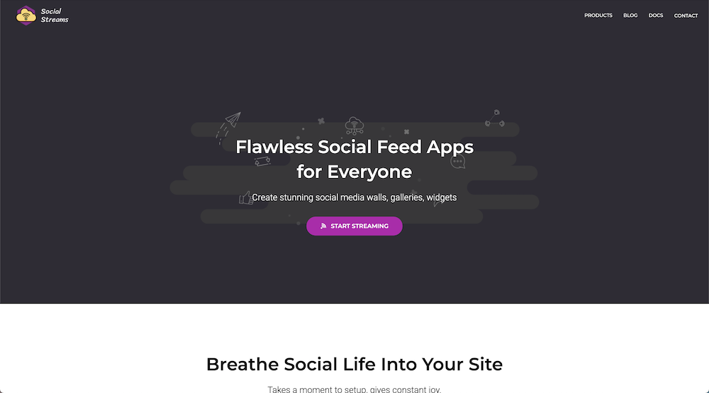
Social Streams has a very fun and colorful website that’s filled with small graphical elements throughout. Although this site is a bit small it’s a great first example of how to use Total for your own business.
They have a homepage, a product section, and a blog. Each page perfectly represents Social Streams’ personality and branding with stunning photography, ample whitespace, and great use of color.
02. Paradise Copters
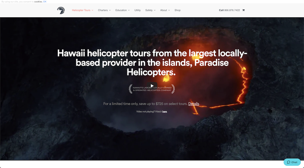
Paradise Copters provides exclusive helicopter tours around Hawaii.
On the homepage, the hero is made up of various video clips from tours which is a great way to showcase the experience for their customers.
Although they provide a large number of tours, each is well-documented on their individual product pages along with tour descriptions, features, photos, and a clear call to action.
03. Kendall Commercial
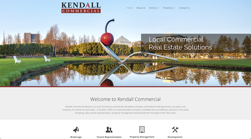
Kendall Commercial, a commercial real estate firm, has a fairly simple and straightforward website. It’s a great example that shows you don’t need an overly complicated website to show off your business well.
The website is mostly made up of text content but each page uses various text block elements to give each page some interest.
04. Yeastar
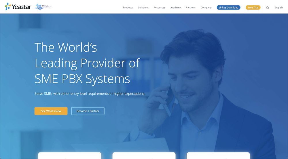
Yeastar, a leading provider of SME PBX systems, utilizes clean and professional graphical elements throughout the company’s website.
Much of their homepage is dedicated to showcasing their product portfolio and the benefits included in their services. If you check further you can see great support systems, informational tutorials, and seminars for their customers.
05. Board Effect
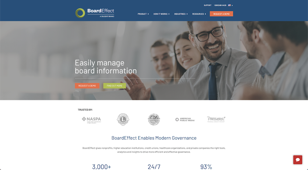
Board Effect uses a welcoming and reasonably simple design that incorporates abundant whitespace throughout its website.
Considering that much of their services and products centered around simplifying board meetings or large video calls, making their website easy to navigate is a great way to translate their mission to potential clients.
06. KM Creative Design Agency
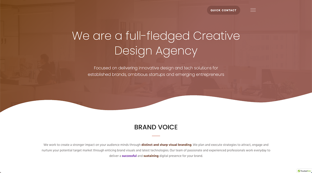
KM Creative Design Agency is an innovative design agency. The homepage is aesthetically modern, it’s easy to navigate and provides clear contact links, descriptions of all their services as well as a few client testimonials. This is a great example of how a business can showcase its brand right off the bat without looking cluttered.
07. Beyond Expectations
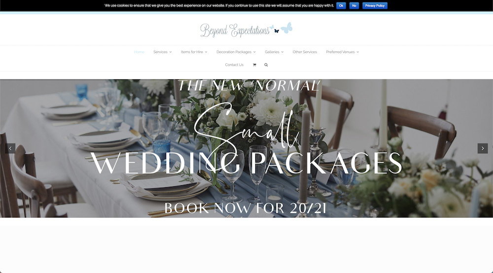
On the Beyond Expectations Wedding and Events Services website we can see great utilization of images the business provides.
With companies similar to Beyond Expectations whose products primary purpose is to be aesthetically pleasing, it’s important to take advantage of using these images which can often serve as testimonials in themselves.
The homepage also provides clear links to further product galleries, as well as decoration packages, venues, and deeper looks into their services.
08. Sleep Baby Love
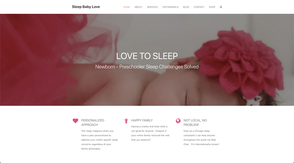
Sleep Baby Love, a child sleep consulting company, has a great color scheme throughout its page.
Incorporating the brand’s color palette while simultaneously advertising their products creates a sleek but inviting way to set the overall tone of the company which can, in turn, entice their desired target market.
The homepage shares common problems parents experience with their babies and offer solutions through their products and attached links at the top.
09. Jennifer Meyering
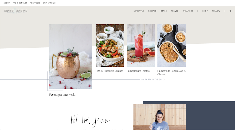
Jennifer Meyering runs her own blog account that focuses on beautiful dishes and drinks along with day-to-day lifestyle posts.
The webpage is filled with gorgeous imagery that displays her creativity and skill while simultaneously advertises her photography business.
Because of the amazing attention to detail within its graphical elements the page as a whole is inviting and trendy to all its visitors.
10. MVA
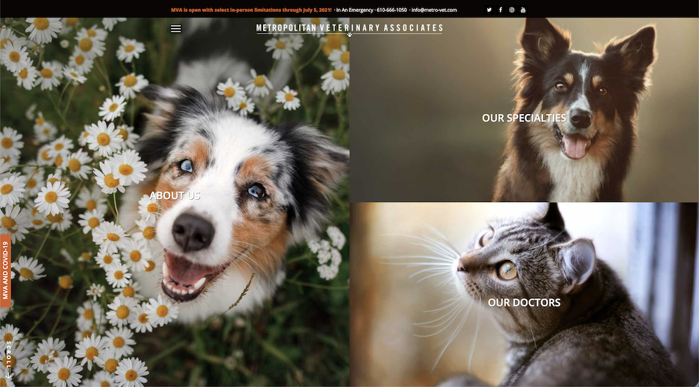
The Metropolitan Veterinary Associates, or MVA, has provided advanced quality care to family pets since 1986. Their page consists of adorable pictures of household animals splashed all over their homepage.
With testimonials from previous patient owners and all their doctor’s credentials highlighted in an easy-to-see fashion, it’s safe to say the MVA has done a beautiful job on their webpage.
The office has also added a banner at the top of all their website pages, showing contact information for pet emergencies.
11. Spoon and Stable
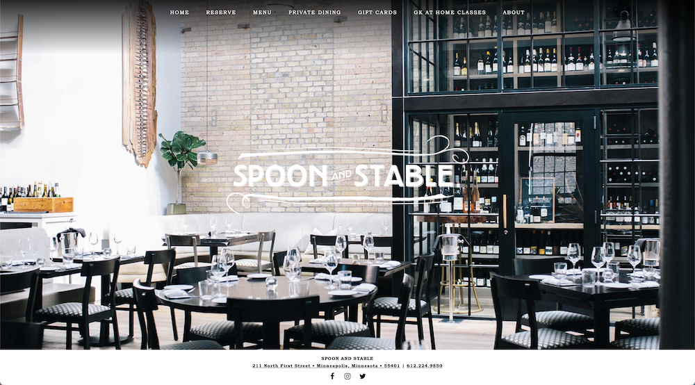
Spoon and Stable is a restaurant located in Minnesota, run by an award-winning Minneapolis-native chef.
Although the website has a beautiful use of imagery and design, it is a fairly straightforward page with minimal page redirects.
The site has options to reserve a table, see the menu, purchase a gift card and even a link to their chef’s personal training for at-home cooking. This is a great example of how businesses don’t need to over saturate their page in order to be appealing.
12. Moula
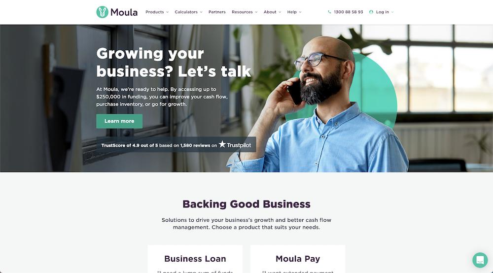
Moula is a trusted business loan company helping people fuel their dream ventures.
In businesses like Moula, where a lot of livelihoods are supported, it’s important to have a professional and pleasant page, which is what we can see here.
The homepage alone has immediate contact support for browsers, multiple testimonials, great imagery, and links to their products and resources.
Having all these at your disposal as soon as you open a website is very convenient but at times could be too cluttered and backfire, but with ample whitespace and a consistent theme, Moula showcases these features beautifully.
13. Denny Karchne
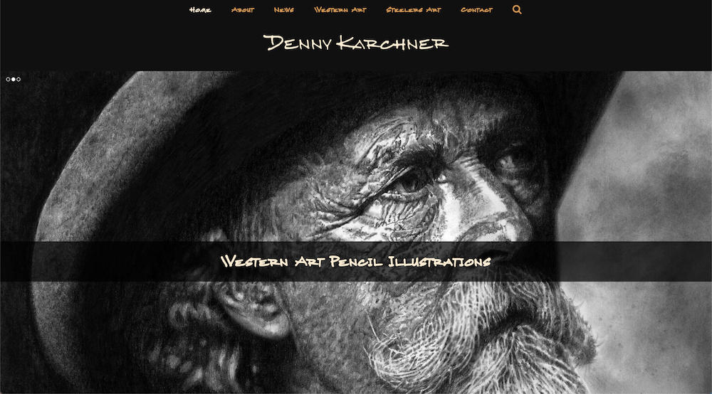
Denny Karchner is a gifted artist specializing in western and Steelers fan art. The website shows the personality of his work through its fonts and color scheme.
The amazing use of masonry design in showcasing his portfolio gives the user a good overview of the art without it being too overwhelming.
14. Barrio
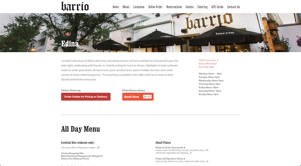
Barrio is a unique and vibrant restaurant and tequila bar.
Their website has stunning imagery of the atmosphere, as well as the delicious cuisine and drinks. The heavy use of imagery for this website is easily organized by using a masonry design accompanied by ample whitespace.
15. Gavin Kaysen
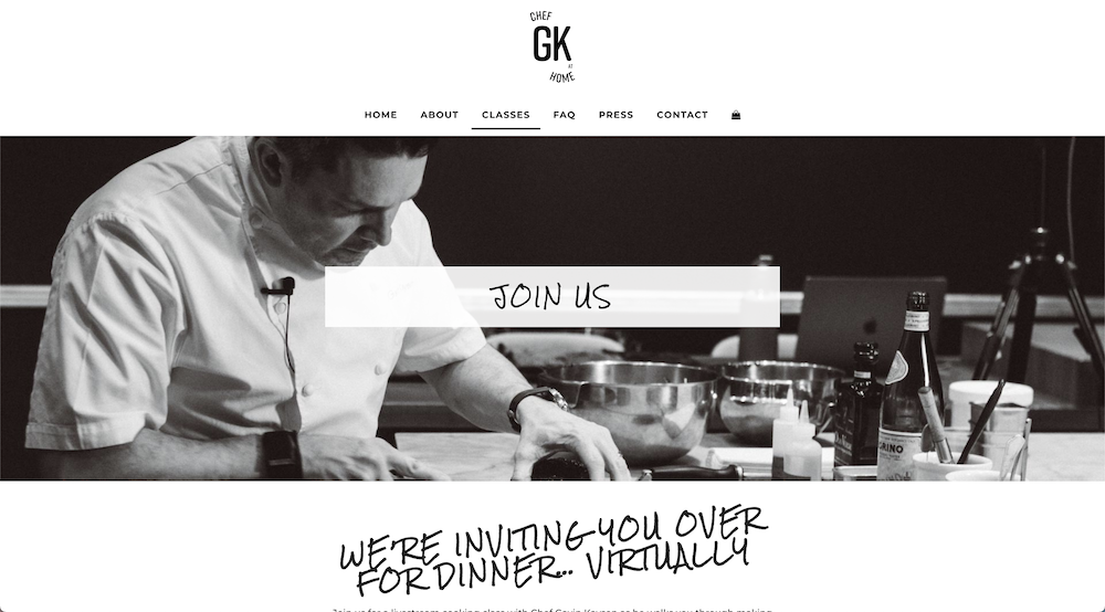
The Chef GK at Home website offers virtual live-streamed cooking classes for those who would like to learn professional-level cooking practices at home.
Their website begins with a clean homepage showcasing clips from previous classes and a schedule for upcoming events along with testimonials from pleased clients.
As you look further the use of whitespace and “handwritten” font compliments the clips of the dishes for a homey but professional feel.
16. Experience Life
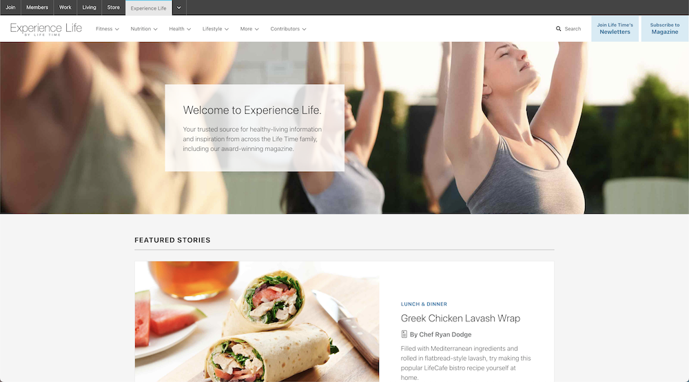
Experience Life, a wellness and lifestyle publication, offers a plethora of articles and reviews for all things fitness and wellness-related.
By following an off-white and grey color scheme the photos and descriptions pop out at the viewer, enabling the brand to fit a multitude of articles on a single page.
17. Film Editing Pro
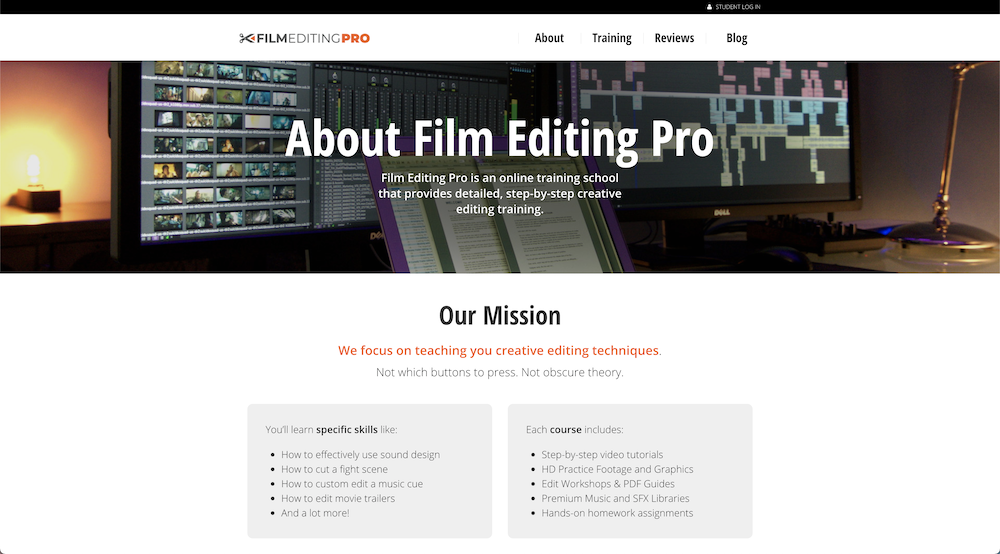
Film Editing Pro offers professional film editing courses and tutorials.
On the homepage, there are simple but effective taglines that entice the viewer along with an introductory video to the business. The front page also advertises the opportunity for a free course in a few editing realms.
There are options to learn more about the brand, training, along with reviews, as well as a link to their own blog. Although the options for the viewer are fairly simple, the graphical elements make the website much more appealing.
18. Spec’s
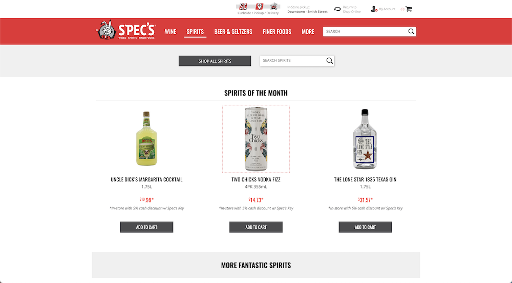
Spec’s Wine, Spirits & Finer Foods’ website does an amazing job of showcasing its products and personality.
First and foremost, since their products are age-restricted they ask the viewer to confirm their age while asking if they are searching for delivery or in-store pickup before allowing them to continue to the page.
Once granted access, the products are displayed in a fun and appealing manner.
19. University of Hawaii
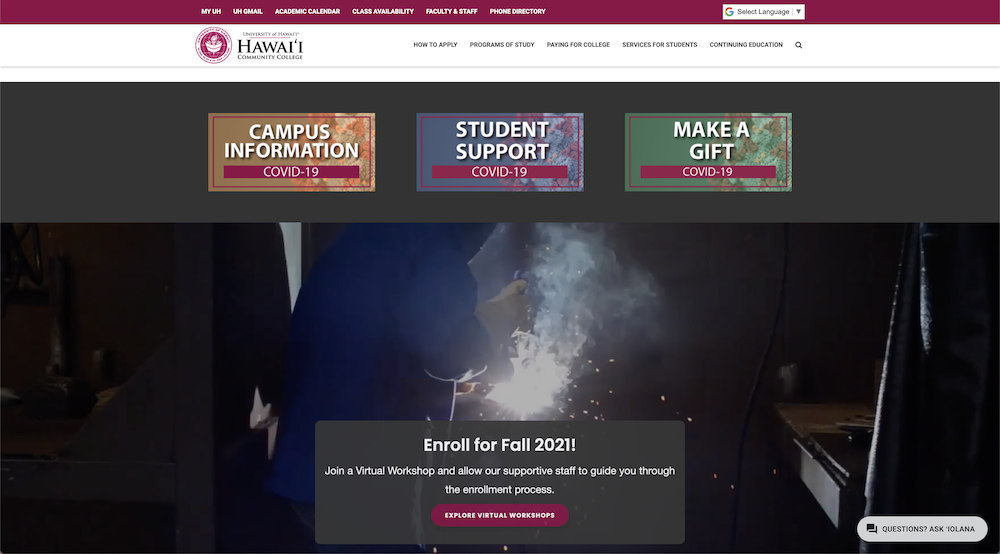
The University of Hawaii’s website has a very clean, inviting, and professional website.
This is a great example of how large establishments with faculty, students, and unaffiliated viewers can all navigate the same page without the options being too overwhelming.
Stunning photos of their campuses and surrounding scenery are all also displayed on the homepage.
20. Actian
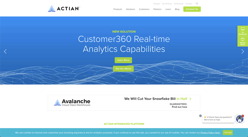
Actian, a professional data management company, sports a fairly simple website.
With minimal images displayed, there is plenty of room for descriptions of what the business can provide for its clients.
This is a wonderful example of how a company website does not have to be overly flashy in order to have a great online presence and represent its brand well.
21. Washington Technology
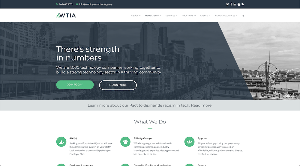
Up next we have Washington Technology, or WTIA, with a very clean website.
The site itself is decent in size but it has a very clean design with well-written copy.
The homepage is well organized as each section has a clear and specific purpose. The color scheme is great too, especially the icons with the round green background, it’s a nice touch.
22. Life Time 60 Day
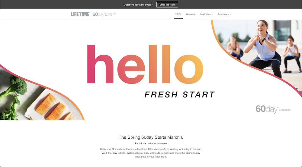
Life Time 60 Day, a fitness and wellness brand, has a beautiful page where its customers can easily find what the company has to offer based on their individual goals.
This website is a perfect example of how a business can have a fun page while still catering to the specific needs of each viewer in an organized fashion with the help of small graphical elements and ample whitespace.
23. Montgomery Tech
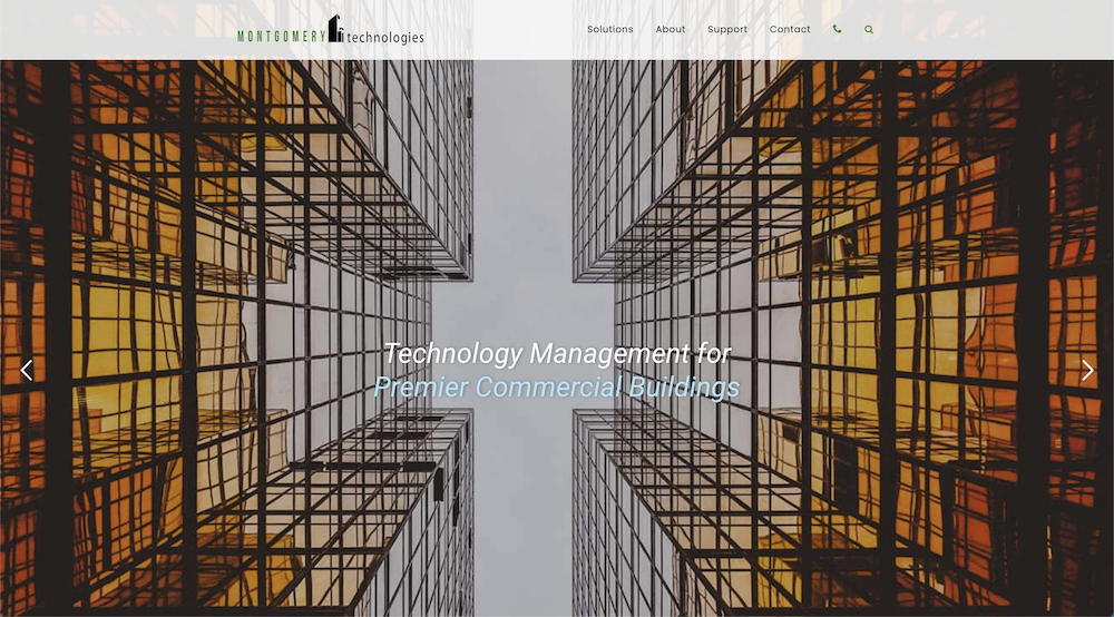
Montgomery Technologies provides integration technologies between commercial real estate and their tenants.
Their website has detailed descriptions of their services and solutions, accompanied by captivating images of architecture.
As you move deeper into the site there are more detailed informational videos displayed about their brand.
Conclusion
If you’ve made it this far in the post, I hope you feel confident in the capabilities that the Total WordPress theme has to offer.
As you saw based on the 23 examples, you can truly create unique websites with Total that would fit your company’s specific needs whether you just need a corporate site, a portfolio, or an eCommerce store.


Leave a Reply