
17 Rock Solid Website Layout Examples for 2019
Some of the most creative web designers out there focus on creating a good layout. In web design, there are actually more things at play than layout design, this article doesn’t really care about those aspects.
I’ve gathered 17 websites from around the web that has fantastic layouts. I’ll discuss what makes each layout great to give you a better understanding of how layout matters in web design.
Let’s get started with The Horse’s design!
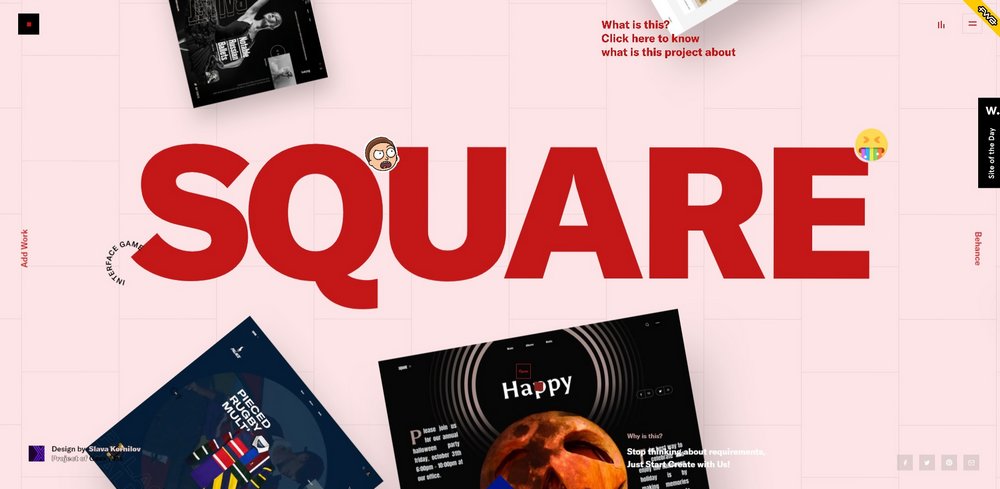
01. Square
Square is one of the most unique website’s you’ll ever see. When you first load the website, it will greet you with a mesmerizing welcome video then you’ll land on its homepage, which is filled with interactive elements and animations as well as background music for entertainment.
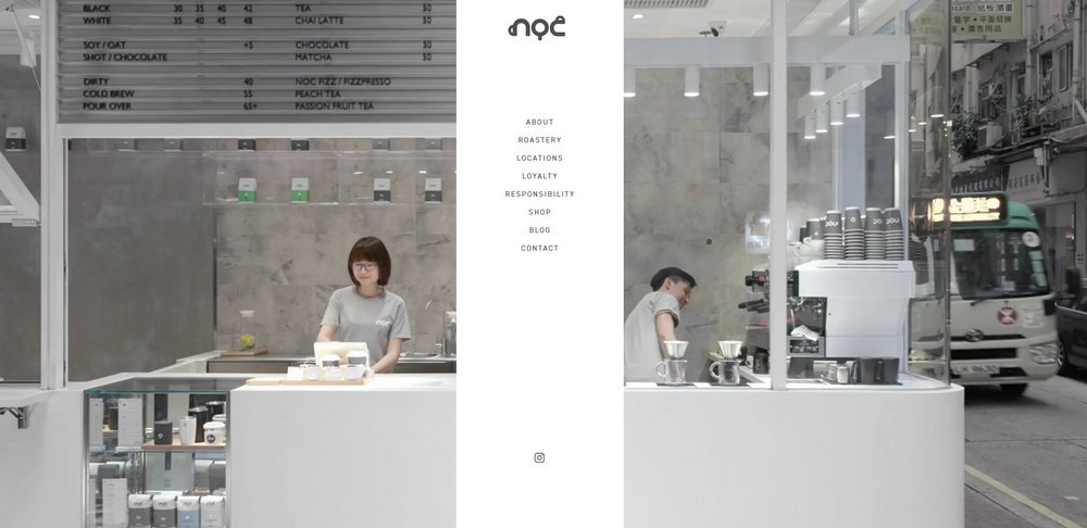
02. NOC Coffee Co.
This website uses a creative layout with a split-screen design. One of the most unusual elements of the website is the middle placement of the navigational menu. However, it makes sense because when you hover over a link on the menu and the descriptions and images are evenly displayed on the split-screen.
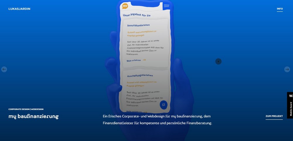
03. Lucas Jardin
This is the design portfolio of Lukas Jardin, a web and user interface designer. Instead of taking the old and dull portfolio approach to layouts, Lucas uses a unique water ripple effect on the website that makes each item on the portfolio more interactive and entertaining to look at.
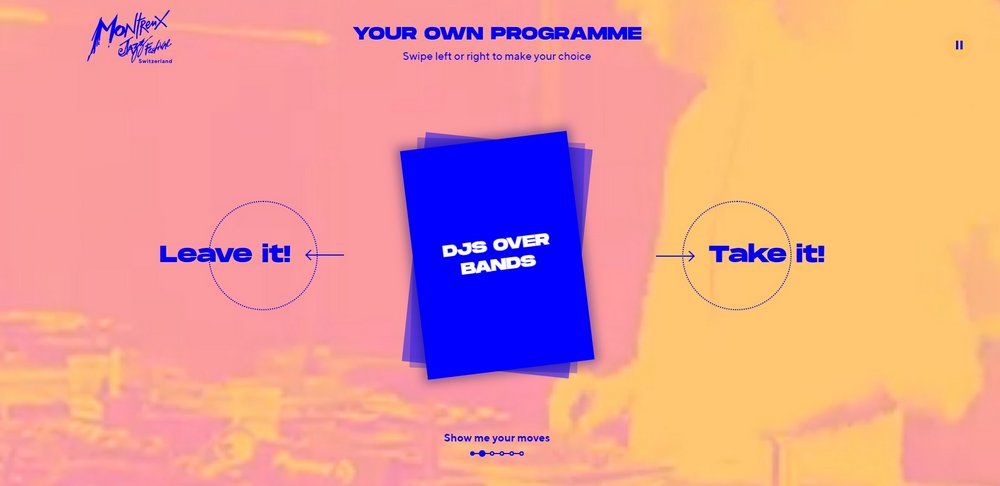
04. Montreux Jazz Festival
The official website of the 2019 Montreux Jazz Festival is filled with entertainment and background music. As you’ll notice at first glance, this website uses a stylish duotone-like color effect throughout its design and offers an easy navigation option for scrolling through the website.
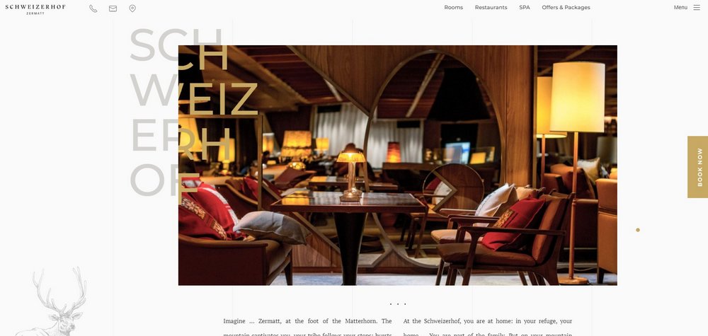
05. Hotel Schweizerhof Zermatt
One of the features that make this website layout more attractive is its overlapping header text that binds the website and its featured images together. In addition, the website features many interactive elements, creative image sliders, and much more than makes it truly one of a kind.
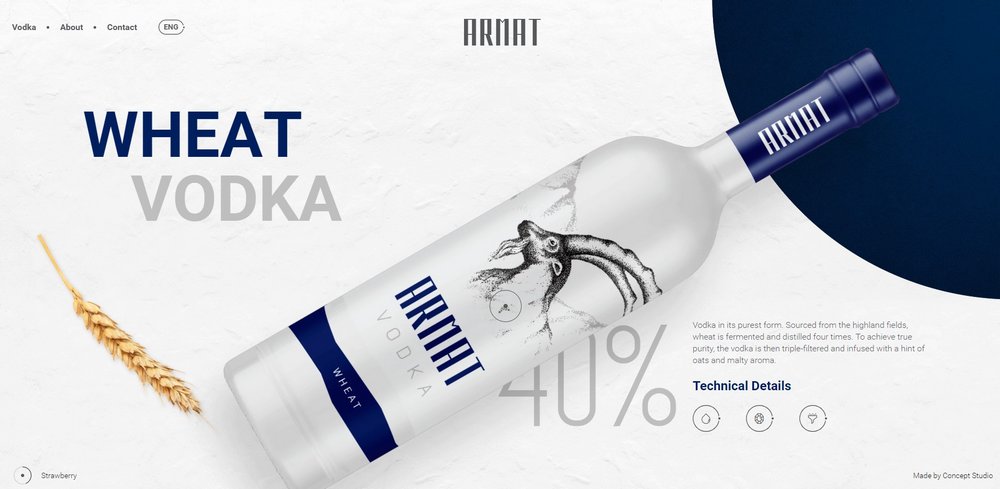
06. Armat Vodka
The beautiful visuals and images aren’t the only great features of this modern and elegant website. It also offers a touch-friendly website browsing experience that lets you slide through the website by swiping up and down on the screen or using the mouse wheel.
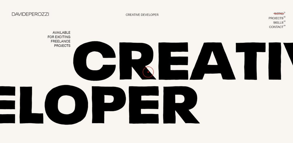
07. David Perozzi
Using big bold fonts is one way to attract attention to your portfolio website. Since this is a website for a creative developer, you’d expect nothing less. Although, this portfolio website is much more than just big fonts. It also features lots of unique interactive elements that make the entire website layout stand out from the crowd.
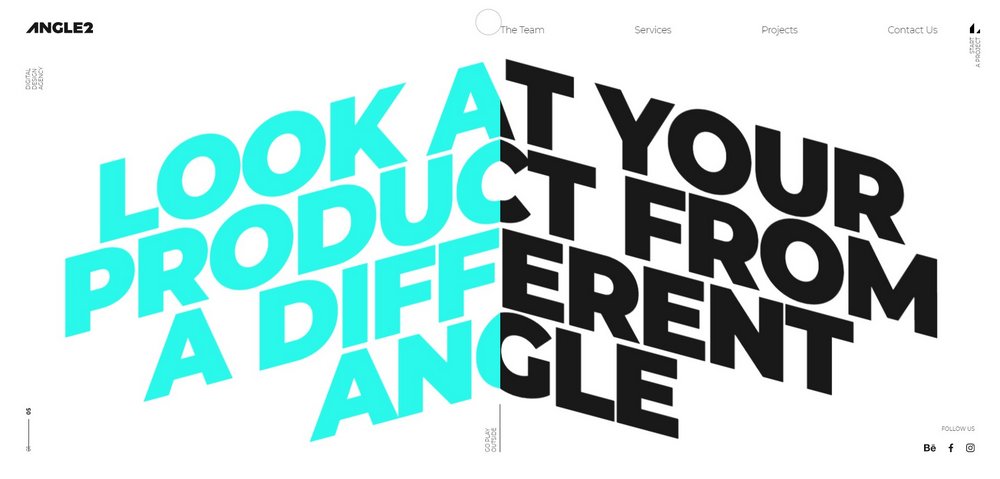
08. Angle2
If you’re a fan of typographical designs and interactive elements, you’ll find this website to be quite fascinating. The website uses a unique effect that animates its large titles and headers as you scroll through the website.
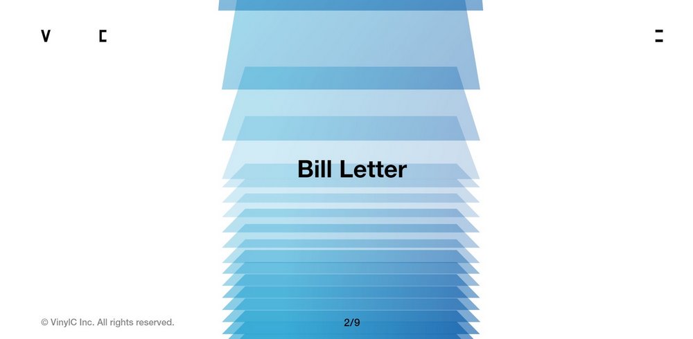
09. Practical UX VinylC
The creative South Korean user experience design agency website features a simple yet innovative design. It has a fullscreen layout that offers a seamless website browsing experience by showcasing their entire portfolio on the homepage.
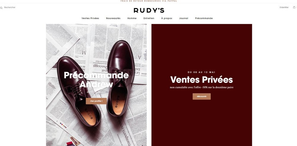
10. Rudy’s
I like Rudy’s website because of all the different but small movements that are incorporated into the design. It makes the layout interesting and eye-catching. The squared photographs are pretty clean-cut. In fact, there is nothing really unusual about them but the slight animations make it so much more interesting.
On the product pages, there are other kinds of photos. Most of them are of standalone shoes. They don’t look like boxes. I like this because it breaks up the pattern of square photos we see on just about every website, including this one.
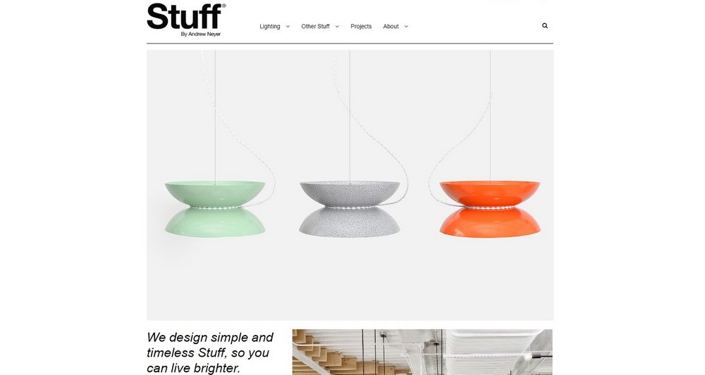
11. Stuff
I was drawn to this website because of that small paragraph in the bottom left corner. You don’t see that kind of product description anywhere anymore. It looks like an article column from a newspaper or online magazine.
On the website, the text is not treated like that. More often than not, text gets more room than pictures. But not here, on Stuff’s website!
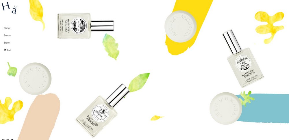
12. Happiness Abscissa
Happiness Abscissa is an interesting website, to say the least. The layout of their home page is fantastic! They are using a parallax effect with a few random pictures of decoration and a few images of their products.
As you scroll down, the layout changes to have just text accompanied by a single decoration. The decorative shapes are really fun touch!
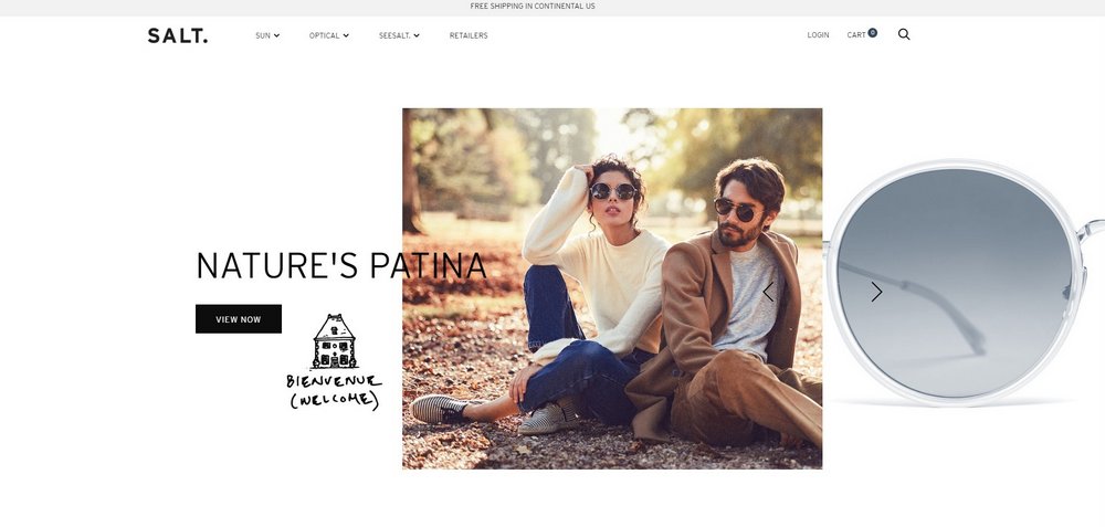
13. SALT
SALt is an eyewear company. Their home page is one of my favorites on this list. The layout is broken down into various blocks. I’m more interested in what’s inside of these blocks.
There is a pattern that this design follows: a single and high-quality image coupled with a small bit of text. The composition of the image and text is executed well. Every block follows this rule but the display of the image and the text a little bit varies each time.
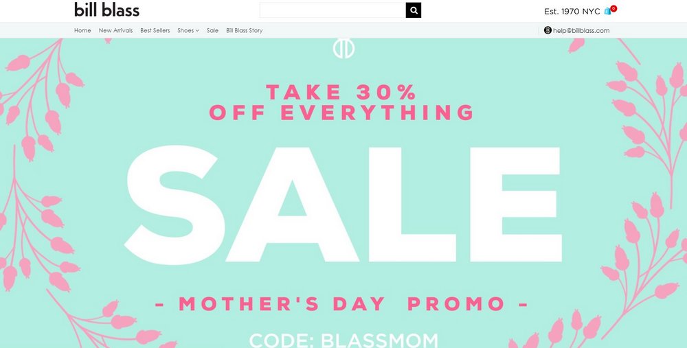
14. Bill Bass
The website of Bill Bass showcases the fall collection called Calm. The whole page is basically designated to all the items in the collection. However, the items are laid out in an unconventional grid.
They are still, more or less, aligned but it‘s not a typical grid you’re used to. It’s not like ERDEM for sure. But, this kind of unalignment makes the design interesting and memorable.
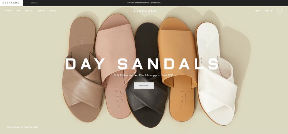
15. Everlane
I have been in love with web designers at Everlane for years. This time they did it again, the layout of this landing page is amazing! Things are overlapping. Things are interactive.
There is plenty of padding around the content in each section. There is also a good visual balance between standalone and overlapping sections.
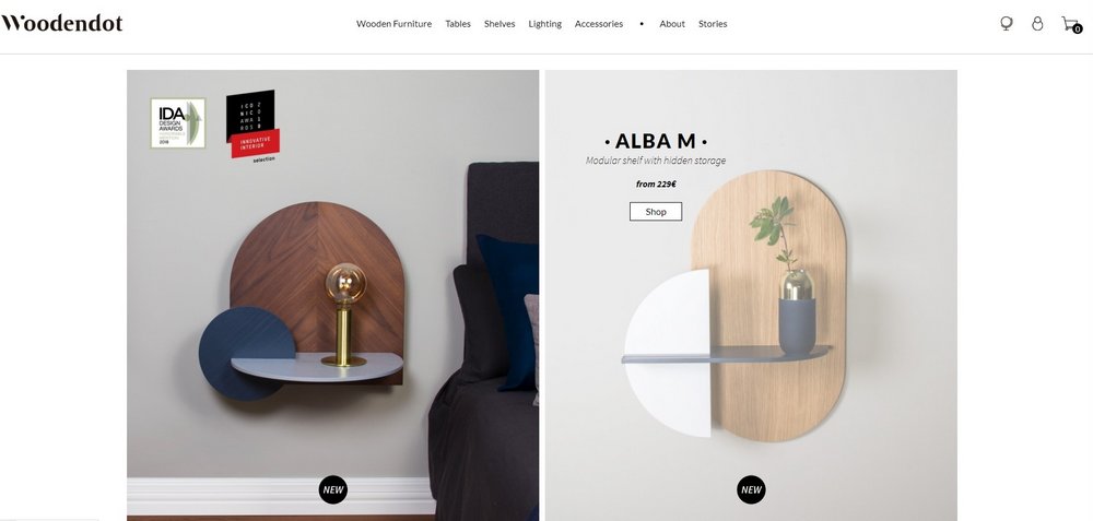
16. Wooden Dot
I’m including Wooden Dot on this list for two reasons. First, the layout is great, as it uses both full-width images and image grids at the same time. This gives some variance to the layout. However, the slight use of paddings and the quality of photography make the layout work. It wouldn’t look as good with different types of photos.
The second reason I like this design so much is that some of the images are gifs. You can’t see this in the static screenshot but you can check it out on the live site. The gifs show how the furniture pieces actually function.
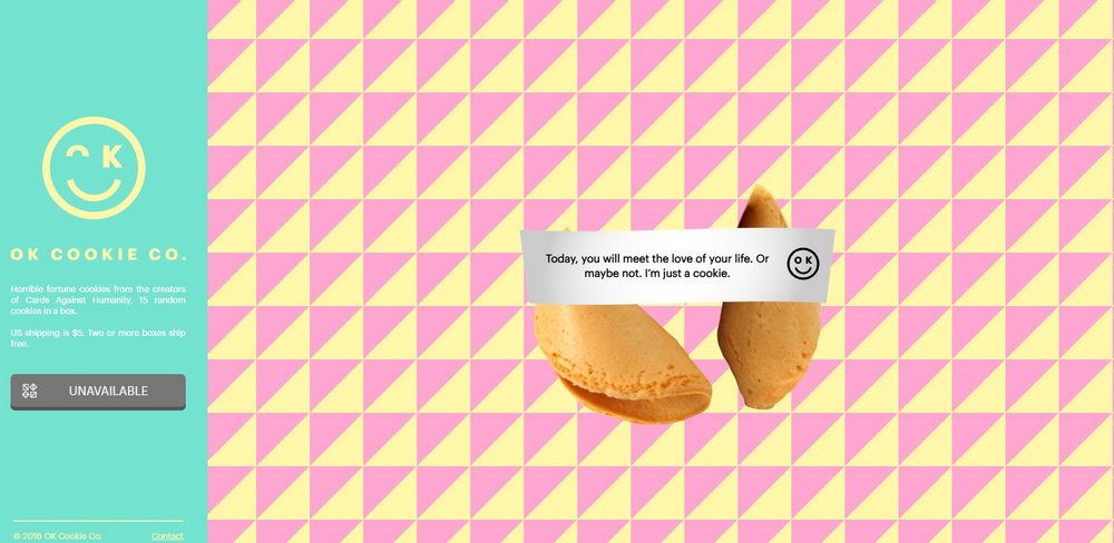
17. OK Cookie Co.
This is by far the simplest layout in this list. That’s because there is nothing else on this page, however it’s a really fun website. The use of color and pattern is perfect. The split between the call to action to order on the left and the sample fortune cookie on the right is a great choice as well.
The overlapping elements are all kind of busy. This is a vibrant design for sure!
Final Words
Remember to take a closer look at each website you visit. What makes the layout great? What design elements support the layout? This will help you find more unique ideas for your own website designs.
If you want more inspiration, be sure to check out our list of the best websites built with Wix.
Thanks so much for your article, it was great to see some of the current website trends. And I loved some of these websites, they’ve definitely inspired me.