5 Quick CSS Hacks to Drastically Change The Look Of Your WordPress Site
If you are new to WordPress, you might get frustrated with the lack to edit certain things about the way your site looks directly through the editor.
But there is one “secret” weapon that more experienced developers use to easily change every element on a WordPress site: CSS.
In this tutorial, we quickly cover the basics of what CSS is, how to change CSS on your WordPress and finally, show you 5 quick CSS hacks you can use to pimp your WordPress site.
What Is CSS?
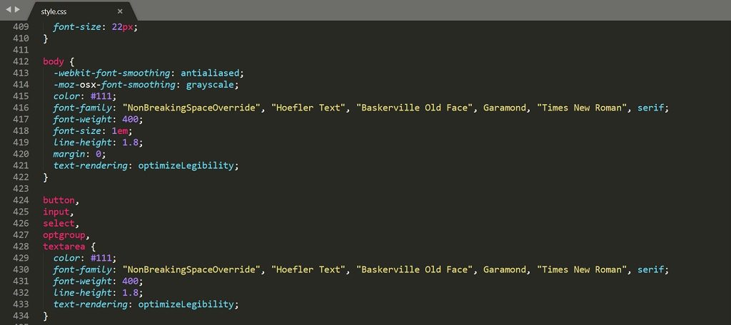
CSS or Cascading Style Sheets, is one of the standard coding languages used for the web.
The unique thing about CSS is that it unlike most languages, it’s not about functions or what happens behind the scenes, it’s a style guide for another coding language; HTML.
HTML tells the browser WHAT should be displayed, and CSS tells you HOW that should LOOK.
It’s right there in the name.
It’s called Cascading STYLE Sheets, after all.
In WordPress, most templates use universal styles that apply to all pages or posts (or perhaps different page templates), which means that if you are not careful, changing some CSS for one page, will also change the look of every page on your website.
CSS styles items based on type of item (like a div container, an img image, or an iFrame) or classes or IDs set in the HTML code itself.
Classes are names or monikers we can target by starting with . (like .header-title).
We target IDs in CSS by starting with #.
We can also furhter narrow our targeting, by targeting only elements that have been preceded by other elements.
For example, a h1 header that is preceded by a “.header” element.
.header h1 {
}
This helps us do narrow edits and not edit every single element of it’s kind on our WordPress site.
<div id="Primary" class="entry-content">
</div>
With the HTML code above, we can target the div element with just div. But this will target every div element on every page on our site:
div {
...
}
Or we can target the ID, which will target that particular div element on every page on your website:
#Primary {
....
}
Finally, we can qualify that by only editing the Primary div element on a specific site, by adding the postid-1 class in front.
.postid-1 #primary {
...
}
This is a basic breakdown of how CSS works in the context of a WordPress site.
For those who need more info, you can read & learn more about CSS at W3Schools or Code Academy for free.
How To Edit CSS In WordPress
If you have an even remotely recent version of WP installed on your site (and you should, for security reasons, read more on that here) , you can add custom CSS through the WordPress customizer.
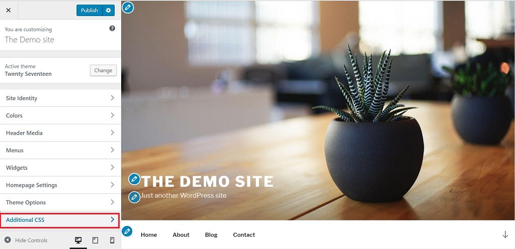
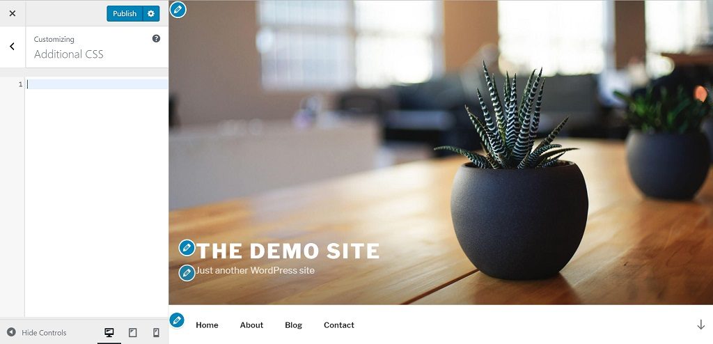
Because you are overwriting, and not editing the base code itself, there are extra steps. You will have to set values you don’t, that already exist in the theme’s stylesheet, to 0.
For example, if you want to add margins to your header, but don’t the borders in your theme, it’s not enough to simple write:
h1,h2,h3 {
margin: 20px 20px 15px 20px;
}
You have to also set the border-width to 0 to overwrite the existing code.
h1,h2,h3 {
margin: 20px 20px 15px 20px;
border-width:0;
}
Note: Responsive Themes & Media Queries
Since it’s 2019 and smartphones now make up a lot more than half of all website visits, every modern Theme is responsive.
This means that it changes the proportions & look of the site based on what size the browser/device that is visiting the site is using.
Responsive themes usually accomplish this with something called a CSS media query.
A media query is a qualifier in CSS to that decides when the style should be applied to html.
The most common form of media query is ones that qualify based on the pixel width of the browser the site is displayed in, and looks like this:
@media (min-width: 768px) { ... }
If you want to edit only the way something looks on tablet or desktop, you need to do a few things.
First you need search through the style.css file of your theme to find the relevant media queries.
Then you make an identical media query in the custom CSS box in the WordPress customizer.
And finally, add the changes that you want to make inside the brackets of the media query.
@media (min-width: 768px) {
  h1,h2,h3 {
    font-size:18px;
  }
 }
The above code on a Bootstrap based responsive design would only change the header font size on Tablets, and no other devices.
(If your theme is based on Bootstrap, or has a mobile-first design, the media queries will include min-width, and you don’t need to use media queries to edit the mobile layout.)
1. Increase/Decrease Margins
Let’s say that you think that there is too much or not enough white space in a certain area in your theme on a certain device.
This is the case for me with the Twenty Seventeen theme.
I think there is way too much white space above the real body content, so I want to remove it.
First I inspect the white space with the chrome inspector, and find out where the padding/margin is coming from.
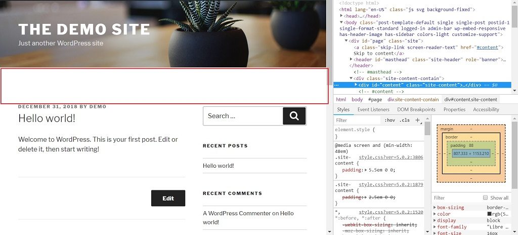
And then I inspect it to find out what classes/ID I can target to change. (Ctrl + Shift + C in Google Chrome)
This particular element is affected by media queries, so I need to make sure to add them to my custom CSS, and target the devices I want to change.
I am happy to just change the look on desktops, so I add a media query for min-width 48em, and adjust the padding down to 2 em.
@media screen and (min-width: 48em) {
.site-content {
    padding: 2em 0 0;
}
}
And enter that into the customizer and update.
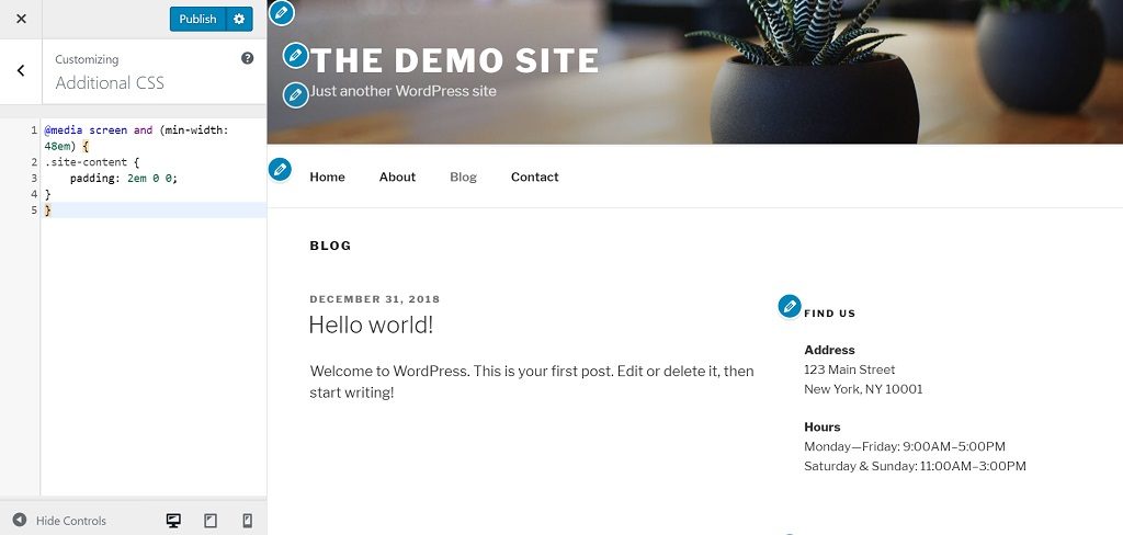
And you can instantly see the results. Much less white space above the main content of the blog.
(Another reason the additonal CSS function in the customizer is the superior way to add CSS, is the real-time previews you get on your code edits.)
2. Style Individual Headers
The second easy hack to completely change the look of your site is to style your headers differently.
Again, the Twenty Seventeen theme has quite boring headers, let’s take a look at how we can spice them up a little bit.
The first step, again, is to inspect the header using Google Chrome Developer tools.
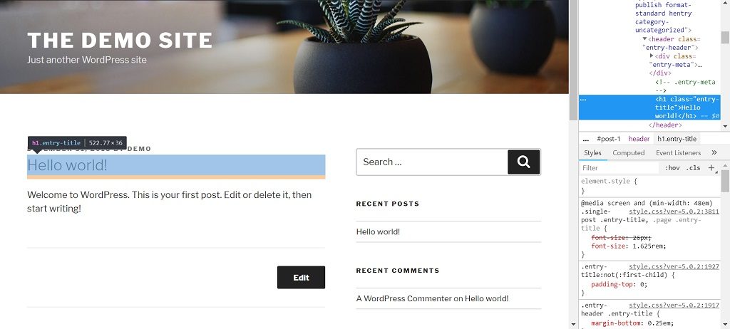
Hover over the headers you want to change, and you can quickly see which classes and styles apply to them.
We see here that the classes in question are “.single-post .entry-title”. The classes in grey targeting the same code are not active on this page, and can be ignored, unless you want to apply these changes to both single posts and pages.
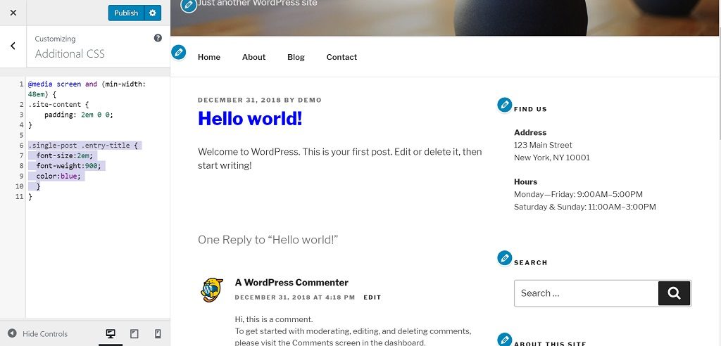
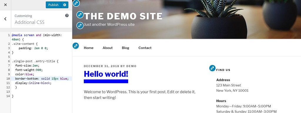
A very simple change we can make, is changing the color of the header & increasing font size & weight.
.single-post .entry-title {
 font-size:2em;
 font-weight:900;
 color:blue;
}
This will give the header a lot more impact. (Specifically, only the headers for single post pages. The headers on the blog page or single pages will remain unchanged.)
Since there are media queries in the theme, we need to overwrite them in the same way.
(If you followed the previous step, you can add it to the same query.)
You can also edit the header in other ways, such as adding a borders above and below (or just below).
border-top: solid 2px blue;
border-bottom: solid 2px blue;
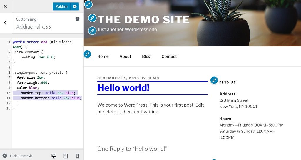
The reason the borders cover the whole section and not just the area the text occupies, is that the h1 is set to act as a “block” element.
To only follow the text, we need to set the it to the “inline-block” property.
This means that the element doesn’t automatically occupy the entire width of the parent container.
We can also easily change the font by using the “font-family” property.
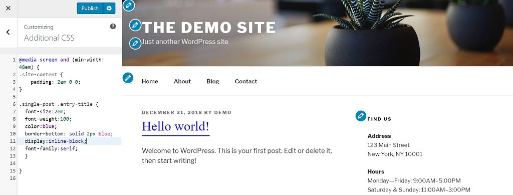
These changes were all made to the entry-header of single post pages only.
If you want to apply changes less or more broadly, you can make use of .class or #id qualifiers.
For example, if we add “.postid-1” in front, these changes only apply to the hello world post page.
3. Create A Full Screen Header (Hero Header)
Twenty Seventeen actually comes with a hero header for the home page. But Twenty Nineteen, and many others don’t.
This is how you can create a full screen (hero) header using only CSS.
Inspect the header and find the relevant classes & media queries.

Now we need to increase the header size so that it increases to 100% of the height and width.
.site-header {
    height: 100vh;
    width: 100%;
}
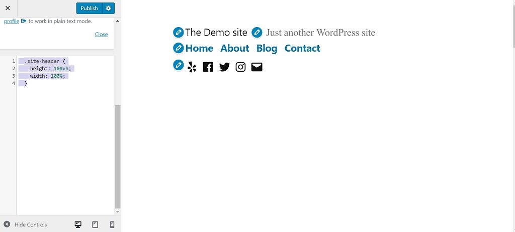
Now that we have a full screen header, we add a background image.
background-image: url("http://yoursite.com/wordpress/wp-content/uploads/folder/img.jpg");
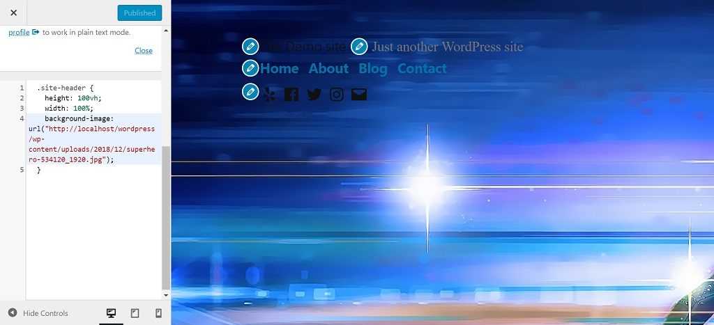
And then we need to format the picture so it doesn’t get stretched out or repeated.
If you choose a large enough image, you should add the following code:
background-repeat:no-repeat;
background-attachment: fixed;
background-position: center;
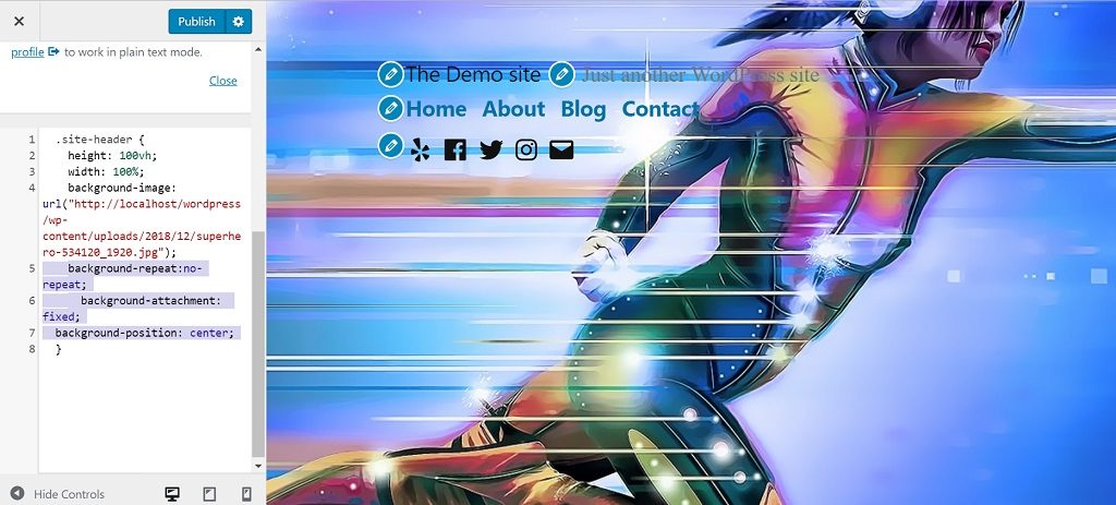
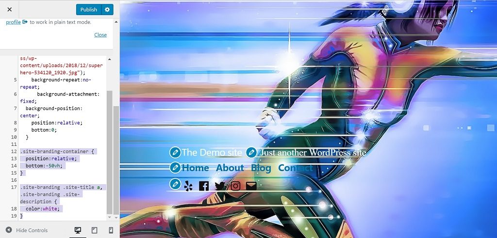
Then we just need to fix the header towards the bottom of the parent element, and change the header & description text color to white so it’s easier to see.
.site-branding-container {
	position:relative;
	bottom:-50vh;
}
.site-branding .site-title a, .site-branding .site-description {
	color:white;
}
4. Remove Sidebar/Header & Create A Full-Width Landing Page
If you want to create a landing page with no sidebar or header, there is a quick hack you can do in CSS.
By setting the display property to none, we can quickly expunge the content.
First we need to inspect the sidebar area to find the classes & IDs.
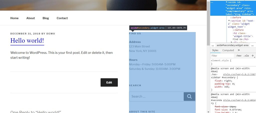
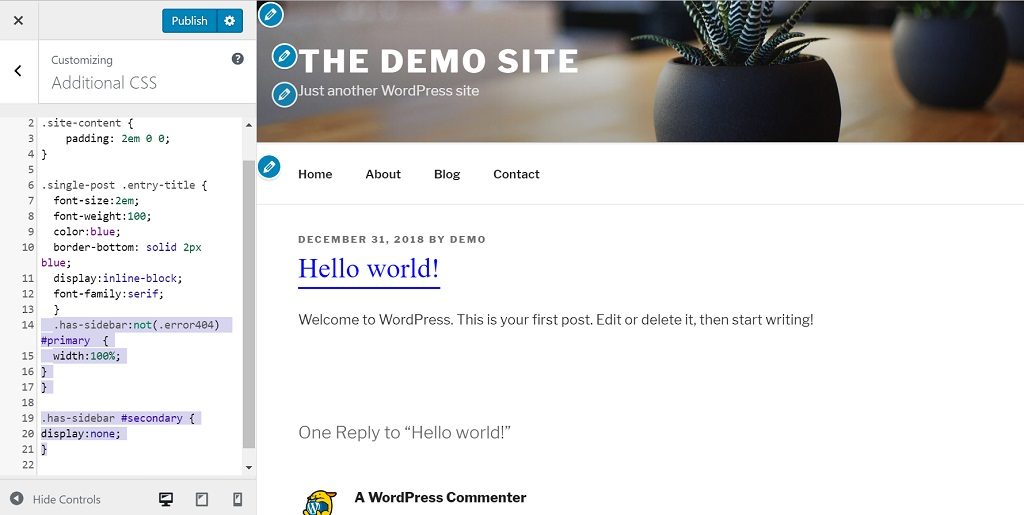
Then we simply target the ids secondary/primary or the classes, remove secondary, and set primary width to 100%.
.has-sidebar:not(.error404) #primary  {
	width:100%;
}

.has-sidebar #secondary {
display:none;
}
Note: Twenty seventeen has page templates that allows for removing sidebars and checks for the sidebar, which is why the qualifying class is “has.sidebar”, and also checks if it’s error404 page.
In other themes, you might not need qualifying code to achieve the full-width result.
(Note: Hiding content with the CSS “display:none” is bad practice in SEO. If you run a business based on organic search traffic to your website, you should create a page template without a sidebar instead of using a CSS hack.
These tips are meant for quickly creating a landing page that you will send traffic to using advertising, not SEO.)
5. Full-Width Images / Iframes / Containers
A lot of themes set max-widths for images, iframes & different containers in pixels.
Probably to maintain the layout that was originally intended even on unusually large screens. Also to not give too much focus to images or iFrames.
But this can sometimes ruin the design you want to make for your site.
With a little bit of unnecessary space left over on the right or left of your highlighted photos or videos.
img, iframe {
max-width:100%;
}
With this simple command replicated throughout the necessary media queries, your job is done.
You will be able to display full-width video, banners, headers and other content without issue.
Bonus: Add Your Own Classes Inside Posts/Pages To Spice Things Up On
Once you start getting more familiar with CSS, you can edit the html elements inside posts & pages.
You can do this by going into the code editor, and not the visual one, and adding classes or ids and then styling them yourself.
<span> is an easy element to work with, where you can break up boring, plain old sentences and create design elements to use in your posts.
What changes have you made to your site with CSS?
Please let us know in the comments.


Leave a Reply