Ultimate Guide To Modal Windows: Design Trends, Free PSDs & JS Plugins
One of the fastest growing web design trends is the modal window. This places a content window on top of the page while blacking out the entire page behind it.
Many people think of modals as annoying marketing popups. But they can be used for so much more, not to mention modal popups are far less annoying that real popups.
Let’s delve into the world of modal windows to examine this rapidly growing trend. I’ve curated a ton of real examples along with some freebies you can use in your own design work.
Designing Modals With Purpose
Every modal window should be used for a specific purpose. If you don’t need to get information in front of the visitor directly then try moving it to another page or adding it dynamically into the page.
Modals immediately grab attention because they appear on top of everything. This can be annoying when it’s overused so try to use modals sparingly and with a strong purpose.
Here are some pretty valid reasons to setup modals:
- Sharing relevant information fast
- Adding a login/signup form
- Showing a confirm/deny box
- Requesting something(email signup, remove adblock)
Marketing is also a great reason to run modals but I recommend doing so with some restraint. Try to keep them brief and to the point.
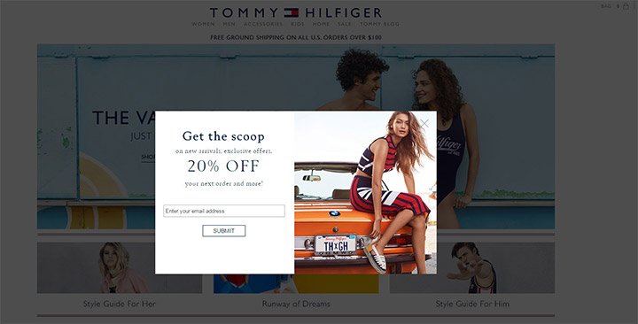
This is a great example from Tommy Hilfiger that shows how an opt-in email field can work wonders if you know how to target the right audience.
Most people have become desensitized to these modals but evidence shows they do work.
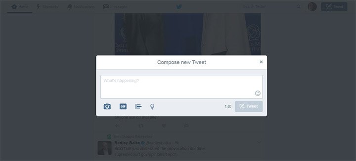
Still another reason you might use a modal is to add onto the existing UI. For example Twitter has a modal for the “new tweet” window so it appears on top of the existing page.
Modals are great and really do well at grabbing attention. Just make sure you have a valid reason for adding it onto the page.
Modal Usability
There are a few design techniques I always suggest for all modal windows. By default they should be fully responsive and they shouldn’t take up the entire screen.
If the user can’t see the page behind the modal then they have no idea why this massive window just overtook the entire page. Have some common sense with modals and try to work towards these general goals:
- Make sure open/close animations are quicker than 1 second
- The user should be able to click outside the modal to close
- Including a small “X” in the corner to close
- Keep the copy brief and direct
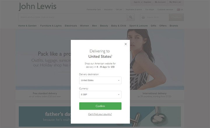
The example on John Lewis is perfect for all of these points. It appears quickly and fades quickly once you close it.
But it’s also very short and gets to the point fast. You can clearly see the entire background is darkened so it’s easy to click anywhere to hide the modal from view.
This appears without warning so it can negatively affect the user experience. But these modals also convert so I understand why designers use them.
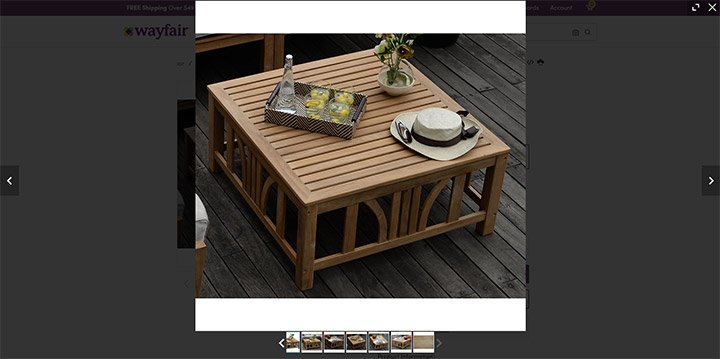
Another modal technique is to connect image galleries when users click to view a photo.
You’ll find this on a lot of ecommerce shops like Wayfair when you click to zoom into a product photo.
Close-ups controlled by the user are far easier to work with. These modals are expected so the user experience is enhanced with a fullpage overlay.
Let’s look at a few other image gallery modals to see how these trends play out.
Image Galleries & Slideshows
The vast majority of modal window slideshows that I find are typically on visual portfolios. These could be websites for artists, designers, photographers, or any other visual medium.
It works well because people are mostly visiting these sites to consume the portfolio work. And what a better way to consume it than through a large fullscreen image slideshow?
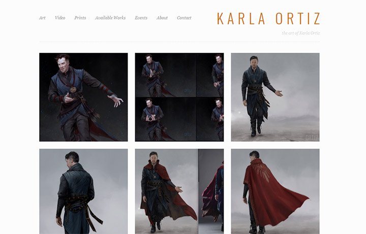
Concept artist Karla Ortiz has a brilliant portfolio design that really places focus on the artwork.
Notice how the entire screen goes black once you click on a piece of work. This goes further than just a typical modal window because it almost creates an entirely new screen on top of the page.
It reminds me of when you press “play” on a PowerPoint presentation. The entire screen fades to black so the presentation becomes your main focus.
You could also do this with a white background like Steven Crosby’s portfolio.
This works like a modal window because you can still see the page background behind the new slideshow page. But it gives the same feeling as if presenting portfolio items in front of a group.
I typically recommend fullscreen slideshows like these for all visual portfolios and for image galleries on ecommerce sites. This can also work for blogs but specifically blog posts with a lot of images.
Logins & Sign Ups
One other area where I justify modal use is with login/signup forms.
For compliance with all browsers you should still have a separate page where users can login or sign up to the site. But I do feel like modals are incredibly helpful in this arena.
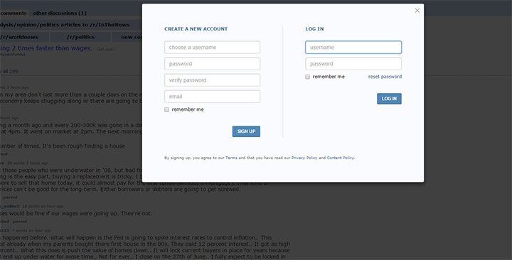
If you browse Reddit without an account you can login/signup on any page. Just click the link in the top-right corner and a modal appears over the screen.
There’s only a few fields required to sign up for a new account. Plus you don’t even need an email address so you can get going fast!
If you have a very small signup form consider running it with a modal window on your site. This is not the best way to onboard for larger websites but it’s more likely to increase conversions if you reduce the amount of work required to sign up.
Best Modal Window Plugins
These days almost everything has its own script or plugin online for free. Why reinvent the wheel if you can build on top of what others have created?
There are dozens of modal window plugins available so I’ve only curated my top picks. However if you’re looking for more check Google and see what you can find.
Tingle.js
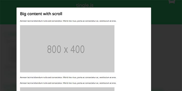
First on my list is Tingle.js which uses CSS transitions to create modal effects. The library runs on JavaScript but also relies on a lot of newer CSS3 techniques.
This modal can behave any way you want from alert boxes to photo galleries or even EULA dialogs. These modals can use photos, videos, or iframes embedded inside the content area.
You’ll find the full source on GitHub along with quick documentation for getting started if you wanna give it a go.
Remodal
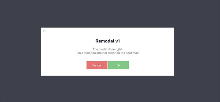
One of my favorite modal plugins is Remodal. It comes with all the basic features you’d expect like quick animations, custom button styles, and background clicks that hide the window.
This plugin is sadly no longer maintained but it does get minor bug fixes every so often. And it still works well as a basic jQuery plugin so you don’t need to worry much about custom edits anyways.
leanModal.js
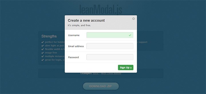
The best thing about leadModal is that it doesn’t assume any specific UI design. You have full control to edit and customize the design to suit your needs whether it’s a simple informational modal or a login/signup window.
This also runs on jQuery but relies somewhat on CSS to create a few animations.
Adjustable width/height, very lightweight, and super easy to setup with one line of JavaScript. Definitely a modal window plugin worth considering.
Unfortunately this plugin does not support galleries or iframes so it’s not a perfect solution. But for static content I couldn’t recommend anything else.
SweetAlert
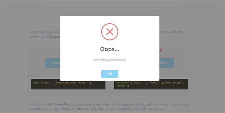
The Sweetalert plugin is a unique type of modal because it mimics the default JavaScript alert box.
However this modal does not take over the entire screen. In my opinion this is a much better choice over the default browser-based alert box, and the SweetAlert box still supports all the same functionality.
Granted this plugin can’t do much else so it’s not great for info-type modals or embedded slideshows. But JS alerts can be a pain so this plugin offers a very nice alternative.
And if you’re looking for other recommendations here are some more plugins you might like.
Modal UI Freebies
If you’re a designer then you probably use UI kits and freebies in your mockups.
Modal window mockups are tougher to find but they are around if you search. I’ve curated some of my favorite freebies here and these work well for all types of designs.
Popup Modal PSD
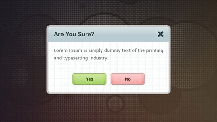
This popup modal from Freebies Gallery is fully layered and easy to work with. It was first published back in early 2012 so it should work in all versions of Photoshop CS5, CS6, and CC.
Not much in the way of a background design but it has a lot of gradients and some very colorful button styles.
Modals do work well as confirmation dialog boxes so you can borrow these styles yourself to see how they fare.
Dark Dialog
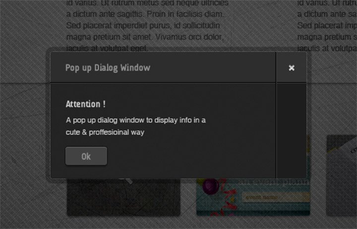
If your design works better using a dark window check out this PSD freebie from Blugraphic.
This modal specifically uses a lightened opacity around the border to create the illusion of a shadow. It’s a really neat effect since most modals actually do darken the background with a slight opacity shift.
It would be pretty simple to recreate this in CSS3 so it’s well worth saving if you like the dark modal design.
Clean Modal
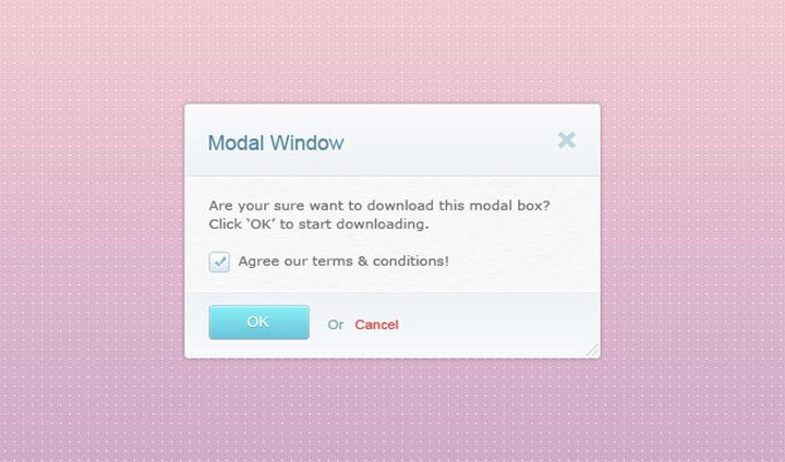
One thing I like about this simple modal is the colorful gradient choice. This comes from 365PSD and it dates quite a few years back when gradients were the norm.
But if you study the interface you’ll notice it does a lot of things right. The OK button is more noticeable than the close button which encourages visitors to take action.
It also has brighter colors on the button along with the checkbox. This modal could be revamped and used quite well as an email optin field too.
Yes/No Option
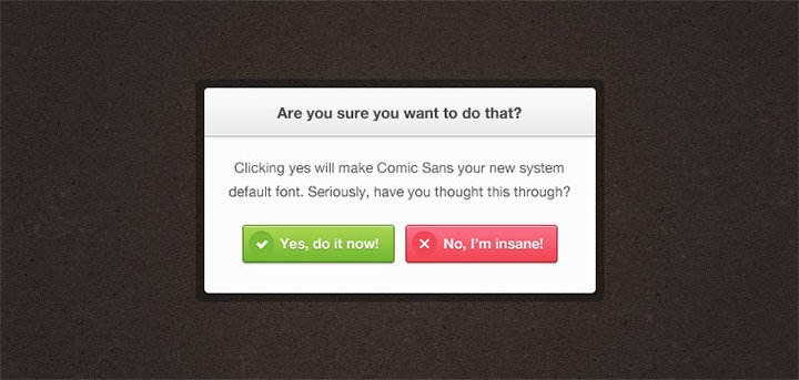
Last but certainly not least is this confirmation modal released by Premium Pixels. The yes & no buttons are brightly colored and meant to grab attention fast.
The icons are a nice touch but I’m most impressed with the glossy gradients.
Plus the outer border design is a nice touch and this whole button should be easy enough to recreate using pure CSS3.
Moving Forward
I hope this guide offers plenty of resources & info for everyone studying the value of modals in web design.
If you want to add modals into your own website just make sure you focus on usability first. This is crucial to making a site that functions well without scaring people away with constant popover windows.

Leave a Reply