How To Master Twenty Sixteen (Or Any WordPress Theme)
Update: We just published an comprehensive guide on How To Master Twenty Seventeen (Or Any WordPress Theme in 2017).
In this post we look at how to bend the twenty sixteen theme to your will, both inside and outside the admin area and customizer.
If you’re new to WordPress, working with a well documented theme like Twenty Sixteen or any of the other official WordPress themes, can really help your learning curve.
In this tutorial, we will cover three different areas to learn to master, and we’ll separate them into three different difficulty categories.
- Learning to use the WP customizer and some of the options of the theme. – Beginner
- Changing a few design things with basic CSS using a custom CSS plugin. – Intermediate/Savvy beginner
- Making a child theme and adding some useful functionality. – Savvy Intermediate
Beginner
Let’s start from the beginner level. We will make some changes to the look of the site, and make use of some of the cool functionality that comes with the twenty sixteen theme.
Setting Up A Social Menu
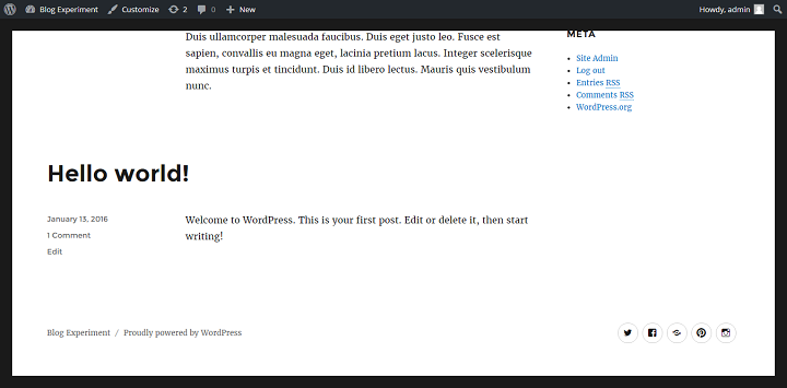
The Twenty Sixteen comes with a sleek social menu included, that automatically shows icons for each social network instead of text.
To make use of this menu, head over to appearance > menus, and create a new menu called ‘Social Menu’ or whatever other name you might want it to have.
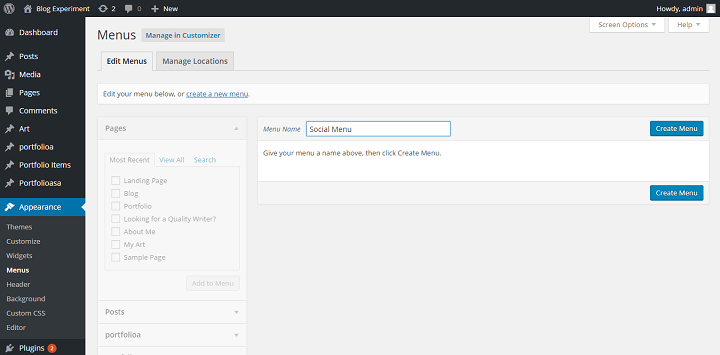
Then fill it with custom links to your different social media pages. Make sure that you write the social network names out correctly, because if you don’t, the link will be shown as just a general icon, not the specific icon for that particular social network. If you write ‘Google plus’ instead of ‘Google+’, that also happens.
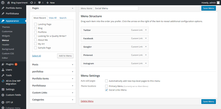
Once you’ve finished adding your custom links, and written in the text correctly, set the location of your menu to ‘Social Menu’ and it will show up in the footer of the page.
Make Twenty Sixteen Your Own With Customizer + A Few Lines Of Basic CSS
Using The Customizer
Now that our social menu is up and running, it’s time to familiarize us with the customizer. The WordPress customizer is where you can change things in the design of different themes. Some themes allow you to customize everything, some themes just allow the bare minimum. Twenty Sixteen is not the most customizable theme ever, but you do have some nice options that you might want to explore. Head over to appearance -> customize.
If we want to set up a background image we can.
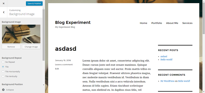
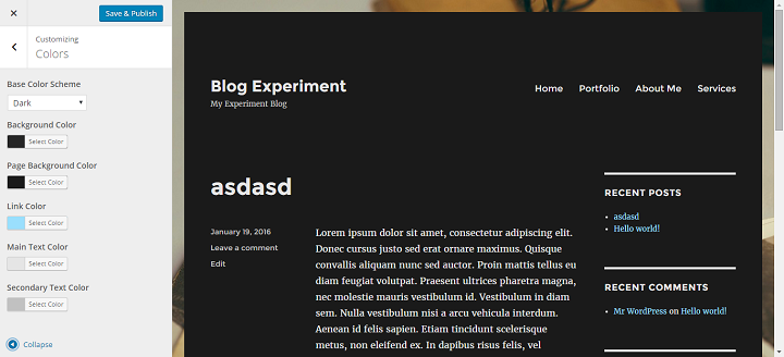
We can set our color scheme to dark, that looks like this:
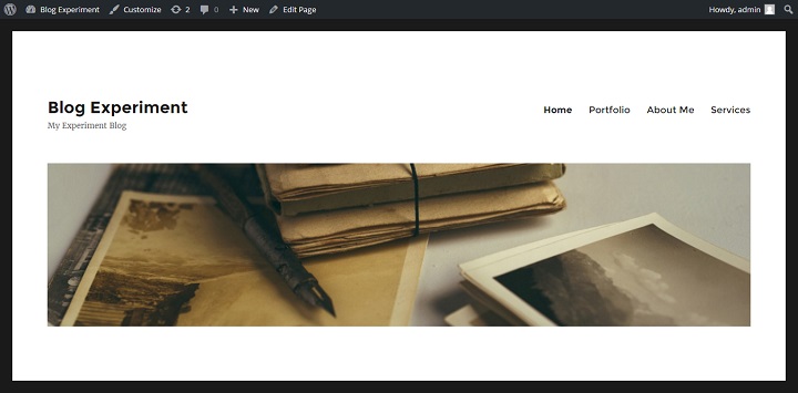
Or you might want to set a header image instead, that would look like this:
Intermediate/Savvy Beginner: Changes With CSS
This is where we start to really gain a lot of control over how our website looks. Don’t worry. Even if you know nothing about CSS or HTML, I’ll show you how to use a Custom CSS plugin to make easy changes without having to mess with child themes or the source code of the theme.
How To Make Twenty Sixteen Opaque/Transparent On Top Of A Beautiful Background Image
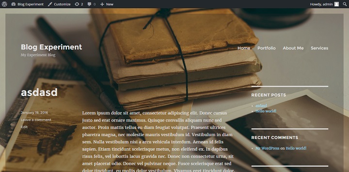
I’m sure you’ve seen websites that are made from transparent elements on top of a background image. With Twenty Sixteen, we can do most of the ‘hard work’ easily from within the customizer, and we only need to add one single line of custom CSS to complete the design.
Let’s start by adding a suitable background image for this. (A good place to find large, high resolution images perfect for this kind of thing, for free, is Unsplash.com. I used this image for this tutorial.)
Once you’ve decided on a picture and uploaded it, make sure you set the ‘Background Attachment’ setting to fixed. This gives the image a fixed position, meaning that it doesn’t move when you scroll, the page content will scroll on top of the fixed image.
Note that this will stretch the image to fit the screen, so you should use a high resolution image for this.
After you’ve done this, head over to the colors section of the customizer, and select the Scheme ‘dark’. Dark elements usually look better when made opaque on top of a background image, in my opinion. (Although it depends on the image you choose and your preference.) I’ve shown how to do this above in the beginner section on the customizer.
Right now it still doesn’t look like much right? But that’s about to change with one single line of CSS. If you already have Jetpack, then go to appearance -> CSS. If you don’t have Jetpack and don’t want to use it, you can install the simple custom css plugin.
Head over to appearance > CSS/Custom CSS and then add this tiny css snippet to make the main part of your site opaque.
.site {

opacity: 0.8;

}
That makes the site look like this.
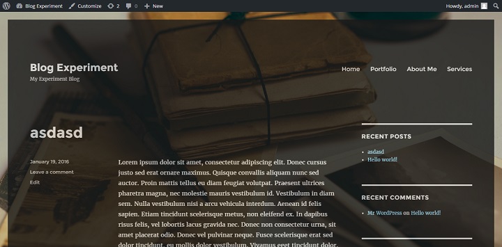
Around 0.8 is enough, because it makes the text opaque too, and any more than that makes it hard to read. 0.2 looks like this.
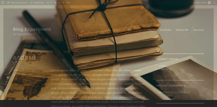
If you want a more opaque container, but you want to maintain readability you can instead make only the background opaque by using this snippet.
.site {

background-color: rgba(38, 38, 38, 0.3);

}

This targets only the background color of the main site element, so you can go all the way down to 0.3 and 0.2 without making the text unreadable. If you choose a picture with very few colors in the content area, you can even set the opacity to 0, which makes the background 100% transparent.
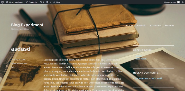
If you want to go for this kind of design, one thing to note is that, as you can see, the background image is what really carries the look. So, spending some time on finding the right one for your website/topic is well worth it in the long run. If you want to go with completely transparent, finding an image with few colors (at least in the areas where text is placed) is important.
Moving The Sidebar To The Left
Because the sidebar and main content elements are positioned using CSS, we can easily move the sidebar to the right.
A tool that comes in extremely handy if we want to change the CSS of a website, is the google chrome inspect functionality. If we inspect the sidebar and content elements we see that their classes are sidebar and content-area.
This is what the content area should look like when inspected:
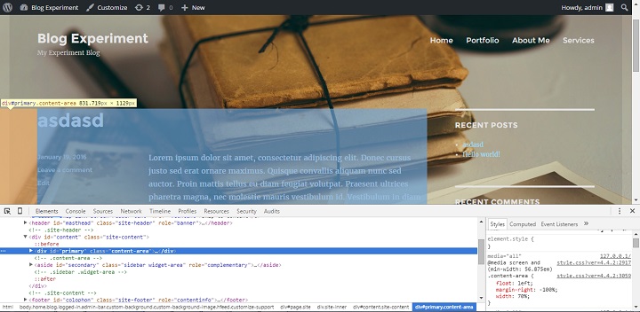
This is what the sidebar should look like when inspected:
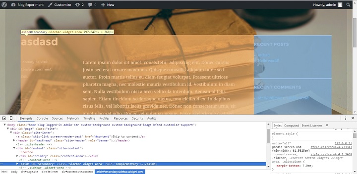
(If this confuses you, you should read more about using Chrome developer tools with WordPress here.
We also see that there are multiple styles applied in different media queries. (If you don’t know what a media query is, it’s basically a way to tell the browser to only apply certain styles depending on how big the screen/browser window is.)
In this case, we can see that the positioning styles are applied at the 56.875em minimum width breakpoint.
The code that we need to change is this:
@media screen and (min-width: 56.875em)

.sidebar {

float: left;

margin-left: 75%;

padding: 0;

width: 25%;

}

.content-area {

float: left;

margin-right: -100%;

width: 70%;

}
We just need to switch the lefts with rights, and overrule existing margins, and we have moved the content to the right, and the sidebar to the left.
@media screen and (min-width: 56.875em) {

.sidebar {

float: left;

margin-right: 75%;

margin-left: 0;

}
.content-area {

float: right;

margin-right: 0;

margin-left: -100%;
}
}
Enter this piece of code into the Custom CSS under appearance, save it, then update your site, and you should see the sidebar on the left, and content area on the right, like this:
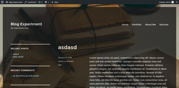
If you don’t overrule the existing margins, WordPress will still pull them from the original style file, and it will mess up the positioning of your content and sidebar.
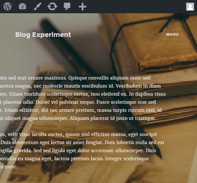
Also, if you don’t include the @media query, you will overrule location placement for other screen sizes, and will mess up what the page looks like on phones/tablets.
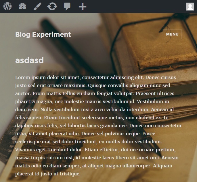
If you don’t add the media query, the page will look like this on small screens:
Instead of like this:
Styling The Sidebar
If you want to style the sidebar, you have a few different areas to target. Again, the Chrome developer tool inspect is our best friend. If we inspect the different things in the sidebar area, we find a few different elements that we can target.
.sidebar {
}
If we want, we can set a unique background color for the sidebar to make it stand out, although it doesn’t go that well with the default theme design.
background-color: #ccc;
.widget {
}
Here we can change margins/padding or fonts for the widget.
.widget-title {
}
In the widget title, one of the things we can do, is set a background color and change the alignment of the text to center.
background-color: #ccc;

line-height: 2em;

text-align: center;
That will look like this:
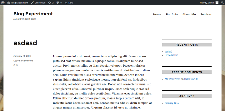
We might want to remove the border above each title and let the title with the new background color be act as the separator. We can do this by adding:
border-top: 0;
To the .widget selector, to override the default style. Which will look like this:
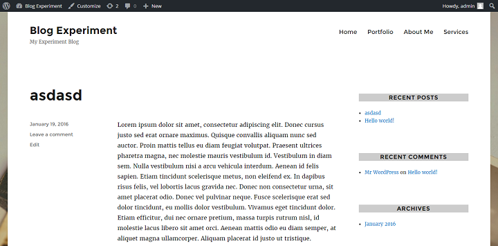
I’ll be the first to admit that this doesn’t look much different/better from the original in this instance, but depending on the color scheme you go with, it is a nice option to be aware of.
Intermediate: Some Ideas For Things To Do With A Twenty Sixteen Child Theme
A child theme is something that we can use to not only create a design that’s completely our own, but we can add extra functionality that we might need for our particular website. Here I’ll cover quickly how to set up a child theme for twenty sixteen, and a few options you have for customizing.
How To Set Up And Use A Child Theme For Twenty Sixteen
Setting up a child theme is super easy, and a better way to make significant changes than to simply edit files through the editor.
Create a folder called twentysixteen-child.
Then you just need to create a style.css file with this code (or you can copy paste this from the Twentysixteen style.css file, and add this line: “Template: twentysixteen”):
/*

Theme Name: Twenty Sixteen Child Theme

Theme URI: https://yourwebsite.com

Author: Your Name

Author URI: https://yourwebsite.com

Template: twentysixteen

Description: Child theme for Twenty Sixteen. Twenty Sixteen is a modernized take on an ever-popular WordPress layout — the horizontal masthead with an optional right sidebar that works perfectly for blogs and websites. It has custom color options with beautiful default color schemes, a harmonious fluid grid using a mobile-first approach, and impeccable polish in every detail. Twenty Sixteen will make your WordPress look beautiful everywhere.

Version: 0.1

License: GNU General Public License v2 or later

License URI: http://www.gnu.org/licenses/gpl-2.0.html

Tags: black, blue, gray, red, white, yellow, dark, light, one-column, two-columns, right-sidebar, fixed-layout, responsive-layout, accessibility-ready, custom-background, custom-colors, custom-header, custom-menu, editor-style, featured-images, flexible-header, microformats, post-formats, rtl-language-support, sticky-post, threaded-comments, translation-ready

Text Domain: twentysixteen-child
This theme, like WordPress, is licensed under the GPL.
Use it to make something cool, have fun, and share what you’ve learned with others.
*/
And a functions.php file with this code.
<?php

add_action( 'wp_enqueue_scripts', 'theme_enqueue_styles' );

function theme_enqueue_styles() {

wp_enqueue_style( 'parent-style', get_template_directory_uri() . '/style.css' );

}
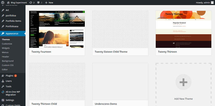
After adding these two files to a folder, you can zip the file, upload it and unzip the folder to wp-content/themes/ with ftp. (I wholeheartedly recommend setting up a local development environment though.) After you do this (or if you’ve put it inside the theme folder of your local WordPress install), head over to appearance -> themes, and you should see the Twenty Sixteen Child Theme pop up as an option:
When using a child theme, it’s always a good idea to keep the styles in the child theme, as you have full control over it anyway, rather than keeping it in a custom css plugin. So take the styles from the appearance -> custom css section and copy them into the style.css file in your child theme. Then delete the custom css styles from the plugin.
A thing to note is that if you want to transfer over your styles, the customizer will override the changes you make to the background colors or fonts in the theme if you set your color scheme to anything other than default. For example, we set it to dark before when we were using the Custom CSS plugin for our styles right. If you did that, if you take a look at your site now it should just look like the color scheme dark, without transparency at all.
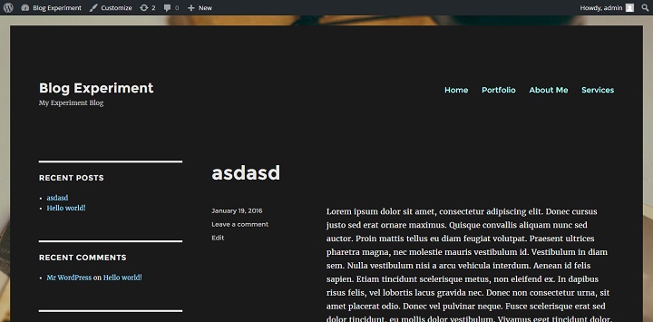
This means that if we want the opaque background, we need to head over to the customizer again, and set the color scheme to default. This lets us set our rgba colors for our site, but it makes our site look like this because all the font colors are back to default.
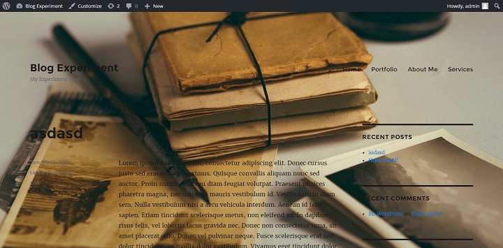
So now we need to get to work using the chrome inspect tool, and writing some simple css. For example if we want the opaque or transparent background and white text, we need to change the font colors to white or lighter colors manually in our child theme’s style.css file. Once you’re finished (depending on your color choices), your site might look like this.
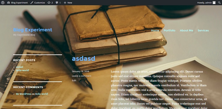
To achieve this look, I styled these elements:
body, button, input, select, textarea {

color: #fff;

}
a {

color: #b3ffff;

}
.site-branding .site-title a {

color: #66b2ff;

}
.site-description {

color: #ccc;

}
.entry-footer a {

color: #ccc;

}
.entry-title a{

color: #66b2ff;
}
.main-navigation .primary-menu > li a{

color: #b3ffff;

}
.widget {

border-color: #fff;

}
Using The Header Image To Send Visitors To A Landing Page
Back inside the customizer, we can set a header image for our site. Because the header image links to the home url by default, we can easily set up the header image to, for example, lead to a landing page instead.
You might for example set your header image to a banner with a special offer, like this:
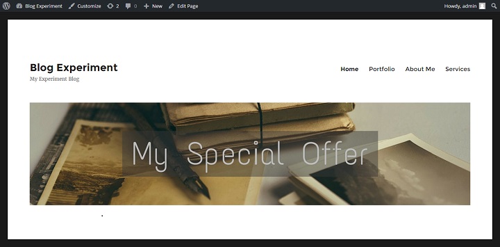
Then we can copy the header.php file into our child theme folder.
Then we open it up, and all we need to do is to add ‘landing'(or whatever slug your landing page has) to this line of code after the /, inside the single quote.
<a href="<?php echo esc_url( home_url( '/landing' ) ); ?>" rel="home">
If you want to link to an external url, then you can change the line of code to:
<a href="http://othersite.com/landingpage">
However, if you want to use a landing page on your own site, there is one issue. If we click through to the landing page, the ad/special offer header is still there.
You might not want this, so we will wrap the whole header section with an if !is_page(‘landing’) : statement. (The ! means not. So basically you are telling WordPress, if it’s not the landing page, display the header image.) The whole block should look like this:
<?php if ( !is_page('landing') ) : ?>

<?php if ( get_header_image() ) : ?>

<?php

/**

* Filter the default twentysixteen custom header sizes attribute.

*

* @since Twenty Sixteen 1.0

*

* @param string $custom_header_sizes sizes attribute

* for Custom Header. Default '(max-width: 709px) 85vw,

* (max-width: 909px) 81vw, (max-width: 1362px) 88vw, 1200px'.

*/

$custom_header_sizes = apply_filters( 'twentysixteen_custom_header_sizes', '(max-width: 709px) 85vw, (max-width: 909px) 81vw, (max-width: 1362px) 88vw, 1200px' );

?>

<div class="header-image">

<a href="<?php echo esc_url( home_url( '/landing' ) ); ?>" rel="home">

<img src="<?php header_image(); ?>" srcset="<?php echo esc_attr( wp_get_attachment_image_srcset( get_custom_header()->attachment_id ) ); ?>" sizes="<?php echo esc_attr( $custom_header_sizes ); ?>" width="<?php echo esc_attr( get_custom_header()->width ); ?>" height="<?php echo esc_attr( get_custom_header()->height ); ?>" alt="<?php echo esc_attr( get_bloginfo( 'name', 'display' ) ); ?>">

</a>

</div><!-- .header-image -->

<?php endif; // End header image check. ?>

<?php endif; // End page exclusion ?>
After you’ve done this, if you click through to your landing page, you should no longer see the header image.
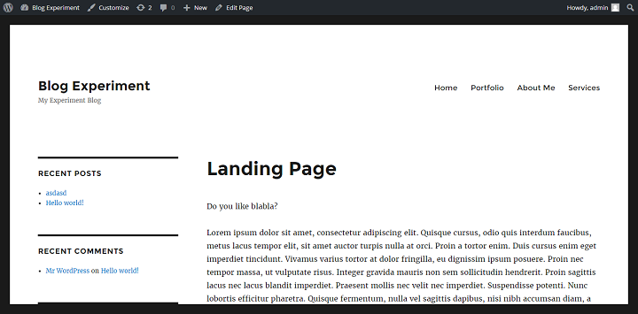
Making A Full Width Landing Page Template
First we’re going to copy over the page.php file into our child theme, and rename it page-landing.php.
The first thing we’re going to do, is replace the comment that says “This is the template for all pages” with a line that says “Template Name: Landing” then we remove the <?php get_sidebar(); ?> function.
Now if you go to your landing page you should see that there is no sidebar showing, but your content is still only filling up 70% of the space. (If your slug is something other than yoursite.com/landing you might need to set the page template to landing.)
There are two ways to set the width to full, either we can inspect the landing page and find the page id in the body class (or see the id in the url when we edit the page), and use that to qualify our content-area element, or we can make our own special class for the element.
You can see that in my case, the page id is 82. So to change the width of the content area only on my landing page, I can write this:
.page-id-82 .content-area {

width: 100%;

}
Or you can set an extra class for the content-area element in the page-landing.php file like this:
<div id="primary" class="landing-content content-area">
And target it like this:
.landing-content {

width: 100%;

}
Either of these approaches should lead to a full-width content container, making it a truly full-width page.
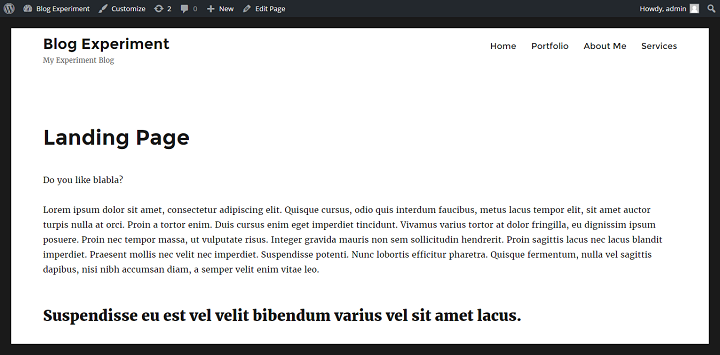
Further Learning:
There are a lot of things you can do with child themes, way too much to cover in just one post. So below I’ve listed some good resources that will help you get going in the right direction.
- Introduction to Custom Post Types
- Custom Post Type Templates
- WordPress Codex
- Tuts+ Tutorials on WordPress Theme Development
- Treehouse/Tuts+ Video Courses
Conclusion
Even if you knew nothing about code or editing themes before reading this tutorial, I hope you’ve gotten more familiar with the Twenty Sixteen Theme, and hopefully have learned some skills that you can use to work with other themes in the future.
Is there anything related to theme development you’d like to learn more about? Let us know in the comments!

Excellent article.
Really liked your article. Keep up the good job !
How to disable the link o category on post page. So that it would not be clickable.
How to add extra theme option in customizer like an,location, etc
Hey Raj,
Working with the Theme Customization API would have warranted a second post. You should check out this page in the Codex though: https://codex.wordpress.org/Theme_Customization_API, it shows you exactly how to do what you want.
Thank you!
Thank you 🙂
Great article. Thanks so much, I will be back again and again to find help with developing my theme.
Thank you! I’m wondering if it’s possible to apply a bold style to only part of the .site-title? Essentially I want a heavier weight on the first word of the title.
Raj,
Excelent post! Please, can you help me to do 2 things at my blog?
https://goo.gl/photos/H4uKt4yFp2Eyzacs8
I need change header for each category, or page. And create a block for mouse over on the menu.
Cheers, and have a nice day!
Hello Sir,
I really love your explanation. However, I have an issue with using
.landing-content {
width: 100%;
}
It doesnt change the layout in my mozilla
using
.landing-content.content-area {
width: 100%;
}
works only on IE and still not on Mozilla!
Could you help me out?
Emma,
It should work smoothly, did you try clearing the cache on your site? If you’re still having the issue, please provide your site url, so I can take a look.
Hello,
I have been using twenty sixteen to design a website, so far it has been great,
i am a beginner and not a very adventurous now, for some reason, something happened and i had to start again, and since then the new pages i published have a big horizontal line on top of their title
but the old pages i created do not have them
the website is not up yet so i can’t show you.
Any idea how i can fix this?
thanks
Hey Rado,
Mind providing your site url, so I can take a look?
it s not up yet, do you mind communicating through email?
Yeah sure, please use our contact us page to get in touch.
Hi, I´m trying to center my site title on my page using twenty sixteen. How can I do this ?
best regards
Cesar
Hey Cesar,
This should do the trick:
.site-branding {width: 100%; text-align: center;}Hi, I’m working on a willow twnety sixteen theme. I wanted to have a read more tag in my excerpt but I dont know how to do it. Hope you can help me. Thanks
Hi TJ,
Add this code where you want to use the read-more tag:
.site {
background-color: rgba(38, 38, 38, 0.3);
}
This does not change anything with my site.
Also, is it possible to make the container more narrow so that I have my background visible on the sides.
Fred,
Just tested the above CSS and it seems to be working fine on my end.
I think I should clear a few things up for you:
— the above css will change the color inside the container.
— if you want to change color outside the container you need to use this
body {background:#000;}About your last question, you can do that by adding the following code:
.site {margin: 30px;}Let me know if you have any more questions.
Hi.
How can i change the width for example 1000px?
Must be OK with tablets and mobiles too. I need “box theme” like Twenty Ten…
max-width for .site and .site-inner maybe? Anything else for mobiles?
Hi Eduard,
Set the max-width: 1000px, if you also want to have a boxed-layout on mobile devices, then you will need to add extra margin on both sides in mobile CSS.
Hello, pages do not appear in my blog. 🙁 I am new in wordpress and in blogging. Please help me.
Hey Naj,
You need to add the pages to your site by going to WordPress Dashboard > Pages > Add New > and click the publish button. If you want to show the page link in top menu, go to Menus (Dashboard > Appearance > Menus), and add the page to menu.
how do i make privacy policy page , terms of use to appear at the bottom of home page on twenty sixteen theme , the menu has only two options primary and social links so how can make those pages to appear at the bottom
If the footer option is not available, you will have to manually add the links in footer, probably via a widget or footer.php file.
Very impressive tutorial. Thanks
Thanks Milano — Hope to see you around :-).
HI,
I am using free plan on wordpress.com. It says I can’t install plugins. Is there a way around it?
Thanks,
Dandy
Hi Dan,
WordPress.com & WordPress.org are two different versions. This tutorial is for WordPress.org (self-hosted platform). Both use the same core software (plus same name), so it is easy to confuse them.
Here’s a detailed comparison by Shaun Quarton.
how amazing!thanks~i stady here a lot~
Hey Ragnar,
Great article! I’ve been trying to use your tutorial on the Sydney Theme. Most things work, however, I can’t seem to get the site container to become transparant. Adding
.site {
opacity: 0.8;
}
works fine, but adding
.site {
background-color: rgba(38, 38, 38, 0.3);
}
doesn’t change a thing. Any idea what I’m doing wrong?
Kind regards,
Guy
Hey Guy,
Thanks for the nice words. This tutorial is mainly for Twenty Sixteen theme and not for Sydney theme. So you will need to contact their support staff.
As for the background color, you may want to add !important and see if it works.
.site {background-color: rgba(38, 38, 38, 0.3) !important}Hi. Thank you for the article. It was useful for me as a total WP beginner. One question though regarding How to make 2016 theme opaque with nice background picture. I followed the instructions, but the picture I chose (I tried more of them) didn’t fit the background properly. I tried Simple Full Screen Background Image plugin, but still, depending on the device. Even on a laptop with 1600×900 resolution screen it didn’t work properly. Can you please give any advice? Thanks
Hey Andrej,
Sorry for taking so long to reply. I think you’re not using the correct size, you need to use a bigger image, to make it fit properly.
On the demo we are using this image, so you can get an idea of the image size.
Let us know if you have any more questions.
Hi Dev, thank you for your reply. I don’t think the picture size is the problem. I used following picture and it didn’t fit the background properly (on most of the devices which I tried): https://unsplash.com/search/bicycles?photo=VfUN94cUy4o; although it has sufficient size. Can you advice what else can cause the problem? Thanks.
Hi Andrej,
Any chance you could share your site url? If it’s still in beta / private, please use the contact us page — http://www.designbombs.com/contact
Hi Dev, I’ve sent you a private message with the URL. Thank you.
Hello Dev,
It’s a superb and awesome article! However, I have a question. How can I add “related posts” in my site (below every article)?
Looking forward for your answer, Sir
Regards,
Yogi
Hey Yogi,
Glad you liked it. We did a roundup of best related posts plugins, you can read the post here.
And we are currently using JetPack related posts module on DesignBombs, if you want to see a full list of plugins / tools we are using, we did a post on that, as well :).
Hello! I’m here again!
I’m getting an HTTP Error message while uploading images. How can I fix this?
Hey Naj,
It usually happens because of the large size of images or issue with memory limit. The fix is to up your memory limit, but you should also take a look at this article, as it gives a bit more options.
hello dear buddys what do you mean by the term – “Landing-Page” – have no glue.
can you describe & explain it a bit more.
that would be more than fantastic – look forward to hearfrom oyu
– just shoot me a mail…
thx inadvance…
Then we can copy the header.php file into our child theme folder.
Then we open it up, and all we need to do is to add ‘landing'(or whatever slug your landing page has) to this line of code after the /, inside the single quote.
<a href="” rel=”home”>
If you want to link to an external url, then you can change the line of code to:
However, if you want to use a landing page on your own site, there is one issue. If we click through to the landing page, the ad/special offer header is still the
Hey Martin,
Sure, landing page is where you promote your services or products. The page which doesn’t include extra elements like sidebar, menus, etc. You should see our post on landing page plugins to understand the concept better.
Hello everyone,
Hopefully someone can help me out. Im trying to remove the dividers/borders in my submenu. I have a whole day searching on internet but nothing has helped so far
Many thank in advance,
Hazy
Inspect the submenu element and look through the styles that are applied to it, then you can override those styles by writing your own lines of CSS in a Custom CSS plugin or a child theme.
That being said, the borders/dividers could be echoed out with PHP in your theme so then you would have to edit the relevant code in the relevant files.
Are you using Twenty Sixteen?
above you mention the
inspecting sidebar of Twenty Sixteen (If this confuses you, you should read more about using Chrome developer tools with WordPress here.
well – can you explain why we should use chrome devel-tools instead of fireBug!?
thanks in advance…
Either Chrome Dev Tools or Firebug is fine in this case. I happen to use CDT that’s all.
Thanks for this nice article about mastering TwentySixteen, but still I can’t manage to remove the “white space” above the menu : http://www.p-gm.eu, in the header
If anybody can help ! 😉
cheers
I’d like to resize the posts title both on the home page and the single post page. How do I do that? Thanks a lot!
howdy hello dear designbombs – experts
i am really excited about your page – it looks great – and you provide lots of great informations – all useful and real ly very interesting.
one question though: we expect the new version of WP – the version 4.7,
is this new version shipped with the theme 2016 or is there any other theme that comes shipped with the new version of wordpress – the wp 4.7
note: i would love to see the 2016 – since this is a very very good theme that is developed sustainably and has got allready more than 1000 000 active users.
so i would love to see this theme coming shipped with the WP 4.7
what d o you say – !? Love to hear from you
hello dear developer
the new theme – that comes shipped with the wp 4.7 is called 2017
seen here http://2017.wordpress.net/
background here:
https://make.wordpress.org/core/2016/10/18/twenty-seventeen-merge-proposal-for-4-7/
https://make.wordpress.org/core/tag/4-7/
question: can you provide some tutorials & manuals for this upcoming theme?
that would be fantastic.
love to hear from you
greetings martin
How can i change the font of the navigation menu via custom css on the twenty sixteen theme?
Quick question: is there a recommended size for the Header Image? One that works well on different devices? (Probably hides on small devices.) The one I have is huge (www.smartini.life), but before just trying a bunch of different sizes, I thought I’d ask.
Also – is there a relatively simple way to have the header image rotate among several different images? This isn’t that important – but would be cool.
Thanks!
You can try this plugin, you can use Google fonts, wide template and change menu position: https://wordpress.org/plugins/customize-twenty-sixteen/stats/
hello dear all – hello dear user and developer,
i really like this place since it offers many many great ideas & tipps and solutions for the great theme 2016
well – since wp 4.7 is out – we have new theme – 2017
allready many people use it – 4000 downloads of the theme itself
many many discuss the theme:
see the forum: https://wordpress.org/support/theme/twentyseventeen
we need a tutorial for this theme –
can you come up with a tutorial – that would be great – and would help the forum-user of the above mentioned forum,…
we look forward to the new tutorial…
keep up the great work – it rocks!!
regards martin
Hey Martin,
Thanks for the kind words and I am actually working on a twenty seventeen tutorial right now.. should be up fairly soon.
Glad you enjoyed this one and hope to out do expectations with the next one 🙂
Does this theme have any abilities for ad space or Adsense..??
Thanks
Hey Howard,
Functionality like that is usually covered by plugins rather than themes.
Hi, I’m confused about something in the explanation that you give above for moving the sidebar from right to left. The code, which you correctly copy from the Twenty Sixteen style.css, is:
@media screen and (min-width: 56.875em)
.sidebar {
float: left;
margin-left: 75%;
padding: 0;
width: 25%;
}
.content-area {
float: left;
margin-right: -100%;
width: 70%;
}
My question: shouln’t the float for a right sidebar be a float: RIGHT? I see that this IS how it is given in the Twenty Sixteen theme style.css (~line 3132), so it is not a mistake on your part. But I am so confused! How is this right sidebar created with a left float? I would immensely appreciate if you could please explain why this right sidebar is not created by a float:right but a float:left.
One more note: in the first sentence of your sidebar section above, you say: “Because the sidebar and main content elements are positioned using CSS, we can easily move the sidebar to the right.” This time I bet you did mean that last word to be “left”.
Btw, great article. I wish there were a manual for every one of the WordPress year themes.
Thank you,
Susan
Hey Susan, you are absolutely correct. It should, I think at the time I might have done the change already to checked that it worked and then copied in the finished code in place of the original. Thanks for noticing I will fix that shortly.
Also, sounds like you might be pleased to know that Im working on another piece like this for the twenty seventeen theme. 🙂
Thanks again,
Ragnar
Very good article. I am in IT but never done webdesign or coding. I have applied opaque feature to my site, but when I do that the videos, and image gallery become opaque as well and hard to see. How can I fix this?
Hey Luis,
Just use the RGBA background Color option instead ☺
An example is shown right under the part explain ing how to use the opaque option.
How do I remove the black margin on top!!!????
good day dear Ragnar,
first of all – many thanks for this great tutorial. I try to dive into this – with a bit learning curve.
what did i do: i just have moved themes from twentyfourteen to twentysixteen
see the results: at http://www.literaturen.org
note: as i have runned an “extended-twentyfourteen with goal “full width” i have added lots of lines in a css-plugin… see below:
1. question: how to correct the “wrong css” to make a good looking theme 2016? guess that i have to correct one or two lines in the css.
2. question: how to activate the left side block!? There two widgets are currently missing..
/* Enter Your Custom CSS Here */
.site-content .entry-header .entry-meta { display: none; }
.header-post-title-container {display: none; }
.entry-title {
font-size: 17px;
}
.home .post-228 .entry-header {
display: none;
}
.entry-meta .byline, .entry-meta .cat-links { display: none; }
.entry-content {
font-family: Georgia, serif;
font-size: 10px;
}
body,
.site-header {
width: 95%;
}
body {
margin: 0 auto;
}
#cff {
width: 100% !important;
padding: 0 !important;
}
.hentry {
margin: 0 auto 18px !important;
}
(margin-bottom is 17px now,)
.entry-title {font: 5px Georgia} /* Inhalte sind nur Beispiele */
.slider_container {
margin: 15px auto;
-webkit-box-shadow: none;
-moz-box-shadow: none;
box-shadow: none;
}
.su-column-inner #scrapeazon-iframe:hover {
height: 400px;
position: absolute;
width: 800px;
background: #fff;
z-index: 9999;
padding: 25px;
border: 1px solid #cdcdcd !important;
}
.su-column-inner #scrapeazon-iframe {
-webkit-transition: .2s ease-out;
-moz-transition: .2s ease-out;
transition: .2s ease-out;
}
.su-column-inner #advanced_iframe:hover {
height: 200px;
position: absolute;
width: 500px;
background: #fff;
z-index: 9999;
padding: 25px;
border: 1px solid #cdcdcd !important;
}
.su-column-inner #advanced_iframe {
-webkit-transition: .2s ease-out;
-moz-transition: .2s ease-out;
transition: .2s ease-out;
}
.list-view .site-content .hentry
{
border-top: none;
padding-top: 8px;
}
dear wp.- users dear Ragnar,
love to hear from you
martin
hello again –
i skipped all the code that i have mentioned in the above posting. In other words – i have thrown away all the code – and have a empty css-widget.
now i try to run the following code to approach the following goal:
– see the left and the right side-column
I tried to make a modification in the Twenty Sixteen theme with the following code:
.sidebar {
float: right;
margin-left: -100%;
max-width: 413px;
position: relative;
width: 14.4118%;
.sidebar {>
float: left;
margin-right: -100%;
max-width: 413px;
position: relative;
width: 14.4118%;
}
but wait: the center area is way too small …
i need to have a center area with a more wide …
how to approach this? – see the page: http://www.literaturen.org
love to hear from you
thx in advance for every hint – and tipp.
Very nice post. Great work. Please I am sure my doubt will be very easy for you, but I have gone thru all over and could not find how to erase the frame on the uploaded pictures, notice on the URL below that all pics are framed , I need to have all pics without frame please send me a light. thanks very much.
mcvantage.com/fsc-sustainable-hardwood-guyana/
Hello – Any idea how to add Written by: above the author name as well as adding the author name to the main page not just the single pages?
Hi Ragar,
Is there a way to let the margin black and the page background color turn into a background image?
hello – how to limit the width of the right column – in theme 2016.
see http://www.ex-libri.org – it seems to be a bit tooo big!?
any idea.?
hello dear experts
can i run a background image: for the theme 2016.
see a site where it is done for an example: http://www.spiegel.de/
probably we can do this with Twenty Sixteen theme,
we can set a background image by going to Appearance > Background.
can any body give some examples to the feature of a _background_ image? love to hear from you.
cheers
hello dear Developer, i am on a page where i want to lower the widtht of the right (!) colum of the theme 2016:
see the page: http://www.ex-libri.org
the right column is tooo big:
/* Enter Your Custom CSS Here */
.sidebar {
width: 18% !important;
}
note: i can change the width a bit – but the funny thing is – i cannot controll the spaces that arise when i change the width of the rigth column.
QUestion: how to controll this spaces ? How to minimize these spaces!?
Hi,
I tried all your suggestions to make the content area of my page full page, using Twenty 16. However, none of it worked for me. I cleared my cache, and used both firefox and chome to check the results. At this time, I have both of your suggestions completed/installed. The only thing I did different, is that I just edited my page.php file, because at this time, I only need one page, which I am using Advanced iframe in to bring a page, that I need to be part of my site, to my site. I have Advanced iFrame set up to load at 100% of the page as well. cotyroneireland.com/amail/ and you see that only part of the frame shows in the middle of the page. I just need to get rid of the whitespace on either side of the frame, and it will be perfect. I’ve tried other people’s suggestions before yours and they didn’t work either. Not sure why.
Thank you in advance,
Tammy
I installed a different theme and it works with full width right away. The theme name is Cronus. Thank you, no need to assist.
Hello,
I want to change the background (black) with other color instead of an image.
Appreciate your help 🙂
Hello,
In the Twenty Sixteen theme customizer I can add a header image of 1200 x 280. I like this, but instead of it being a header image I would like to add a footer image, so that the image would be at the bottom of each page. Is there a way I can do this? Thanks so much.
Very good explanation.. I want additional left sidebar2 in replacement of author information with child theme functions. can you help me. or is there any ready made solution.
this sidebar should start along side the post contents only. Title and header should remain same.
hello – are we able to add a background image to the 2016 theme!?
Eg like it is done here http://www.sueddeutsche.de/
[note – this one is divided into two pieces ]
generally spoken: is it possible to add a image to the 2016er theme?
love to hear from you
Thanks so much for putting this together. I want to make changes to the 2016 theme and I’ve read about creating the “child” but most of the instructions were a little confusing. Yours are much more clear – I’ll tackle that this weekend and then I’ll be able to try all your other ideas.
I do have a question, which may or may not be related to the 2016 theme – when I add a post to the site I am working on it, everything appears correctly updated in Chrome. But usually the page will not update in Safari (not desktop or iPad or iPhone). I know how to reload the page to clear the cache), but I worry that a reader might assume I haven’t written anything new and never come back. I am not running any cache plugin (I’ve read that setting that up wrong can cause this). Any other obvious places to look?
Figured this out so thought I’d post in case others have the same problem. The part where I said “not running any cache plugin” turned out to be false. I’m hosted at BlueHost, and they had two cache plugins kind of hidden in a Must Use (MU) directory. Removing those and editing my .htcaccess file solved my problem.
I am struggling with something I cannot figure out. I am using twenty sixteen with a good working child theme with style, header, footer, functions, even a few page templates.
I want to put a small add to any share button span floated to the right of every page and post title. I just don’t like the big heavy plugins for this and want to do it with a template. The last time I tried something like this it was with twenty ten. I found a simple step by step somewhere that I can find now.
I cannot for the life of me, find a simple tutorial for this. Can anyone help with this. I see a template parts folder. I move one of those files to my child theme, make changes, upload ftp an nothing changes. I’ve tried all of them and nothing changes anywhere.
What am I doing wrong?
Thanks!
hi … i am trying to customize the side bar and just need width …
currently i have an “under construction” up so cant post website that will show but here is it ..
debbyquigley.com
thanks for any help
this is what i have so far on sidebar …/*
i am using the additional customizing CSS
Click the help icon above to learn more.
.site-header {padding-bottom: 2rem;}
header#masthead {
padding-top: 0;
}
.header-image {
margin-top: -10px;
}
.site-header {
padding-top: 24px;
padding-bottom: 24px;
}
.header-image img {
height: 150px;
}
.widget-title {
background-color: #ccc;
line-height: 2em;
text-align: center;
}
.widget {
border-color: #fff;
}
.widget {
border-top: 2px solid #777070;
border-bottom:2px solid #777070;
border-left:2px solid #777070;
border-right:2px solid #777070;
padding-bottom: 22px !important;
padding-top: 22px !important;
padding-right: 12px !important;
padding-left: 12px !important;
margin-bottom: 10px !important;
}
.main-navigation a {
font-size: 20px !important;
}
ul.sub-menu .menu-item{background: #f2f2f2 !important;
}
Thank you so much for this comprehensive detail on twenty-sixteen. Through your recommendations I managed a beautiful apt background image to add to my WP blog, just a subtle background without interfering with the content… looks great!
There doesn’t appear to be an article on allowing comments. Do I have an option with this particular theme?
Thank you so much, the article is really very helpful.
Hello,
Very good explanation. Can you explain me how can i hidden or remove the menu?
Thanks
Hey Jonathan,
Use the below CSS code to hide the navigation menu:
#site-header-menu {display:none;}Hi Dev,
Thanks for you answer.
How can I remove the entries that appear in the categories?
I hope i do not abuse your trust
Thanks
Thanks so much, it really helped me a lot!
.site-main > article {
display: none;
}
Voilà
First off, thanks for this great post, and all the replies you’ve been throwing in for over a year now,on just this post.
I really would like to know what css code I can use to centralize my site Title and description
And I would also like to know how I can have my top menu displayed in a row of 3-4 closely spaced columns like the size of a medium icon in a pc’s window explorer.
Thanks again for all the good work and an anticipated reply.
Hi Lyke,
No problem, happy to help.
If you are trying to display above the menu, then us the below code:
.site-header-main {text-align: center;display: block;}If you are were just talking about making the site title & description center, use this:
.site-branding {text-align:center;}As for the menus, can you please provide a bit more info?
Cheers,
Dev
The code you gave (.site {opacity: 0.8;} ) works great but it applies to all the pages on my site. Can I just have it apply to the front page and not the others?
Thanks
Nancy
Hi Ragnar
Interesting info on this theme. Just a question I wan to move the menus to the middle of the home screen how can that be done? Let me know if it is possible.
Regards
Nokia
hello dear developer
many many thanks for the great tutorial – it rocks!
i still stuck in the work here – workin on a theme called wp 2017
see the page: http://www.f-s-j.de/
The thing: the width of the center-(block) should be a bit bigger; in other words : can i stretch the Center block – where we can see some postings and the output of some data that are stored in the WordPress plugin called Participant database.
hope i was able to explain what is wanted and needed.
love to hear from you
regards martin
you can reach me with mal martin.kaspar@campus-24.com
many thanks in advance
martin
Hi, I see this is allready some time ago, but the article is excelent. For those who want to remove the bullets from the menu and change the color, see the following code:
#menu-hauptmenue li,
.menu
{
list-style-type: none; /*This will remove the bullets*/
}
#menu-hauptmenue a,
.menu
{
color: black; /*This will change the color*/
}
Hello,
I’ve toyed with making a site transparent on top of a background image using:
.site
{
opacity: 0.95;
}
It works except for the bottom of short pages/articles. See:
http://www.ocivelo.fr/enconstruction/latelier/
Any idea what might cause this?
Other style.css modifications include hiding the site credits and black border of the twenty-sixteen theme. I’ve tried removing these modifications but it didn’t help.
Hi
I am using theme for my website and the “read more” isn’t working on my pages. Pls help.
Thanks
On mine the sidebar isn’t showing up? How do I activate it??
Hi Trisha,
Do you have widgets added to the sidebar? In WP Admin > Appearance > Widgets. If there aren’t any widgets the section does not show up.
Thanks for the great post! I just have a quick question:
I would love to know how to keep the “Date” and the “Leave A Comment” section at the bottom of my blog posts, instead of on the left side of the post.
I notice when I shrink my browser window, it reverts to that, aligning the Title of my post with the Content. It’s so much more visually appealing.
Is there anyway to change that?
Hi Josh,
Give this CSS a try.
I’ve been using this theme for 2 years, and I am only now noticing that even though the menu looks fine for mobile devices when I’m in the customize option, when I go to an actual Apple or Android phone and choose menu, I get ALL my pages not just the 7 or 8 I have set up. It’s fine on tablets, this is just phones.
I can’t figure this one out. Help!
How to get image width in twenty sixteen to full page width, rather than staying in the middle column?
am new to WordPress and haven’t yet hit the coding side, but willing to try.
I use twenty sixteen
I use Firefox with Windows 7
My problem is the width of my images. In the picture accompanying the publicity for the twenty sixteen theme, the images reach towards the left of the screen, i.e., are wider than the text column area. This is what I want. I want to load images of maps, but no-one will be able to see the details if they remain limited to the middle column, they need to be wider, exactly like the image of the sunset on this page: https://en-gb.wordpress.org/themes/twentysixteen/
Now how on earth do I achieve that? Because my images are staying in the middle column.
How to achieve this?
Great article, was just wondering how to remove the author name and date from the archive page, or index.
I mean, how to hide tags we put on the product pages?
I know we can remove the tags, but tags help searches to be landed on the related pages, right? It really looks silly to have a lot of tags on a product page.
Pls help, and thank you very much!
MZ
Hi, The sidebars on this template are default and appear on every page. Is there a possibility to create a text block on the right that is custom to each blog? So part of the sidebar would be information pertaining to this specific blog and others are more general like they have it with ‘search’ and ‘related posts’ etc?