
16 Impressive Landing Page Examples Optimized for High Conversions in 2023
These landing page examples all have one job to do that they do extremely well: persuade the visitor to complete their next step of the marketing funnel.
A great landing page is eye-catching, persuasive, and simple. It should encourage people who click onto that page to complete a specific action such as signing up for a newsletter, becoming a member, or making a purchase.
Landing page design is different from standard web design. For example, many landing pages have simplified navigation to encourage users to click the CTA rather than drifting off to anther page on the website.
The main homepage of your website might also be your main landing page. But you can often get higher conversions by creating a landing page for a specific campaign or target market and funneling traffic from an ad or email to that particular page.
If you’re looking for some inspiration for your own landing pages, we’ve compiled some of the best landing page examples we’ve found.
Copy these landing pages for your own site or mix and match ideas you find from several to come up with your own unique, highly converting landing page, and watch your conversion rate soar!
1. Airbnb
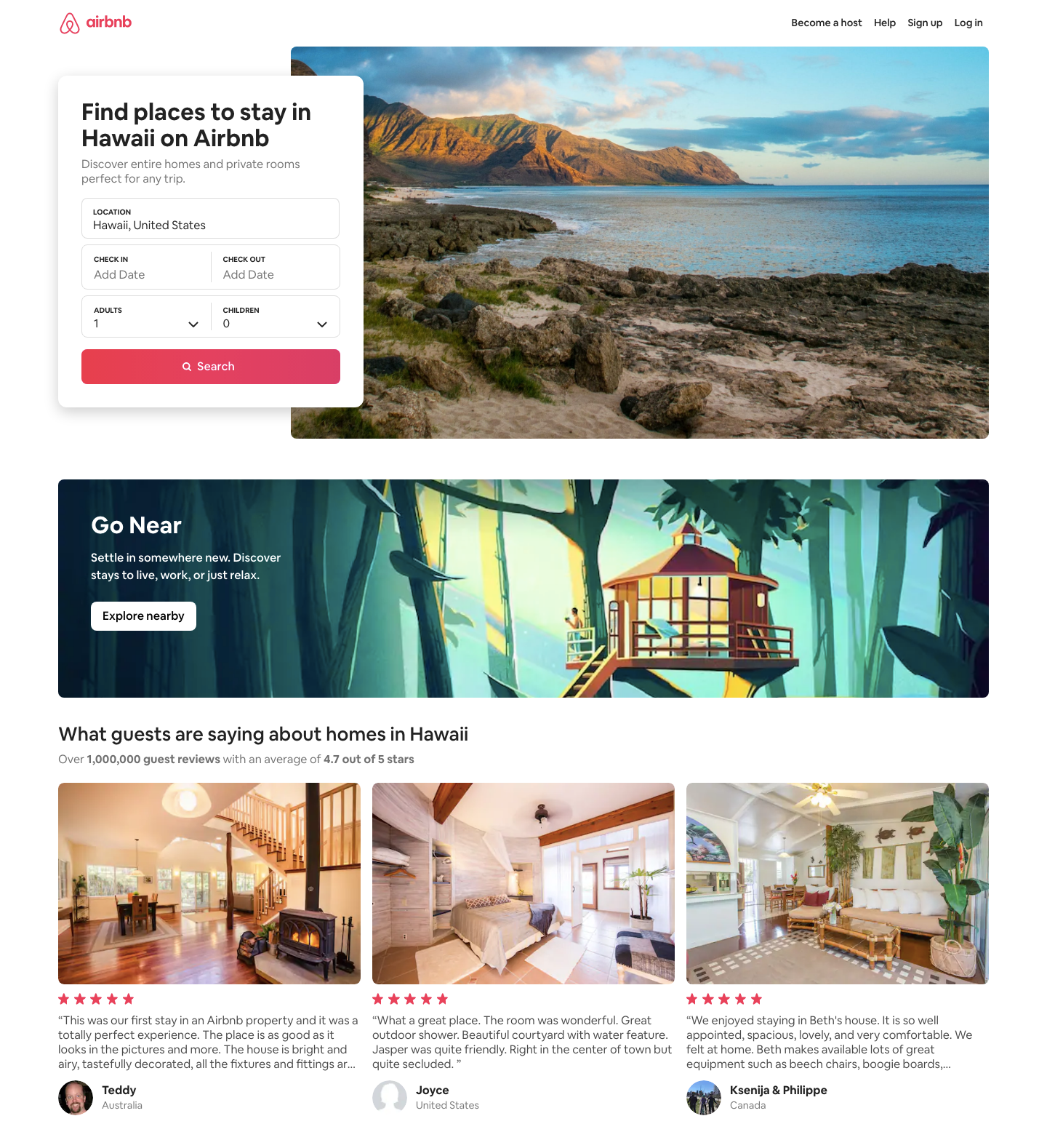
Airbnb has several location-focused landing pages that show up in the search results when a user searches for holiday rentals in a particular area.
This landing page example focusing on Hawaii encourages visitors to enter the dates they’re looking to stay, but if they scroll past they can see a selection of some of the top-rated and recently booked properties.
Why it works
- Attractive images mean casual browsers will start imagining themselves in the location and property immediately.
- The simple form above the fold encourages users to find short-term rentals that meet their needs.
- Reduced navigation with links only to log in, sign up, become a host, or get help.
- Displaying star ratings and reviews on featured properties provides important social proof.
- A clear listing of the top 3 features of the platform helps to increase confidence in the brand.
2. Codecademy
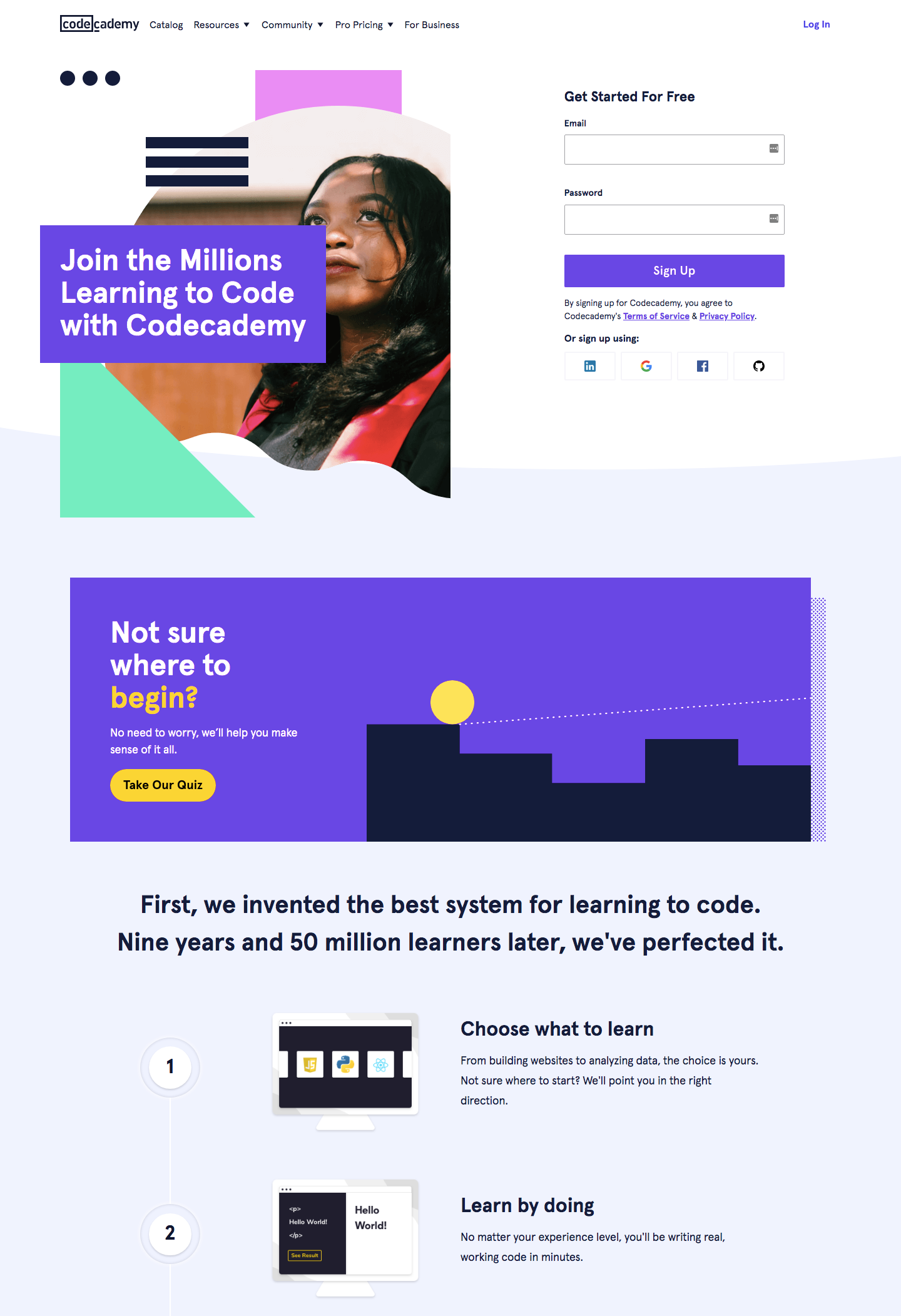
Codecademy is a suite of online courses for learning to code. The landing page meets the needs of people who are ready to get started right away (with a signup form above the fold) and those who aren’t sure if they’re in the right place with links to an interactive quiz and a visual representation of the step-by-step process Codecademy takes you through from choosing a course to landing your dream job.
Why it works
- Main CTA (sign up as a new user) is clear and the first thing you see.
- A clear value proposition (“Join the millions learning to code with Codecademy”) encourages brand trust.
- A visual numbered list takes visitors through exactly how the website works and the benefits they’ll get at each stage.
- The most popular courses are featured on the page.
- A “Get started” button captures those who have scrolled to the bottom of the page without taking action.
3. Shopify

There’s been a huge surge in new eCommerce businesses in the last couple of years and competition between eCommerce platforms is high.
Shopify’s landing page lays out simply and clearly what they provide and why you should choose them over a different platform.
Why it works
- Simple email capture form to sign up for a free trial is an effective way to capture leads with low friction.
- Clear image shows what Shopify provides (an eCommerce site and app)
- Primary features and benefits are clearly displayed.
- Customer logos and testimonials provide social profit.
- A second “Start free trial” button at the bottom of the page captures those who have scrolled to the bottom.
4. Aweber
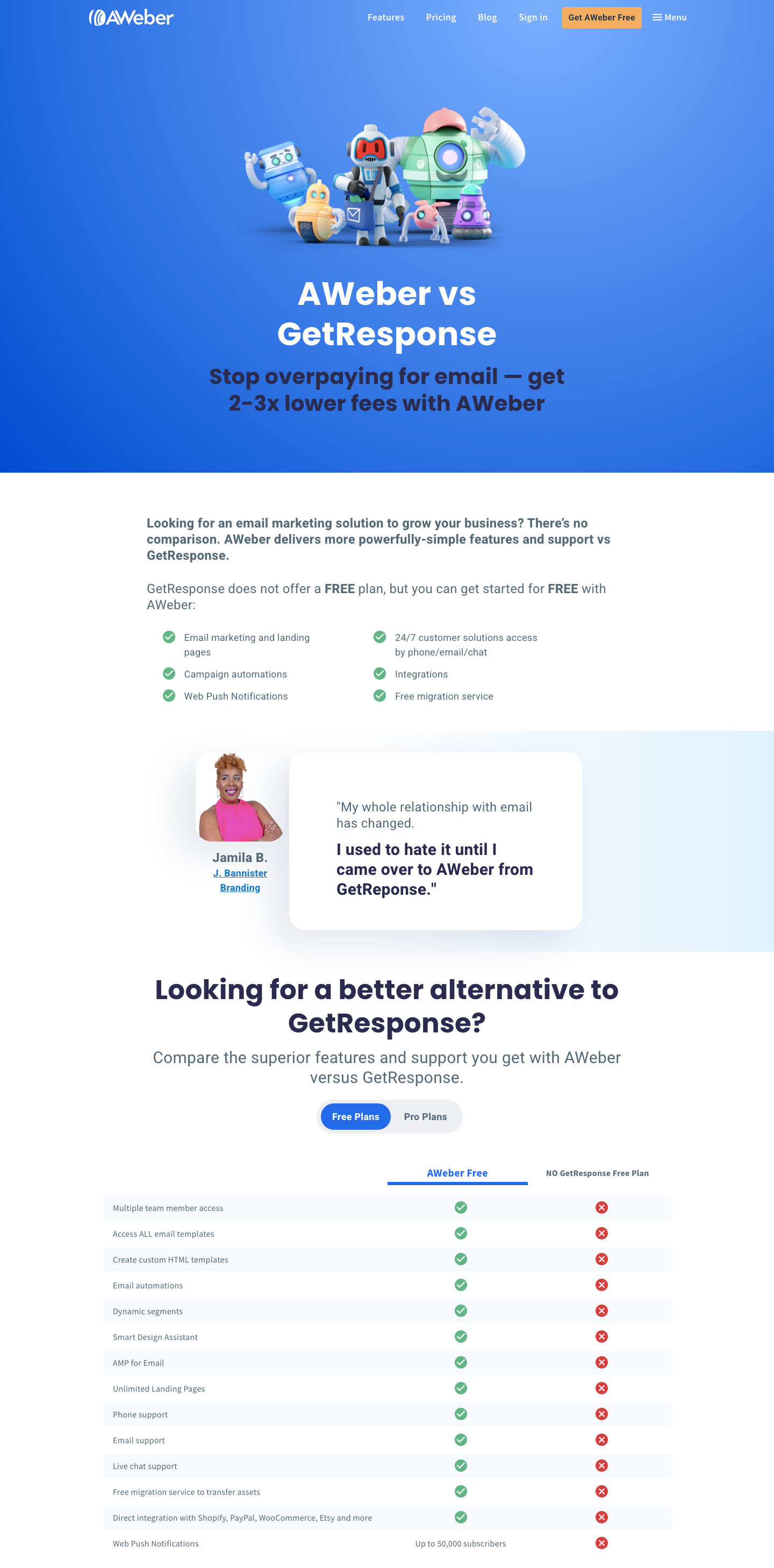
Email marketing software company Aweber has designed this landing page specifically targeted at users searching for one of their main competitors – GetResponse.
Above the fold are an eye-catching image and an attractive proposal – “get 2-3x lower fees”. As the user scrolls down the page, every piece of information reinforces the message that Aweber is better than GetResponse
Why it works
- Prominent “Get AWeber Free” button in the main menu
- Eye-catching color scheme and main image
- Clear value proposition
- Customer testimonial with a photograph adds social proof
- Comparison table pointing out the extra features you get with the AWeber free plan makes it appear a clearly better choice
- Only 2 CTAs on the page – one to try AWeber free for new customers and one to migrate from another provider for free.
5. HelloFresh
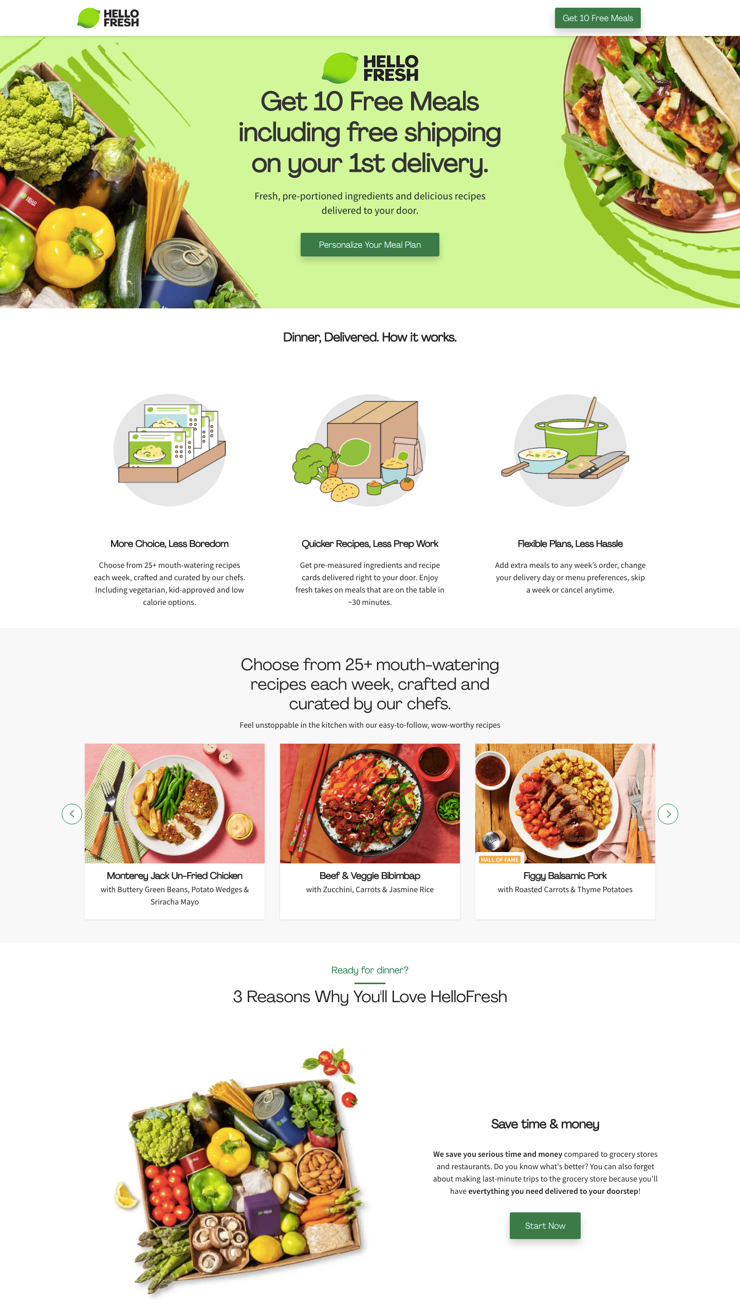
HelloFresh is a subscription meal kit delivery service aimed at people who want to cook healthy, delicious meals at home. The brand has realized that the price of the service is the main barrier to gaining new customers and immediately overcome this barrier with the first CTA offering the promise of “Get 10 Free Meals”.
Why it works
- There’s no main navigation. Instead, there’s only a button to “Get 10 Free Meals” – a very attractive offer for casual browsers
- Attractive images of the meals you’ll get, as well as the fresh ingredients
- Benefits clearly displayed – save time & money, reduce food waster, and lead a healthier lifestyle, each with a CTA button
- Photos of couples with 5-star ratings and testimonials show this is a tried and tested service
6. Gleem
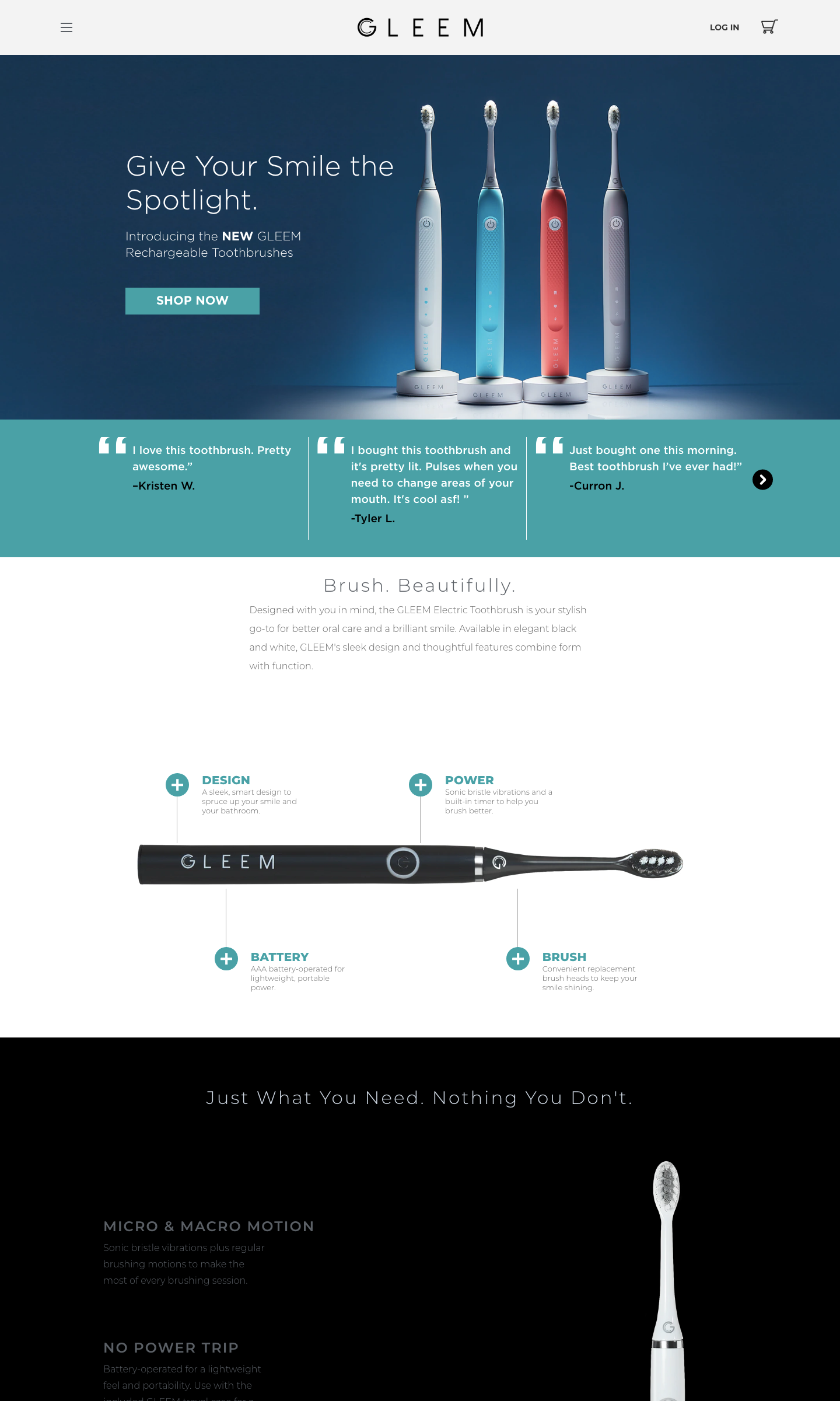
The landing page example for Gleem electric toothbrushes showcases the product front and center with a prominent “Shop Now” button. The features of the product are clearly displayed along with customer testimonials in a simple landing page design with plenty of white space.
Why it works
- The main navigation is hidden – the first thing you see is the “Shop Now” button.
- Features and benefits displayed alongside a clear image of the product.
- 15% offer pop-up as you scroll down the page.
- Testimonials and customer photos add social proof.
7. Stripe
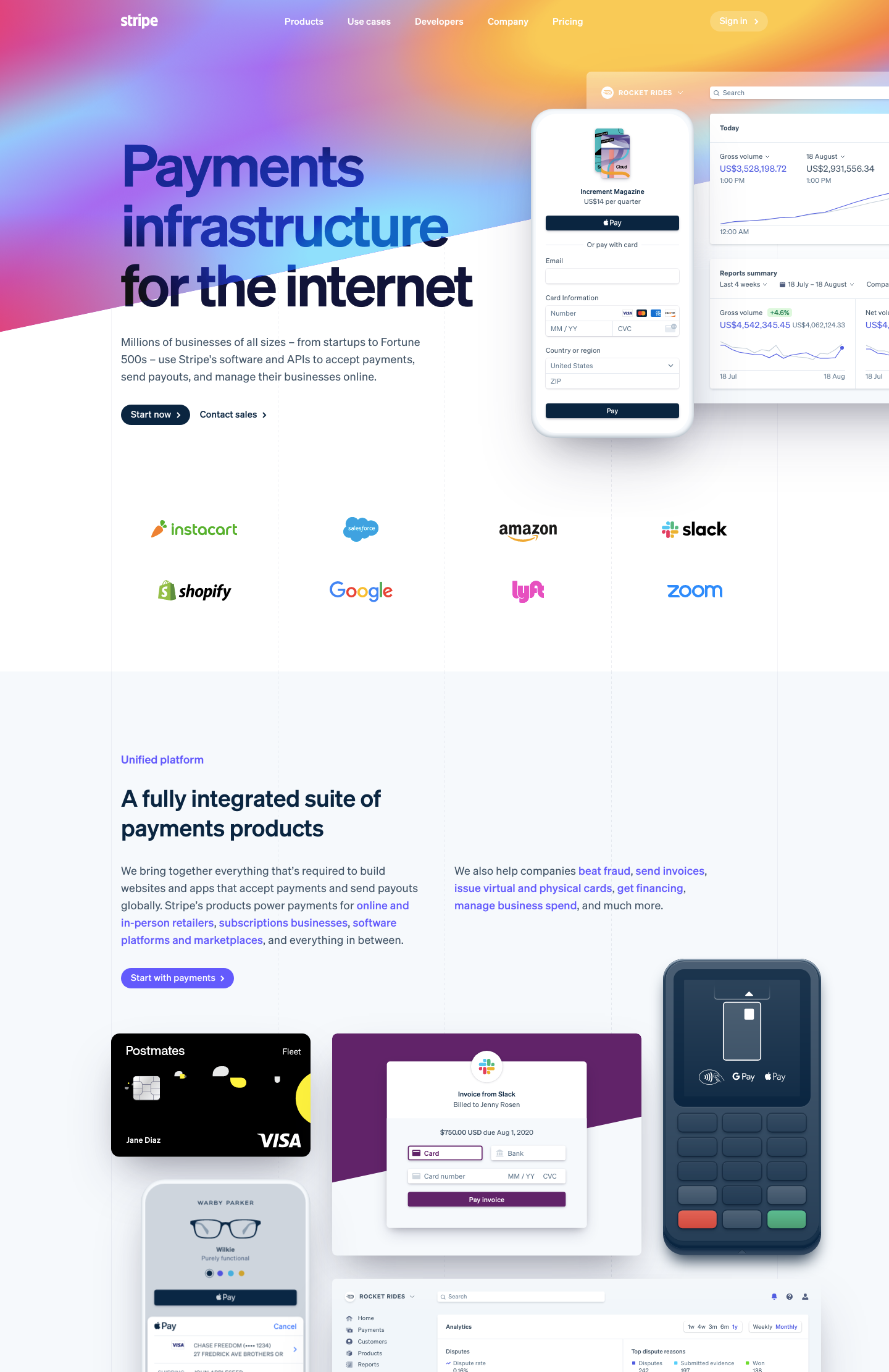
Payments platform Stripe has a very effective landing page that reflects the premium quality of its products. Product images clearly display how the system looks from both the front and back end, and you can see the main features immediately.
Why it works
- The main headline and image clearly explains what the product does
- Logos of major brand customers show this is an established and highly trusted provider
- Main features clearly displayed
- Numbers and data showing how widely Stripe is used by businesses all over the world.
- Multiple CTAs at various points in the page to suit users at different stages in their buying journey.
8. Oregon Valley Farm
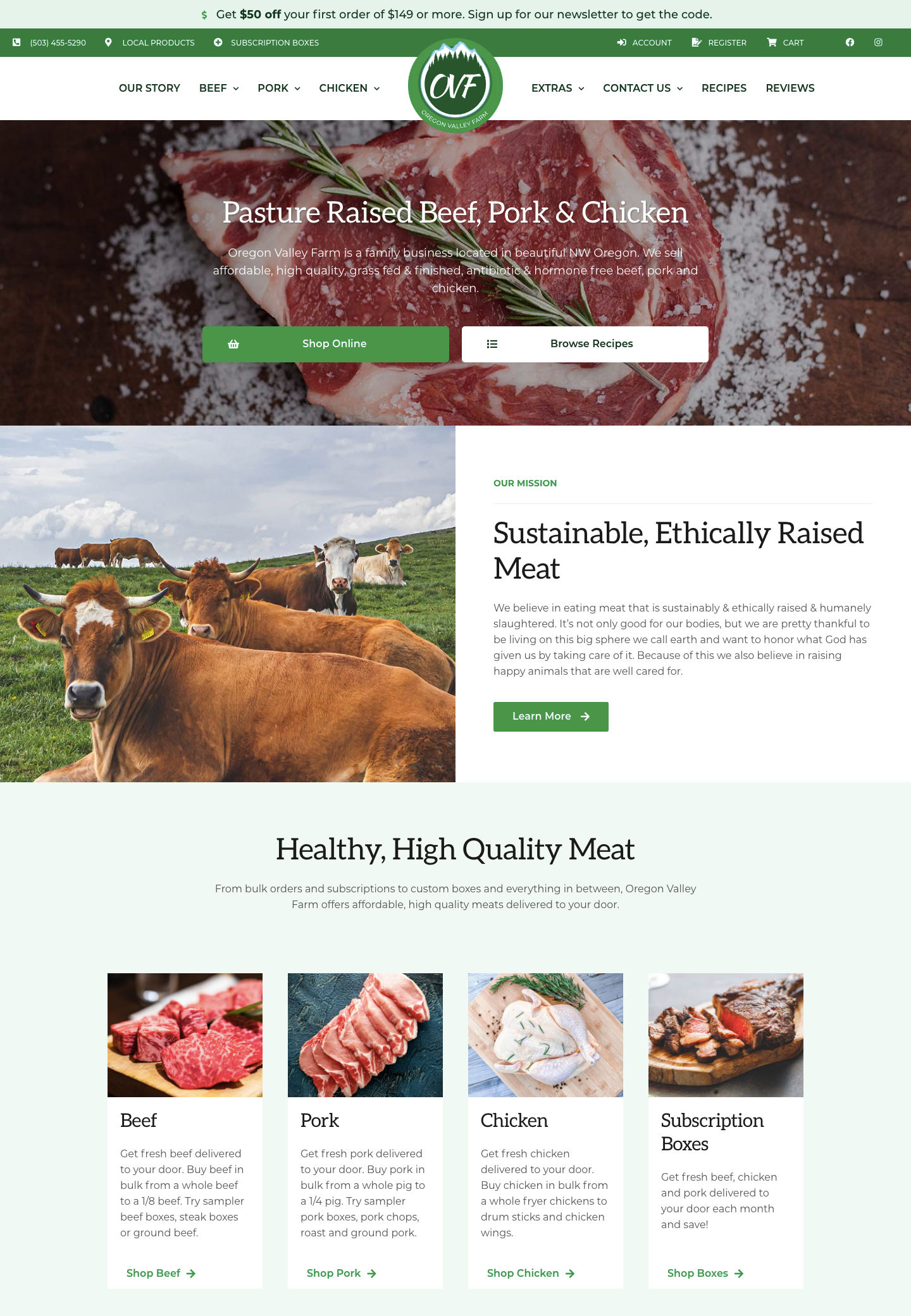
Oregon Valley Farm is a family business selling high-quality grass-fed beef, pork, and chicken. Because the people who buy these products often want to learn more about the company and be confident in their credentials before buying, some of the CTAs on the landing page link out to informational content as well as directly to the shop.
Why it works
- Clear headline describing the product and why it is better than other options.
- Images of the animals, as well as the meat, show that welfare is a high priority.
- Clear links to each type of meat available, as well as the subscription box service.
- Direct links to healthy recipes inspire casual browsers to explore new ways of cooking with meat.
- Customer reviews add social proof and improve brand trust.
9. Sugarwish
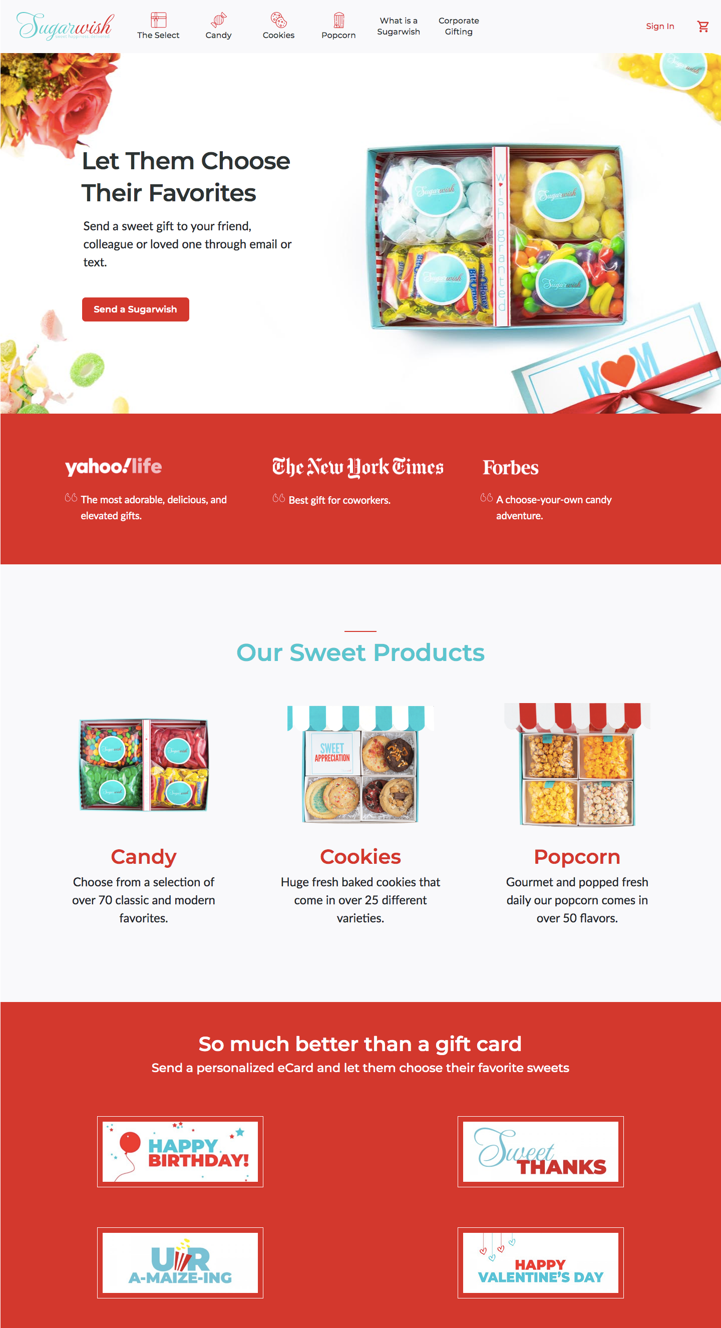
Sugarwish is a candy gifting service that sends a personalized eCard and allows recipients to choose their own favorite flavors. The clever thing about this landing page is that it’s targeted at users searching for online gift cards and promotes the service as a unique alternative.
Why it works
- Attractive product image + value proposition (“let them choose their favorites” + clear CTA button above the fold.
- Media mentions and testimonials from big-name corporate clients show this is a trusted brand.
- Clear links to the different product categories with mouthwatering images.
- Visual step-by-step representation of how the service works.
10. Wix
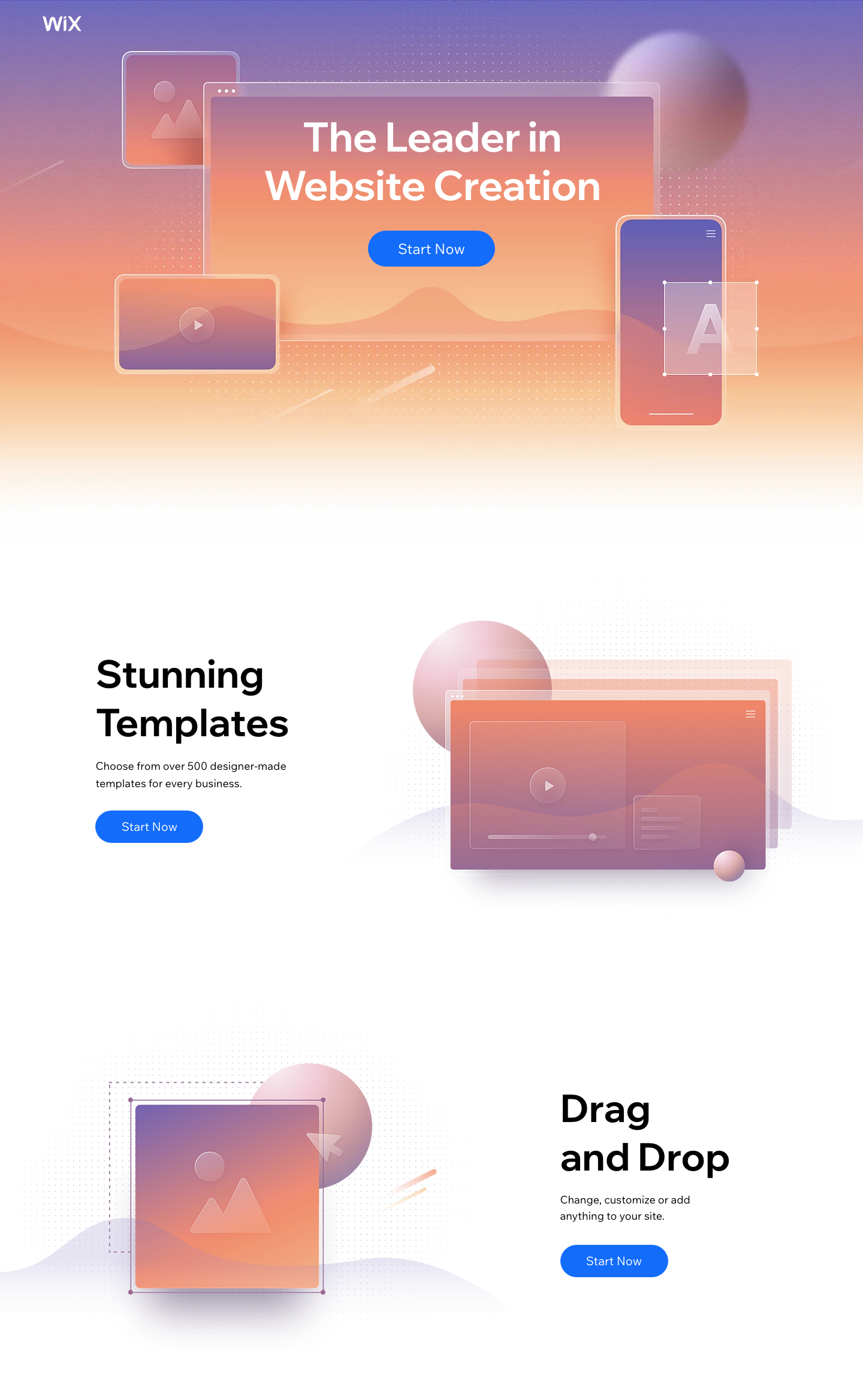
Drag-and-drop website builder Wix uses a minimalistic landing page to show off the main features of its product with only a single exit path for users.
Why it works
- Multiple CTA buttons to capture users at any point in their scrolling, but only one desired action – “Start Now”.
- No other navigation to distract from the CTA.
- Features listed clearly alongside simple graphics and plenty of white space.
- Users who get to the bottom of the page see that the landing page itself was built with Wix – showing off the capabilities of the builder.
11. Lyft
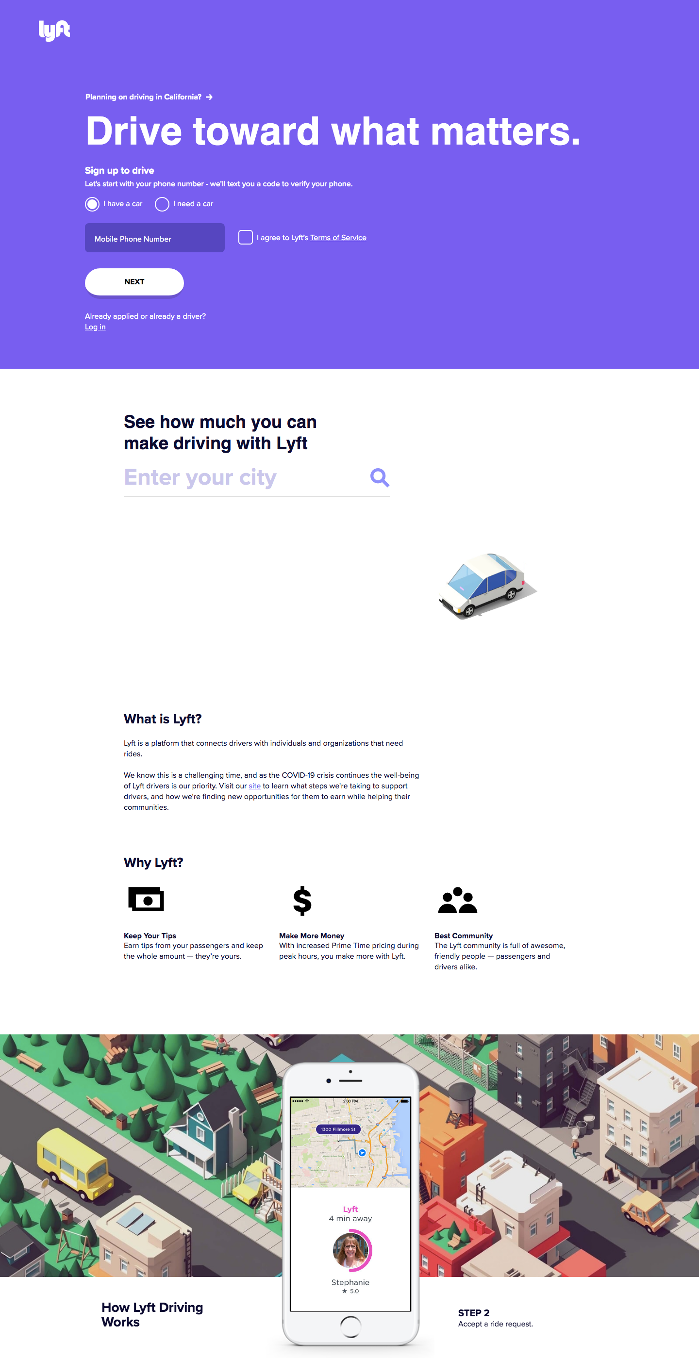
Rideshare service Lyft designed this landing page targeted at people looking to make money through driving. The page includes a form to capture leads, a basic description of how the service works and the benefits for drivers, and an FAQ for further information.
Why it works
- This landing page example is very simple above the fold – no images or navigation to detract from the lead capture form.
- The benefits of working with Lyft are clearly displayed
- An attractive image slideshow explains how the system works
- A sticky footer asks users if they are ready to start driving with Lyft and offers 2 options: “Yes” or “Not Yet”. Those who click the “Yes” button will be taken directly to the lead capture form, while those who click “Not Yet” will be asked why they’re not ready to make an application. The information gathered from this can be used to improve the landing page in the future.
- FAQ answers common questions and concerns, reducing barriers to sign up.
12. Headspace
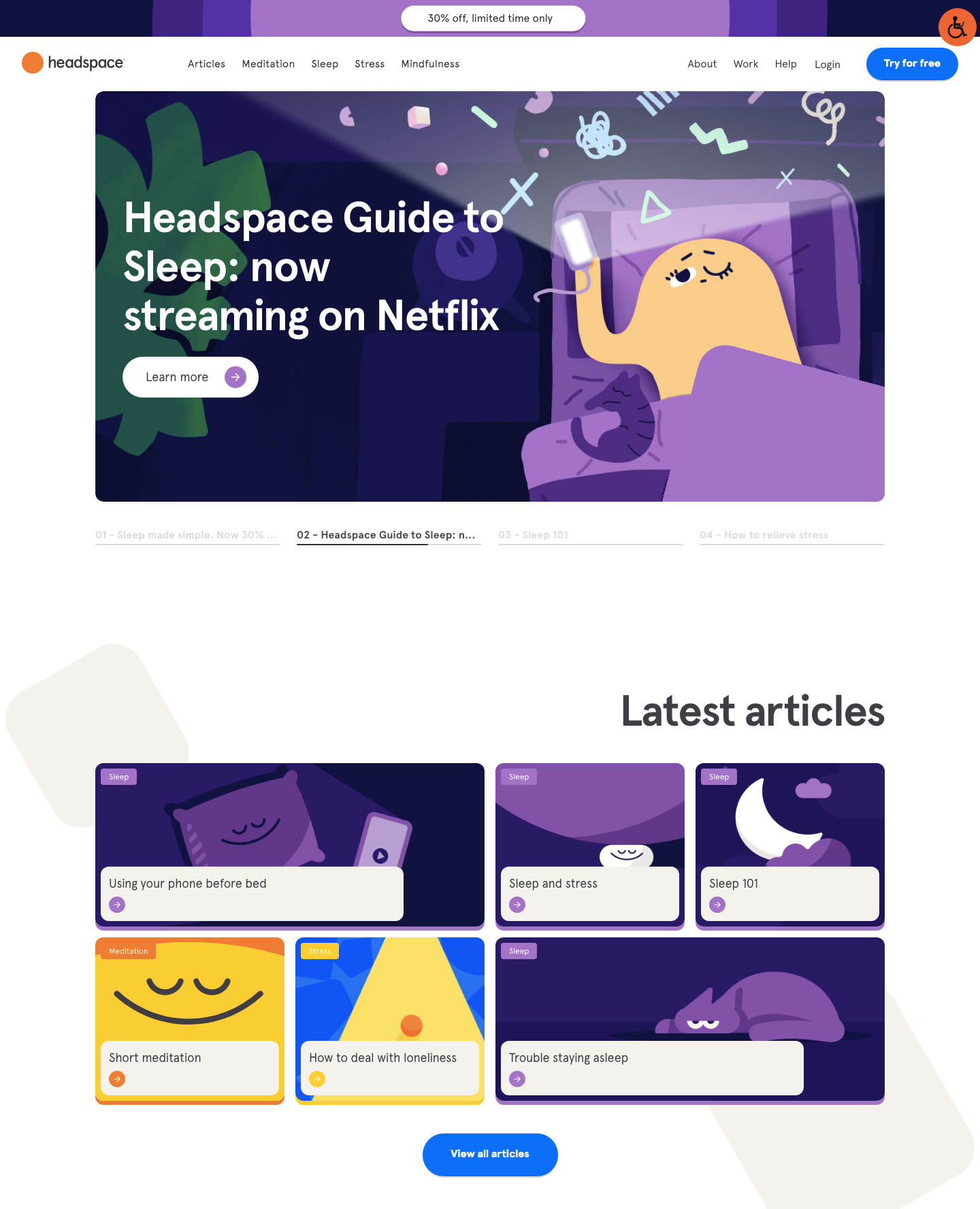
Meditation app Headspace needs to take a less direct path to make sales than many other products or services. Most users will want to try out the app before they buy and others will need more information about the benefits of meditation before they even give it a go.
With this in mind, the Headspace landing page acts more as a portal for users to find out more about meditation, while subtly pointing out the benefits such as improved sleep.
Why it works
- A sticky banner offers a discount for a limited time only, prompting a sense of urgency.
- A button in the main navigation prompts browsers to try the app for free.
- Links to information articles help to educate browsers and build brand confidence.
- Users can preview the meditation tracks directly from the landing page.
- User testimonials, ratings, and the number of downloads provide social proof.
13. Audible
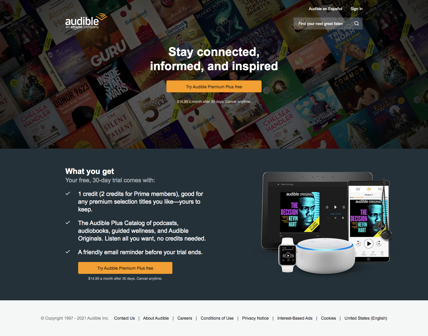
Audiobook service Audible uses a very basic and simple landing page to encourage users to sign up for free. Rather than creating a long page explaining all the features and benefits, the page simply explains the offer and offers a single CTA so there’s no other option but to click or to leave the page
Why it works
- Very simple landing page example with no navigation and only a single exit point
- CTA buttons stand out and make an attractive offer (try the service free for 30 days)
- Image shows that the service can be used on a tablet, phone, smartwatch, or smart speaker.
- Background graphics shows the range of audiobooks that are available.
14. The Princeton Review
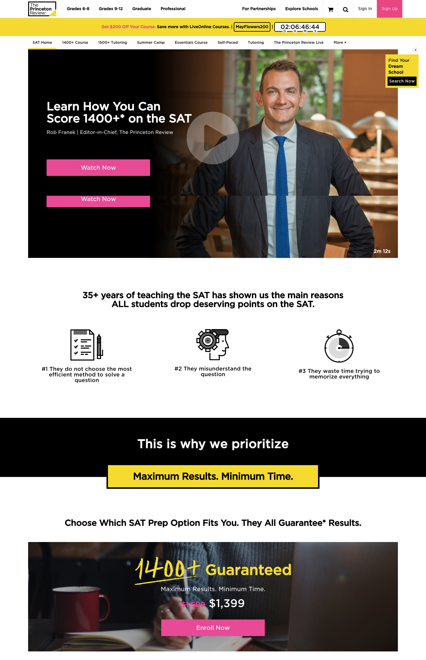
SAT prep is a competitive industry so it’s important for The Princeton Review to capture leads immediately before they leave to browse another site. It does this by introducing a sense of urgency, clearly displaying the different options and prices, and offering live chat with an advisor.
Why it works
- A sticky countdown timer with a discount code introduces a sense of urgency.
- Chatbot answers frequently asked questions or allows a browser to talk directly with a customer service advisor.
- Video explains the service and its benefits in a compelling way.
- Guaranteed results displayed prominently.
- All package features and prices are clearly displayed so there are multiple options with the most popular option (mid-price) highlighted.
- Several customer reviews and star ratings demonstrate social proof.
- FAQs and further information on the page mean that there’s no need to browse around the site to find the information you need.
15. Argaux
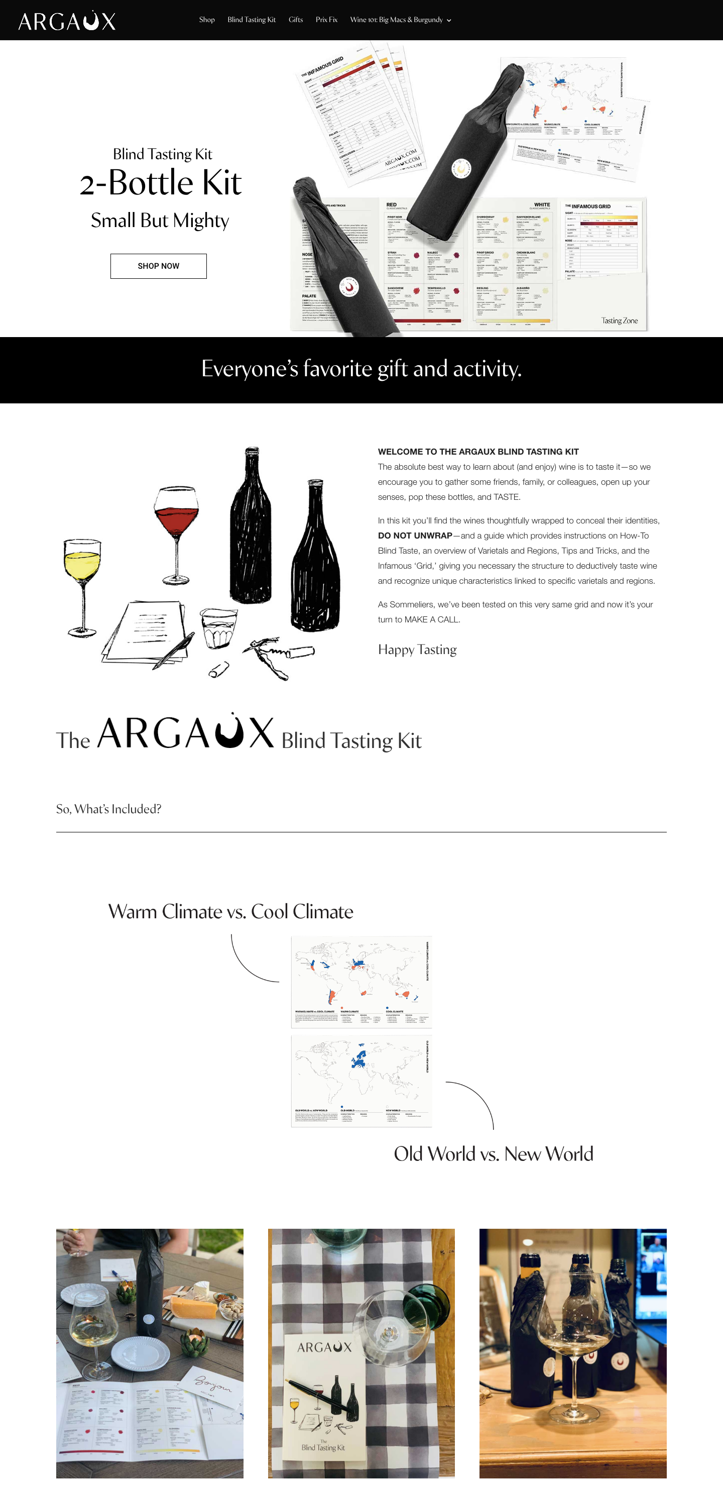
Argaux is a blind wine tasting kit that markets itself as a fun gift or activity for couples. The landing page explains the concept and what’s included, with links to the different product options available.
Why it works
- Clear product image with a link directly to the shop above the fold
- Animated visual showing what’s included.
- Instagram pictures from customers provide social proof and also make the product more appealing.
- Logos of high-profile media mentions help to improve brand trust.
- A full-screen video shows the product and how it works.
- Direct links to the different package options offer prices for various budgets.
16. WorldRemit
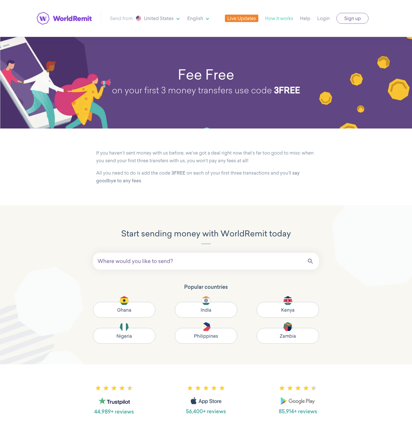
There are dozens of apps that offer international money transfers and users tend to stick with a single service when they’ve found one that works. WorldRemit realizes how important it is to capture potential customers before they start researching other services, so they use this landing page to make the attractive offer of no fees on the first three transfers.
Why it works
- Prominent and attractive offer above the fold
- The form allows users to search for the country they want to send money to. This takes them directly to a page showing rates and fees.
- Displayed high star ratings in various app stores build brand trust and demonstrate social proof.
- Buttons to the two most popular app stores encourage users browsing on their phones to download the app directly.
Ideas to takeaway for your own landing pages
If you’re building your own landing pages, any of these would be a great example to base your design on. You can also use pre-built landing page themes to provide a template to get you started.
Most of these landing pages stick to some basic principles that you should definitely keep in mind:
- Keep it simple – don’t overwhelm the user, present the relevant information in a clear way, and limit navigation options.
- Present your main value statement and CTA above the fold – make it easy for the user to convert
- Work on your copy – landing page copy is an art in itself. Teach yourself the basics of sales copywriting and use clear language in as few words as possible. None of these landing pages include huge paragraphs of text.
- Include social proof – testimonials and ratings are important evidence of the quality of your product and services.
- Continually test and optimize your landing pages – you never know exactly what’s going to work until you try it out so it’s worth experimenting with a few ideas to see what converts.
Make sure to checkout our roundup of the best landing page plugins for WordPress, as these tools can really speed up the process.
A/B testing is also essential to optimize the conversion rate of your landing pages and improve them over time.
Leave a Reply