How to Design with a Monochromatic Color Scheme
Working with colors can be scary. However, it helped me understand different types of color schemes. The more I understand about colors the easier it is for me to work with them naturally. Monochromatic color schemes are fairly common in web design, however they are less widely discussed.
So, I’ve written this post to explain how you can work with a monochromatic color palette. I’ve made sure to include plenty of examples in order to show, not just tell. When speaking about colors and how to use them, it’s important to have something to look at as well.
Let’s get started by understanding what monochromatic color schemes exactly are.
What Is a Monochromatic Color Scheme?
A monochromatic scheme starts with a single hue. Any additional colors used in the palette are variations of that specific hue, either in shades, tints, or tones. The idea here is that there is only one main color in the design, for example only pink or blue, instead of the combination of various colors and hues. The idea of monochromatic color dates back to the time of painters and other types of visual artists. Today, it’s a relevant term for both web and graphic designers.
Its popularity is growing these days, as it provides a more cohesive look for design. A well-executed monochromatic color scheme can be a creative way to express brand identity. It can bring attention to a design when it’s done well. You shouldn’t worry about a monochromatic scheme being boring or limiting.
You’re welcome to use any shade or tint of the color/hue in order to create something invigorating. Using white and black is okay in monochromatic color schemes, as they are not colors. They help you achieve the various tones and shades anyways.
01. Messenger
The landing page of Facebook’s Messenger is a fantastic first example. The design of this website and its various UI elements are monochromatic, using the iconic Messenger blue. As far as web design goes, there aren’t many true monochromatic examples.
Even if a website only uses an orange color and its variations, it will also include shades of grey as well. And, that is already including white and black which most people see as separate colors. Although, grey is usually used for text color, and that’s okay. The buttons and links are blue, while the inputs use a lighter grey for text and border color. That’s completely acceptable as well.
02. DigitalOcean
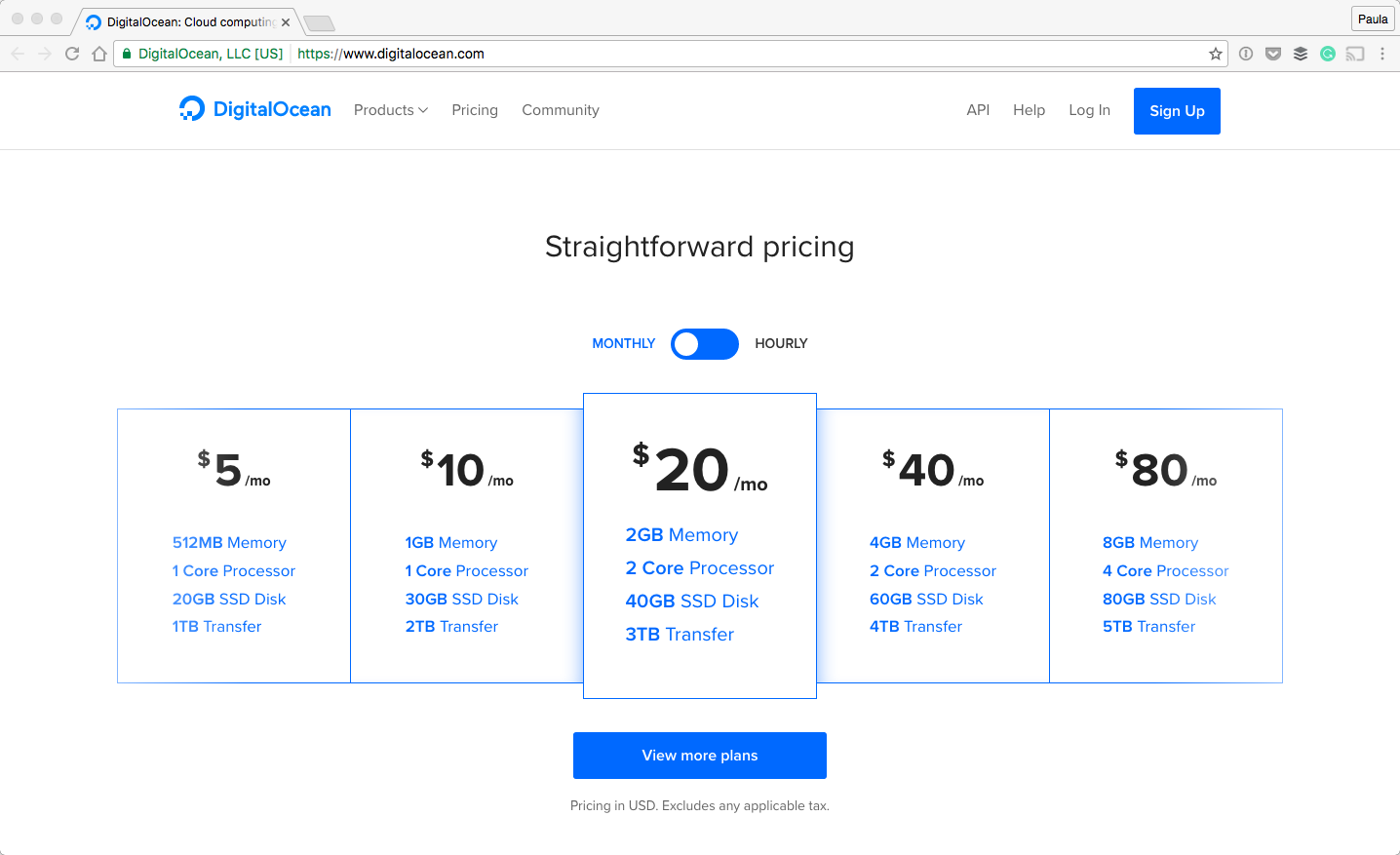
The landing page of DigitalOcean is another great example of monochromatic design. The homepage features a bright blue as the main color, with a few different variations in the graphics throughout the page.
Inputs, buttons and even links are all colored blue. Some text strings in the graphics are blue, too. If I could show only one monochromatic website example it would be this one.
How to choose the right palette?
There are a few steps you need to take to begin to work in monochrome. First, decide on the brand colors. It’s silly to just pick a color on a whim to use in your designs whether the palette is monochromatic or not. If you’re in charge of a redesign involving colors then again, pick what is right for the specific product and brand. Most brands have just that one specific hue that’s tied to the logo and identity of the business. It’s, more often than not, going to be the main focus color on the website as well. That’s the color you need to use.
When designing a complete website, I would urge you to decide if the whole thing needs to be in monochrome. Working with only a monochromatic palette can become frustrating. For instance, how can you make something stand out if everything is the same shade of red or green? Maybe all you need is just a single section to make it more interesting.
03. SendGrid
Another thing to understand about monochromatic palettes is the amount of emphasis you put on the color. Let’s take a look at SendGrid’s website for a moment. When you click through their site, you may not even notice that it’s monochromatic because the emphasis is subtle.
On the pricing page, there is very little blue, except for some key pieces of information such as links and a few buttons. The FAQ section and the footer are also blue and monochromatic. The design calls for a limited amount of color on this website. It just happens to be the same blue color. Here, the monochromatic color palette is not pushed into the user’s face. It’s all up to you how intense you want to make it.
04. WeDo
WeDo is another soft example of a monochromatic color scheme. The website has more shades of grey than it does of blue, its primary color. Either way, you can call this design monochromatic. The web page is not overwhelmed with color at all. The blue is noticeable but it’s not over the top.
The same can be said about the different shades of grey, too. WeDo is a great example of how pleasant and simple a monochromatic website can look.
05. Lookback
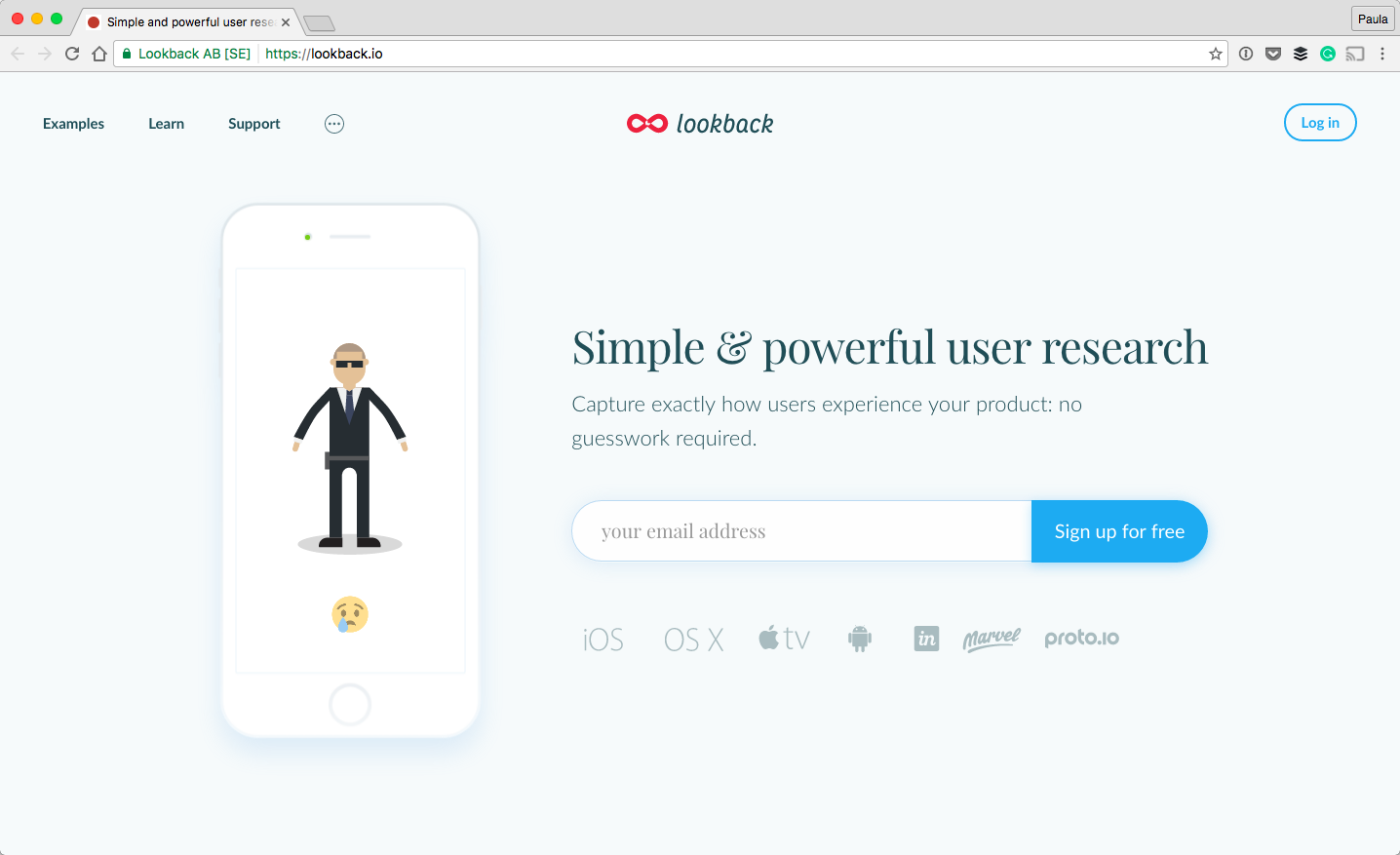
I have found another example of subtle but much more monochromatic colors. Although not all of lookback’s website is true monochrome, we can still examine the homepage’s header. The background here is light blue. The input has a blue border that’s also the color of the CTA button. Both the email signup button and the iPhone image have a slight blue shadow, too.
Even the text is a darker shade of blue, actually. The icons below the email capture use a blue shade as well. This is the most monochromatic example yet, even if the graphics inside the iPhone image are of other colors. Like I’ve said, there is always a color balance you can bring to a design whether it’s with a monochromatic color scheme or not.
Faux Monochrome Color Schemes
A big concern about using monochrome is that if everything is a shade of the same color, it’s hard to make something stand out. It can be a struggle, I agree. That’s why you often see faux monochrome designs. Lookback’s homepage isn’t just made up of blue but there is also a pink button further down, without mentioning the graphics and photos.
I wouldn’t call these color schemes monochromatic if they use more than one color. But, there is nothing wrong with using a monochromatic color scheme as your starting point or incorporating it as a major element of the overall design. Let’s talk about three different examples of this approach to give you a better idea.
06. Simple
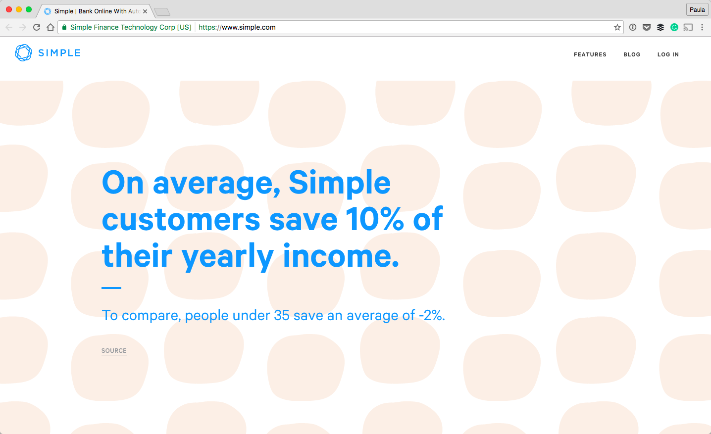
The first example is Simple. The website is mainly blue, white, and grey. The colors are great, and their use is also very interesting, at least on the homepage. Sometimes the headings are blue, sometimes they are dark grey. It’s fun that the design mixes it up.
Another thing the design mixes up are the colors. Sometimes there is a very light beige background pattern behind a section. The pattern also varies, which is a constant theme of this design style. But, the important thing is that the pattern is not blue but beige. Although the majority of the homepage is, in fact, monochromatic, the beige pattern breaks this color scheme.
07. UXPin
The second example is a landing page for UXPin. Their landing page is very similar to the other designs in this article. But those have used full colored logos and photos and also a few different colors in their graphics such as green, brown, and yellow.
The landing page is mostly filled with black and blue. I think designers here wanted to keep blue as the main color and keep the design monochromatic as far as they could take it. Again, it’s perfectly fine to do so and add the color variations as needed.
08. Vero
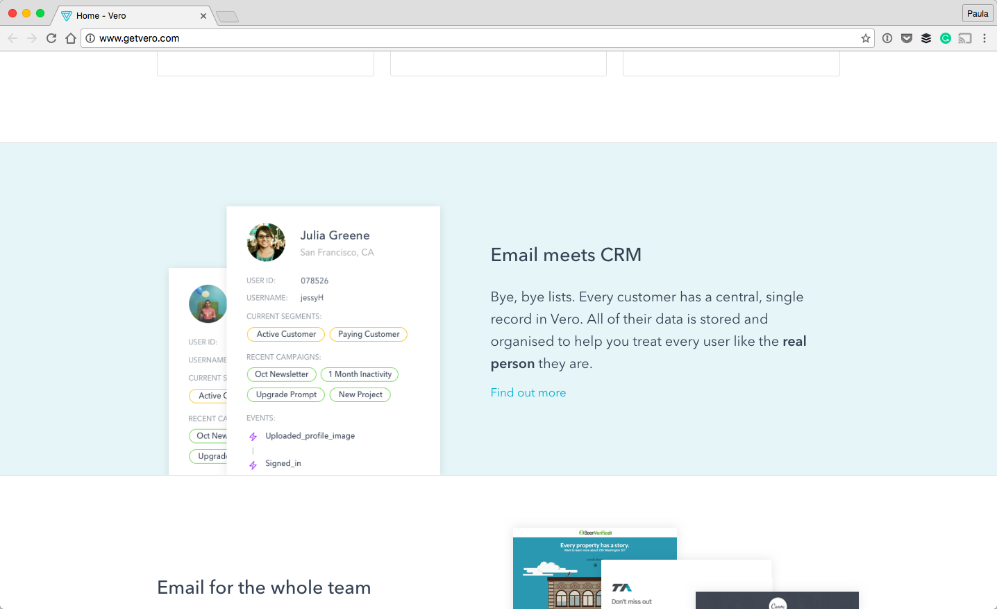
The last example here is the homepage of Vero. Most of the site uses the same teal shade of blue. Most of the sections have a specific color scheme. The one you can see on the screenshot has a light blue background and a blue link color. Yet, in the accompanying image, there is a small hint of yellow, green, and purple as well.
This kind of color pattern is true of a lot of sections here. Even the hero section uses it. It’s mostly blue until it needs another color. Vero’s website is a good example of starting with a monochromatic color scheme and adding other colors to it in order to better the overall design.
Do you like the way monochromatic color schemes look in web design? Would you now consider using it in your own designs?







The colour palette gives us scope of selecting a variety of colors as per our requirement. In order to make our website look more attractive we need to use appropriate colors. Here this palette comes in handy.