Pair Colors Like a Pro in Your Next Project: Tips and Examples
One of the most important decisions you will make in a design project is picking a color palette. Website color choices give users a lot of information about your content and can set the tone for an entire project. The best color palettes are engaging, create a sense of balanced harmony and are an extension of the message you are trying to convey.
But how do you do it? How do you create the perfect color palette? Where do you start?
Here, we’re going to look at a few ways that you can combine colors like a pro – even if you aren’t that comfortable with creating palettes – with plenty of great examples as a source of design inspiration.
Color Theory 101
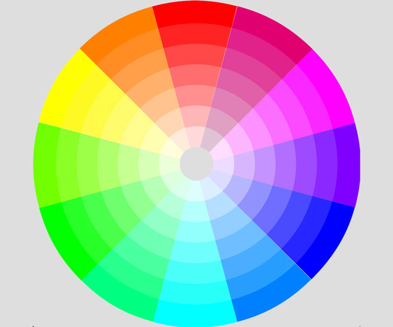
Great color palettes start with a solid foundation in color theory. If you have a good idea of how a color wheel works, then you shouldn’t struggle with pairing colors. (You’ll even feel like a pro when you talk about why you made certain choices.)
The color wheel is a giant circle divided into three groupings of equally spaced color.
- Primary colors: Red, yellow and blue (all colors can be made using combinations of these colors)
- Secondary colors: Green, orange and purple (made by mixing two primary colors)
- Tertiary colors: Yellow-orange, red-orange, red-purple, blue-purple, blue-green and yellow-green (made by mixing a primary and secondary color)
Every color combination can be pinpointed and found on the color wheel. The relationships between colors determines how well colors should (or should not) work together. Break the wheel down further by adding tints and tones so that more colors than you can imagine a represented in a single image. (This is why most color picking tools use a giant circle. It’s a variation of the color wheel!)
- Complementary colors: Pick your favorite color on the wheel and pair it with the color in the opposite position. This pairing creates immediate contrast and a high level of vibrancy.
- Split-complementary colors: This variation on the complementary scheme is one of the most popular options. Start with a color on the wheel, then choose colors on both sides of the complementary color (but not that hue itself). This scheme gives you a little more flexibility with color choices and is a little softer than a straight complementary combination.
- Monotone colors: Choose one color and associated tints and tones. Monotone color schemes can be easy to create as long as you remember to include enough contrast between tints and tones. (And you know the colors will always match!)
- Analogous colors: Similar to the monotone concept, an analogous scheme is made of colors that are clustered on the color wheel. The result is often a three-color palette with a quite calming feel to it. This type of palette will not have a lot of contrast and should be used with that in mind.
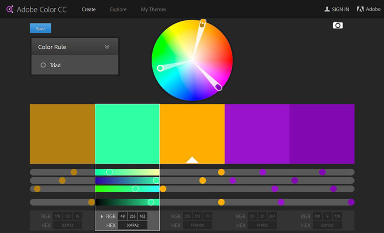
- Triadic colors: If you are looking for excellent color balance, this is the way to go. Pick three equidistant colors on the wheel.
- Tetradic colors: Select two pairs of complementary colors two spaces apart on the color wheel. This is as difficult as it sounds and can be one of the toughest color scheme styles to create. The result can be stunning for large projects, but you have to take special care when working with so many colors to ensure that the visuals don’t overwhelm users.
After you decide on a color scheme, consider mixing and matching tints, tones and saturation to create a distinct feel. The color wheel is a place to start. But if you just pick from the 12-color wheel, you are likely to find the palette is overwhelming and “too colorful.”
Color Meanings in a Nutshell
When it comes to color, every hue has associations and meanings that are hard to avoid. Most colors have a few positive and negative meanings that are amplified by surrounding content.
- Red: Passion, love, energy, anger
- Orange: Wealth, youth, attention, health
- Yellow: Cheer, optimism, attention, caution
- Green: Nature, envy, balance, calm
- Blue: Trust, stability, faith, power
- Purple: Mysterious, power, arrogant, luxury
Stick to Two or Three Colors
A great color palette has only a handful of colors. Too many colors can overwhelm the user and a single color design can appear bland. The balance is somewhere in the middle.
If you are building a website for an established brand, the color palette is likely part of the scope of the project. (You’ll get a guide with precise color mixes and usage.) That makes it easy. It’s also a great learning tool because you can figure out how the colors interact without the stress of having to pair them yourself.
If you are creating a color palette from scratch, the best idea is to start with a blank canvas. Interior and fashion designers use the 60-30-10 rule for creating color schemes and it works for web design as well. Color in the design (white and neutral backgrounds are the exception) can be divided into three parts:
- Primary color: 60 percent of the color in the design
- Secondary color: 30 percent of the color in the design
- Accent color: 10 percent of the color in the design
Take Care with Contrast
This might be the most important color tip you ever get: Color pairs must contrast adequately if you want to read them. This includes reading text and other visual information on the screen.
There’s a reason that dark on light or light on dark color choices are so common. They are exceptionally readable.
Just think about trying to read hot pink text on a red background. The idea alone should make you cringe. Determining color contrast starts with the eyeball test – does it look good? Is it readable at different sizes and from a distance?
If you still aren’t sure about the color choices, consider using a tool to test contrast levels. (Try Contrast Ratio. The free tool lets you select color pairs and see how they work together on screen before you commit.)
If you like your basic colors, but the contrast is off, consider tweaking the saturation just a bit. A color palette with different saturations, vibrancy and tints and tones is a lot easier on the eye than just pulling options right off the color wheel.
Consider Tints and Tones
Tints and tones are the variance that every color palette needs.
- Tint: The addition of white to any color to make it lighter (common).
- Tone: The addition of gray to any color to make it richer (very common).
- Shade: The addition of pure black to any color to make it darker (less common).
Tinting, toning and shading impact color saturation and value. What’s more important to you is that these color variations can help you expand a palette. In addition to the two or three colors you select, set two or three tint or tone values for each color to have a range of options. Now you have a color palette with plenty of choices that blend beautifully.
Pick a Color Concept
This is the fun part. Pick a color concept.
Is your style fun a bright? Monotone? Dark and mysterious? There are so many different styles and concepts when it comes to thinking about color. The first step to picking the perfect color combinations is figuring out that style.
The best way to do it is to peruse plenty of other websites. Keep a list of the ones that jump out in your mind immediately. What do they have in common when it comes to color?
“Steal” From a Photo
Is there an image that defines your website? Steal a swatch of color from it as the basis for your color palette and build around it.
There’s nothing like a great photo for color inspiration. The added bonus is that your website imagery and color choices will have instant harmony and cohesion.
When building a color palette from an image, be careful not to match colors too much.
Only select one color from the image and choose secondary or accent colors that don’t match the photo. This method will give you a visual connect but will help create enough variance and contrast to remain interesting. You don’t want the imagery and website elements to blend too much. Just as you need to create contrast between colors, ample contrast between elements is also necessary.
Think About Trends
An uber-trendy color palette is the quickest way to date a project. If you have the flexibility to change colors often, trends are a good place to start. If not, pick one trendy color as an accent hue and build a palette around it.
Today’s color trends are bold, saturated colors. Many are inspired from flat and material design concepts. Bright blues, greens, pinks and purples can add a modern flair to a project.
Need help finding an on-trend color? Try one of these tools:
Thinking about color from this backward perspective can give you a new outlook on how colors work together and how to use them effectively. This technique can be a little tricky for those who haven’t created a color palette before and isn’t recommended for beginners.
What’s particularly nice about adding a trendy color to your palette is that you can use this idea to freshen up an older color scheme without a complete overhaul. Many brands are able to successfully change accent color options without disrupting visual flow or identity. This is a great tool if you are in need of a change.
Try a Color Scheme Tool
Now that you have color on the brain and have an idea of the hues you want to use, how do you find the perfect color mix? A color palette tool is a great place to start. Each of the tools below is free to use and will help you refine your choices. You’ll see how colors interact and get color mixes that you can use in projects. Have fun!
- Adobe Color: Use a giant color wheel and color theory to create a palette. Adobe subscribers can save and connect palettes to other software tools.
- Coolors.co: Generate a color scheme from images or using the fun random generator. Every color comes in an exportable format.
- Color Palette Generator: Upload your favorite image and extract a color palette.
- CSS Drive: Perfect for web designers, this tool allows you to create a color palette and export a CSS stylesheet or Adobe Photoshop swatch file.
- Palette Generator: Upload a series of photos and this tool will use a special algorithm to cluster pixels by color and pull dominant colors in the groupings.






Leave a Reply