10 Stunning Foolproof Font Pairings to Inspire Your Next Design Project
Font pairing is hard to get right. Finding two typefaces that harmonize without looking samey, yet don’t look awkward together or fight for attention, is a fine art. It’s also one of the most frustrating and time-consuming tasks designers face when starting a new typography-driven project.
When you get font pairings right, it makes a website look much more dynamic and visually effective, ultimately, improving its ability to convert. Get it wrong and your words look messy and amateur.
Here, I’ve put together sure-fire tips to make font pairing less of a headache, 10 stunning examples of pairings to inspire you, and a brief list of resources you can bookmark for the next time you’re searching for ideas.
Tips for Pairing Fonts
There are a few golden rules to keep in mind when searching for the perfect font combination.
1. Pair Contrasting Typefaces
When pairing fonts, you want to contrast and complement, but never conflict. This means pairing different fonts that work together in harmony, with neither stealing the limelight.
A classic pairing you’ll often see is a serif font with sans-serif font. It’s not unusual to see sans-serif fonts used for titles and serif fonts for body text. This pairing works because of their strong contrast.
Serif fonts are a little old-fashioned and traditional in how they look with their strokes at the edge of letters. By contrast, sans-serif fonts are modern with clean lines.
When done right, contrasting fonts that are boldly different in style can bring out the best in each other, creating a rich visual diversity.
Typefaces will generally clash if they are too similar. For example, two sans-serif fonts that are only subtly different.
2. Use Font Super Families
A sure-fire way to guarantee that two fonts will look great together is to use different fonts from the same typeface family.
So-called “superfamilies” offer a collection of different weights, styles, and classifications that are specifically designed to work together. The result is a mix of sans and sans-serif styles, which all have a similar appearance and complementary humanist design.
A popular example is the Lucida superfamily, which includes Lucida Sans, Lucida Serif, Lucida Typewriter Sans, Lucida Typewriter Serif and Lucida Math, all of which comes in regular, italic and bold.
3. Establish a Hierarchy
It’s important to set a clear and consistent hierarchy for your fonts. This means one font will be more prominent than the other.
The easiest way to achieve this is by varying the size, weight, and even color of your fonts. For example, using 45pt Montserrat for your headings and 16px Courier New for your body text.
The important thing is to use font sizes consistently so readers can quickly distinguish a heading or sub-heading from body text.
4. Consider the “Mood” of Your Project
Before diving in and choosing two fonts you like, think about the “mood” of your project and the overall look and feel you want to achieve.
If you’re designing a website for a wedding photographer, fancy fonts with flourishes would work. But if you’re creating a site for an insurance company or a law firm, you’ll want to look at fonts that are strong and give off a more dependable feel.
10 Font Combinations That Just Work
As designer Jeremiah Shoaf says on his fantastic typography site Typewolf:
“Seeing type samples set in ‘the quick brown fox jumps over the lazy dog’ isn’t very useful when it comes to web design—seeing how real type performs on actual websites is much more helpful.”
With that in mind, let’s take a look at 10 examples of font pairings in the wild.
1. Caslon & P22 Underground
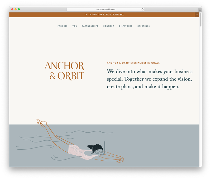
The Anchor & Orbit website pairs two very different typefaces with fascinating typographical backstories.
P22 Underground has been used for the site’s small sub-headings. This font is an adaption of Johnston, Edward Johnston’s famous typeface used in the London Underground, and originally designed in 1916. This modern version, designed by P22 Type Foundry, includes a variety of cuts including small caps, petite caps, and titling versions, all available in a full range of weights.
The body text uses Adobe Caslon Pro, a modern version of Caslon, an old-style serif typeface. It was originally designed by Willian Caslon in 1722 and used for the Declaration of Independence.
I think it’s wonderful that both Caslon and Johnston, with their rich histories in print, continue to be popular online.
Paired together, these typefaces complement each other beautifully in this classic serif + sans-serif combination.
2. Stepp & Avenir
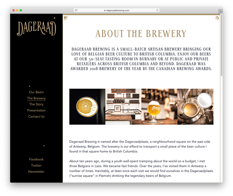
Dageraad Brewery’s website evokes old-world charm with its use of Stepp, a tall Art Deco typeface. Designed relatively recently in 2005, Stepp is the perfect typeface for this site—its helps underpin the brewery’s focus on beers crafted in the Belgian tradition.
Here, Stepp has been used in all-caps, which in any other case might run the risk of coming across as “shouty” to readers. But with some slight letter spacing, it perfectly complements the artisan message of the text.
Meanwhile, Avenir plays its supporting role well, keeping things simple for the body text. Released in 1988, Avenir is a geometric sans-serif typeface designed by legendary type designer Adrian Frutiger. It was modeled after Futura (Avenir is the French word for “future”) but has some slightly humanist features that add warmth, such as the tail on the “t.”
Avenir is inviting and easy to read. It’s the perfect partner in its simplicity here, helping to counteract some of Stepp’s flair.
3. Freight & Calibre
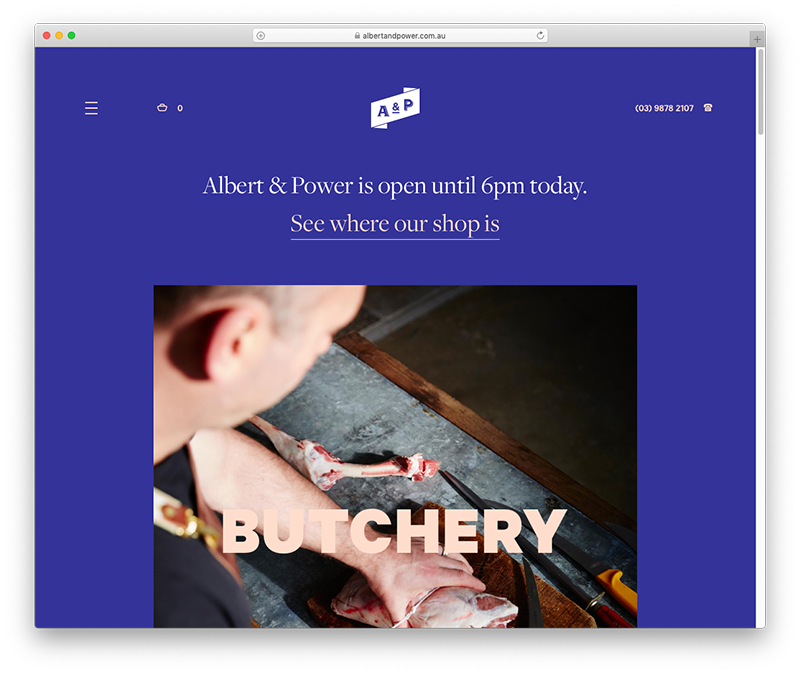
Have you ever seen a more beautifully designed butcher’s website? Albert & Power pairs two bold fonts with wonderful harmony, using Calibre Black for its big headings and variations of Freight for its sub-headings and body text.
Calibre is a neo-grotesque san serif typeface designed in 2011. Here, it makes a big impact with its fat lettering and pale pink color. Interestingly, Calibre was designed alongside Metric and the two typefaces can be used almost interchangeably as they have similar letterforms.
Freight, meanwhile, is an extremely versatile superfamily that includes Freight Sans, Freight Neo, Freight Display and Freight Big. The Albert & Power website uses a Freight Display Pro for its larger sub-headings and Freight Text Pro for its body text, which contribute to the site’s warm, trusting and modern design.
4. Neuzeit & Miller
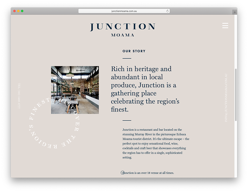
Junction Moama’s website exudes warmth and elegance while still feeling down to earth, thanks in large part to its beautiful typography.
This classic serif + sans-serif pairing uses Neuzeit and Miller, two fonts with rich histories. Neuzeit is a geometic sans-serif typeface originally released in 1928, and designed to be timeless with no distinguishing characteristics.
Is Neuzeit plain? Far from it. When paired with a serif, as in this example, it provides an understated simplicity that is perfect for a wide variety of uses.
Miller is a transitional serif typeface family designed and released in 1997. It’s considered a Scotch Roman design—a style that originated in Scotland that was popular during the nineteenth century. Transitional typefaces are fonts that were designed in between the old style and modern typography eras.
If Miller looks familiar, it’s because its used in numerous U.S. newspapers. Paired with Neuzeit, these two fonts have real chemistry, making the text readable and inviting.
5. Harriet & Tablet Gothic
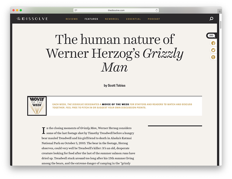
The Dissolve site, which features movie news and reviews, uses two very compatible fonts: Harriet and Tablet Gothic.
Harriet has been used for headings and the body text, using different weights and sizes to establish a simple but effective hierarchy. Released in 2012, Harriet’s design drew inspiration from both transitional serifs like Baskerville and modern serifs like Century. These influences make it both easy to read and give it a pleasant, nostalgic feeling.
Harriet plays well with Tablet Gothic, a grotesque typeface that has some unique characteristics for the gothic genre, such as the bars on uppercase “I,” which you can see in the image above, unfortunately as the text is all-caps.
Font combinations using an old style serif and a grotesque san serif are a safe bet and work exceptionally well in news and digital publishing contexts.
6. Baskerville & Univers
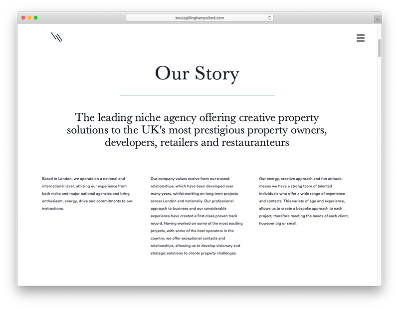
In this transitional serif and neo-grotesque pairing, property firm Bruce Gillingham Pollard uses Baskerville and Univers to instill its corporate site with a warm yet trustworthy feel.
Baskerville was designed by John Baskerville way back in 1757. The design was intended to improve the legibility of the old style typefaces of William Caslon.
Meanwhile, Univers is a popular typeface released in 1957, the same year as another famous neo-grotesque typeface—Helvetica. Univers is somewhat similar to Helvetica as both were based on the 1896 typeface Akzidenz Grotesk.
Together, these fonts carry a modern sense of minimalism with little effort.
7. Johnston & Caslon
Johnston (in a different interpretation) and Caslon reappear in this list in a very modern design for these two old-school typefaces.
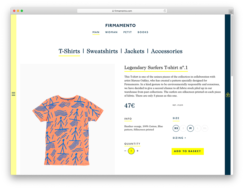
Here on the Firmamento site, Johnston has been used in all-caps for sub-headings and Caslon has been employed for all else.
As I mentioned earlier, Johnston is famous for its use in the London Underground and offers an easy simplicity in this example of an ecommerce product page.
Caslon complements Johnston nicely in this context. In fact, it’s rarely inappropriate to use this typeface, so much so that for many years a common rule of thumb amongst printers and typesetters was, “When in doubt, use Caslon.”
Caslon offers an old-world feel that it nicely offset by Johnston in this instance. Together, these fonts bring a classic, modern minimalism.
8. Brewery & Regular
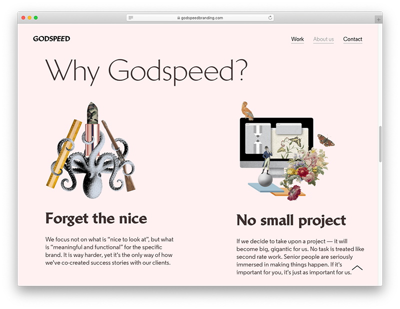
Usually, when pairing typefaces, it pays to keep things simple and follow well-established rules, such as combining a san serif with a serif. Here, Godspeed kicks the rules to the curb, instead opting to pair two sans-serifs. And I must admit, it works rather beautifully.
Brewery looks like a sans-serif at small sizes, but the design actually features tiny serifs that become noticeable only at larger sizes. It’s used for headings in this example, so you can make out the serif details, especially on the “g” and “j.
Regular, a geometric typeface, has been used for the body text. Together, these fonts bring a modern and quirky feel to the Godspeed site.
9. Anton & Work Sans
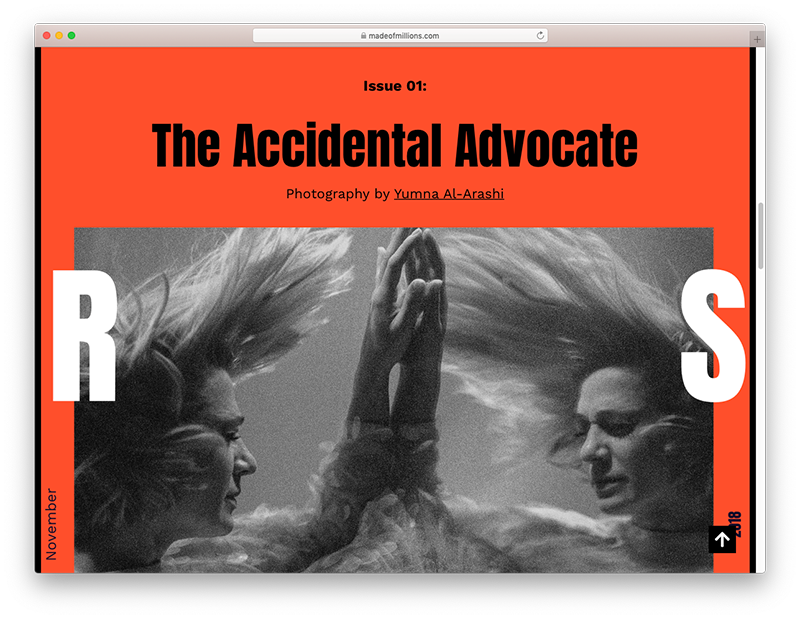
Combining two typefaces that are both sans-serif can often cause a clash of styles due to typeface similarity, but in this example, Anton and Work Sans are so different that there’s no conflict at all.
Anton features an extremely tall x-height, heavy strokes, and condensed proportions. Used on the Made of Millions site, it really makes an impact.
Meanwhile, Work Sans counteracts Anton’s brashness with its simple lettering. Together, these Google fonts create quite a unique design that would only be appropriate for certain brands.
10. Windsor and Danzza
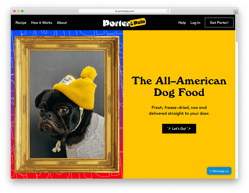
This is easily the quirkiest dog food site I’ve ever seen! It’s not just the colors that make this site fun—the typography also lends itself to 1790s nostalgia.
Windsor has been used here on the Porter & Pals site for the Headings. Designed in the early twentieth century, is features distinctly angled stems on the letters a, m, and h. This typeface was popular in the 1970s and continues to strongly evoke that period of time.
Counteracting Windsor is Danzza, a typeface that mixes geometric letterforms with a grotesque influence. It’s best read as larger sizes, and has been used in this example perfectly.
Conclusion
Pairing fonts can be a challenge, but if you follow this tips in this post and take note of the examples I’ve shared, you should have no trouble at all creating stunning combinations.
If you find yourself stuck when starting a new design project and need further inspiration, check out Design Bombs’ collection of fonts to try in your next design, and bookmark Typewolf and FontPair. Both of these typography sites features hundreds of examples of pairings to help get your creative juices flowing.
Do you get frustrated trying to find the perfect fonts? What resources have helped you with typography? Let us know in the comments below!


Great font pair ideas!!