20 Websites with Typography-Driven Design
I love typography as a design element. It can make a huge impact on design when it’s used as a focal point. I want to share with you an amazing list of 17 websites that know what they are doing when it comes to online typography.
There are so many things you can do to create a bold and eye-catching design. Let’s see what these designs did to stand out from the crowd!
01. Andre do Amaral
While scrolling down the homepage and Work page of Andre do Amaral’s portfolio I was blown away by its minimalistic nature and boldness. The case studies sections are only made up of a big photo, a giant headline, and the year of the projects.
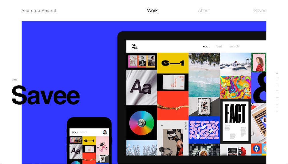
The juxtaposition of the client’s name and the year looks fantastic. Not only that the two texts are different in size and font-weight but also in font type. The year uses a serif typeface while the name uses sans-serif.
02. Aiaiai
Based on the hero alone, I don’t think it’s obvious you’re looking at a headphone eCommerce website. That hero is bold, it’s vibrant it’s not a typical online store hero. The overall presentation of this site modern and edgy. It actually looks like an ultra-modern editorial design.
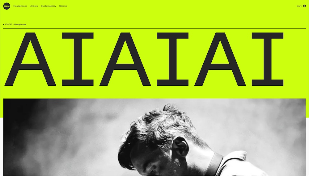
Although the typography on this site isn’t large throughout. Instead, it’s neat and well organized. Thanks to this, in the few areas where the typography is large, it stands out and grabs your attention. typography doesn’t have to be flashy in order to dominate a design. Regular sized texts as just as important as the large ones.
03. Adoratorio
The black-and-white portfolio of the Adoratorio Collective has a distinctive look. I like that they’ve tried to do something with the color only present in the photographs/screenshots; it’s not something that’s easy to do well.
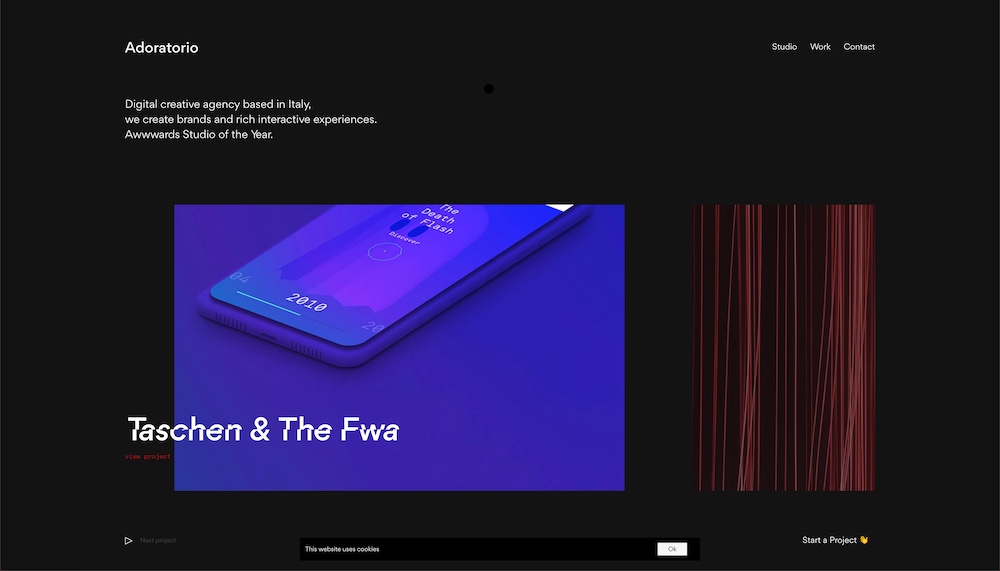
The animations on the portfolio pieces on the homapge is a really cool touch. Not only do animation add further personality to a web page, this one particularly gives the studio an edgy vibe which is important for tech oriented companies.
04. Pest Stop Boys
I can honestly say, I’ve never encountered such a vibrant and fun website for a pest control company. Bravo for standing out and having such a different branding that’s more or less unheard of in their industry.
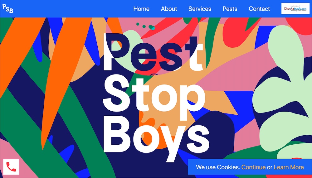
The Pest Stop Boy’s website uses so many great colors as both backgrounds and texts. The typography is large as are the background patterns, and the animated roaches. Their services and contact info is hard to miss thanks to their great use of typography. It looks so cool! This is a website that makes a statement and one that makes you stand out among the competition for miles on end.
05. Piet Oudolf
Here you can see a highly creative design. Piet Oudolf designs gardens around the world and to show his work off he uses larger and slightly bolded typography with names of the locations he has worked on.
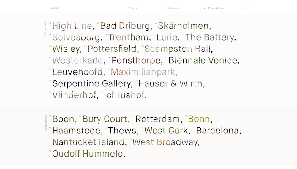
Furthermore, each location’s name is filled with a photo of the same location. It’s a clever way to display one’s work. The photographs used as background for the text is very creative in my opinion because they show the gardens while keeping the focus on the text.
06. Ginventory
What we have here is a landing page for a mobile app that helps you find the perfect gin drink. The typography used both in the app and on the landing page is fantastic.
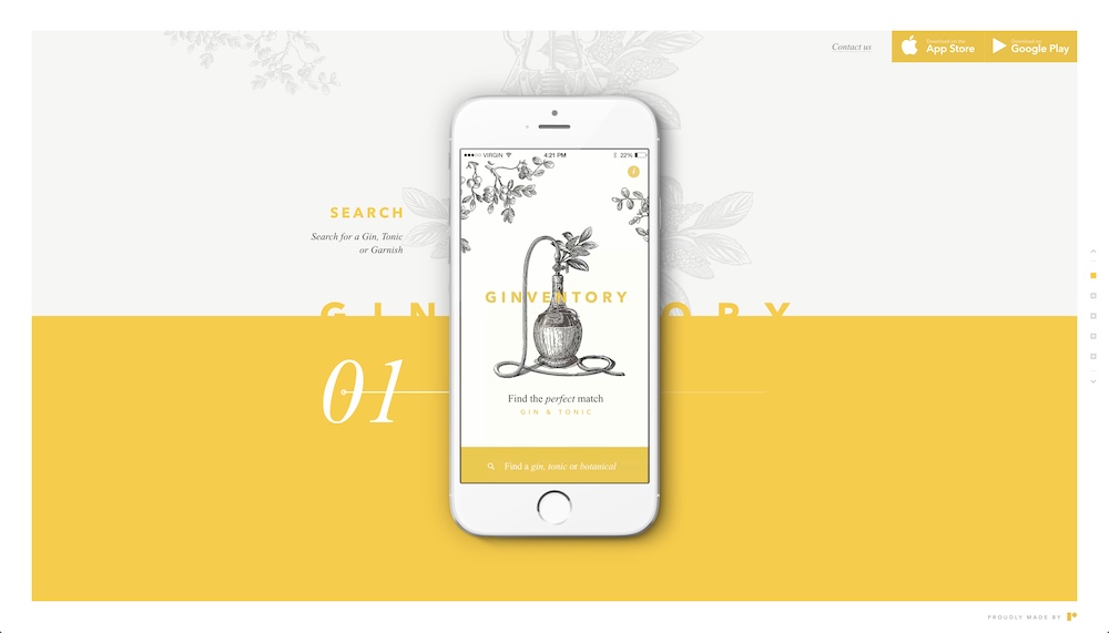
There is actually a lot going on with the typography of the landing page. You have four different colors, about five different font styles, and two different typefaces. It’s usually a bad idea to have so much variation but it’s well executed here. The different texts feel harmonious on this page as if they belong. That’s some really good design.
07. Nurture Digital
This website knows what they are doing when it comes to typography. The big and bold letters on the left-hand side are animated and tailored to each portfolio piece. That means that each new case study you preview on the homepage comes with its own letter design, animation, and even color scheme.
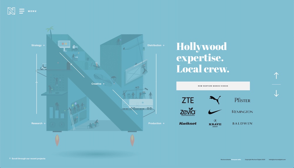
Moreover, the page has many elements surrounding it, yet it’s easily digestible. The short copy of the projects doesn’t get lost. Of course, typography is very important in the design of this homepage. Yet, it’s not overwhelming as it balances all the other elements and needs of the design well.
08. Filip Nordin
We have a lot of portfolios in this collection, as you may have noticed. Filip Nordin’s portfolio doesn’t disappoint. The typography is well-placed and the white text on the black background makes a huge impact. The font choice is clean, simple, and the sans-serif typeface works really well.
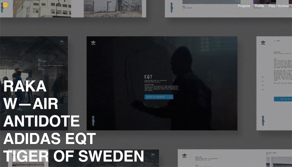
Great typography doesn’t have to overtake the design of a page in order to be good. It simply has to work well with the remaining elements such as whitespace, colors, or layout. In the case of Nordin’s portfolio, that’s exactly the case as you continue to explore his site further.
09. Matt Steel
Matt Steel’s website is gorgeous. The use of color, space, and typography is spot on. Besides maybe this list, you don’t often see larger texts too often. Nor do you encounter colored text on a colored background.
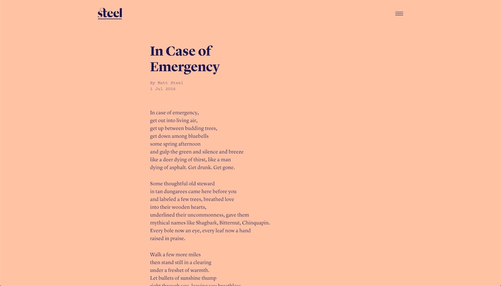
The navy blue looks absolutely fantastic alongside the pink, and vice versa. You can really see that the fonts are not back thanks to their size and thickness. Additionally, Steel did a great job with the site’s layout that allows him to highlight different typography elements to better tell his professional story.
10. Kite Festival
Kite Festival is a new kind of festival that focuses on combining music and ideas. Their website has an awesome color scheme. First, it’s obvious that they rely on the complementary colors of blue and orange. But, they’re also leveraging the contrast of black and white too.
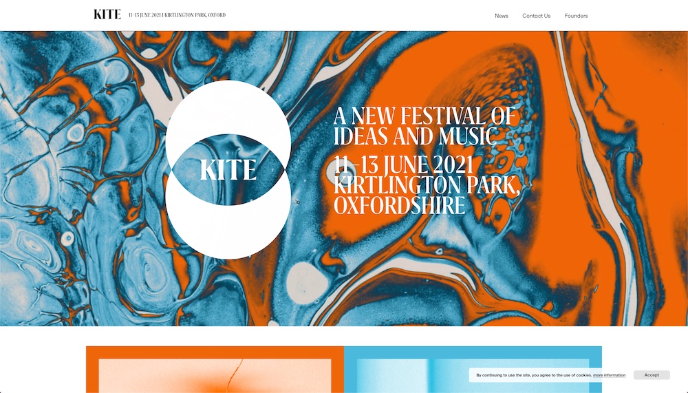
Without such a well-defined color scheme, their typography might not be as strong because this contrast allows the large text to stand out. Additionally, the chosen Grifito font face has a specific look to it that helps embrace and even radiates the Kite Festival’s creative energy.
11. SFCD
I’m a very big fan of the attention to detail this web page has for typography. As you scroll down, you can see a few apps that the SFCD agency has done.
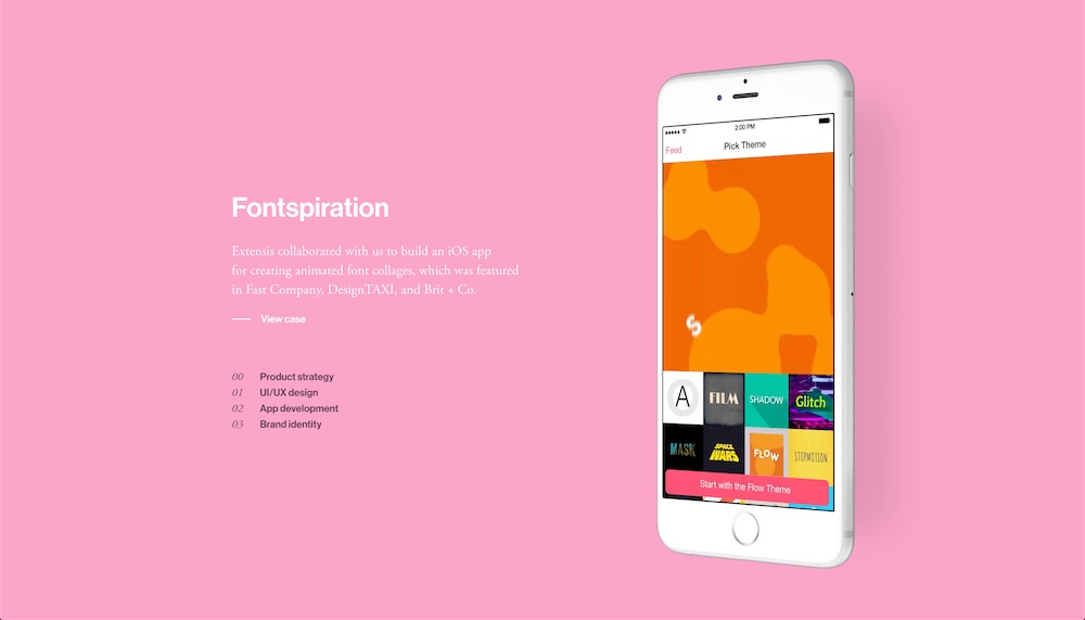
The combination of white and black, big and small, italics and regular is beautiful. The balance here is struck well. This is mostly because there is not a lot of copy on the page. The text area is pretty small, so they can get away with breaking the rules and having five different text styles. It’s also good that they repeat this diverse styling in each case study to keep the design consistent.
12. Wonderland
Here we have another fantastic example of how typography can be a design’s great statement piece. Wonderland’s site is elegant. As you scroll through this creative website, you’ll experience various colorful shapes as backgrounds and their smooth animations.
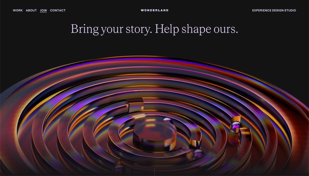
This was a well-thought-out site with an amazing dark color scheme, spacing, animation, and typography. In each section, it’s clear what a user is supposed to read and take away. Teodore and Dazzed are the two main typefaces and they work exceptionally well together.
13. Sonder
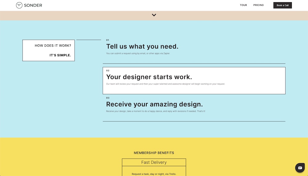
Soner has a color website with ample whitesapce and well picked typography. The reason I say this is because a different typeface wouldn’t work as well with their visual design style nor would the text look good without the color scheme and decorative elements such as the boarder boxes or diver lines.
14. Italic Type
Although by now many of the examples on this list share similar design treatments such as large but thin serif fonts, I do enjoy the different variations this kind of typography element can take with various design styles. Italic Type has a few different sections on their homepage but the thing that strikes me the most are the white sections with black text such as the one right below their homepage hero.
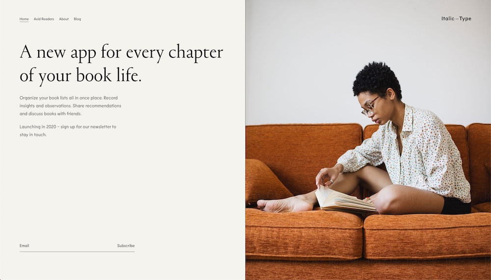
The light and gray-ish highlights under certain words is a lovely touch. It helps pull the eye of the visitor even further. Additionally, this design seems to have a lot of fun with typography as other sections use outline text or an hand-drawn style underline.
15. Next Rembrandt
Next Rembrandt is an incredible project by ING and Microsoft. They analyzed hundreds of Rembrandt paintings in order to create a new one. The site is all about the final piece and the creation process. And, let me tell you the typography is stunning. It’s well-done for the small amount of text that is present.
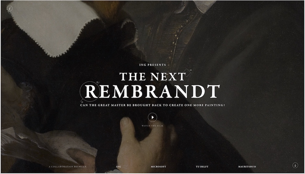
The small amount of text has also been a smart decision because it lets the background and the paintings be the main focal point, while the text plays a supporting role.
16. Studio Rotate
Studio Rotate’s website has a minimalist design but at the same time, it does highly value typography. It’s the core of their style. As you click through their work or their About page, the little text briefs stand out compared to everything else. The typography is strong thanks to the minimalism.
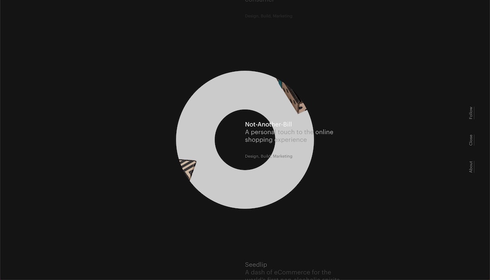
The Graphik Web font stands out very well against both the light and dark background, and also when it’s surrounded by photos on the Case Study pages.
17. Checkland Kindleysides
As you wander around their website, you can tell that the designers at Checkland Kindleysides know what they are doing. The typography is well placed, it’s the main focus everywhere thanks to the great use of layout. And, it looks powerful.
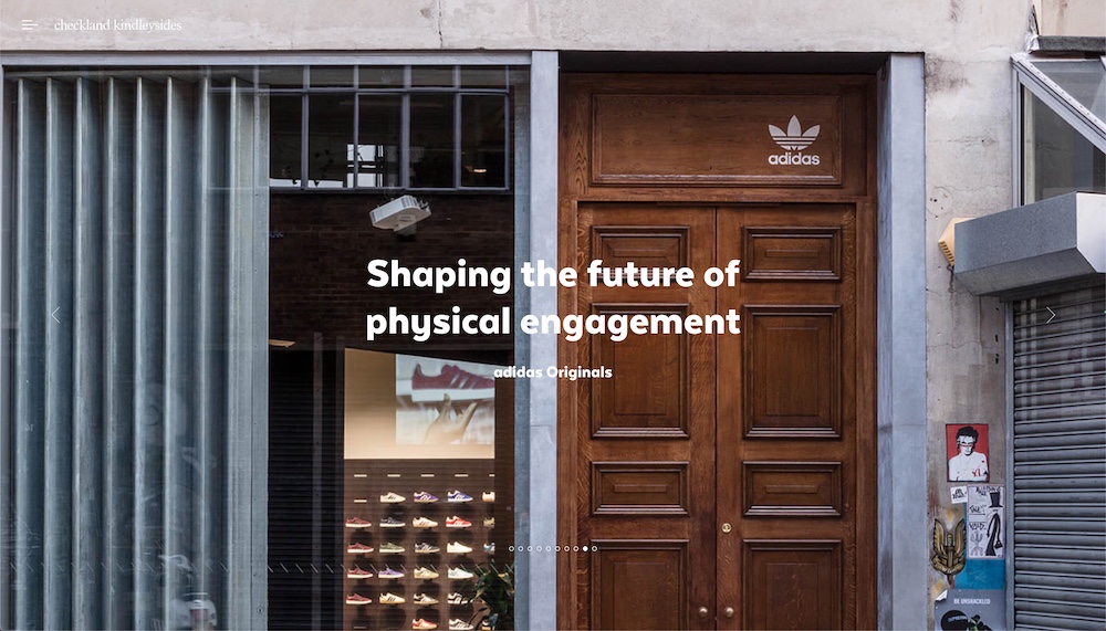
TextaAlt is the company’s main font and it looks stunning both in the header and paragraphs. In all honesty, the type itself is modern, professional, and sleek; it’s everything you’d need on an agency website.
18. Emergence
Emergence is an investment firm with quite feminine and light branding. There are many things on their site that stand out to me such as the color scheme but so does the typography.
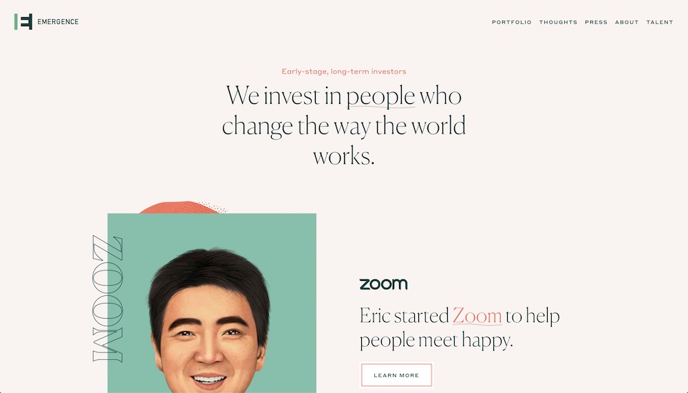
The designers seemed to make sure that the typography elements are playful while still having a professional look and feel. You can see this through the use of the fonts such as the serif headlines, each with little accent lines and different colors. Or, you can see it in the outlined company colors – not to mention the whole design of the company summary sections being playful too.
19. OpenWeb
OpenWeb is on a mission to improve online communications. It’s no wonder that their website has a fantastic design that’s centered around great typography and readability. Their headlines are large and prominent which is hard to come by in online publications especially, who they’re trying to work with.
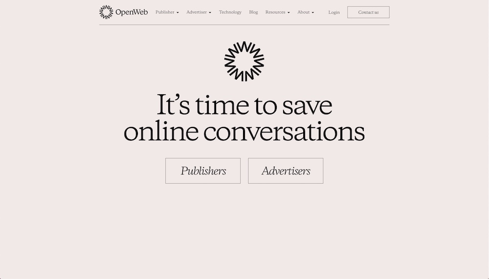
The company stands for open, honest, and respective communications so it only makes sense that their website has the same look and feel thanks to the light color scheme and large amounts of white space.
20. By the Books
Our last site on today’s list is a list of books presented by Mailchimp and curated by Aminatou Sow and Ann Friedman. And, this landing page is an absolutely stunning example of how typography and influence a site’s design. That reason for this is that although the headlines and body text use the same typography throughout, the different books use additional typefaces.
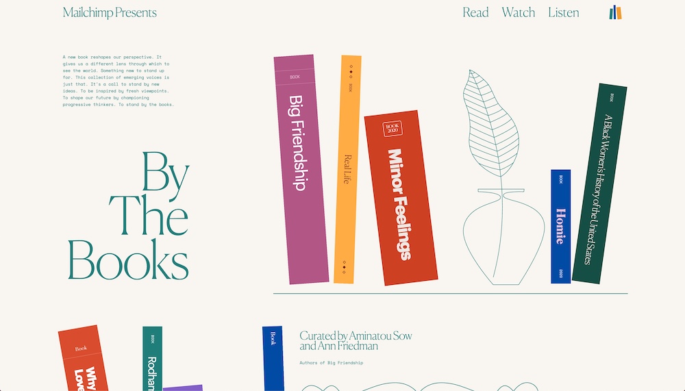
It’s a great example to see because it demonstrates that you can have typography as numerous design accents. Each book’s spine is a different width and height and with a different color scheme. Yet, it all comes together for a lovely landing page with great flow.
What Do You Think?
Do you know a website with typography that’s to die for? This list of 17 items was not easy to an note down. There are just so many good examples out there!


Leave a Reply