Visual Hierarchy: Improving Your Designs with Typographic Hierarchy
Visual hierarchy balances form and functionality in a design. It can help you combine your abilities as a designer with the message you need to relay to your audience to pull together a design that guides the audience through it.
Typographic hierarchy is one of the easiest yet most effective forms of visual hierarchy you can use in your designs. You’re most likely using it in your blog posts without even knowing it. We’re going to go over what this means and how you can use it to improve your designs.
What Role Does Typography Play in Visual Hierarchy?
Typography plays a huge role in visual hierarchy, and it’s nothing new. In fact, typographic hierarchy has been used by the newspaper industry for centuries. Check out the front page of The New York Times after the sinking of the Titanic:
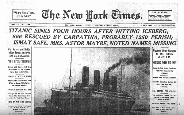
The article was published on April 16, 1912, a time when newsstands were the primary resource for obtaining the latest news. Just like you’re fighting for your designs to stand out from the hundreds and even thousands of other designs users have to pick from on social media, newspapers needed a way to catch a reader’s eye so they were more likely to buy when passing a newsstand.
They did this with typographic hierarchy. The New York Times article uses four levels of typographic hierarchy. The first level is the title of the article, “Titanic Sinks Four Hours After Hitting Iceberg…” Excluding the The New York Times print at the top, the title is using the largest size in the entire article, and it’s even written in all caps to emphasize the urgency of the event.
The first level should always express what the article is about. This is the title of your blog post in the digital era. The second level of the New York Times article uses a smaller font size and contains more information about the incident.
The third and fourth levels follow this trend, using visual hierarchy to arrange the details of the event from most important to least important.
How Typographic Hierarchy Improves Your Designs
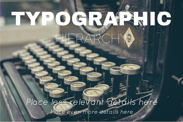
Typographic hierarchy improves your designs by increasing their effectiveness and ability to convert, and it can even improve the overall look of your designs when incorporated properly. This includes using different font sizes, different font styles, different typefaces and even different colors.
Users are more distracted now than they have ever been. Whether you’re creating a featured image for a blog post, a cover for an audio track, a cover for a book or a graphic to use to promote something on social media, you have a lot of competition.
Utilizing visual hierarchy with compelling headlines and captivating graphics or images can make your designs stand out against the crowd. Users scroll endlessly through music libraries, online book stores and social media feeds. It’s hard to stand out against everything else being thrown at them, so incorporating as many simple tricks into your designs as possible can be crucial.
The Three Levels of Typographic Hierarchy
No matter what style you go with, every design that incorporates typographic hierarchy typically uses three levels of it.
- Level 1
- Introduces the topic.
- Includes the most important information.
- Uses the biggest font size out of all other text in the design.
- Level 2
- Contains additional details on the topic.
- Uses the second biggest font size out of all other text in the design.
- Level 3
- The meat of the design.
- Contains additional details that are not as important as the details in level 1 and 2. It can also be used to expand upon the details introduced in those levels.
- Use this for details that can’t be explained with a catchy headline. This would be body of your blog posts.
Now, let’s talk about how you can use different font styles to boost your designs.
Typeface
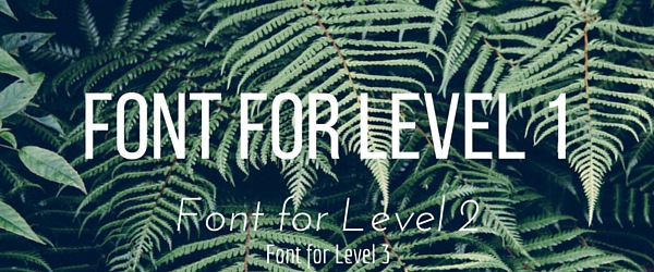
A great way to use typographic hierarchy in a way that improves your design is by using different typefaces for different levels. This differentiates each level from the previous one and keeps your design from looking too bland.
Size
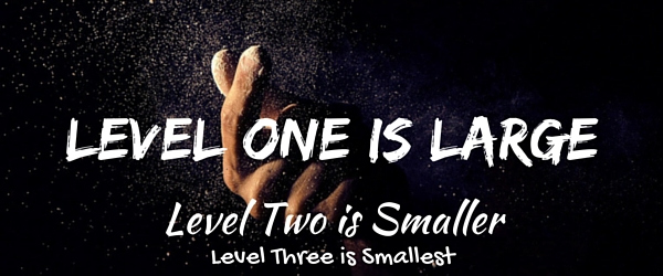
We’ve already mentioned this several times, but it’s worth mentioning again. The best way to establish visual hierarchy with typography is by making certain elements larger than others. For example, the main heading should be larger than all other text in the design. It’s also one of the easiest ways to establish typographic hierarchy.
Style
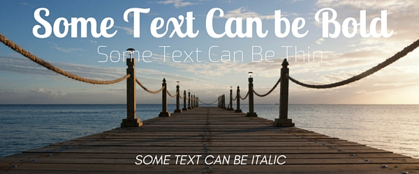
Style is another way you can create visual hierarchy in your designs using typography. You can do this by making some text bold, some text normal and other text italic. You can even display some text in uppercase letters while leaving most of the text in lowercase letters.
Color
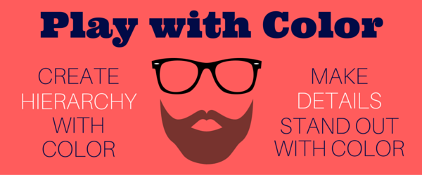
Color is another great way to use typography to create visual hierarchy. For example, your eyes probably catch the white “hierarchy” and “details” text before anything else when you look at the image above. The majority of the text is in navy blue, so the white really pops out. This is how you can use color to make certain details stand out.
Orientation

Orientation can be tricky to implement correctly, but it does certainly catch the eye in any design that incorporates it. For example, the largest heading in the image above uses a tilted orientation with black text against a light background, almost ensuring your eye focuses on it ahead of everything else, even the Golden Gate Bridge behind it.
Whitespace
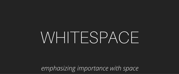
Whitespace is one of the most popular ways designers use typography to create visual hierarchy in their designs. Whitespace involves the art of doing more with less, that is, emphasizing importance without overwhelming the reader with information. It typically involves using a solid-colored background with a typeface that features a contrasting color. The exact words used should be clear and concise.
Implementing These Strategies on Your Website
Alright, you know the basics of how to use the various styles of typography you’re already experienced with to create visual hierarchy in your designs, but how do these strategies translate to your website?
Using Typography to Create Visual Hierarchy in Blog Posts
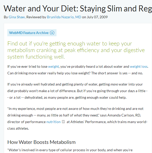
This is a simplified example. If you’ve been blogging for a while, you know the importance of using H1, H2 and H3 tags in your posts for SEO purposes. What designers know is that these various headings can be used to create visual hierarchy in every single blog post you publish.
Take this snippet of a WebMD article, for example. Its title uses the largest font on the page, and it uses a much smaller font for the meta data.
Next is a typographic technique too few blogs use, and that’s placing a short and simple summary of the post directly underneath the title before anything else is written. This summary should feature a different color than the rest of the body at the very least, but it can also feature an entirely different typeface to reach an even higher level of typographic hierarchy.
You can do this using the TinyMCE Advanced plugin if you use WordPress. This plugin enables you to place a font selection and font size settings in the WordPress editor.
Don’t be afraid to get creative with your posts. The fonts used on WebMD are a little bland for 2016. Don’t be afraid to use a web-friendly serif font for headers and a gorgeous sans-serif font for the body. This can bring blog posts to life without changing a single word.
You can also make a few important phrases and words in your post bold. Some users scan a page rather than reading the entire text, so they’re more likely to stop and pay attention when something catches their eye.
Split Testing Your Designs
Drawing back to our original point, visual hierarchy is meant to balance form and functionality. You can’t know if any of these strategies are actually working without real numbers and real data. You need to split test your designs to see which ones are converting better than others.
Start by recording your conversion rates, or your client’s conversion rates, before you implement visual hierarchy into your designs. Release a few designs using at least one of these techniques, and make note of your conversion rates. Try out a different technique, and record your conversion rates yet again.
Do this until you’ve tried all methods and variations you can think of, and use the data you come up with to build a style guide based on the styles that converted best.
Final Thoughts
Web design and business are two very different beasts, and they’re incredibly powerful when combined. Don’t underestimate how the smallest details can boost yours or your client’s business, and don’t underestimate how they can improve your designs.
Before you work on a design, stop and think about what action you want your audience to take when they see it. Use the techniques explained throughout this post to come up with a design that guides the user to that action.
If you need a little inspiration, check out our post 14 Websites for Your Typography Inspiration.


Leave a Reply