8 Modern Brand Logo Redesigns & What You Can Learn From Them
Design is not something you can learn from school or by reading a book. It needs to come from within you. However, that doesn’t mean you can’t gain experience from the world around you to learn a few tricks.
“Design is a way of life, a point of view. It involves the whole complex of visual communications: talent, creative ability, manual skill, and technical knowledge.” – Paul Rand
As Paul Rand, the legendary designer behind logos such as IBM and UPS puts it, design involves much more than just creativity and talent. You also have to follow certain standards and technical aspects when crafting brand logos.
For example, the size and the color of the logos play a crucial role in every logo design. Your design needs to look great at any size, whether it’s on a tiny business card or a giant billboard.
Of course, sometimes you won’t be able to get it right the first time. Don’t feel bad because even some of the most iconic brands often do logo redesigns from time to time.
In this post, we take a look at some of those popular logo redesigns to see what kind of mistakes and improvements they did with their logo designs. Grab a pen and paper and start taking notes.
01. Google
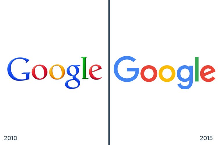
You won’t find a better example of design perfection than Google. The tech giant takes design more seriously than anyone else. In fact, the company has a whole page dedicated to its brand identity to explain all the details behind its logo and branding.
Since its official launch in 1998, Google went through several stages of logo redesigns. And it took them a while to achieve the perfection that we see today.
What You Can Learn From It
The biggest lesson you can learn from the latest Google logo redesign is its simplicity. Google used to have a glossy logo with a slightly embossed design. The new logo has a cleaner and a consistent design featuring a geometric sans-serif typeface.
The main takeaway of the story: Consider the geometries of your designs. And, also, sans-serif is always better than serif.
02. Uber
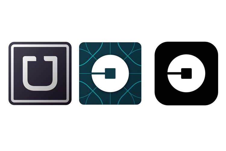
Uber, the ride-sharing service, also went through a major brand identity redesign in 2016. And it came under a lot of fire from its customers, users, and everyone else who ever knew about Uber.
Uber had it right the first place. The old “U” logo was one of the most recognizable logos there ever was. Whenever you see that U logo on a car or an ad, you instantly recognized the brand behind it.
What You Can Learn From It
The new logo redesign was supposed to make a new identity for Uber and it was all part of a corporate rebranding effort because Uber has become more than just a ride sharing app. The company wanted a logo that represents itself in its entirety, which was a mistake.
This redesign was so bad that the company had to redesign the redesigned logo shortly after the initial rebranding. The redesigned colorful logo reverted back to the old black and white design.
The main takeaway of the story: If something works, don’t try to change it.
03. Formula 1
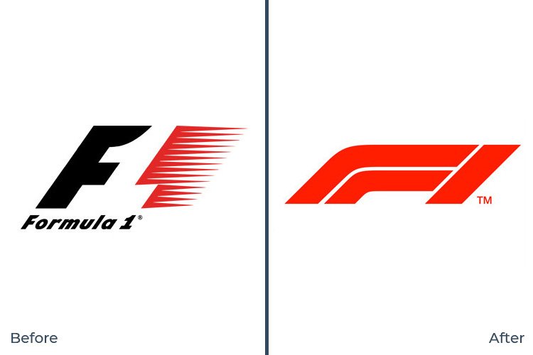
There’s a lot you can learn from other rebranding mistakes. The most recent Formula 1 rebranding is another one that gives you a lot of new lessons. And it also has a similar story to Uber’s rebranding.
The new head of marketing for Formula 1 was tasked with rebranding the 30-year-old F1 logo to better represent its corporate owner, Liberty Media. And the outcome was a disaster.
What You Can Learn From It
The F1 logo is a popular logo that everyone from sports fans to 10-year-old kids easily recognizes. The logo badly needed a redesign. However, this is not the right redesign. The company made a big mistake when coming up with this new logo, they listened to fan feedback. It only made things worse because, surprisingly, fans also hated it when they officially revealed the new logo.
The main takeaway of the story: When rebranding logos, use a design and layout consistent with the old logo.
04. YouTube
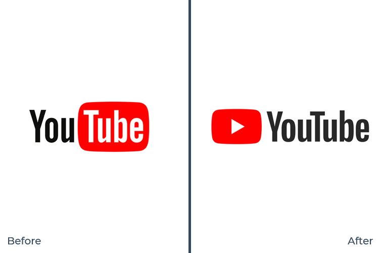
For 12 years, YouTube had the same logo across many platform redesigns. Even though the YouTube player and the user interface went through many design revamps, the logo stayed the same. This finally changed in 2017 when a new logo was introduced with a platform redesign.
What You Can Learn From It
For this new logo, they made a simple change by taking the red background color out of the “Tube” section of the wordmark and turning it into an icon. The button now represents a play button and it definitely improves the overall look of the logo. YouTube logo is now more recognizable, authentic, and, more importantly, doesn’t look like an adult-film website logo anymore.
The main takeaway of the story: Adding an icon can make a logo look much better.
05. Audi
Logo design used to be simple. Back in the day, it was only going to appear on print designs like newspapers, billboards, and letterheads. But now, you also have to consider the digital aspects of your logo designs.
How a logo looks on mobile devices, as an app icon on Google Play Store, website logo, social media presence, are now also much more important than it ever was.
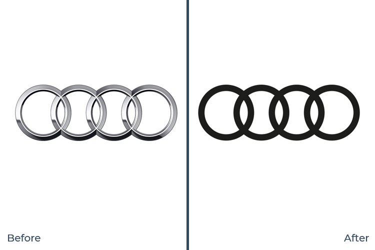
This is why Audi made a radical “digital first” rebranding to make the logo and the brand more open and accessible across all platforms.
What You Can Learn From It
Audi’s logo redesign actually follows all the right standards of a proper redesign. While being consistent with its original and famous logo, the new redesign only simplifies the logo to make it more digital-friendly.
The main takeaway of the story: When designing a logo, take all digital and printing platforms into account. And keep it simple.
06. Medium
The online publishing platform, Medium had a logo crisis from the very beginning. Since its launch in 2012, the company went through several logo redesigns within a very short period of time.
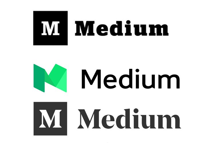
The company was using an in-house design team to redesign the logo and they had a vision problem. And they finally got it right in 2017, by going back to the old logo.
What You Can Learn From It
The first Medium logo was decent. But, there was something missing from it. Then the redesigned logo completely changed all aspects of the logo by introducing a new icon and a wordmark based on a sans-serif font. It didn’t take long for the company to realize the mistake. And they went back to the old serif-based wordmark by slightly reducing the boldness of the font and adding sharper serifs instead of the old rounded font.
The main takeaway of the story: Sometimes, all it takes is a small change to make a big difference.
07. Airbnb
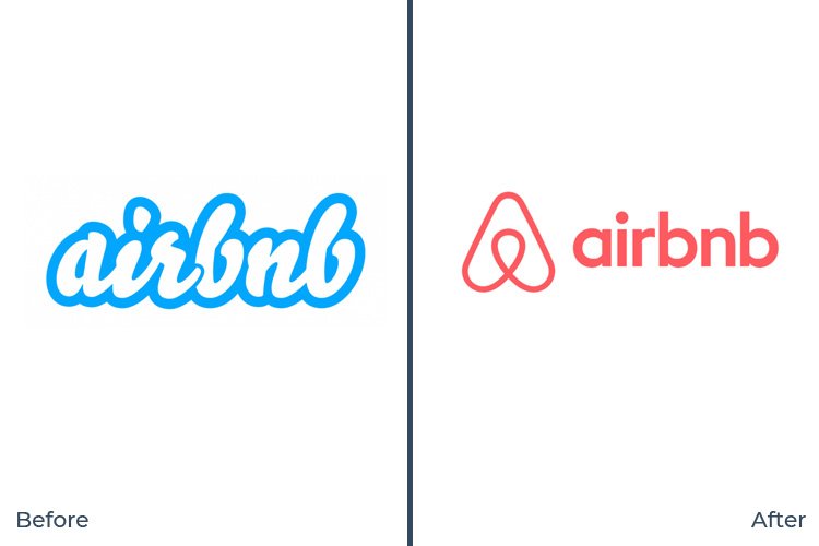
Airbnb’s new logo was a refreshing change that completely changed the way we look at the brand. It was clean, simple, and elegant. It was much more professional than the one it had before.
However, the company had unknowingly made a terrible mistake with the new logo. The new logo was a lot similar to a logo of another brand.
What You Can Learn From It
Airbnb’s new logo had an icon to give the brand a new identity and make it recognizable across digital platforms. But, this icon closely resembled the logo of the company Automation Anywhere. Luckily, Automation Anywhere was also working on a logo redesign and changed its logo helping Airbnb to avoid going through another logo redesign.
The main takeaway of the story: Double check to make sure your design doesn’t resemble another logo.
08. PayPal
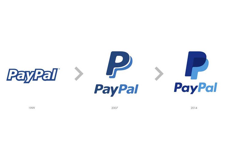
PayPal had a very decent and an elegant logo from the beginning. It’s a logo that perfectly matched with the business concept. After introducing a more colorful and an attractive logo in 2007, PayPal redesigned its logo once again in 2014.
The new 2007 logo was creative and beautiful. But it was missing the originality of a brand logo to make the company stand out. The new 2014 redesign fixed this problem.
What You Can Learn From It
Take a closer look. In addition to the icon redesign, what else can you notice in this latest logo design? The new PayPal logo uses a new font that features a more rounded design.
The new monogram was also updated to better represent the company’s vision and theme. It’s also meant to help give the company a “short form of expression”, especially to be more recognizable on mobile platforms and online shopping transactions.
The main takeaway of the story: Monograms help create a more recognizable logo design, especially in the digital era.
Summary
The logo takes a massive part of a brand’s identity. It’s what helps a brand represent itself. And it’s something that requires a lot of creative thinking and originality.
Whether you’re crafting a logo for a big corporation or a small blog, you should put more thought into your logo designs. Don’t make the mistake of hiring someone to design your logo for $5 dollars.


Leave a Reply