18 Mobile UIs with Amazing Layouts
Mobile has been all the rage for a little while now. But for some reason, it’s not the most common thing you can see in design galleries such as Behance or Dribbble or in inspirational posts.
Mobile design can be sometimes so beautiful that I’ve decided to write a long post filled with great mobile UIs. I’ve gathered a list of 18 beautiful mobile UIs with amazing layouts.
These designs are extremely impressive and I hope they will spark some inspiration. It doesn’t matter if you’re designing right now for mobile or not; these mobile UIs are bound to inspire you to create something amazing, be it even a desktop app or a responsive landing page.
Let’s take a look!
01. Email Blast
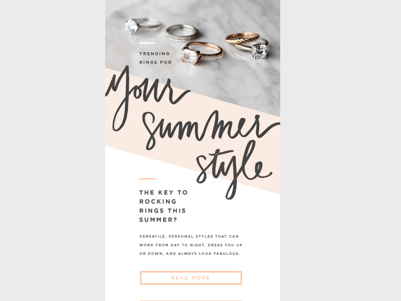
Look at this small layout filled with creativity! I love that it’s not a cookie cutter design because that makes it interesting. Mobile designs are often pretty straightforward because they have to work on small screens, but not this one. Although this is an email design, it can also work great as an example of a mobile interface.
The diagonal backgrounds and the big handwritten fonts give this design interest. It makes the design look great. The play in scale is also well-done from the big handwritten fonts to the smaller decorative dashes. All in all, this an amazingly well-executed layout!
02. Dictionary Application
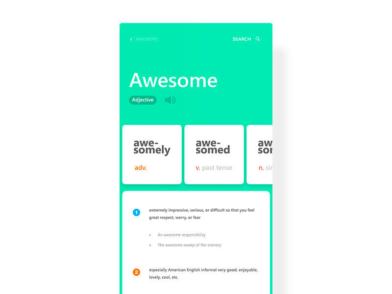
Here we have a design for a dictionary app. What I like about this screenshot is the fact that the UI uses different swiping axes. You can swipe up to get more details about the current definition of a word or you can swipe the smaller squares to see more variations of the word. This interactivity gives a simple app some dimension.
Not to mention, the use of color is well-done, too. The design uses a few accent colors to complement the bright green background.
03. Sparkles and gifs!
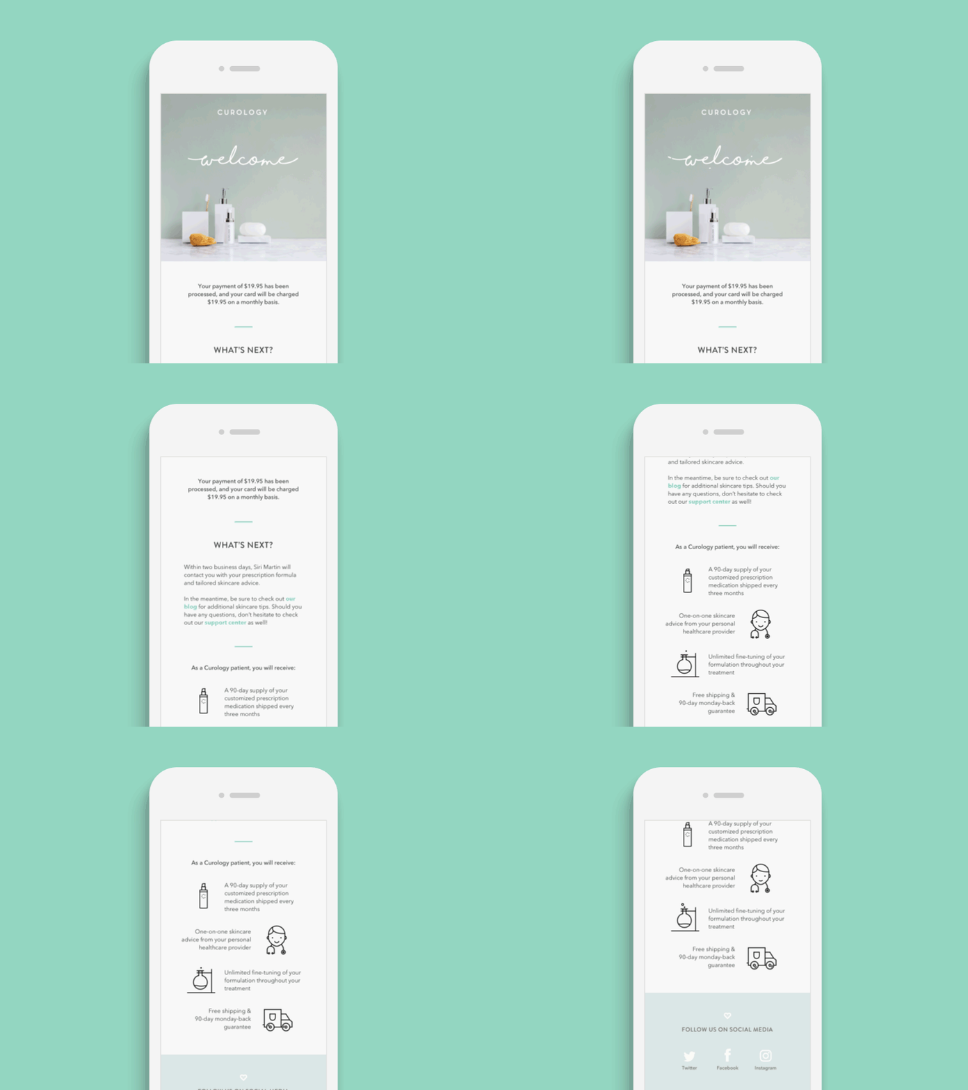
Here we have another email design but its mobile layout is spot on beautiful! The little animated welcome gif at the top is fantastic. And, as you scroll/swipe down the email, the layout is lovely as well.
The little bits of the seafoam green accent works well throughout the page. The typography is really beautiful, too. All in all, it’s a great-looking mobile email.
04. What a f**king day
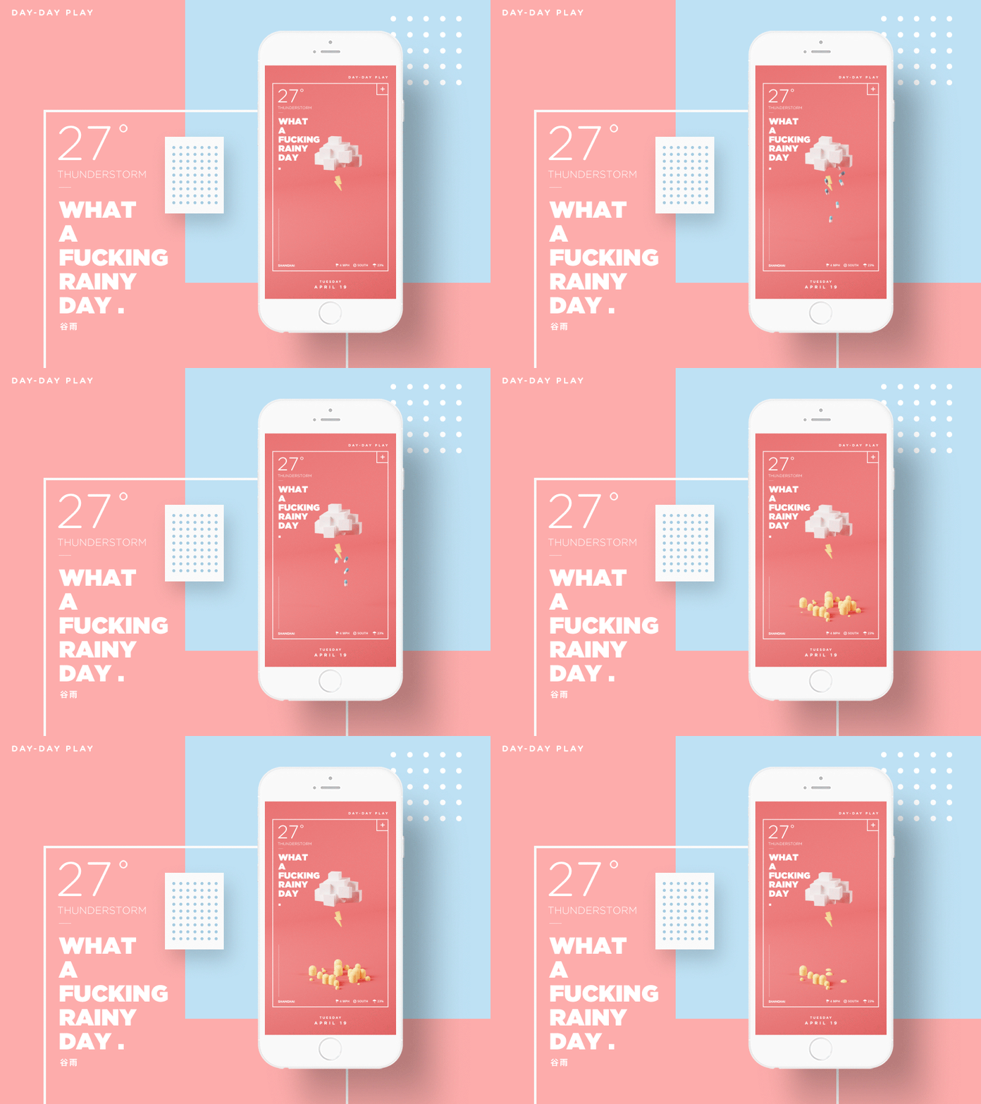
This mobile weather app concept is too cute (although I’m not sure about the raindrops looking like pills, but I digress). It may be a stereotypical weather app design, sure, but it’s still a great style. The 8-bit inspired 3D graphic is adorable! The animation adds a lot of character and personality to the whole experience as well.
Lastly, the layout itself, within the white, thin box is pretty modern-looking. You definitely don’t often see mobile UIs or layouts like this.
05. Pinefor App
I’m in love with the clean look of this design, especially with the white screen on the left. Besides, the menu layout is not that bad, either. Other screens of the app are stunning and modern, too.
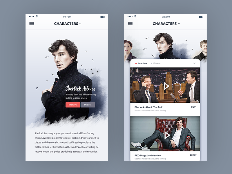
06. TV Show Characters
This UI uses photography very well on both the left and right screens. In the left-hand side layout, it’s been a great idea to make the text overlap Sherlock’s image. Actually, this is a clever way of saving space.
On the right-hand side, it’s brilliant that there is a little bit of space above the content card. It helps keep the aesthetics of the app in check.
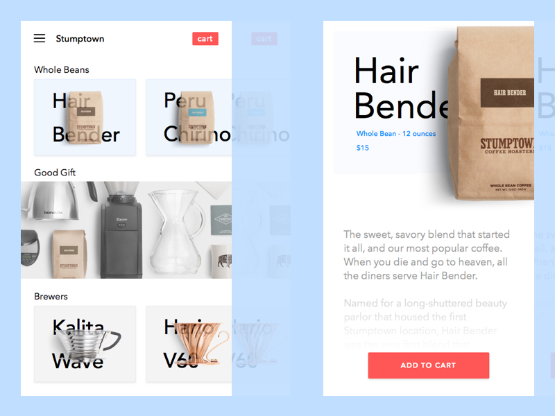
07. E-Commerce Stumptown
On the left-hand side screen, the products are showcased by overlapping the photos over the text. It looks interesting, to say the least. It’s a little jarring because the text is semi-transparent over the image. But, the middle part uses different spacing and is totally different than the top and bottom sections, which makes the UI and layout of the app interesting.
Actually, I’m a bigger fan of the right-hand side product display. The coffee bag cropped in the top right corner looks fantastic! It definitely draws your attention and captures it.
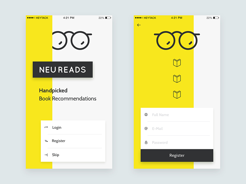
08. NeuReads App
I love this layout—it’s jarring and different. The yellow color is used very sharply in the background and it grabs your attention for sure. At the same time, yellow make the design looks fun, too.
The eyeglasses logo has rounded edges, that makes the style more friendly, which is a good thing. Without that and the rounded font, the app would look too edgy. Then again, I don’t know what style this designer was exactly going for.
09. ToDo List
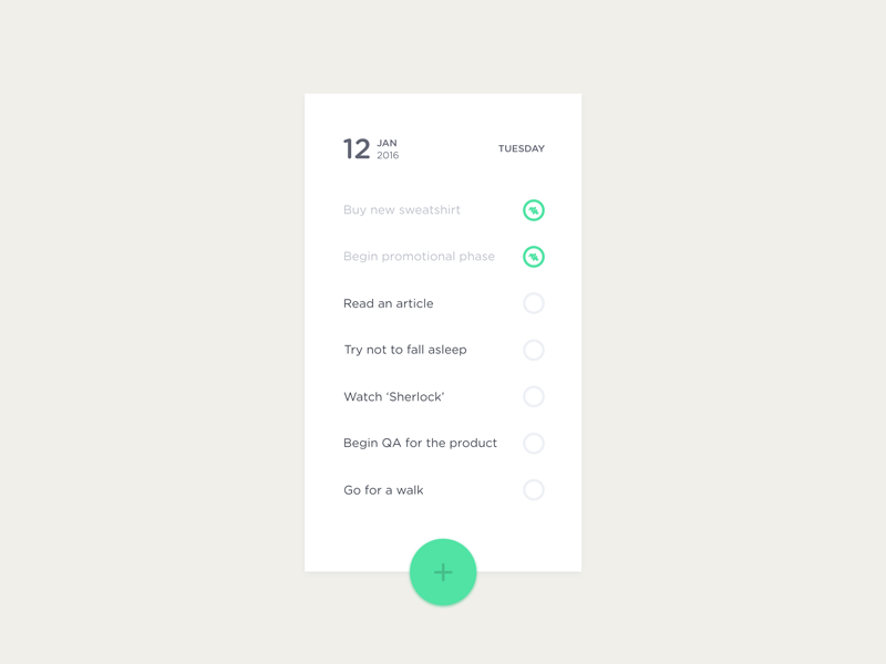
I’ve included this UI because it’s so simple. It’s a checklist UI that doesn’t look overwhelming. For some reason, most to-do list apps try to be creative while they don’t need to be.
The green is used very well as an accent color and the spacing works good, too. The green, the spacing, and the typeface combined make the style of the app very friendly. Simplicity fits very well with this design.
10. Xiaomi Mi Band App
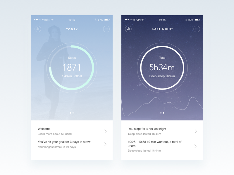
This is a redesign of a fitness tracking app. I like the idea that a different background belongs to each topic. For instance, the right-hand side background is darker because it’s showing your sleep patterns. Even though this background is darker than the one on the left, they both still appear subtle.
It’s an interesting design choice but there is absolutely nothing wrong with it, as it works well for the overall UI. The background extending to the top of the screen and being showcased under the phone information such as time and battery life was a good idea, too; it makes the UI much more cohesive.
11. Optimize – Free vs Premium
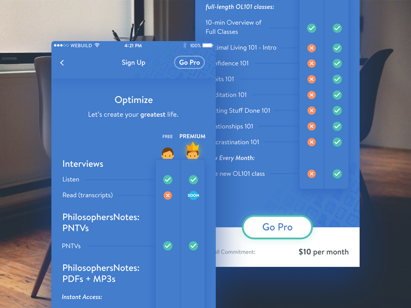
The amount of content presented here is too much for a small screen. Most mobile UIs and layouts stay away from so much copy.
Furthermore, most mobile UIs are not this color-heavy (just check out this list), however it works here because it’s well designed. The copy uses a small font size and repetitive icons (since it’s a comparison table) in order to make it easier to digest the information, visually.
12. Demo screens for a chat app
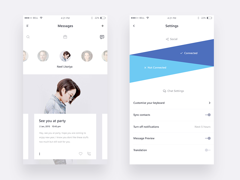
The blue social media triangles look fantastic on the right screen. It’s a unique take on how to include social media and it works well. Without icons or text, you can still easily tell one is for Twitter and one for Facebook.
On the left screen, the spacing around the bottom white box is well done, too. The text doesn’t feel too crowded, at least not while I’m checking out the UI on a desktop.
13. Concept transition – Multi-window switch
This is a multi-functional animation concept that gives a good amount of depth to the mobile UI. When it comes to animating hidden interactions, it’s all about the overall UI—does everything make sense for the user? It’s hard to tell with just a concept but it does look great at the first glance.
14. CloseCircle Mag
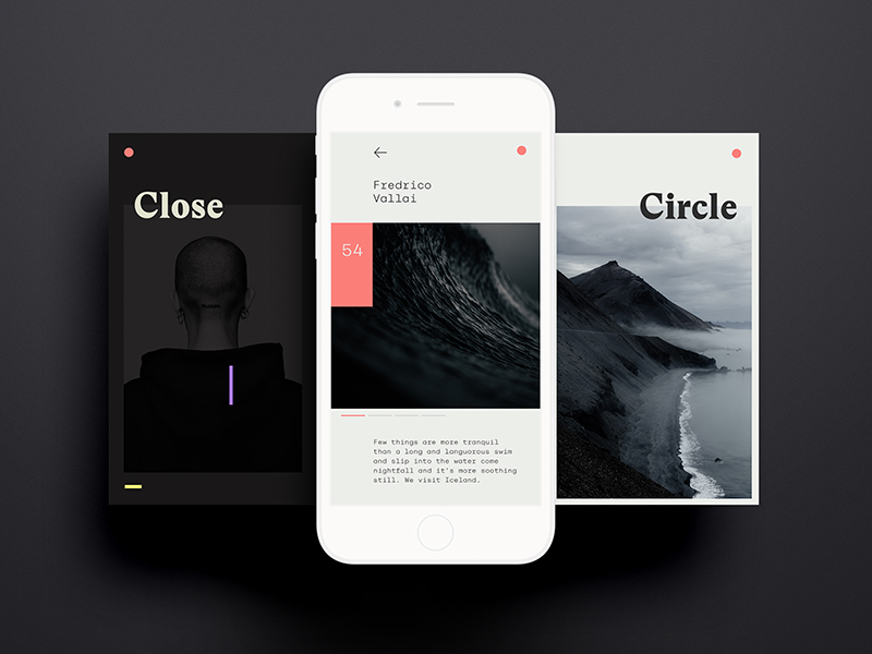
I’m in love with the style of this UI. The minimal and clean look-and-feel is combined with the black, white, and pink tones in order to achieve a high-end style and I love it.
I’m a very big fan of the colors but also of the typography. The word “Circle” being off the grid and overlapping is a wonderful touch! The use of the green color for the background has been a fantastic choice as well. It’s just bold enough to really make a statement and highlight a section that needs to have more focus.
15. News app experimentation
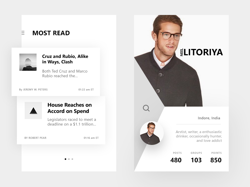
My favorite is the layout on the right. I find it awesome that the layout is divided up into three polygons. It’s a pretty creative way to go about mobile layout, as most of them are divided into rectangles. The different light shades of the background give the three section the perfect amount of definition.
The composition of spacing and typography is also well-done on the left screen. There are four different font sizes and weights, yet it doesn’t look overwhelming. It looks actually great.
16. Hackathon – framerJS Challenge #9
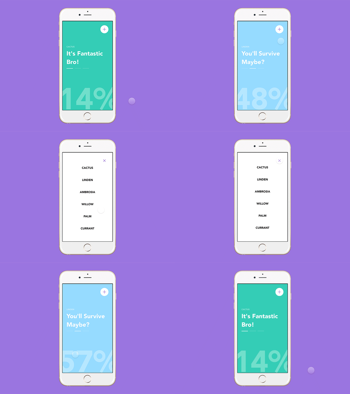
This is an animated concept of an application that will let people with allergies know how safe it is to go outside.
You can select which allergies give you the most trouble and you get a lovely report on the current outside conditions in your location. Again, this is a simple interface but the colorful background and the percentage animation give it amazing life.
17. Keroessa
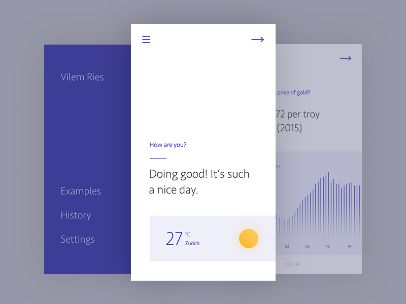
Here is another UI concept for a news app. I love how simple and clean it is. The main screen doesn’t have a lot going on within, just a question “How are you?” and a little weather report.
There is ample white space on this screen and the two hiding behind it. Yet, it doesn’t look minimalistic or cold. Something about that navy blue keeps things lively within the UI.
18. Recipe Application
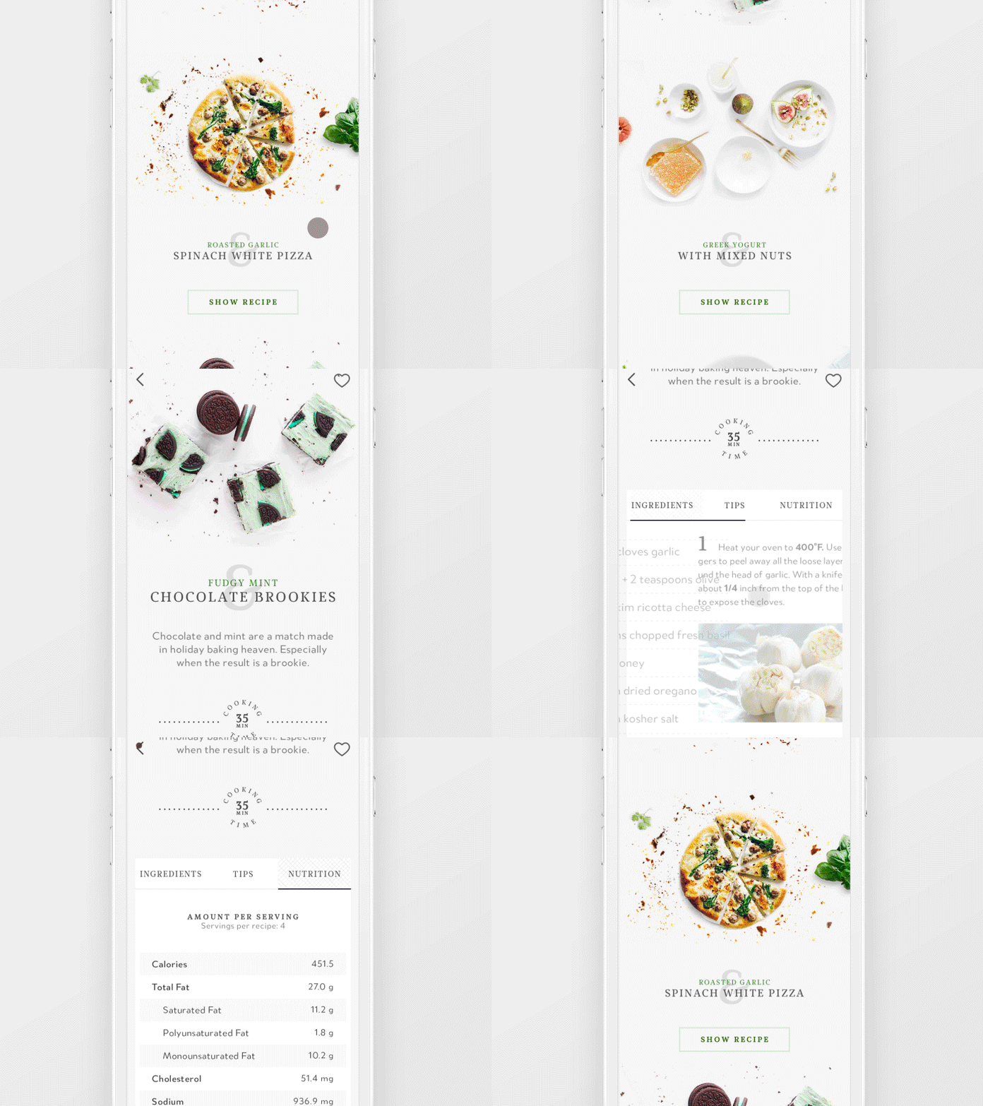
The last design is a lovely animation of a recipe app. I’m in love with the typography and headings. The layering of the ampersand with the title of the recipe and the tiny two-letter flavor description all look really nice. You don’t see that too often in mobile apps; it’s refreshing just like those fudge mint chocolate brookies would be!


Leave a Reply