How To Master Twenty Seventeen (Or Any WordPress Theme in 2017)
Another year, another official theme released by WordPress, this time of course it is Twenty Seventeen. For last year’s theme Twenty Sixteen, we did a comprehensive guide that showed you how to master it, or any theme.
With the things that have changed in the last year in WordPress, it seems like perfect timing to make another one on the Twenty Seventeen theme.
If you want to use this guide to set up a good looking version of the Twenty Seventeen theme on your live website, I would recommend using a (local) development version of WordPress, or a staged version of your site first.
So head over to the appropriate installation of WordPress, search for the theme and install it.
In this tutorial, we will cover three different ways of changing the way your site looks and we’ll separate them into three different difficulty categories:
- Making the most of the WP customizer and some of the options of the theme. – Beginner
- Changing a few parts of the design with basic CSS – Intermediate/Savvy beginner
- Making a child theme and adding some useful functionality. Also making bigger changes to the design. – Intermediate
Beginner
Before we go into the advanced steps of messing around with our own code and the page templates of the theme itself, let’s take a look at the out of the box functionality.
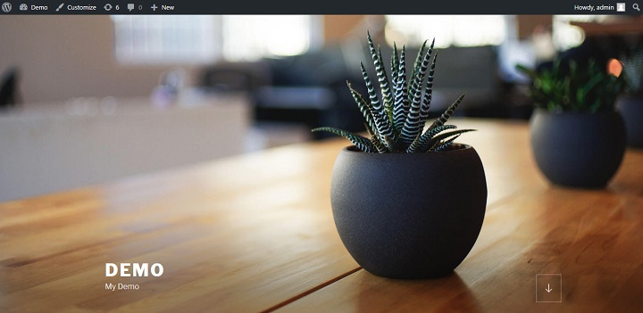
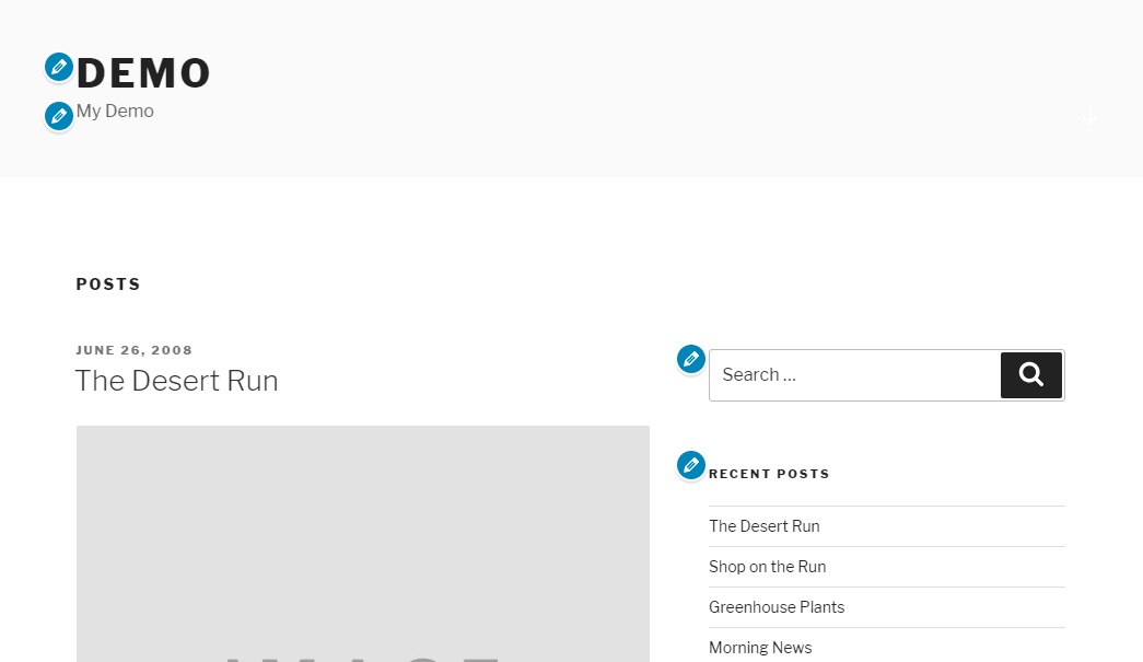
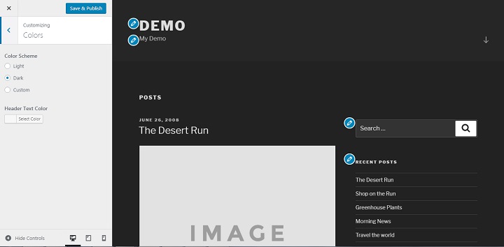
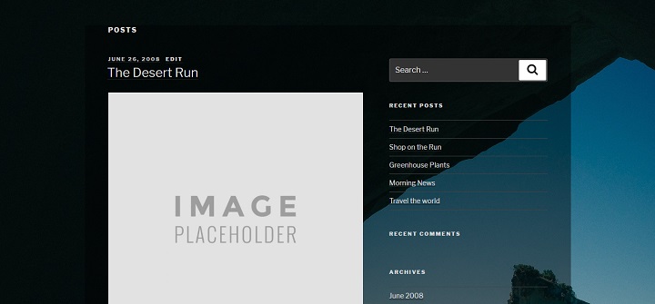
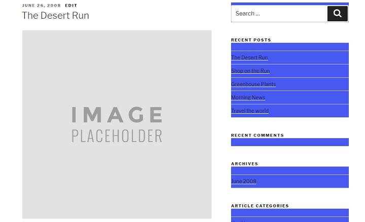
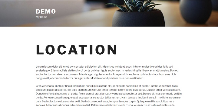
Right now, my demo website looks like this. All I’ve done is install the theme, not bad, right?
Getting Familiar With The New Customizer
First things first, let’s head over to the customizer by clicking the customize link in the top left of our admin bar.
A few things have changed with the last few updates of the customizer. My favorite update in the most recent update (4.7 at the time of writing) is that there are clickable links next to all editable elements in the preview, that will take you where you need to go to edit that very element.
For example if I click the pencil button next to the headline, it immediately takes me to the customization menu for “Site Identity”, the appropriate section.
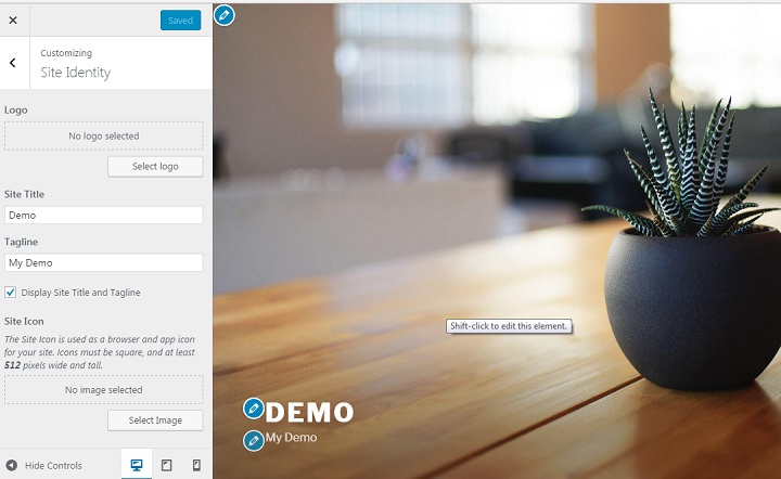
Another handy update is there is now a live preview of any changes you make. Instead of constantly having to make small changes and then click preview after each one, you can now edit on the spot.
Changing or Removing The Header Image Or Using a Header Video
Out of the box, Twenty Seventeen looks a lot better than the themes of previous years. But there is one big problem. You can’t have the same header image as thousands of other websites.
Thankfully changing is as easy as pie. Simply click the edit this element pencil button in the top left corner, or shift click while hovering the header image.
This takes us to the header media section.
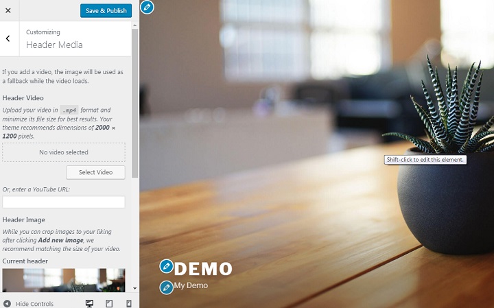
If you want to remove the header image, simply click hide image.
This leaves the theme looking like a bare bones blogging theme.
If you want to use your own header image, make sure that you use a HD one with similar dimensions. The theme advises that you use a 2000 x 1200 dimension image for your header.
There are a number of sites out there where you can find free stock photos. One of the best for HD images that are suitable for header image is Unsplash.com.
I scrolled through the top images at the moment, downloaded my favorite and cropped it to the recommended dimensions.
Then I simply clicked “add image” and uploaded it. My website then looked like this:
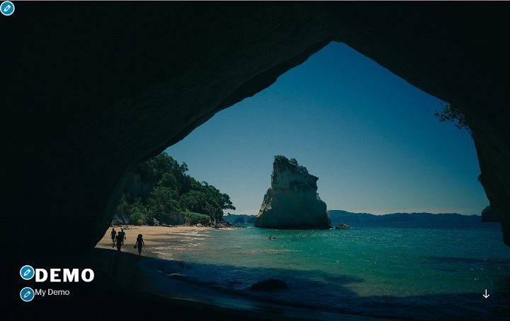
Same as the original look just different image.
However, if you upload a header image with different dimensions, your website won’t end up looking as good.
Because it is a hero image style header that resizes the image to make it full screen on computers, it stretches images of wrong dimensions and makes them look grainy.
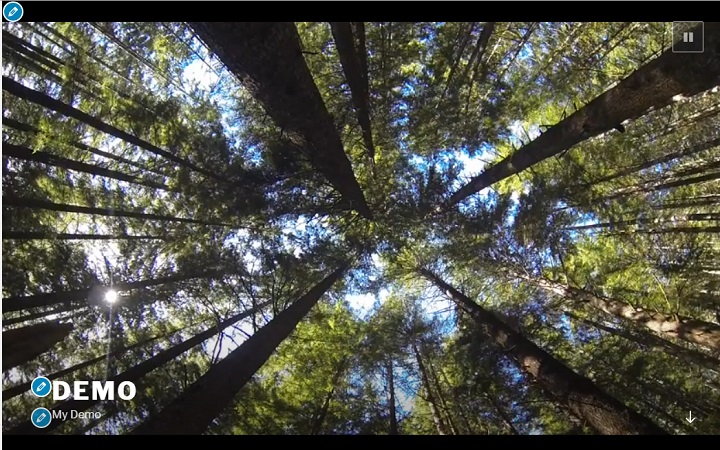
Video Header
With the 4.7 update, WordPress now supports video headers. Adding one is as easy as copying and pasting a youtube URL or uploading a video (not recommended due to the server load of hosting your own video).
If you want to show a header video instead of an image: Click to hide the header image, and then enter the Youtube url of the video, and press enter.
Voila you now have a video header:
Custom Colors
Unfortunately the custom color options for the Twenty Seventeen theme are quite limited. All you can do is select either the standard light theme, or the dark theme and edit text colors.
If you select custom, you can choose a different color scheme for the text on your site, but it doesn’t let you choose background.
Of course, this is not really a problem for those of you willing to get your hands dirty with some CSS.
Intermediate
At this point, it helps if you are already quite familiar with WordPress, and know a thing or two about HTML and CSS. If you don’t, not to worry, all you really need is a willingness to learn and some patience.
CSS Only Changes
Another welcome addition that came in the big 4.7 patch, is the ability to add custom CSS directly in the customizer.
This means that you no longer need to use a plugin for this functionality. It also means that you get to see the effects of your changes in real time, making it easier to notice mistakes.
If you are not familiar with HTML and CSS at all, you might want to study up a bit. I recommend you read a few articles, or start messing around with Code Academy’s completely free course on HTML & CSS.
If you do know the very basics, you can follow along as it is.
How To Find The Right CSS Selector And Other Basics
Before you can make any changes to the CSS, you have to understand how to correctly target a html element with CSS.
If you are in Google Chrome, it already comes with Google Developer tools, and you don’t need to install any addons. If you are using FireFox, you would want to install Firebug or a similar plugin.
All you have to do is open up your website. Then, highlight, or hover over, the relevant part of your site. Finally, right click and select inspect.
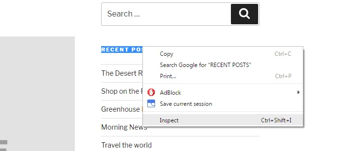
This opens up a tab below the website that shows the relevant line of source code. For example, if I inspect the headline of one of the widgets, this pops up.
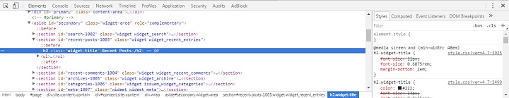
I can easily see that the CSS class is: widget-title.
There is also a box next to it that shows the CSS that is already applied to it.This is important, because when you work with custom CSS or child themes, you have to overwrite a lot of styles to get the look you desire.
This means two things; first of all, you have to be at least as specific as the original CSS is.
In this example, the CSS is targeting the element using h2.widget-title, so if I just use h2, or widget-title the original CSS will be more specific and the CSS won’t be applied like I want to the element I want.
Also you have to overwrite lines of CSS you don’t want. For example, if there is a left margin, but you want a right margin, you cannot simply add a right margin. You need to overwrite the left margin by adding :
margin-left: 0;first.
Media Queries
Another important thing to look for is something called media queries. They are the lines of code that make themes “responsive” or “mobile-friendly” in CSS. Media queries in WordPress themes are usually used to set different width break points to apply unique styles to different devices.
So because I’m inspecting the element while the browser window is a certain width, those are the styles I see in the browser.
In this case a width over 48em.
 @media screen and (min-width: 48em)
 h2.widget-title {
 font-size: 11px;
 font-size: 0.6875rem;
 margin-bottom: 2em;
 }
There are also other media queries with different styles “hidden” for you to find if you scroll down the tab.
It’s important to work with media quieries correctly, or your site will not look good across all devices.
Now that we’ve covered some of the basics of working with CSS and WordPress, it’s time that we get on with a few experimental changes.
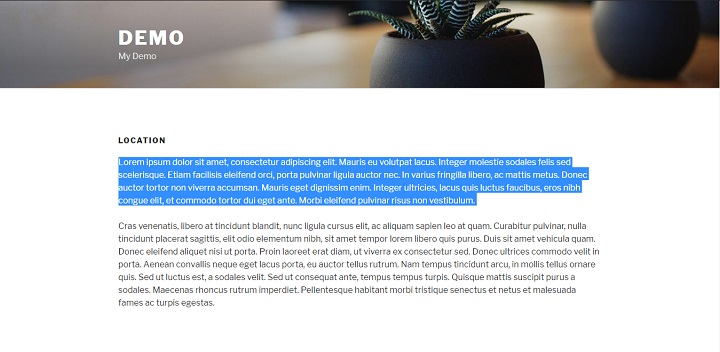
Adding A Background Image
Before we add a background image, you should adjust the color scheme to the colors of your picture. The picture I chose has relatively dark colors, so I chose the dark color scheme for bright text.
Then you simply add these few lines of code with the URL for the picture that you want to use to the additional CSS section of the customizer.
 .site-content {
 background-image: url("REPLACE WITH THE URL OF YOUR IMAGE");
 background-repeat: no-repeat;
 background-attachment: fixed;
 }
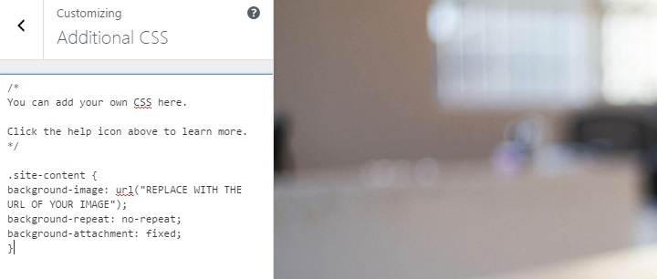
This way of adding a background image stops the image from repeating. It also fits it to the screen of the browser used to see the site.
All of a sudden, the website should look something like this:
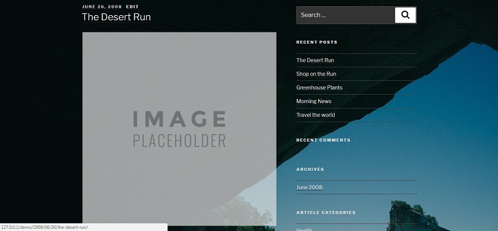
If you want to, it’s also possible to add an opaque layer on top of the background image for better readability. You can do this by targeting the wrap layer, and adding an opaque rgba background color. (The first 3 numbers determine the color, the last number how solid the color is. 0 is invisible, 1 is 100% solid.)
.wrap {
background-color: rgba( 0, 0, 0, 0.4)
}
After you have done that, it should look like this:
Styling The Sidebar
We can also for example style up the sidebar a little bit.
If I want to apply changes to the entire sidebar, I use the .widget-area selector.
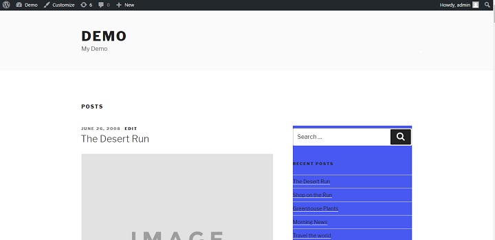
I could for example add a background color to the sidebar area.
 .widget-area {
 background-color: #4859f1;
 }
That looks like this.
Not the most amazing change, but you get the point.
I can also target specifically the widget titles and give them another background color.
h2.widget-title {
background-color: #fff;
}
That looks like this:
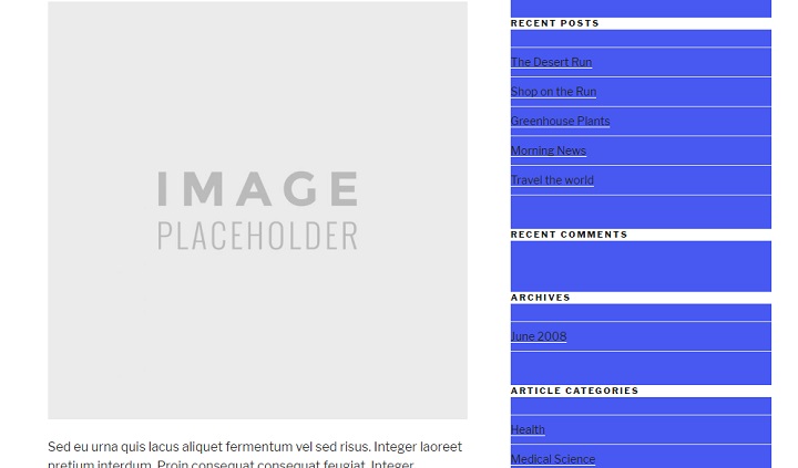
We can also do something as simple as just increasing the padding or adding a margin between the widgets, by targeting the .widget elements.
.widget {
padding-bottom: 6em;
}
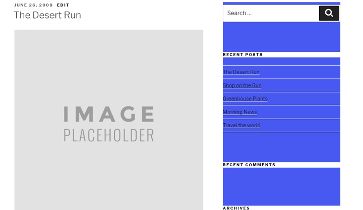
Or I can remove the padding completely, move the background color to only affect the individual widgets, and make it a margin instead.
.widget-area {}h2.widget-title {
background-color: #fff;
}
.widget {
background-color: #4859f1;
padding-bottom: 0;
margin-bottom: 3em;
}
That looks like this.
This should give you an idea of the many very basic ways in which you can style your sidebar with CSS.
Now let’s tackle slightly bigger project together, moving the sidebar with CSS.
How To Move The Sidebar To The Left
In the Twenty Seventeen WordPress theme, the sidebar is on the right. With CSS, we can easily move the sidebar to the left, and the main content to the right.
In this case it’s important to target the correct media query. Here it’s min-width: 48em.
All we need to do is switch the floats around from the #primary and #secondary ids.
 @media screen and (min-width: 48em) {
 .has-sidebar #secondary {
 float: left;
 }
 .has-sidebar #primary {
 float: right;
 }
 .has-sidebar:not(.error404) #primary {
 float: right;
 }
 }
And all of a sudden the sidebar is on the left! Almost like magic.
(If you use the wrong media query here, it will mess up how the website looks on certain devices. )
Working With A Child Theme
This is the part of the guide that might be slightly challenging for a complete beginner even if you are willing to learn.
If you are just starting out, be patient and explore things you don’t understand by yourself.
To create a child theme all you need to do is head over to the wp-content/themes folder. (If you are using a local development environment, you can just use explorer to do this, if you are using a staging server, you need to do this in a file manager or FTP client.)
Then create a new folder called twentyseventeen-child. Inside it, create a new file named style.css. (Make sure the file type is .css, that you don’t save it as style.css.txt If you use notepad, write file name: style.css, and save as type: all files.)
Then copy and paste this text into it and fill in relevant information as you go along.
 /*
 Theme Name: Twenty Seventeen Child Theme
 Theme URI: https://yourwebsite.com
 Author: Your Name
 Author URI: https://yourwebsite.com
 Template: twentyseventeen
 Description: Child theme for Twenty Seventeen.
 Version: 0.1
 License: GNU General Public License v2 or later
 License URI: http://www.gnu.org/licenses/gpl-2.0.html
 Tags:
 Text Domain: twentyseventeen-child
 */
Now create a functions.php file in the same folder with this code:
 <?php
 add_action( 'wp_enqueue_scripts', 'theme_enqueue_styles' );
 function theme_enqueue_styles() {
 wp_enqueue_style( 'parent-style', get_template_directory_uri() . '/style.css' );
 }
After doing this, head over to the WordPress admin under Appearance/Themes, and you should be able to see your child theme.
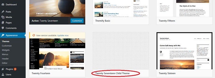
Go ahead and activate the child theme.
How To Create A Full Width Page Template
One thing that is maybe not appealing to everyone about twenty seventeen, is the design of their pages. The title alone takes up about 30% of screen on the side. With the margins on each side, there’s not that much space left for content, especially a combination of visual and text.
So we’re quickly going to create a full width template.
The first thing you need to do, is head over into your twentyseventeen theme folder, and copy the “page.php” file. Then paste it into your child theme folder. Finally rename it “page-full-width.php” and save the file.
Your child theme folder should now look like this:
Now all you need to do is open up your “page-full-width.php” file in an editor.
Change the line that says
* The template for displaying all pages
To
* Template Name: Full Width
Then all you need to do is add the class “page-full-width” to the wrap driv.
<div class="wrap page-full-width">If you go to create a new page now, you should be able to select Full Width as a template.
Create a page using the Full Width template so that you can refresh and see if the changes you make to the CSS are working.
Take a look, right now it should still look like a standard page.
First we need to set the width of the header and content to 100%.
Because of the way the CSS is written, we need to be very specific, so you should select the html elements on the full width pages like this.
body.page-template-page-full-width #primary .page-full-width
Then you simply set the width to 100% for both the entry-header and entry-content for the min 48em query.
The code should look like this:
@media screen and (min-width: 48em) {
body.page-template-page-full-width .page-full-width #primary .entry-content {
width: 100%;
}

body.page-template-page-full-width .page-full-width #primary .entry-header {
width: 100%;
}
}
If you look at your page now, it should show the header above 100% width content.
Another thing you might want to do is increase the size of the header for your full width template. Again you have to be very specific with the CSS, I target the element like this,
body.page-template-page-full-width #primary .entry-header .entry-title
and I set a px font size and a rem font size like in the parent theme.
I set two separate ones, one for computer screens (above 48em) and one for all other screens.
body.page-template-page-full-width #primary .entry-header .entry-title {
font-size: 3rem;
font-size: 48px;
}

@media screen and (min-width: 48em) {
body.page-template-page-full-width #primary .entry-header .entry-title {
font-size: 5rem;
font-size: 80px;
}
}
Make sure to include this in the media query that is there already.
The final code should look like this.
body.page-template-page-full-width #primary .entry-header .entry-title {

font-size: 3rem;

font-size: 48px;

}
@media screen and (min-width: 48em) {
body.page-template-page-full-width #primary .page-full-width .entry-content {
width: 100%;
}

body.page-template-page-full-width #primary .page-full-width .entry-header {
width: 100%;
}

body.page-template-page-full-width #primary .entry-header .entry-title {
font-size: 5rem;
font-size: 80px;
}
}
And the final result should look like this:
This is just an easy example how you can create your own templates with designs that differ hugely from the original page designs of the theme.
It can be very useful for setting up landing pages or other content focused pages.
Further Learning:
Another year, still a lot to learn! There are a lot of things you can do with child themes, way too much to cover in just one post. So below I’ve listed some good resources that will help you get going in the right direction.
- Introduction to Custom Post Types
- Custom Post Type Templates
- WordPress Codex
- Tuts+ Tutorials on WordPress Theme Development
- Treehouse/Tuts+ Video Courses
Conclusion
I hope you enjoyed this second installment of “How to Master … theme”. Even if you knew nothing about code or editing themes before reading this tutorial, I hope you are more familiar with the Twenty Seventeen Theme now. I also hope that you learned some general WordPress skills that you can use to work with other themes in the future.
Is there anything related to theme development or WordPress in general you’d like to learn more about? Let us know in the comments!
Hello Ragnar,
Thank you very much for this long article. It helps me a lot since I have chosen twenty seventeen for my new website.
Back to the full width page creation, I was a little lost after you wrote “Then all you need to do is add the class “page-full-width” to the wrap driv.”
Could you please help me further by providing the full code of the full-page-with.php file ?
Besy regards
Hervé
I seem to have mastered this step:
Open the renamed copy in notepad, find (Ctrl + F) the word “wrap”. And change into . Then save the file on your hosting server in the same directory as were you found the page.php file.
I have trouble with the next step. Where can I find the “body.page-template-page-full-width #primary .page-full-width” code? I did not create a child theme. Is that a problem?
Help appreciated!
… change it into:
third attempt (lol):
… change it into:
Hey Hans,
Yes for the code in this article to work you would need create and activate a child theme, or you can just use custom CSS, and target the unique page IDs for the pages you want to be full-width with CSS.
Hope that helps,
Ragnar
I think Ragnar child theme is the safest option.Otherwise if the theme updated then all work may be lost. I have one question about this full width theme matter. There are lots of pages in a theme like header.php , footer.php, page.php, like these. So where shall we create this change in width??
Hey Herve,
This is the code that should be in the style.css file in your childe theme folder :
@media screen and (min-width: 48em) {
body.page-template-page-full-width #primary .page-full-width .entry-content {
width: 100%;
}
body.page-template-page-full-width #primary .page-full-width .entry-header {
width: 100%;
}
body.page-template-page-full-width #primary .entry-header .entry-title {
font-size: 5rem;
font-size: 80px;
}
}
It’s highlighted at the very end of the article.
Hope that helps 🙂
Hey Ragnar,
Is there a way to keep the scrolling menu bar to stay static at the top of the page while its scrolling? i’ve been trying to mess around with some of the coding but i can’t seem to get it.
page-full-width.php:
<?php get_footer();
I noticed that the header media image is not responsive on smaller devices (you lose parts of the image). Is there a way to make it responsive using CSS?
Agreed, the non-responsiveness of the image can lead to some very odd looking pages on mobiles – which nowadays seems odd when we are encouraged to design for ‘mobile first’.
Help with putting this right would be most appreciated.
I found this on the WP theme’s forum:
https://wordpress.org/support/topic/mobile-header-image-doesnt-resizeunresponsive/
As they say, it depends on what you want it to look like on a mobile device. The way they do it allows the screen to fill with a (albeit) cropped image, but there is CSS suggested there for getting the full image (and more white space). You need to alter the px size of the media query to what size you want it to start putting in the full image.
Hi… I’m a total amateur so most of the above is way over my head. I pretty much have the site doing what I want it do (www.gautengschoolswaterpolo.co.za) but I just need the header image to resize when viewed on a mobile device. How do I do that? Can it be done?
.following. I have the same issue.
Dear Ragnar,
Congratulations for your long article. I have a question, which is caused by my lack of real expertise in CSS and HTML.
What do you mean when you say:
“Because of the way the CSS is written, we need to be very specific, so you should select the html elements on the full width pages like this.
body.page-template-page-full-width #primary .page-full-width”
I didn’t understand where (in which .css file) I should be looking for this query. I previously followed all steps to create a child-template, therefore at such point the style.css file is almost empty and the only other is the functions.php. I guess I might lack some very basic information.
Sorry for the bother.
Kind regards,
Niccolò
Dear Ragnar,
This is exactly what I am struggeling with too!
Hans
Hello Ragnar,
Could you please help us completing all the steps to get the full page template ?
Your help would be greatly appreciated.
Happy New Year,
Hervé
PS ; I am still stucked at : “Then all you need to do is add the class “page-full-width” to the wrap driv.” I can’t complete this step properly.
Hi Ragnar
This is a much needed article. Thanks for taking the time to compile it.
I just need a little more detail – I am stuck at :-
body.page-template-page-full-width #primary .page-full-width
Where exactly do I find this and alter it? I really need it as the narrow width at my website https://www.joehendry.com just doesn’t look right but I otherwise love the video header on the 2017 theme.
Many thanks
Joe
Hey Joe,
Did you create and activate a child theme?
I did Ragnar. Your instructions up to that point were really easy to follow. I still have the website operating through the child theme. It’s from your instructions at body.page-template-page-full-width #primary .page-full-width
I am not clear where this is to alter it.
Apologies for not being a bit smarter but I was pleased to get the Child theme part working! 🙂
Alright then it should be quite simple. Open the style.css file in your child theme folder, and copy paste this code into it:
@media screen and (min-width: 48em) {
body.page-template-page-full-width .page-full-width #primary .entry-content {
width: 100%;
}
body.page-template-page-full-width .page-full-width #primary .entry-header {
width: 100%;
}
}
Remember to select the Full-width-page, as the page template inside the WP Admin editor.
Ok, I’ve done that Ragnar but it’s still not full width.
Could there be any plugins preventing full width display (I’ve switched off caching to check btw)
Hey Joe,
When I took a quick look at your site I saw that your main content area had max-widths set in pixels, which might be caused by some kind of plugin yes. If you cant find the perpetrator you could try to overrule by adding max-width: none; to your custom CSS for the relevant divs.
Ragnar
Thanks Ragnar, I will take a look at that.
Ragnar: MANY THANKS for your help here!
It seems I got it all setup but not able to get full width either:
http://www.reck.us/home/test/
I feel I am *really* close to getting it right………but what am I missing?
As a side Q: We are doing this for “pages”, will it apply to “posts” as well?
AGAIN, THANK YOU!!!
Peter
Same question re blog posts. More than anything I’d like to have full-width apply to posts, and not pages.
Thanks 😀
Hey Tonner,
To apply full-width to posts and not pages, just change the CSS variables you are going after. Instead of page template, you’d be going after “single-post” for single post pages, or post-id’s if you’d only want specific posts full page. I think this should work:
@media screen and (min-width: 48em) {
.single-post .has-sidebar:not(.error404) #primary, .single-post .has-sidebar #primary {
width: 100%;
}
.single-post .has-sidebar #secondary {
float: left;
width: 100%;
}
To expand on this, is there a way to get individual specified posts to NOT show the sidebar, and use 100% of the available space?
I’m basically looking to put 100% on blog posts, but only on specified ones. If there was a “full width” alternate page template, that would be easier of course – but that’s not in twenty seventeen anywhere.
Also, I tried your CSS code above, and WordPress rejected it saying this:
Your curly brackets {} are imbalanced. Make sure there is a closing } for every opening {.
There’s one thing I’m having trouble with after this.
Is there a way to make a separate header image for when the site is in mobile view?
I have a logo in my header image but it’s not visible in mobile view, and putting the logo in a location that’s visible from mobile view looks really weird in normal view.
This is very good and interesting.
Perhaps you could do one on ‘pictures on pages’ or ‘pictures on posts’ for us beginners?
I’ve been looking for a theme or a technique or code to enable me to put our family pics on a page and position them wherever I like rather than have them simply in a list.
Or I had twenty or so pics on a post and they were just in rows and columns.
Which wasn’t too bad.
But when I started to add titles to them, or comments or whatever, they came out of that grid and thenceforth all I could do was select ‘align’ right, left or centre and basically I couldn’t do anything with them.
I see there’s commercial packages for this, I think. Any free techniques, code, themes, packages?
Hello Ragnar,
Thank you very much for this article. I too struggled a bit to create the full page layout like yours. The only way I could replicate it was to remove the id=”primary” from the inner div otherwise a very helpful article.
Many Thanks
Darren
Hello Ragnar,
I have two questions regarding twentyseventeen.
I have created a homepage (static) I would like to remove the breadcrumbs, also how can I remove the suggested jpg? (the one with the flower pots) It’s not on media folder so I’m not sure if would be possible to change it for another jpg, I have nwe pictures on the header but on customise the suggested jpg is still there. Also found this and it saves some troubles 🙂 https://en-gb.wordpress.org/plugins/customize-twenty-seventeen/
thank you, Happy New Year
Hi Ragnar,
Thanks again for the great post. I have a little html knowledge but not css and would like to change the background colour from dark grey (dark scheme mode) to a blue. Is there and easy way to do this or if not, which parameters should I change in the style sheet?
Thanks, Andy.
Hey Andy,
If you follow the steps of inspecting the relevant elements and looking at the code that pops up you should be able to find the parameters you’ll want to apply changes to.
I had to change the css slightly to get it to work, I had to put .page-full-width before #primary
Below is what works for me to make a 100% wide page.
@media screen and (min-width: 48em) {
body.page-template-page-full-width .page-full-width #primary .entry-content {
width: 100%!important;
}
body.page-template-page-full-width .page-full-width #primary .entry-header {
width: 100%!important;
}
}
Hey John,
Nice catch! That’s the order it’s supposed to be in, not sure how I managed to mess it up in the post, I thought I copied it from my text editor but on my demo site it’s in the correct order….
With that specificity it should apply the rule without using !important.
Thanks,
Ragnar
Hi Ragnar
Thank you for this blog.
While it is easy to follow, and I have followed your instructions, created a child theme and created a page using full-width template this just not go full-width for me. I know something is working as the heading is huge but this is still not full width like your example. I am testing this on a local server using WAMP. I have no plugins except askimet and hello dolly. So confused and would appreciate any help.
Thanks
Kathy
Hey Kathy,
It might be that the .page-full-width selector should be in front of the #primary id.
So the code dealing with full width should look like this :
@media screen and (min-width: 48em) {
body.page-template-page-full-width .page-full-width #primary.entry-content {
width: 100%;
}
body.page-template-page-full-width .page-full-width #primary .entry-header {
width: 100%;
}
Thanks Darren, removing “primary” from div did the trick.
Yup. The latest update from John works well for me. Thanks.
I love the design of twenty seventeen. I am new to word press and I am enjoying designing my first blog. I am going to ask an elementary question that I can’t seem to solve after researching on line and following many instructions. The comments on my blog page do not appear on the site. I have enabled, checked and turned on the discussion and comment “button” everywhere and it still won’t show up. Please help!! This should be a simple task with out plugins.
Hey Camille,
Do you mean they don’t show up on the homepage, or on different pages or that they don’t show up on your individual blog posts at all?
There is no link to comments in the homepage or normal page template for Twenty Seventeen, so you would need to add that functionality to a template in a child theme for it to show up on the homepage.
Ragnar
Hi – as a beginner I wonder wich font family is used in the 2017-theme template? Does anyone see this information? Thank you much in advance, Andrea
Hey Andrea,
Libre Franklin
If you inspect any text on a page using the theme you can see all styles that apply to it, including font family.
Ragnar
How do I go about to change it ?
I an using @font-face, it works on Safari, but does not appear on Chrome at all…
Thanks !
Hello, is it possible to change the background color of main navigation (top navigation) in custom css of twenty seventeen?
Hey Robert,
Yes quite simply put the following code in the custom CSS part of the customizer with the color you want.
.navigation-top {
background-color: #COLOR;
}
Hope that helps,
Ragnar
Thank you for the tip, Ragnar, but it doesn’t work.
Rob
You can try this plugin, you can use Google fonts, wide template and change menu aligment: https://wordpress.org/plugins/customize-twenty-seventeen/
Hi Ragnar,
Thanks for all you have done, it’s been very helpful!
I am stuck with my header at to original size and cannot seem to be able to make it bigger…
Here is the code i have in place: (done directly in the (style.css) main theme, no child.
All pages are set in full width.
Can you please tell me what i am doing wrong?
Thanks
Dom
PS: this is the site: http://www.dpdesignandbuild.co.uk
@media screen and ( min-width: 79em ) {
.has-sidebar .entry-content blockquote.alignleft {
margin-left: -20%;
}
.blog:not(.has-sidebar) .entry-content blockquote.alignright,
.archive:not(.has-sidebar) .entry-content blockquote.alignright,
.page-two-column .entry-content blockquote.alignright,
.twentyseventeen-front-page .entry-content blockquote.alignright {
margin-right: -20%;
}
}
@media screen and ( max-width: 48.875em ) and ( min-width: 48em ) {
.admin-bar .site-navigation-fixed.navigation-top,
.admin-bar .site-navigation-hidden.navigation-top {
top: 46px;
}
}
@media screen and (min-width: 48em) {
body.page-template-page-full-width #primary .page-full-width .entry-content {
width: 100%;
}
body.page-template-page-full-width #primary .page-full-width .entry-header {
width: 100%;
}
body.page-template-page-full-width #primary .entry-header .entry-title {
font-size: 5rem;
font-size: 80px;
}
}
Hey Robert,
I noticed that your website’s front page did not have the page template set to full width, if you already did the steps to make a child theme please make sure you set the page template to full width.
If you just want to style the front page without making a child theme, you can target twentyseventeen-front-page instead. Also the #primary id should be behind the secondary selector.
Try this:
@media screen and (min-width: 48em) {
body.twentyseventeen-front-page #primary .entry-content {
width: 100%;
}
body.twentyseventeen-front-page #primary .entry-header{
width: 100%;
}
body.twentyseventeen-front-page #primary .entry-header .entry-title{
font-size: 5rem;
font-size: 80px;
}
}
Hi Ragnar,
Thanks for writing up these instructions.
I too am not able to target the content with the css written as you’ve shown. Is it possible there is a typo? in your instructions where you talk about being specific with the CSS, the very next instruction has `#primary` in a different location.
I am able to set up the template and set my page to use that template.
Hello,
I think I’ve followed all of your instructions fairly carefully so far, but my content is still not centered on the page. I’ve created the child folder with all the different files and selected the “Full Width” template. I can tell the code is sort of working because the header font size is changing, but the content is not centered on the page. Any ideas? The code I’m using now is below. Also the website is: http://www.thearosaclub.com/
@media screen and (min-width: 48em) {
body.twentyseventeen-front-page .entry-content {
width: 100%;
}
body.twentyseventeen-front-page .entry-header{
width: 100%;
}
body.twentyseventeen-front-page .entry-header .entry-title{
font-size: 5rem;
font-size: 80px;
}
}
Hi,
Love this theme but I cannot add author’s avatar even though I have the WP User Avatar plugin. Does anyone have any suggestions? Thx
Hi and thanks for a great article.
I’m really enjoying the 2017 theme however I’ve found all the header images distort in the mobile view – even the sample pic used by wordpress. No other pics do this apart from the header image and it’s not something that happens in other themes that I’ve used.
Can you please advice how this can be fixed, I’m a total beginner.
Cheers
Christine
Sorry one other question. There also doesn’t seem to be a section to add in a copyright function. I did go into the html area to change this but it hasn’t saved.
If you could advise on both of these that would be fantastic
Cheers
Christine
What are the image size restrictions, or recommendations? If I want to have images within a post for example, is there a recommended size? Also, what about the featured image, what size should I use? I did see 2000×1200 for the header.
Thanks
Steve
Hello Ragnar1 Thanks for all the work you put in to help everyone here – I have a question regarding the size of the images you can put the “header media” and “Front Page Section 1,2,3,4 Content”
Where can I change the size of the height of the images you put in there?
1000 Thanks Ragnar–A great article rich with detail on 2017 and very helpful. A little bit advanced for me, but I start with the following question:
Upgrading to WP 4.7.1 and activating the 2017 theme has fouled up something. Now ALL themes show the sidebar on PAGES but OMIT the sidebar on all Post pages.
My guess is a corruption that happened when I upgraded to 4.7.1 or something in the default settings of the 2017 THEME remains when I change back to one of my previous themes.
Any ideas/help appreciated.
Oops. Site is actually http://www.newworldwriting.net My apologies.
Hi Ragnar, is there a simple CSS recipe to make the “slit” which the parallax images appear though much narrower? I don’t see the sense in having an image take up the whole screen as you scroll down. People who visit my website don’t scroll down because they don’t realize there is more content below.
chadvanderlinden.info
Hey Chad,
Took a quick look and the code that seems to deal with the height of your parralax images is this:
@media screen and (min-width: 48em) {
.panel-image {
height: 100vh;
max-height: 1200px;
}
}
So if you insert that code into custom CSS and change the viewport height and max height values to what you want, it should work.
Hi Ragnar, that worked like a charm! Thank you very much, this tweak makes the theme do everything I need!
I’d like to add to the chorus of thanks for taking the time in writing your article and making your code available.
I too have a question though — I need 5 or even 6 main pages on my main page section. How would I add more?
wpcolt has a solution
/*
* A simple function to control the number of Twenty Seventeen Theme Front Page Sections
*/
function wpc_custom_front_sections( $num_sections )
{
return 6; //Change this number to change the number of the sections.
}
add_filter( ‘twentyseventeen_front_page_sections’, ‘wpc_custom_front_sections’ );
I have been unable to make my header image responsive with this theme. Everything else looks fine, but on mobile device you only see the middle part of the header.
Do I have to make a child theme for this??
Will changes made to CSS be lost next time the theme auto updates?
I’m a complete newbie creating my first website, your instructions have been very useful so far. Three questions to see if it’s possible. This is my website, so you have a better idea of what I’m trying to achieve:
robertomeg.com.ve/
1. I’m using the background on the content to create a transparent glass effect, using a blurred and desaturated version of the header image. It fits perfectly on the main site, but not in the content ones (when you click on the menu). Is there a way I can alter the header in the content sites only to make it match?.
2. Can I change the alignment of the logo and name on the main website?. I’d like it to be aligned to the top and right instead of the bottom left.
3. Can I reduce the size of the image between sections in the main site? (the featured image on each page). I want to keep them, as it adds to the transparent glass effect on the actual content, but I’d like it to be smaller.
Thanks for a great article!
I want to add different background image on a pages, but can’t figure out how, can you help?
Hi Ragnar,
Just thought I’d mention, as others I was having trouble with your full width. Never got it to work, or perhaps you simply mention getting rid of two columns for which there is an option in the Customiser?
Either way, for what I desired neither worked, but adjusting this line of CSS did the trick for me. Sharing for any one else interested
.page-one-column .panel-content .wrap {
max-width: 100%;
}
tmrob.com
Thanks Tim. After many tries I came to that conclusion as well. I should have scrolled down here first. Ha. Oh well it was good practice.
This is not working for me at all. i’m working on localhost with a child theme and i’ve given all read& write permissions.
in Full-Width Page Template i put
in Stylesheet style.css i put>
@media screen and (min-width: 48em) {
body.page-template-page-full-width #primary .page-full-width .entry-content {
width: 100%;
}
body.page-template-page-full-width #primary .page-full-width .entry-header {
width: 100%;
}
body.page-template-page-full-width #primary .entry-header .entry-title {
font-size: 5rem;
font-size: 80px;
}
}
Then i tried adding @ Tim Robison’s suggestion in the extra css and also style.css after the above mentioned code
.page-one-column .panel-content .wrap {
max-width: 100%;
}
Nothing happens.
i also deactivated my sidebar plugin and moved the location of the theme sidebar to footer.
Any ideas,
Thanks,
Larry
Edit for some reason it didn’t copy div class=”wrap page-full-width” after full width page template. Could’ve been the less than/greater than tags??
Template for full width works for me – accept for a static front page. I did choose full-width template and the header styling does change, but it is not full-width format. see stapf-deutschland.de
Any idea why the template does not work when I make the page a static landing page?
Thx for your help
Gerd
The first image that covers the entire home page, can it get reduced slightly?
Thanks in advance
That’s an excellent tutorial for modifying twenty seventeen wordpress theme. Do you know how to align logo in the left and the navbar in the right in a same row? Something like bootstrap navbar?
Thank you for writing this article, it is really helpful! I think I have a simple question, but I cannot find it in the CSS. I want to change the typography of the header (site title). Where in the Editor can I change that specific font? Would be great if you could help me out with this.
I’m confused. I created a twentyseventeen child theme exactly as you described above. When I select and activate it all seems to work as it should EXCEPT in the customer I am missing the ‘Theme Options’ tab …. which would normally give me the front-page scrolling options.
I’ve tried it twice and just can’t figure what’s going on. Anyone any ideas?
I tried this, followed each stem but unfortunately this does not work for me. The page is even more squashed than before.
This worked for me:
In style.css, increase max-width from 740 to whatever you like for the below
.single-post:not(.has-sidebar) #primary,
.page.page-one-column:not(.twentyseventeen-front-page) #primary,
.archive.page-one-column:not(.has-sidebar) .page-header,
.archive.page-one-column:not(.has-sidebar) #primary {
margin-left: auto;
margin-right: auto;
max-width: 740px;
}
/* Layout */
.wrap {
max-width: 2000px;
padding-left: 3em;
padding-right: 3em;
}
Thanks! Thought it was a max width issue, but couldn’t get the target right. Thanks for posting 🙂
Can you provide a screenshot on how to get to the wp-content/themes folder to add a child theme?
Hey Selma,
Assuming you have created a child theme, you upload it the same way you’d upload any other theme.
How do I get rid of the proudly powered by WordPress footer?
If you want to remove the footer credits, you’d need to:
1. Create a child theme
2. Replicate the folder structure from the parent theme (Twenty Seventeen) inside the child theme. So add a folder called template-parts, then add another folder folder inside template-parts called footer.
3. Copy the site-info.php file from the parent theme over to the footer folder in your child theme.
4. Delete this line from the site-info.php file in your new child theme. (Or replace it with your own Company name and link).
<a href="”>
5. Then install and activate the child theme on your site.
Is there any way we can decrease the space between top menu and the page header? there is too much of blank space and it doesnt look good.
Hi,
On the original, whne you scroll down you get to another background picture or featured image in each section. I deleted the original phots but cannot find how to innsert my own. please help.
Thank you. i am a complete newbie.
here are some mods, took me hours! Hopefully someone gets some value from these
add these to Additional CSS
fix panel images not being fixed when screen is less than ~740px wide:
.panel-image {
background-attachment: fixed !important;
}
Adjust panel image height (make thin strip):
.panel-image {
height: 10vh;}
Make Header Logo larger:
.custom-logo-link img {
max-height: 200px;}
Hi, i would like to know where i can customize the fonts. I can’t seem to find that anywhere. Can you assist? Thank you
Hey Oluyemisi,
You will have to manually customize the fonts. Are you looking to switch to different fonts or just change the font size / style?
Thank you Ragnar, I love the 2017 home page but hate the standard page layout!
I have created the child theme, my php file was slightly different to yours as it was stored under page template parts and the line I changed was
* Template part for displaying page content in page.php
When I activated the child theme the header customisation and the home page sections had to be reset. But I am having an issue changing the header images, and as a result the page isn’t displaying (see http://bfitnessandwellbeing.co.uk/about/)
Warning: Cannot modify header information – headers already sent by (output started at /home/louizcgw/bfitnessandwellbeing.co.uk/wp-content/themes/twentyseventeen-child/functions.php:1) in /home/louizcgw/bfitnessandwellbeing.co.uk/wp-includes/pluggable.php on line 1179
Please can you help?!
Hi Ragnar,
Thank you for the perfect post ! This is really helping me.
I am still a bit struggling with the full with of the page, before i continue i’ve read about static front page in combination with full doesn’t work, is this correct ?
Because this is my setup on the moment, my front page is static and theme option ‘One Column’
The code I have from your website should be perfect (includes the corrections from the comments)
Could you maybe help me, on why the full width is working ?
It’s about this website ‘ http://www.schigt.be ‘
looking forward on your comment.
Sebastian
Maybe useful to know, I have edited the css and created a ‘page-full-width.php’
Thank you very much. Though I am a non-coder, the explanation was so clear that, I could work out things. I am able to work on websites and make a living only because of people like you. Heartfelt thanks
So glad to hear that, Sirisha. Thanks for the compliments :).
Cheers!
Please help, I have followed these instructions and I am now receiving this error. I don’t have a line 1179.
(I have deleted all plugins.)
Warning: Cannot modify header information – headers already sent by (output started at /home/louizcgw/bfitnessandwellbeing.co.uk/wp-content/themes/twentyseventeen-child/functions.php:1) in /home/louizcgw/bfitnessandwellbeing.co.uk/wp-includes/pluggable.php on line 1179
and now even worse than the headers just not displaying, I can’t even access the log in page, i am just seeing this error message!
I think I know your problem, and you will get many good answers by googling it, just not the right one. when you copy and paste functions be careful that there are no spaces at the start of lines. that fixes it.
This is a really good tutorial, it just doesn’t work unless you are careful.
* functions.php
Hi, I’ve tried the code below, but i cant align the image to the center, need help thank you
.site-content {
background-image: url(“http://www.mywebsite.com/wp-content/uploads/mybackground.jpg”);
background-repeat: no-repeat;
background-attachment: fixed;
background-size: contain;
background-position: center center;
}
Hey Gavins,
You will need to specify the width & set the left / right margin to auto to make it work. If you still need help, share your site url, and I will take a look.
Cheers!
How to change the colour and/or font in main-navigation?
Have been looking for hours…
Hope you have an idea
Hey Mooie,
This should do the trick:
.navigation-top a { font-family: Arial; color: hexcode; }Any idea where/how to change the font and/or fontcolour of main-navigation?
Have been searching for hours…
thanx if you have any suggestion
Hey Manja,
Use the below code for changing the font family & font color of navigation:
.navigation-top a {
font-family: Arial;
color: hexcode;
}
Make sure to replace Arial with your choice of font & hexcode with your own choice of color code.
Unfortunately this code only works for submenu, not main-menu.
Any other tips?
Hi Manja,
Apologies, didn’t test the last code. This one should do the trick:
.main-navigation a { font-family: Arial !important; color: hexcode !important; }That’s the one, thank you very much!
This worked briefly for me but now content area is again too narrow :-(.
Hey Steve,
Use the below code to increase the content area:
.has-sidebar:not(.error404) #primary {width: 50%;}
.has-sidebar #secondary  {width: 50%;}
Make sure to change the sidebar width, if you increase the content width, otherwise the sidebar will move down, below the content area.
Hi, there.
Great page and a great help for me, to dig a little bit deeper to the twenty seventeen child theme stuff and its CSS.
I’m currently trying to get a image/icon/logo to menu navigation bar of the twenty seventeen theme – but sadly without success… 🙁
Any working idea, how to get a simple image (company logo) into the navigation bar (top menu) of the twenty seventeen theme?
Thx in advance,
Wallace
This worked for me for changing the width (found it on another site):
@media screen and (min-width: 30em) {
.page-one-column .panel-content .wrap {
max-width: 1200px;
}
}
None of this is working for me at all. Have no idea what I am doing wrong. Where do I edit the CSS. Can you please give me step-by-step instructions? Thanks.
Hey Steve,
Are you running any cache plugin? If not, please see if it is being added by your host.
The above code should in child theme, via custom template. For css, you can add them via custom css option in customizer (dashboard > appearance > customize > custom css).
What would your suggestion be in order to force the content area to become 100% for tiled mosaic galleries?
Each time I create a gallery, only about 60% ( 58% ) of the page is used. The body class is rendering out .age-two-column which seems to be the culprit however, I cannot target that css. Am I missing something in your post?
Great article – everything works beautifully.
Hi,
Great tips thank you !
One question:
How do i change the footer colour with a child theme?
Thanks in advance!
Hey,
If you are not using a child theme for anything else I would recommend just using the WordPress customizers custom CSS option for that.
Just use the site-footer selector and change the background-color. Code should look like this:
.site-footer {
color: #666;
background-color: black;
}
Hello,
Thank you very much for your tutorial
(I do not speak very well in English)
I have a problem with the part concerning the creation of a template for a page full widht: I applied the code but the modification applies only to the title of the page and not to the content: the text is always aligns to the right…
In the admin, of the customization it’s possible to set in 1 or 2 column but this change applies to the entire site.
I wish to have the home page in full screen for example and another page with a sidebar, so in 2 columns ..
Miles apologies for my English!
thank you very much!
It’s still jenny
I forgot to specify the code I applied: (This will allow you to see my error)
code into page-full-widht.php:
<?php get_footer();
The code on style.css :
body.page-template-page-full-width #primary .page-full-width
@media screen and (min-width: 48em) {
body.page-template-page-full-width .page-full-width #primary .entry-content {
width: 100%;
}
body.page-template-page-full-width .page-full-width #primary .entry-header {
width: 100%;
}
}
body.page-template-page-full-width #primary .entry-header .entry-title {
font-size: 3rem;
font-size: 48px;
}
@media screen and (min-width: 48em) {
body.page-template-page-full-width #primary .entry-header .entry-title {
font-size: 5rem;
font-size: 80px;
}
}
@media screen and (min-width: 48em) {
body.page-template-page-full-width #primary .page-full-width .entry-content {
width: 100%;
}
body.page-template-page-full-width #primary .page-full-width .entry-header {
width: 100%;
}
body.page-template-page-full-width #primary .entry-header .entry-title {
font-size: 5rem;
font-size: 80px;
}
}
i'm working in local.
thk!
i’m so sorry the code into page-ful-widht.php not appear….
<?php get_footer();
i hope that all! thank you!
Thank you for this very helpful article!! Twenty Seventeen is so functional right out of the box, but I could not figure out how to change the page background color. Your tips worked and also gave me a valuable tool for using custom CSS.
Hi Ragnar,
Thanks for creating this useful resource. I am indebted to you for your clear advice which worked exactly.
Hi – thank you so much for this extremely detailed and helpful writeup. I am using this theme and am having the worst time trying to get the home page header photo to be responsive. It gets cut off in different browsers, as well as the phone and tablet. I tried it with the suggested size, but to no avail. Any suggestions to make it responsive?
Lisa
Thanks! full width info saved me a bunch of time trying to figure it out myself…
Chris
hi! what if I don’t have a child theme folder – can I just created via FTP?
hi! full width for pages doesn’t seem to be affecting posts. Is there a way to set posts to full width as well?
How could you not notice or not address the issues with the black bars for the video header?
When you resize your browser, the bars get even worse.
Completely unusable.
How would a master fix this?
how can I insert an Adsense script exactly under the post title?
I can only insert it above the post title, on Single Post.php
Hey Andre,
You will need to edit the single.php file, look for the_content() or the_excerpt(), the adsense code should go above that line.
Make sure to backup the file, before making any changes.
Hello,
thanks a lot for such an article. I have a problem with the full-width layout on the front page – it works perfect as far as it is a regular page. But than I set the page as a static front page and the 2-column layout is back on the front page. Can you help please?
Nina
Thank you for the very good tutorial. Helping me create a full width page template has been so useful!
So glad to hear that, Paul. Thanks!
Hi Ragnar
I hope you haven’t answered this one and I missed it but how do I make the header image on the additional pages deeper. Maybe not as large as the home page but certainly more height than they have now. Can I use custom css and if so what would that css be. I’m trying to do this with another theme as well which also truncates badly.
Thanks so much for your tutorials, very helpful indeed.
Cheers
Hey Glyn,
Not sure, if you still need any help. But if you do, it can be done, by using min-height and use .single class for single / blog posts.
Hi Ragnar,
I can’t seem to figure out what you mean with:
Then all you need to do is add the class “page-full-width” to the wrap driv.
There is no “wrap” div in my page-full-width.php
There is only a
Am I looking in the wrong file? Or has the page.php file been updated since this article?
I’ve created the Child theme and am modifying the files in there, so all the original files are in order.
Thanks for your help!
Hey Gurt,
Just downloaded a fresh copy of the theme and it still has the wrap class, search for
and replace it with
In nutshell, what Ragnar explained is that you need to copy the code from page.php and paste it into the newly created file. Then add this:
, so it can be used as template.
Hope that helps, let me know if you have any questions.
Is anyone of Designbombs still around? 🙂
Yes, we’re still around. Just replied to your above comment.
Hello Ragnar,
Thanks for your very good Tutorial. I’m following the tutorial using WordPress 4.8. So far there have not been any significant differences – until now. Regarding this instruction: “The first thing you need to do, is head over into your twentyseventeen theme folder, and copy the “page.php” file. Then paste it into your child theme folder.”
There is no “page.php” file in the theme folder. Under template-parts/page/ there are 3 files named content-front-page-panels.php, content-front-page.php and content-page.php. I’m guessing even If i should try to deal with each page, the entire structure has changed (in terms of referencing the files). I’m wondering if perhaps I should abandon trying to follow the tutorial, considering that there’s this structural difference this early in the process. Would very much appreciate your advice.
Regards,
Karl
Hey Karl,
Thanks, glad you found the tutorial useful.
There should be a file called page.php under theme folder wp-content/themes/twenteyseventeen/page.php.
Basically, page.php is a file that every theme has, without which pages won’t work properly.
Also, you may want to download a fresh copy of the theme from here — https://wordpress.org/themes/twentyseventeen/ (open the zip and you’ll see it has a page.php file).
If there is anything else, please let me know. I’d be more than happy to help.
Cheers!
Hi Ragnar,
Thank you so much for this.
This seems to work for all of my pages, BUT my home page.
Anyway to get the front page to be full width in addition to my other pages?
Hi Ragnor – this tutorial is extremely helpful, but it’s missing some really basic information that I would like help on (and I have been searching and not able to find it). I would like to create a more robust blogs page (like a separate page for blogs only) – can you describe the best way of doing that?
Login to your hosting cPanel navigate to subdomains and create a subdomain. You can then install WP using softcalous. Install any theme u like, or even twenty seventy for consistency.
Remove all sidebar widgets ..then on style.css chnage width to 100% which would be on line 3804
Good to see articles amd “how to” tutorials on the Twenty Seventeen theme…I’m also amazed at just how many active installs this theme has over the other default themes at WordPress….something that gives me pleasure to design child themes for it.
Out of all the default themes for WordPress, this one definitely is the better of them all.
Is there a way to edit the SITE NAME (an H1 tag apparently) to not show only capital letters?
Demo becomes DEMO .. is there a way to have it show as “Demo”
I need some help with this theme, ASAP. I’ve somehow added “about” content but can’t now delete it. I want to keep the About *page* but can’t seem to get to the Home text frames to edit or delete them, despite the display of the Pencil icon indicating editability. Help!
Hey there,
can somebody help me:
1) I’d like to have “color scheme light” for header and body, but “color scheme dark” for the footer. How do I do that?
2) Where do I change the distances (paddings?) between the single parts of the page. There’s too much space between “entry title” and the content/textarea, and too much space between the content/textarea and the footer.
Thanks!
Daniel
In “Site Identity” Customizer, there is only 1 textbox for Tagline.
I’d like to add another textbox for a second Tagline.
How can I modify “Site Identity” Customizer to add a second textbox for Tagline?
Hello,
This is brilliant, thank you.
Can you help?
I am making a site using the WP2017 theme…
Everything looks fine on the homepage on a desktop and the homepage content scrolls over the header media smoothly.
However, when using a phone (iphone 6+) or a tablet (iPad pro 9.7), when scrolling down the homepage, the scroll is jerky, and the header media can be seen to change size after scrolling down a few centimetres, making for a clunky feel.
This can be viewed at icmtrainee.co.uk – perfect on a desktop, clunky on a mobile / tablet.
I’m happy to edit custom CSS or the theme editor, but I’m not sure which bit of code is responsible for this.
Please help,
Thank you,
Jon
Hi Ragnar,
Thank you for the article. I am using the 2017 theme and love it but for some reason, the comments box does not show up on my blog posts. I’ve enabled all of the comments sections but still nothing. Do you know what I need to do?
My site is: http://www.newgenerationoma.com
Thank you!
Angela
Hi Ragnar,
I’m trying to get the full-width page to work but it does not cooperate. I’m working with a child-theme, made a full-width.php, and tried all the suggested css (your’s, John’s and all fixes). Could you have a look at my site to see what is going wrong? https://www.noroadback.com/test/
I’m using this in my PHP:
<?php get_footer();
And as I said, all CSS solutioned proposed above do not help… In really want the page to stretch so the images I use in my grid are displayed in full and not cropped like is now the case.
/*
<?php get_footer();
*/
Hey Thijn,
The page in question seems to get the css overruled by :not(twenty-seventeen-frontpage) specificty so added that to the css and it works. Also there’s a max width set in pixels so you need to overrule that.
.page.page-template-full-width:not(.twentyseventeen-front-page) #primary {
width: 100%;
max-width: none;
}
The wrap also has a max-width set in pixels that you should be able to override like this:
.wrap.page-full-width {
max-width: none;
}
Hope that works, it did in chrome dev tools at least.
Thank you for a useful article.
When I try this, I end up with the heading text taking up the left third of the screen and the text on the right-hand two thirds of the screen.
When I look at the elements in Chrome, I see that entry-header has:
@media screen and (min-width: 48em)
style.css?ver=4.8.1:3799
body:not(.has-sidebar):not(.page-one-column) .page-header, body.has-sidebar.error404 #primary .page-header, body.page-two-column:not(.archive) #primary .entry-header, body.page-two-column.archive:not(.has-sidebar) #primary .page-header {
float: left;
width: 36%;
}
entry-content has:
@media screen and (min-width: 48em)
style.css?ver=4.8.1:3810
.blog:not(.has-sidebar) #primary article, .archive:not(.page-one-column):not(.has-sidebar) #primary article, .search:not(.has-sidebar) #primary article, .error404:not(.has-sidebar) #primary .page-content, .error404.has-sidebar #primary .page-content, body.page-two-column:not(.archive) #primary .entry-content, body.page-two-column #comments {
float: right;
width: 58%;
}
Is there any way to over-ride these styles and force there to be no float, and the title and entry both 100% width?
Many thanks
Holy shit that worked indeed. Thank you man!
Hello,
In customizing the front page, when opting for the front page to display “Your latest posts”, how do I modify the page template that’s being used ? It does seem to be exactly the blog page. In particular, I’d like to remove the “POSTS” header that appears in bold on top of the page. Any clue on how to do that ? Thanks a lot !
I’m sorry if this has been asked before, but I cannot find the exact answer to the problem which I have anywhere in this thread. I have been trying to install a child theme for twentyseventeen using the instructions above
I followed the instructions, but when I go to the themes page I don’t see the new them and get the message: Twenty Seventeen Child Theme\ The parent theme is missing. Please install the “/wp-content/themes/twentyseventeen.
This is the CSS code:
/*
Theme Name: Twenty Seventeen
Child Theme Theme URI: https://ormskirkchristadelphians.org.uk
Author: Andrew Fenner
Author URI: https://ormskirkchristadelphians.org.uk
Template: twentyseventeen
Description: Child theme for Twenty Seventeen.
Version: 0.1
License: GNU General Public License v2 or later License URI: http://www.gnu.org/licenses/gpl-2.0.html
Tags:
Text Domain: twentyseventeen-child
*/
Any suggestions? Thanks.
The site I need help with is: http://ormskirkchristadelphians.org.uk
Hello, great post. I find that a “flaw” in this theme is that when words are placed in bold it makes an “I” look like an “L” (usually when they’re both typed in lower case). So how do I fix this? …and if it can’t be fixed how can I change the site font?
Hey Rich,
Sorry for the late reply.
If the dot in a lower case i becomes so big that it touches the lower part of the letter making it look like an l, you could try changing the font weight for bold.
Add this to your child theme or custom css:
“b, strong {
font-weight: 600;
}”
Thanks a lot for sharing this information with so much detail.
Great, comprehensive guide-thanks!
hi guys, is it possible in the theme twenty seventeen to have only the cover front, and the bottom menu of social networks?
Even if I put a blank page, there is a blank space that I do not like.
Cheers.
Hey Kanto,
Sorry for the late reply.
It’s possible you just have to either remove the content part of the relevant page template. (For example create a new page template called page-blank) and then don’t include the loop or the divs to contain content only the footer.
Hi there,
I want to use the “Gallery” Post Format. But if I click it, nothing happens. I can’t find an option to add more than one featured image or an other images without them appearing in the text.
How can I get a header slideshow for a post?
So either you could edit the featured image function in the theme by hand, or you could simply use a plugin to add featured image sliders to your posts/pages:
https://soliloquywp.com/how-to-add-a-featured-image-slider-in-wordpress/
Hi Ragnar – Thanks very much for your great article on mastering the WordPress 2017. It’s very helpful!
I have a top menu that is so wide (so many items in it) that it wraps to two lines when you make the browser window narrower before the mobile menu appears. (at 48em)
Can you help me figure out how to display the mobile menu sooner – at 60em instead of 48em?
Thanks in advance for your help with this!
Hi Jane,
You can use this CSS code:
@media screen and ( max-width: 60em ) {
.js .menu-toggle {
display: block;
}
.navigation-top .wrap {
padding: 0;
}
.site-header .menu-scroll-down {
display: none;
}
.js .main-navigation ul,
.js .main-navigation > div > ul {
display: none;
}
}
Here’s the code formatted a bit better.
Is there an easy way to add a search bar (or even a search icon that expands to a search bar) to the global navigation bar? I want to position it to the right, which I can probably do with CSS.
Hi JP,
The file you’ll need to modify is template-parts/navigation/navigation-top.php
At the end you can add the PHP function get_search_form() which displays the search form and then you can do the positioning and other styling changes with CSS.
Hi Ragnar,
Great article, but like some of the others I’ve seen here, I am unable to get full width on the homepage content. All other pages are fine, but despite me setting the template to be ‘Full Width’, the content is still not (only on the homepage).
Can you advise please? Many thanks.
Hi Jason,
The theme has a special template file which is used when a regular page is set as the front page. That file is front-page.php.
To make it work for the front page ( homepage ), you’ll need to modify the front-page.php file, copy/paste the contents of page-full-width.php to front-page.php. Then just remove the second line ( Template name ) from there.
Hi Ragnar.
That worked perfectly thanks!
Regards,
Jason
You’re welcome Jason.
I tried using your idea regarding the full-width template to widen the content area of the page but I found it didn’t work…the area is no wider than when I started…there must be something missing here.
Regards,
Charles
Hi Charles,
By default the content area is limited to 58% of that whole main area, the tutorial goes over making the width of the content area 100% of the whole main area.
What you’re describing is making that whole main area wider ( 1000px originally ). But I see you found a solution ( the comment below ).
I discovered the following css code seems to solve the problem with the limited width of the full-width template:
@media screen and (min-width: 48em) {
.wrap {
max-width: 1200px;
}
.page-full-width #primary {
max-width: 1200px !important;
}
}
I found the if the !important is not there it won’t work. I believe this is the case due an !important somewhere in the theme’s style.css file that limits the width to 740px.
Regards,
Charles
Hi Charles,
There isn’t !important somewhere else, it’s just that the selector is a bit more specific so it takes precedence, adding the !important makes sure it takes precedence, regardless of how specific the selectors are in other places.
Hi Ragnar,
Thank you for laying out these steps. Unfortunately, I find myself lost! I ‘ve created a child theme and successfully created the Full Width Template, but after that – no success. I’ve tried every fix mentioned above by yourself, Dev, other commenters, as well as others I found on WP Forums. I’ve changed the style.css, used the Customizer for Additional CSS, you name it. Eventually, I found that my header text moved farther over to the left (I wasn’t looking to do that but OK), but the content text has stayed in exactly the same place (that is, over on the right). At this point, I am totally turned around and don’t know where the problem lies. Would you be able to take a look at my site and help me to pinpoint where to go from here?
http://mauramcgurk.com
Thank you for any help you can give me!
Hello,
Is there any way to unmute a video from Youtube? We are using this site for a band and wanted to have sound go with the video at the front. I know that it’s set up for “mute” but I can’t find this section in the html. Any ideas?
Give this a check https://wordpress.org/support/topic/no-sound-in-youtube-on-frontpage/
Hello,
thanks for the great instrucion!
Sadly, I have a problem with the background-image.
In this instruction is says “It also fits it to the screen of the browser used to see the site”.
I did according to the instruction, but the background image doesn’t fit to the screen size. Either it is smaller than the screen or bigger. It just fits, when the screen size matches to the picture size.
What did I do wrong?
Thank you in advance!
Try adding this:
.site-content {
background-size: cover;
}
Hi Ragnar,
This is a great article !
Your full width tip works fine on my site !
I just got one question. How can I make this work on my post pages and category page ?
On my site it works fine for every pages like : https://weusi.fr/nos-offres/ but it does not work for https://weusi.fr/blog/ and https://weusi.fr/category/bases-du-seo/. For the posts page the full width template model is not avaliable I do not know either how to handle it for the category page….
Thanks in advance for your help.
Try this:
#primary .page-header,
#primary .page-content {
width: 100% !important;
}
Great post! Having a problem with one step: How to move the sidebar to left. My WP 2017 sidebar is already on the left but I want to move it back to right side. Using your CSS does not work. Is there another way to do this, say via .php file? Thanks!
Here’s what exists now:
Sidebar on the right is the default position. So the code from this article is not needed, remove it. And check the rest of the CSS code, you must have code in there that makes it go to the left side, since it is on the right side by default.
I added the additional css provided to put a background image on my home page, and that worked fine. However, the background image does not appear on other pages in the site! I checked the “inspector” and “site-content” would seem to be the right place for it…something somewhere must be overriding it. Any ideas? TIA!
Should be working. Can you send over the URL to the website, need to see it to figure out what’s going on.
The site is at https://www.deplorablemountaineer.com .
Hi Todd,
You don’t seem to have an image set, only a video. The “custom header” functionality in WordPress supports video for homepage and shows the image everywhere else.
Adding this code at the end of functions.php of the theme will enable the video for posts and pages as well.
The Home Page header image preferred size is 2000 px x 1200 px
I was having trouble in understanding why my correctly sized images were not behaving as I expected.
I created a sample measuring image 2000 x 1200 pixels. Then I viewed the header image and in none of the three views (pc, tablet, phone) did I see the image that size and in all three views, the viewed image size is not the same.
The original idea was to take a group of five standing people as the ‘Hero image’ but their feet and heads get cut off as the screen size changes.
Can you give me some direction in what should be done to stop the image cropping.
Regards
Hi,
Since that section of the theme varies in width and height based on the display it’s normal to have it shown cropped.
It’s a known issue, https://wordpress.org/support/topic/struggling-with-header-image-in-twenty-seventeen-2/
As stated over there:
You could add this code which will make the image always fully show, but there will be empty spaces around it:
.has-header-image .custom-header-media img { object-fit: contain; }
Hi Thanks for your in depth lessons….. but I have a problem after creating child theme.
First to say that I am on a sub.domain which is probably causing the problem but how to overcome this?
Thanks in advance Graham
Warning: Cannot modify header information – headers already sent by (output started at /home4/xx/twentyseventeen-child/functions.php:1) in /home4/xxxxx/wp-admin/includes/misc.php on line 1126
Warning: Cannot modify header information – headers already sent by (output started at /home4/
xxxxx/wp-content/themes/twentyseventeen-child/functions.php:1) in /home4/xxxxx/wp-includes/pluggable.php on line 121
You have an error in the PHP code. Can you share the full code of the functions.php file of the child theme? You can use https://www.pastiebin.com/, just paste the full code there, save and send over the URL.
Many thanks for your response. I have pasted contents of functions.php, but all there is there is the content as on your webpage, nothing else.
Many thanks Graham
Make sure that there’s no blank space at the very start of functions.php file.
The < character ( from <?php ) should be the very first character.
Hello,
I am having a problem with my “posts” page. I have my posts page designated to house all of my blog posts. However, the titles of each blog post is being displayed on the right hand side and I cannot move the titles to the center of the page where they should be.
I can change the alignment (left, right, center) but the text all still stays to the right side of the page. Help!!
This was really helpful Ragnar. I tried your fix for the full page width template and it worked great. Can you give me any advice on setting up a template that includes a sidebar on specific pages? I’d love to show my product categories on pages such as ‘About Us’ but I’d like to have no sidebar on pages like ‘Checkout’.
Thanks in advance.
I’m not sure why they haven’t added support for sidebars on pages. You could create a custom page template that’s basically a copy of page.php, then add the get_sidebar() after the #primary div ends, and then use CSS code to style it properly.
Or try Page Sidebar For TwentySeventeen plugin
Ragnar you seem to be an expert on this theme which is awesome. Any idea how I can quickly get my blogs/products list to show only an excerpt instead of the whole post/product?
I know that I can insert a ‘read more’ tag into each post but I have hundreds of posts so I’d prefer a quicker way of inserting that manually will take forever.
Thanks in advance.
Hi,
Try Advanced Excerpt plugin.
I managed to get a little closer to what I want by putting this code in style.css:
.fbc-wrap{ text-align:center; padding:0 27%; }
.fbc-items{ margin:0px auto; }
The value of 27% was found by experimenting, I expected 50% to be perfect but somehow the breadcrumbs are horizontally crushed and put underneath eachother rather than side by side with that value. Stuff looks a little better now but the left side of the breadcrumbs are only well aligned with the menu on a 2560px horizontal resolution now, and the breadcrumbs are nicely centered on small screens (tablet, phone). On anything else it looks a bit weird now. I can’t get my head around it. Help would still be appreciated!
Excellent article!!
Loved the article. Is there any way to add a section above the header?
I want to add address and phone number up there, where it is more visible,.
Thanks