Design Inspiration for Scroll Actions
Scrolling is an essential user action in almost every website or app design pattern. But not all scrolls have to be boring. More designers are opting for unique scrolling patterns that encourage engagement and drive user actions.
Here, we’re going to dive into scroll actions that are worth trying, what makes them work and why the scroll is an effective design tool. (Note to readers: You need to click on the example links in the post to really get a feel for how the scrolling actions feel. Spend some time playing with each of the websites, and you are sure to find some design inspiration!)
Return of the Scroll
It wasn’t that long ago that some designers declared the website scroll dead. But those prophecies did not hold true. Thanks to smaller devices, the scroll became more necessary. (How would you put everything on a single phone “screen?”)
The new philosophy is pretty simple: The smaller the screen, the longer the scroll. And that longer scroll concept has carried over to all devices.
The other consideration when it comes to the scroll is access to high speed internet connections for more users. Faster connections make more elements and larger pages load quicker and with ease. It’s not something you always think about first when you are working with scrolling, but is a key consideration.
[contact-form][contact-field label=”Name” type=”name” required=”true” /][contact-field label=”Email” type=”email” required=”true” /][contact-field label=”Website” type=”url” /][contact-field label=”Message” type=”textarea” /][/contact-form]
even busted the idea that users don’t scroll with some hard research. Here’s the most eye-opening fact: “Chartbeat, a data analytics provider, analyzed data from 2 billion visits and found that “66% of attention on a normal media page is spent below the fold.” There’s plenty of other data too, if that’s not enough to make you think about designing for scroll actions.
And thanks great techniques – from parallax to storytelling to animation – the scroll can be a designer’s best friend and an effective tool.
Pros and Cons of Scrolling
While scrolling can be an effective tool for generating user conversation and engagement, it needs to be done with care. A never-ending scroll with no purpose can actually have a negative impact on users.
It’s important to weigh the pros and cons of scroll actions based on your design goals and messaging before starting a project. Like any other design technique, the scroll works best in some situations and for other projects other actions might be more desirable.
3 Reasons to Scroll
- It encourages user interaction because of motion and movement. Parallax scrolling actions are one way to create this type of engaging content that drives users to keep flicking the mouse or screen.
- It provides immediate gratification for content seekers. With a longer scroll, more content is on a single page so users can find everything they need efficiently and without hopping around multiple pages.
- It’s intuitive. Scrolling is a pretty natural gesture on touch-based devices (which are constantly growing in number), and users don’t really have to think about how to use it. The pattern is becoming widely accepted among all users, regardless of age or device.
3 Reasons Not to Scroll
- It can complicate design because you have to create intentional linkages to keep users moving through the design.
- Large pages with lots of animation or effects can slow down the design. Some techniques might not work on mobile and you might have to consider multiple patterns in the responsive framework.
- Navigational challenges can pop up with long page outlines. Consider a sticky header or footer so that users can always go back to other parts of the design and avoid getting “lost.”
Vertical Scrolling
Long vertical scrolling is the most common type of scroll action. It works best when there’s a lot of content to populate (think Facebook or Twitter) and users won’t necessarily need to return to the top frequently.
Vertical scrolling is also the most natural scrolling pattern with users moving from the top to the bottom of a page. To make sure users engage with the scroll, include a visual cue at the bottom of the first page to help encourage the action if the design doesn’t make it immediately clear.
Certain types of content work best in this format as well, such as blogs or other information that will change or is subject to frequent updates. Infographics and long-form narrative pieces can also benefit from vertical scrolling pattern.
Vertical scrolling is also great for websites that get a significant percentage of traffic from mobile users. (You’ll have to check your analytics to see how users are accessing your website.) A significant percentage would be that most users (at least 51 percent) use the design on a mobile device. Tablet interactions don’t typically count in the mobile category because of the significantly larger screen size.
Horizontal Scrolling
Horizontal scrolling is not as common but growing in popularity. The concept borrows from the idea of a slider, with panels that move from left to right (or right to left).
This scroll action is a fun alternative on desktop and tablet screens, but can sometimes be a little awkward on smaller, mobile devices because it is often tailored to horizontally-oriented content.
The key to making a horizontal scroll work is that you have to let users know it exists and show them how to use it. This can be as simple as small arrows on the sides of the screen to indicate an action, a scrolling progress bar at the bottom of the screen or a text indication to “scroll here.”
Because the user pattern is less common, it’s important to track website analytics to determine the effectiveness of the technique. Some user bases will adopt the pattern immediately, but others might have some resistance.
Scrolling as a Game
Scrolling doesn’t have to be boring. Try a game to keep users interested while increasing time on site. You can design an actual game for users or create a visual pattern that’s so much fun, users are delighted by the experience and just want to see more.
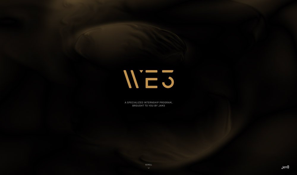
We3 turns the content into a choose-your-own-adventure style game. Users have to make choices using click and scroll actions. This type of design is complex but when done well can keep users interacting with the site for extended periods of time.
Stink Studios is a great example of the latter. The design uses multiple bit of content in creative, colored blocks that populate on the scroll. The animations are on point, the content type (portfolio) works with the technique and the design demands continued scrolling thanks to the way elements break on the screen.
Scrolling with Other Actions
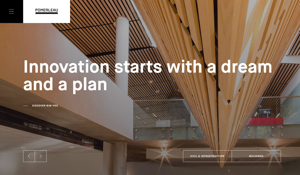
You don’t have to stick to one type of scrolling pattern – mix it up and incorporate vertical and horizontal scrolling. But be warned – this is a very tricky thing to pull off effectively. Powerleau uses this very mix to take users through lots of different types of content. It works thanks to plenty of navigational tool with arrows indicating a horizontal scroll (which includes more content in a display format) and the more common vertical scroll that includes information that would otherwise be clicked on from the hidden menu.
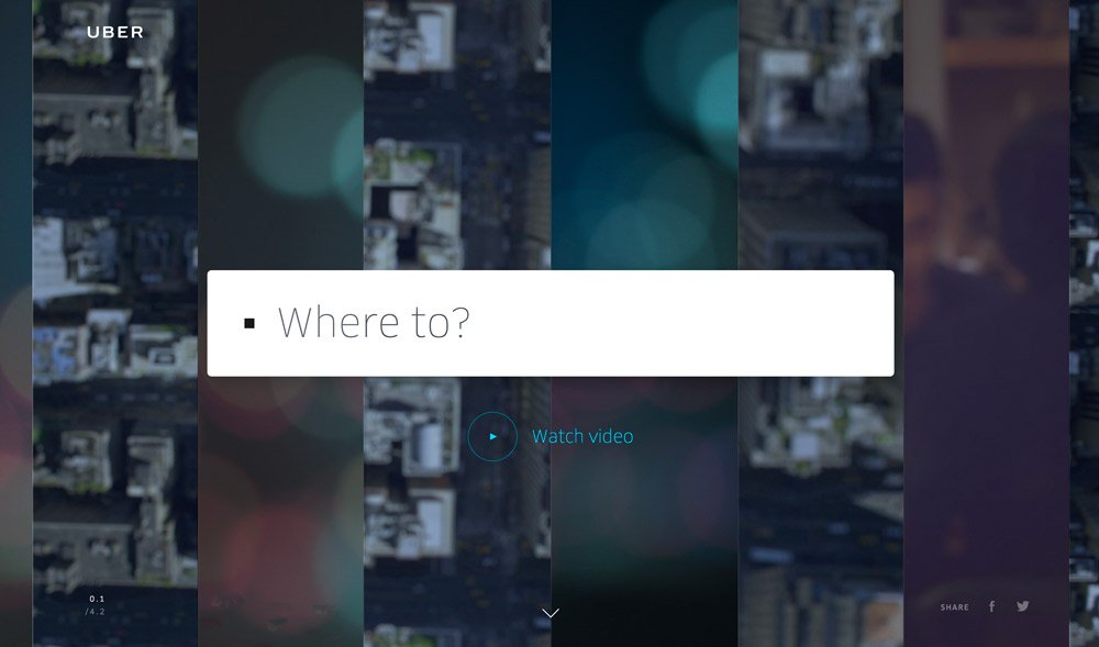
Scrolling can do other things as well, such as pan and zoom information on the screen. Uber uses this type of concept with its actual website. What’s interesting about the design concept is that scroll actions on the desktop website mirror zoom actions in the app. (Pretty cool, huh?)
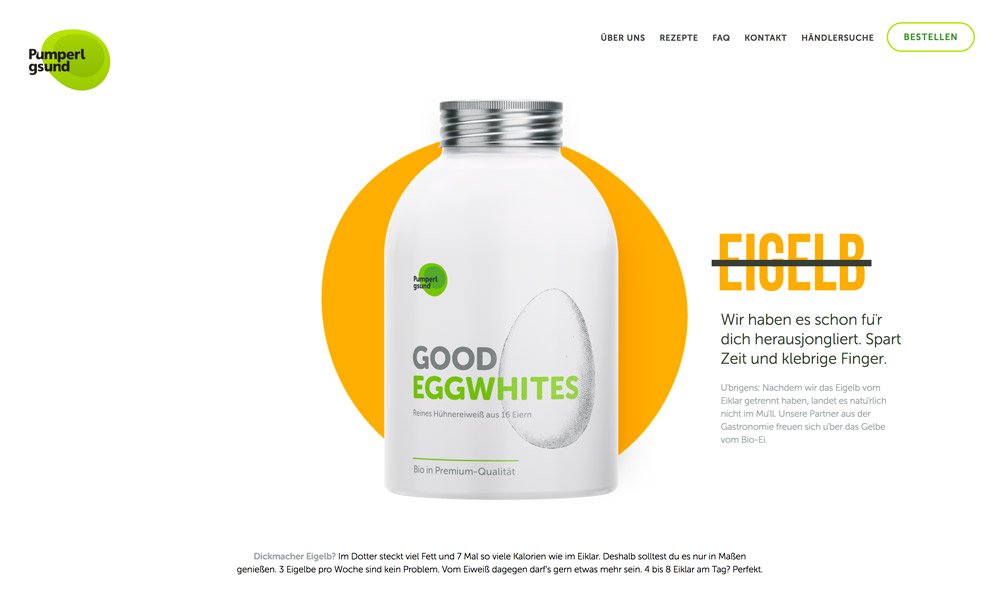
Finally, some scroll actions might not appear to be actions at all. With the magic of parallax and great animated flow and color choices, Pumperl gsund uses scroll to create an almost video style display of a product. Moving the mouse spins the product (in time with mouse speed, no less), adds content and give the user plenty of information about what might otherwise be a too simple, colorless project.
Conclusion
Here’s one more fact from UX Myths: “The design agency Huge measured scrolling in a series of usability tests and found ‘that participants almost always scrolled, regardless of how they are cued to do so – and that’s liberating.’”
That alone should be enough to make you consider a scrolling format. If it’s not, think about usability, creativity and overall function. Users do understand the scroll. They will try to do it. Shouldn’t your designs reward them for interaction?


Great read, Carrie.
As you’ve mentioned, scrolling does increase the user’s interaction with your website, but if you have long page outlines it can be daunting.