16 Creative Portfolios to Get Inspired By
I found designing my own portfolio to be hard. That’s because I’m doing it alone. I don’t have anyone else to collaborate with. It’s not like I have a teammate working towards the same goal. It’s also hard because I’m the stakeholder. I make the final call. It’s easy to get off track and get stuck in the rabbit hole.
The most important advice I can share with you is to treat your portfolio like you’d be the client. Set goals and expectations, and keep yourself accountable. With that in mind, I’ve gathered 16 portfolios to inspire you. I find it helpful to keep the creative juices flowing when I’m exposed to beautiful designs created by others. Let’s start with some self-promotion by checking out my own portfolio.
01. Paula Borowska
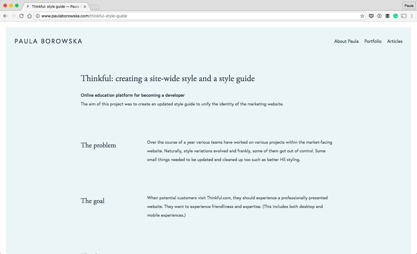
The reason I want to include my own portfolio is the way I structured my case studies, aka portfolio pieces. I wanted to experiment and see how I could make an impression on people who view my portfolio.
So, I remove all visuals until the end. I structured my case studies around progress. I talked about the problem, end goal, and brainstorming, followed by user research, mockups, and any iterations I made. Eventually, I showed the final visual design as well. I must say, I’ve received positive feedback from clients about it :).
02. Steven Mengin
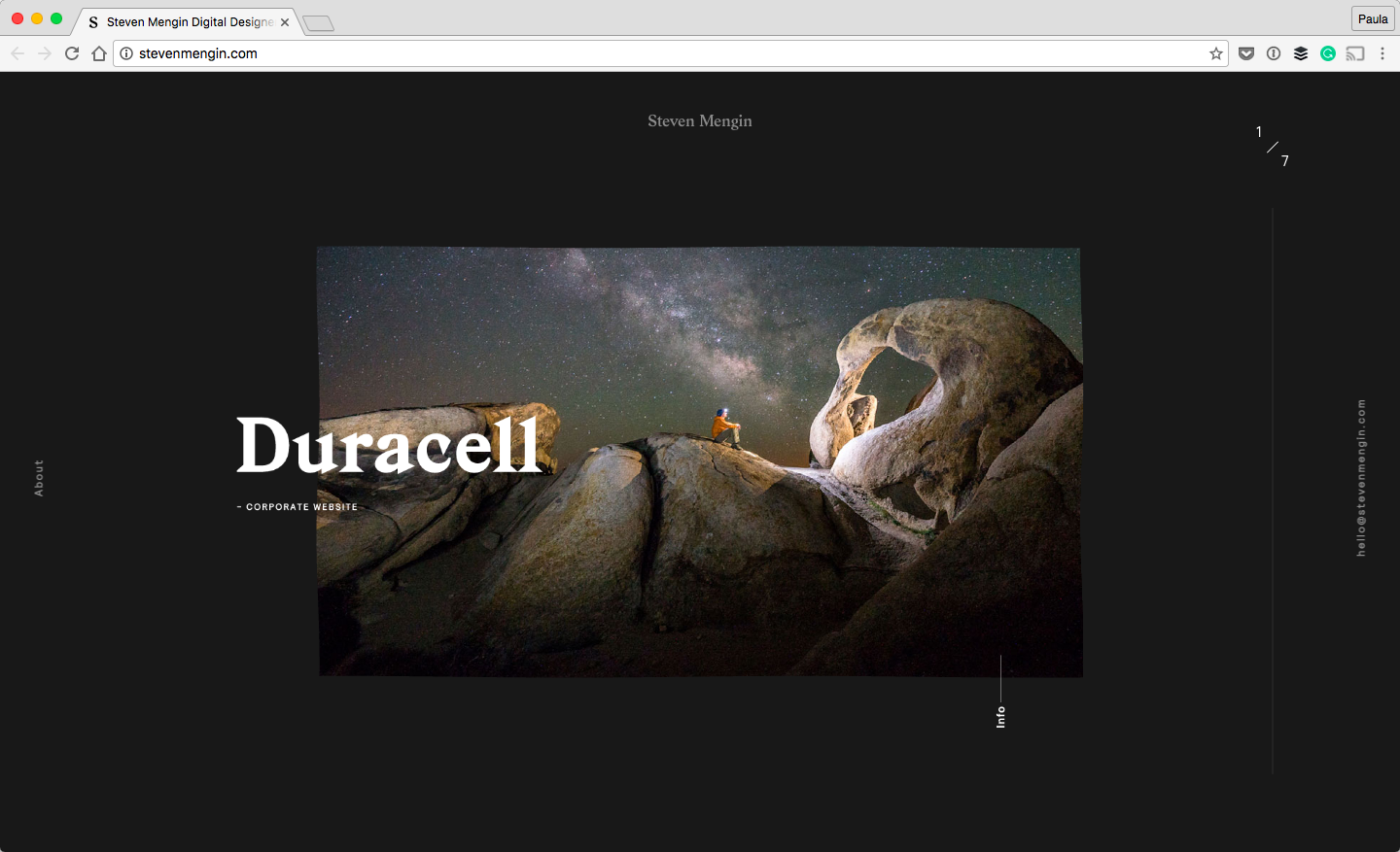
I like Steven’s portfolio for all the different animations and transitions. It definitely makes the website much more interesting and captivating.
The portfolio doesn’t come off as showy, though. The animations are small and subtle. They aren’t distracting at all. I think the hover effects are my favorite. The topography is nice, too. I’m a big fan of the big type for the titles of his projects, for instance Duracell. The font is called Gza.
03. Ghostly Ferns
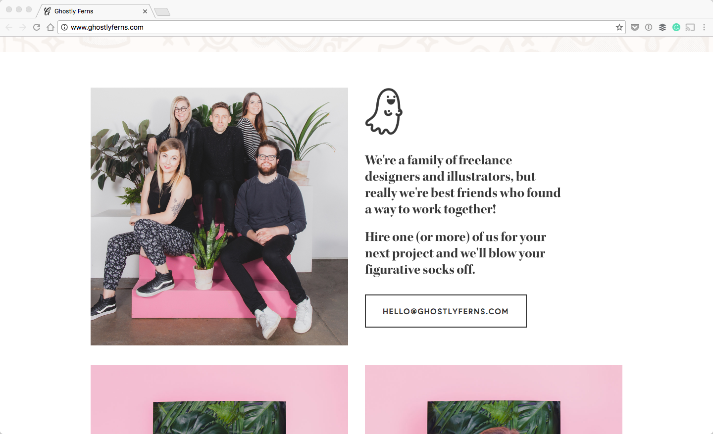
The quality of design of Ghostly Fern’s website is unreal. It’s just so good! The homepage is filled with beautiful photos of freelancers and their workspace.
The design is light, which I enjoy. The white background with the charcoal gray font is a nice touch. But, I also like the pink color thrown around occasionally. It makes the design feel much warmer and friendlier.
04. Susan Lin
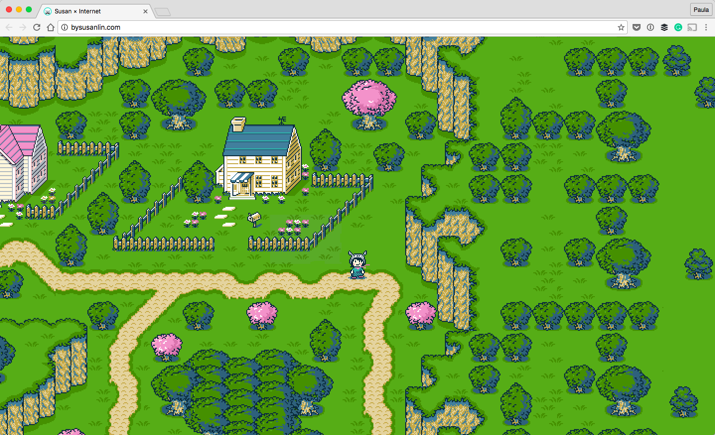
Susan’s homepage is fantastic! Susan is a great visual artist. She is also an illustrator who makes beautiful watercolor trees—it’s just her thing. Her Gameboy-like pixel art homepage is a unique touch. Only a few portfolios do something like this.
There are a navigation and a scrollable graphic on the page. The first time I saw it, I was pleasantly surprised. Now, every time I think about portfolios, I think about her homepage. It was a great move to design it this way. It makes it so much more memorable.
05. Oykun Yilmaz
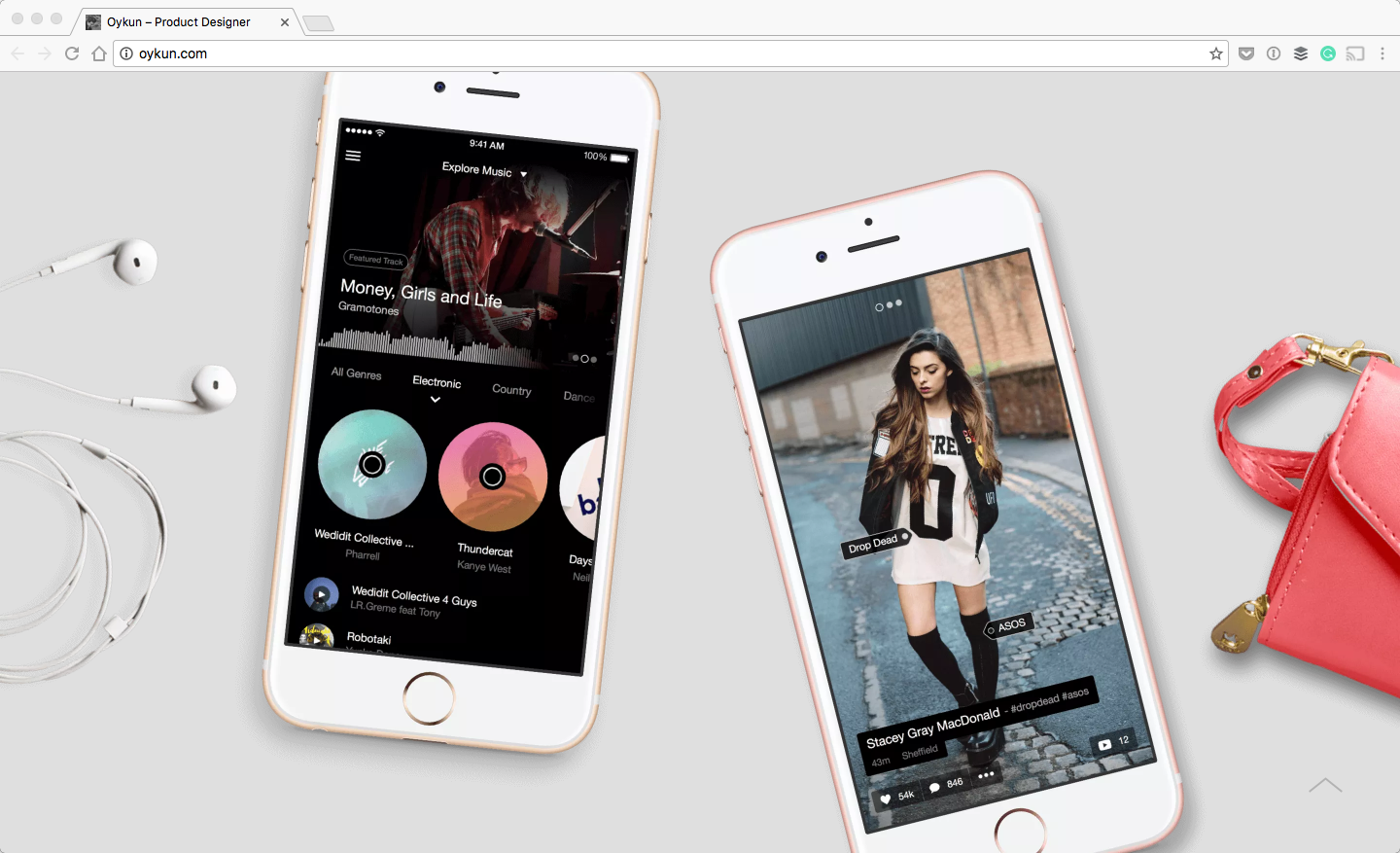
I’ve included Oykun’s portfolio into this list because of the visuals. His portfolio isn’t a cookie cutter, as it features many overlapping elements. There are many out-of-grid elements, too.
I enjoy the iPhones that are showing off his mobile UI design; it looks like they have been just thrown on a table. It makes the presentation of his work much more interesting. Overall, I think Oykun has an amazing eye for design and presenting his own work.
06. Jan Losert
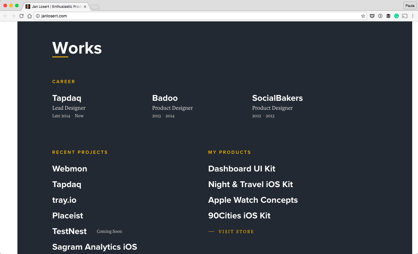
A piece of Jan’s work became viral a few years ago. He redesigned Facebook as a concept and it became an utter sensation. It was a good design. His current portfolio is well designed, too.
The typography is big, which is something I really like. It makes it easy to scan the copy. It can’t use too much jargon because there isn’t much place for it either. I like his light use of color, too. The design is pleasant. I like that it’s heavily focused on big typography.
07. Samuel Medvedowsky
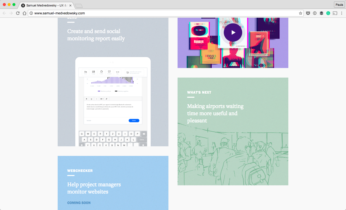
My favorite part of this portfolio is the pastel-colored blocks on the homepage. I like that they are not arranged in a perfect grid. I don’t know if I would call this masonry, though.
There are only three portfolio pieces and one is coming soon. Yet, this portfolio looks high quality. The limited portfolio pieces are strong. This goes to show you don’t need a lot to wow someone.
08. Samuel Burrows
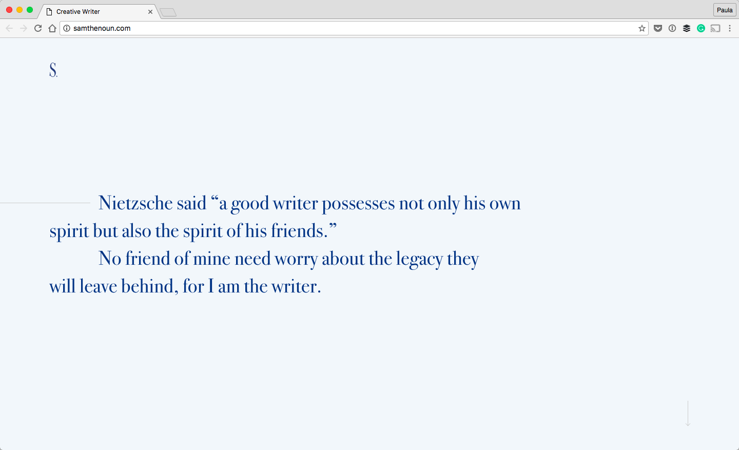
There is a lot to like about Samuel’s portfolio. First, I noticed the use of color. The almost navy blue type and the background is a great color.
The use of white and light blue throughout the page has was a good design decision as well. But, the best part of this portfolio is the story it tells as you scroll. It’s not a standard portfolio by any means. This is a portfolio of a great storyteller.
09. Ales Nesetril
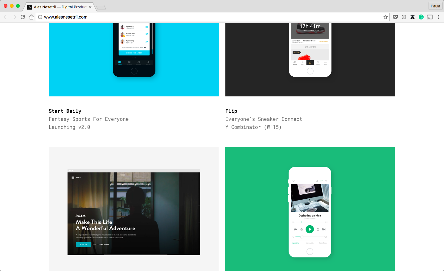
Ales is a product designer from Prague. I like Ales’ portfolio. Besides the big font, I like the use of a monotype font. It makes this portfolio a little different.
I think Ales’ portfolio deserves a mention for its cleanliness. It doesn’t have any bells and whistles and that’s okay. Not everyone’s portfolio needs to put on a show. A portfolio should show off one’s work. Ales’ portfolio does this exceptionally well.
10. Joe Mortell
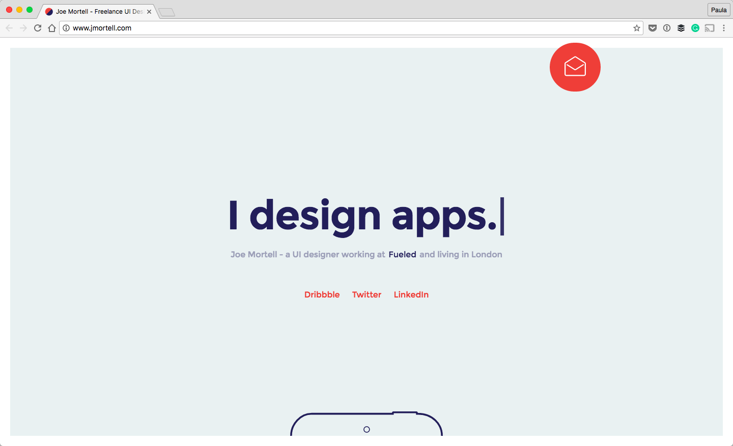 I think I have a thing for non-black fonts. I often use charcoal for text but I’m starting to get into using dark blues like in Joe’s portfolio.
The navy blue text looks so good with the light blue background and the mid-blue shade for the subheading. It looks really great alongside with the accent red. Both of these colors and their shades look good with the small accents of white, too. Who says gray or black has to be part of a design?
11. Sean Halpin
 I love the graphics’ of Sean’s portfolio. The hero image on the homepage is so sweet. Obviously, Sean knows a thing or two about emotional manipulation within a design. Don’t you just love how adorable the design is? It’s a mixture of high-quality illustrations with a beautiful shade of green. The light use of pastel colors takes it over the top!
12. Jake Blakeley
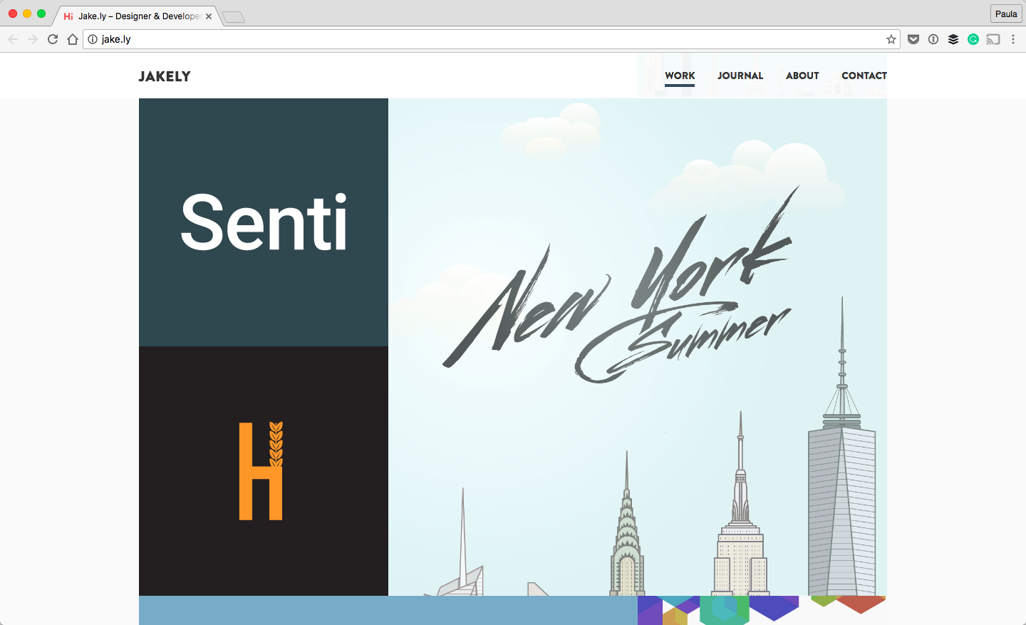
The reason I included Jake’s portfolio here are the animations. Specifically, I’m interested in the transitions between the pages. Most page transitions use the typical reload effect. Jake took this to a whole another level.
The portfolio piece image moves around and becomes the header image. The illustrations within the header move around, too. The text kind of jumps into the page. None of this is jarring. Everything is smooth, pleasant, and impressive.
13. Waaark
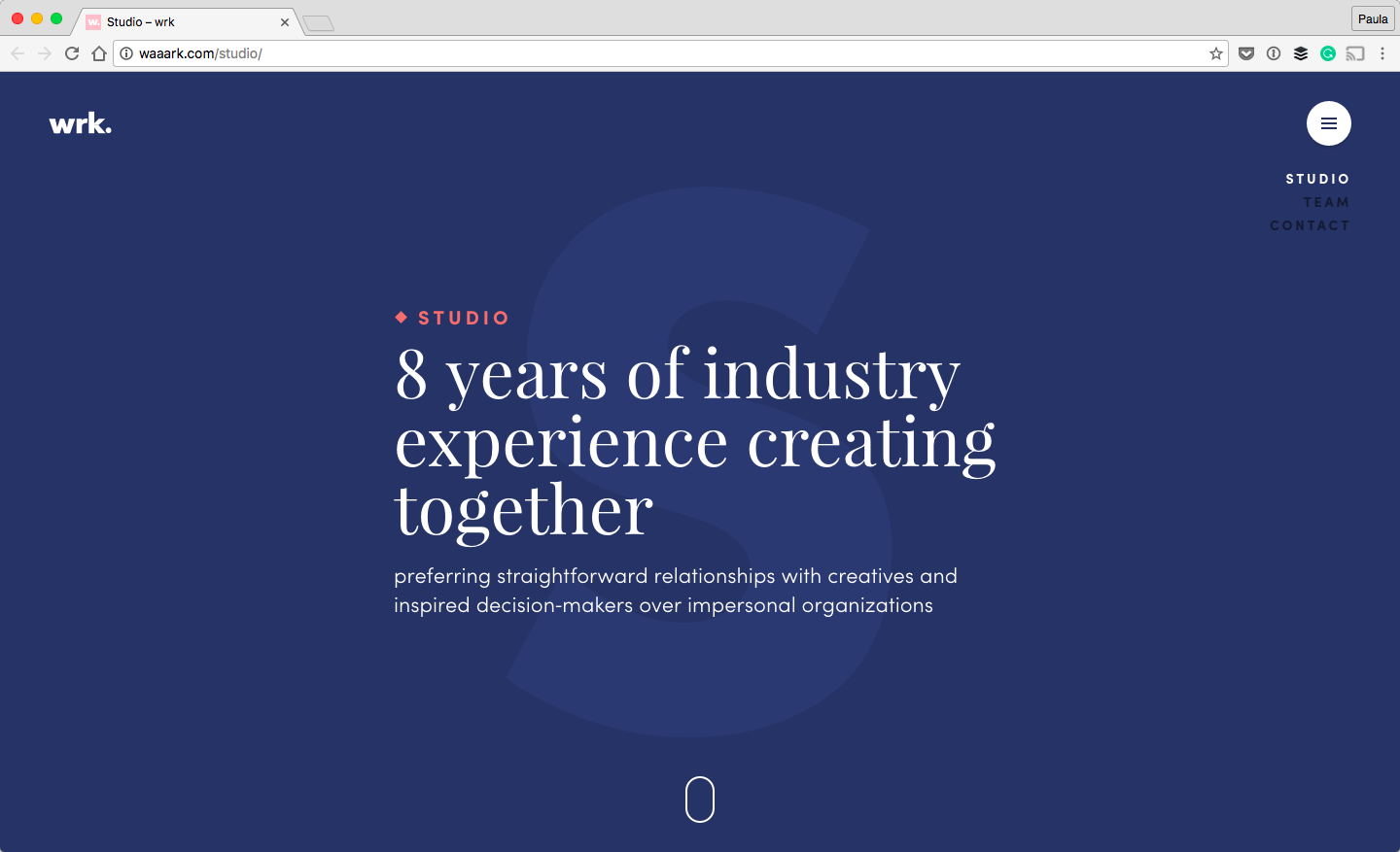
This is another portfolio for a web design studio. But it’s a studio of two, not a big agency. I think we can throw this in here, too. Especially because the design is of amazing quality. What I love the most about this portfolio is the meticulous attention to detail.
The hover animation of the logo, the dripping pain of the letter “J” on the About page, and the transition effect when the website loads. These small details make this website that much more beautiful.
14. Anton and Irene
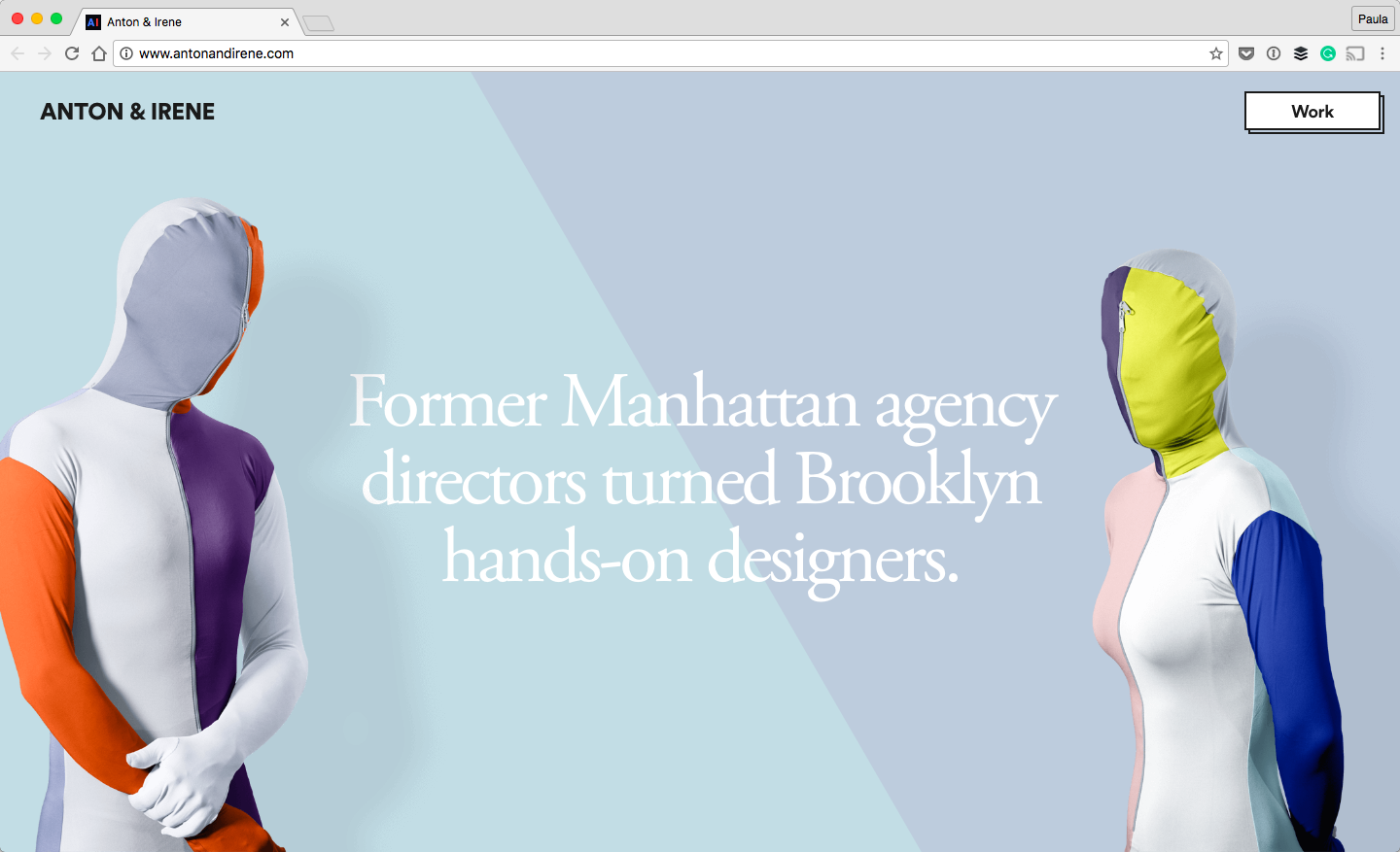
Anton and Irene are a couple of two creatives. Their portfolio is unique. It definitely grabs your attention. The portfolio is heavily focused on scrolling through the homage.
The creative expression in this design is oozing from every pixel. This ranges from the photos in the header to the way the figures move out of the way for the upcoming section. It continues throughout the whole website. I’ve never had so much fun scrolling.
15. Aaron Porter
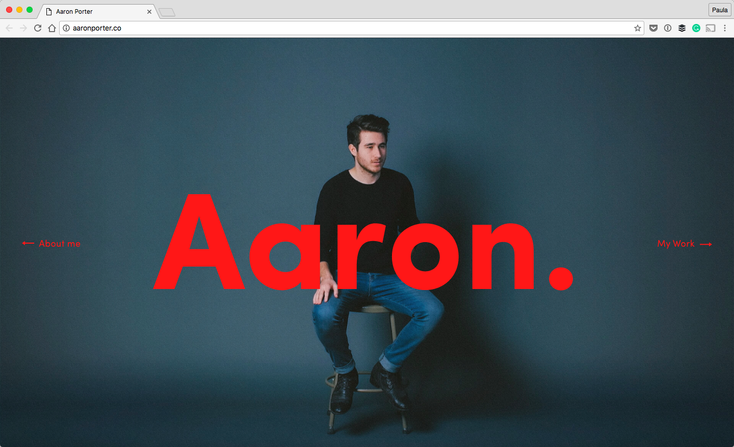
Aaron is a creative filmmaker. It’s no surprise that his website is well designed, too. I like that the design features bright red lettering. Red seems like something most web designs avoid. Especially red which is that bright. Yet, it works here.
I also like the incorporation of video to show off Aaron himself between the homepage and About page. He walks up to you from the stool when you click “About me” and goes back to his stool when you return to the homepage.
16. Admir Hadzic
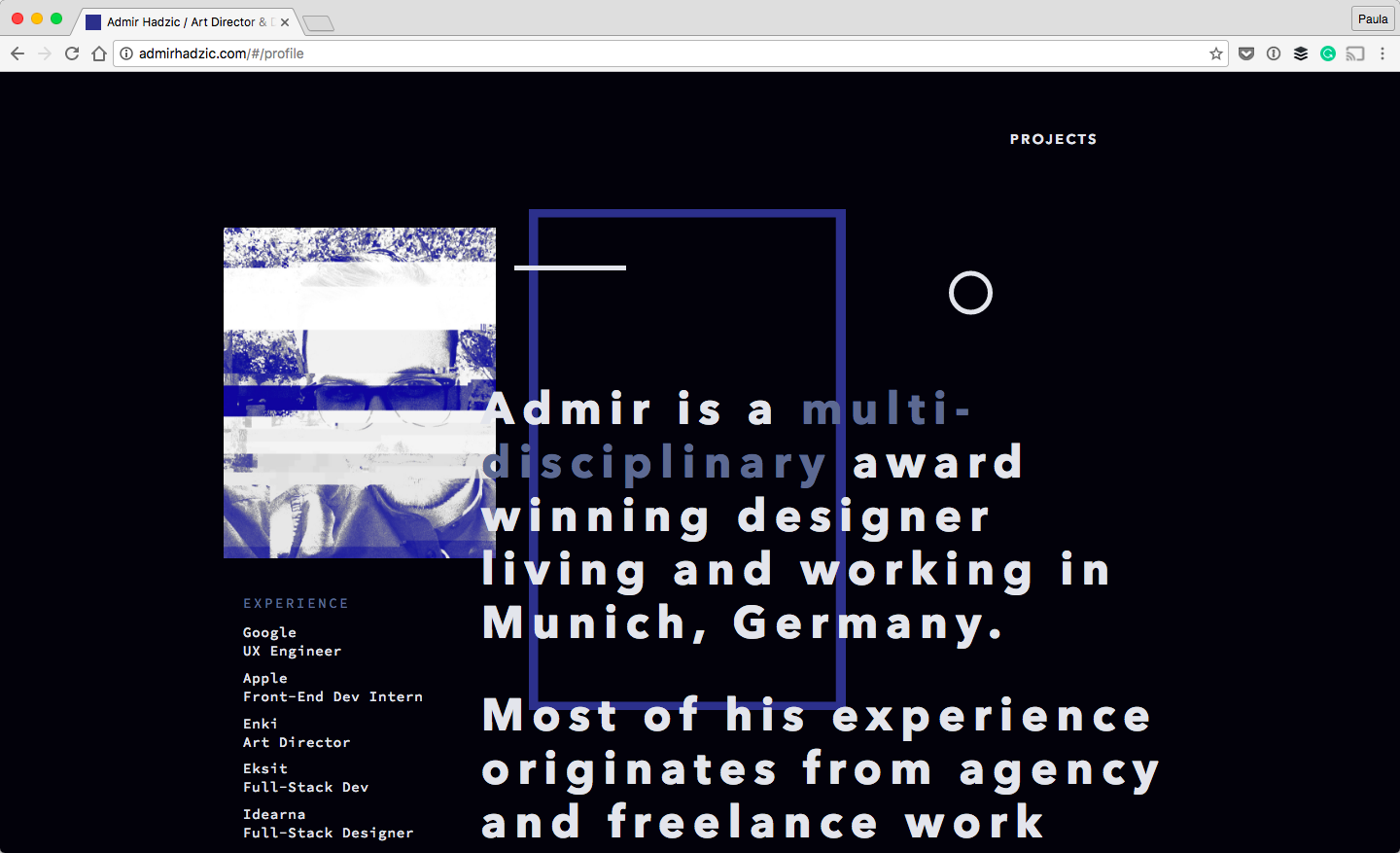
I’ve included Admir’s portfolio because of its messiness. Personally, I believe in cleanliness. But, business or messy design can be a good design, too. Too often, we associate busy with bad design when people threw everything at the user, all at once, hoping something will stick.
Amir’s portfolio doesn’t have this problem. The goal is very simple, it’s to show off his work using various design elements. However, showing everything makes the site much more chaotic than we are used to. At least for me. That’s why I enjoy this design.
Conclusion
Portfolios come in so many varieties. I know it can be hard to design one for yourself. Like I mentioned at the beginning, my best advice is to treat it as you would do a regular design project.
Ask questions of yourself. What goal is this portfolio solving? For instance, I wanted my potential freelance clients to know I could help alleviate their business problems through design. I cannot tell you what that is. It varies from person to person. But, I can share with you some beautiful portfolios. Hopefully, I can inspire you to make something beautiful and amazing, too.


Leave a Reply