30 Creative Designs of WordPress Websites
If you’re in the process of designing a new WordPress website have a look at these 30 creative designs. I’m sure they will inspire you to make something amazing. Even if you’re not dealing with a WordPress site directly have a look anyways.
I enjoy putting together these posts because they are filled with some fantastic design. I love being surrounded by beautiful websites. It really does help me create more creative and fantastic designs.
01. Build in Amsterdam
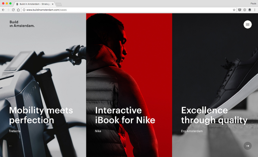
Build in Amsterdam is a creative agency specializing in branding and eCommerce. You can clearly see the extent of their creativity in their portfolio. Their case study page has a lot of cool interactions such as the faux horizontal scrolling and subtle animations on hover.
02. The Cool Club
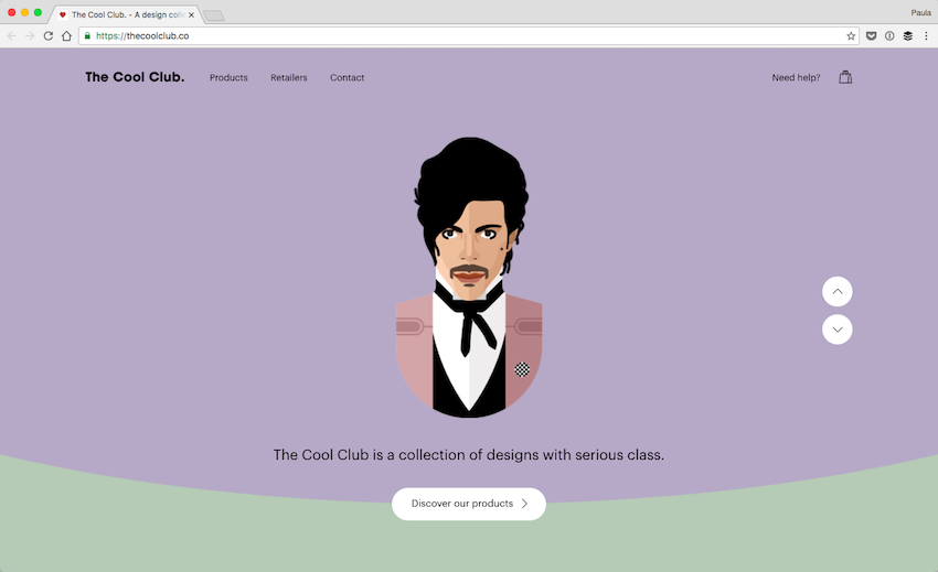
My favorite part of this design is the scrolling effect. I like how the different artist sections bobble. I love the animation effect that changes the curved background into a straight line. And, most of all, I love that when I scroll onto Prince, he winks at me. The design of the Cool Club’s homepage is incredibly well-thought-out with many great details.
03. Mt. Cuba Center
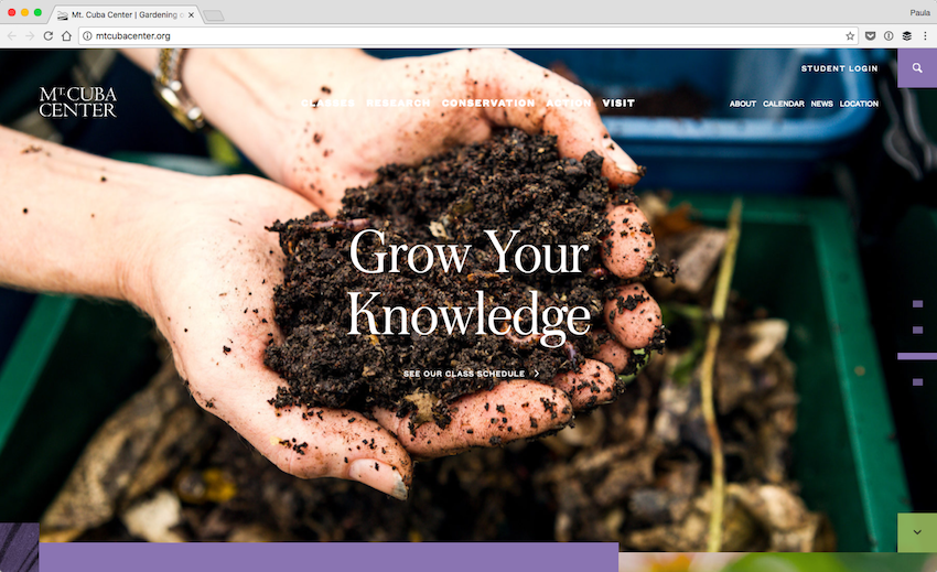
The website for this botanical garden is amazing. It makes a great use of typography in the sections that are not made up of photos or videos in order to highlight them. Additionally, the website is filled with so many different colors such as purple and green. The photos are really high-quality as well, featuring different colors throughout the page.
04. NightShift
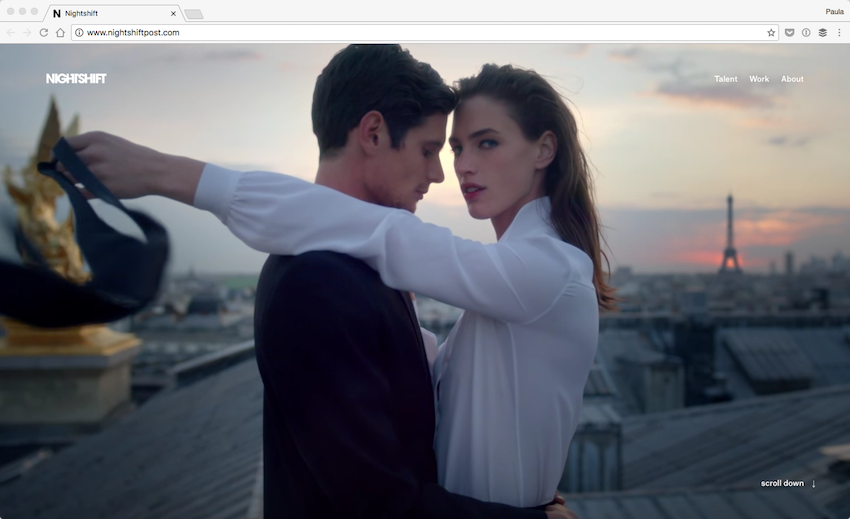
Nightshift is a company that believes in innovations, creativity, and the talent of their designers. On top of their homepage, you can find a quick video showing their past work. The video content is high-definition and made up of fun little bits. It’s an amazing introduction to the rest of their wonderful website.
05. Smith
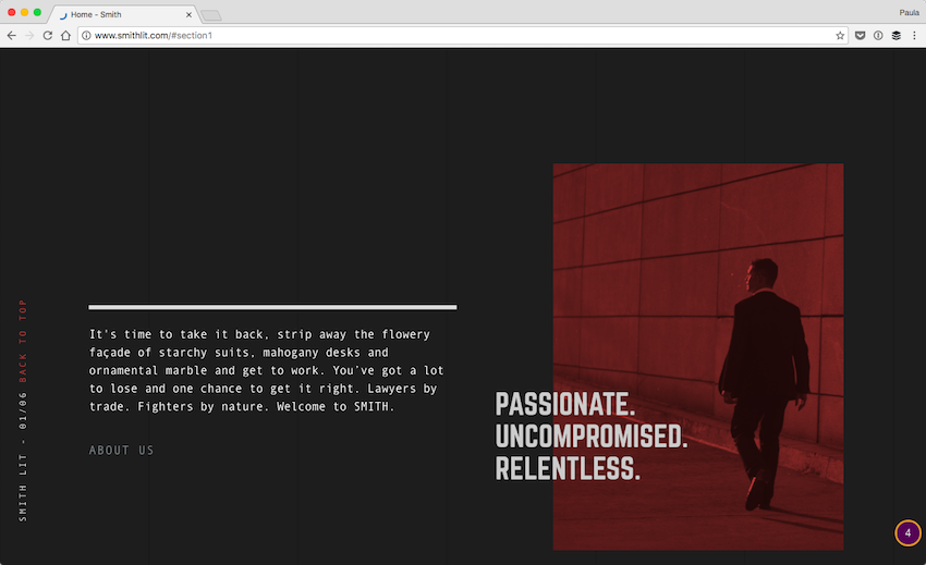
Smith is actually a website for a law and attorney firm in Atlanta. I don’t know about you, but I do not see that many well-designed law firm websites. The design is very dark and very serious. The recurring theme of the site is legal fight that is excellently presented with the smart use of imagery and quotes. Again, this is something you can’t find on the websites of most law firms.
06. Startup Lab
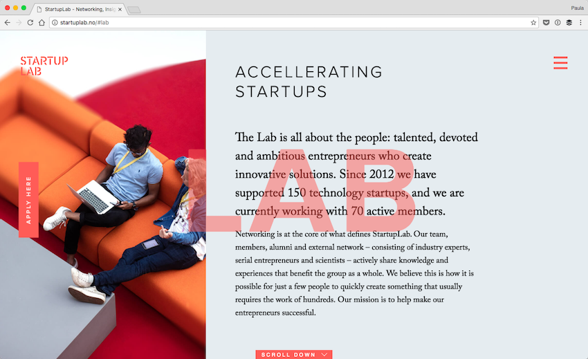
Startup Lab is a startup accelerator with a lovely website. The design is light, thanks to their generous use of whitespace. Most of the colors on the page are light as well, with little bits of accented red. It’s a delightful website to browse through.
07. Melville
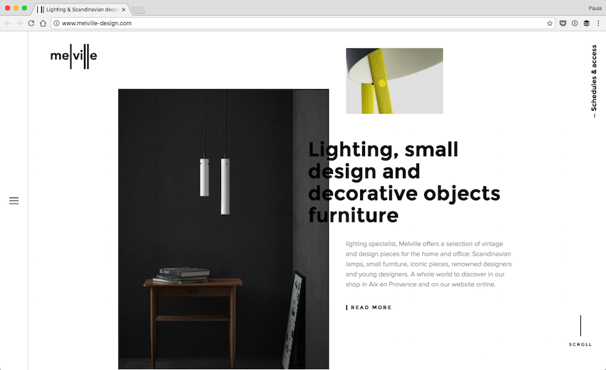
Melville is a furniture design company. I’m in love with the orderly but overlapping layout. I’m a huge fan of design elements overlapping and not being in a perfect 960-grid. It’s much more interesting to overlap elements or misalign them. It gets the visitor’s attention right away.
08. Draft
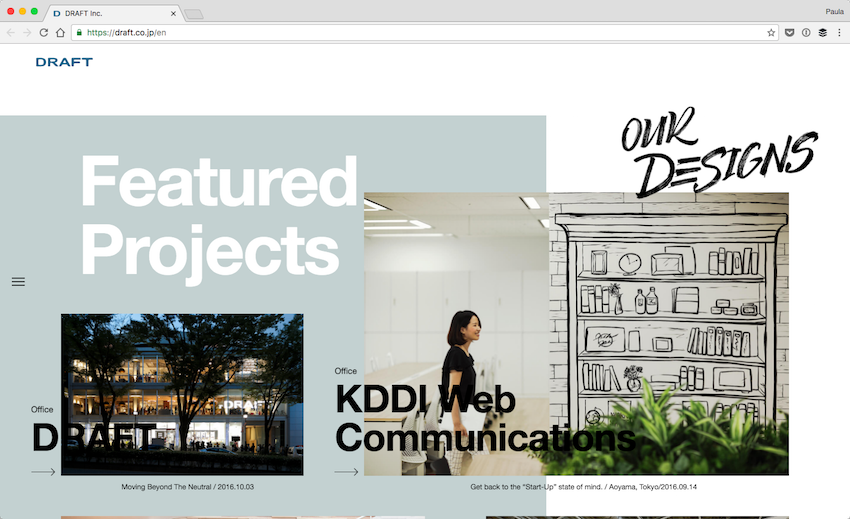
Draft is another example of a design with an atypical layout. Draft’s design relies on a few different typefaces, a lot of photos, and colors as accents. Attention to detail is high in this design. Otherwise, the design would quickly look like a mess.
09. Ben Pearce
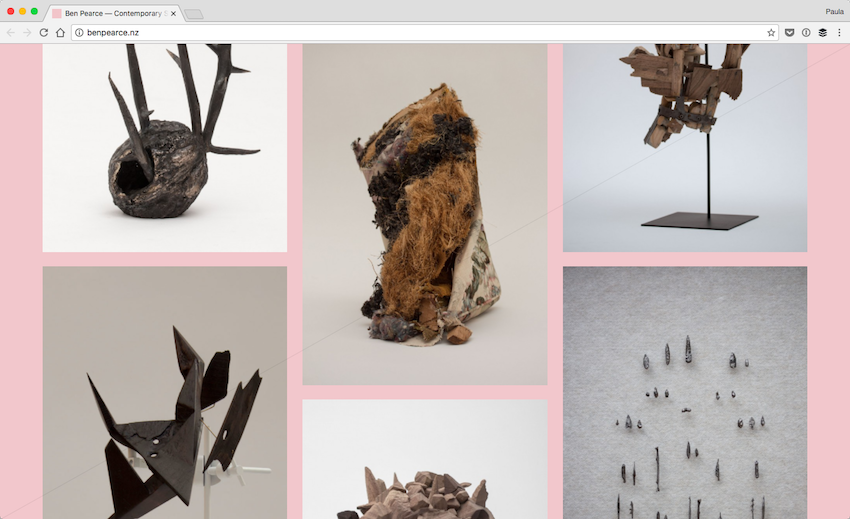
Don’t let the screenshot of Ben’s portfolio deter you. The design has a pink background and is filled with beautiful photographs of his sculptures. When you hover over a piece, the animation is a little unexpected but appreciated because it’s something different. The portfolio really shows the creativity of the sculptor Ben.
10. Wrk
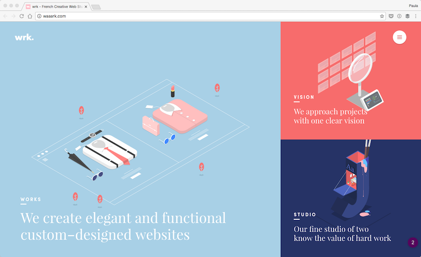
I’ve been in love with the portfolio of wrk for a long time. The colors, the layout, the typography, and the graphics are just perfect. Better yet are the animations and interactions. On the homepage, I enjoy hovering over the different squares because the border animations are so much fun. You don’t see that often in web interactions. It’s lovely!
11. Yoan Chevjon
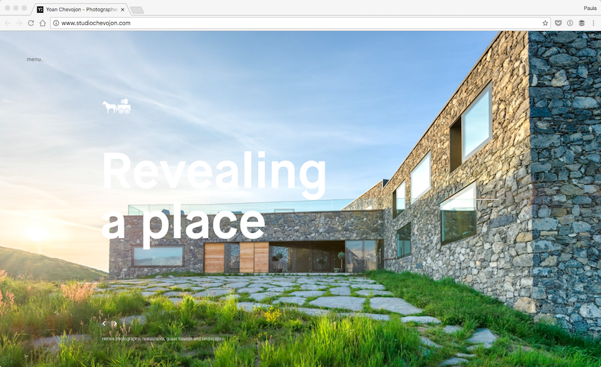
The transitions between the sections as you scroll the page are really cool on this website. The background image zooms out of the browser, the content switches to the next section, and the next photo zooms back in. That’s something really creative.
12. Papazian
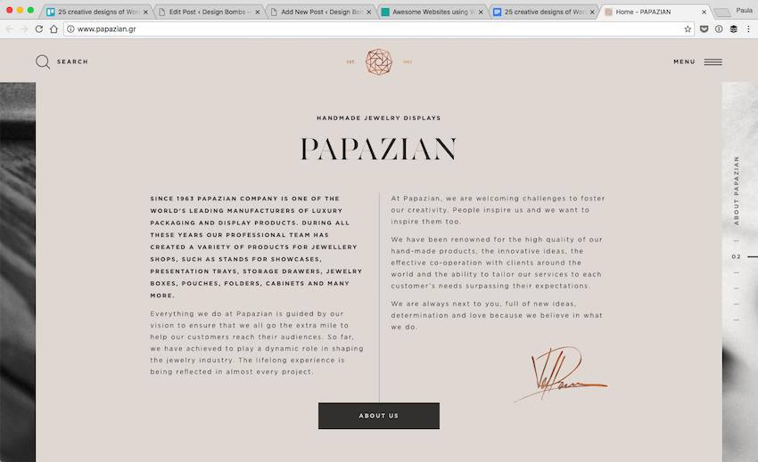
The design of Papazian is sleek, elegant, and modern. It’s pretty stylish as well. The design uses background photography in a unique way. The cold accents are extraordinary, too. The gold signature and the logo have different shades. Definitely, it uses handwritten fonts and it looks fantastic.
13. Middle Child
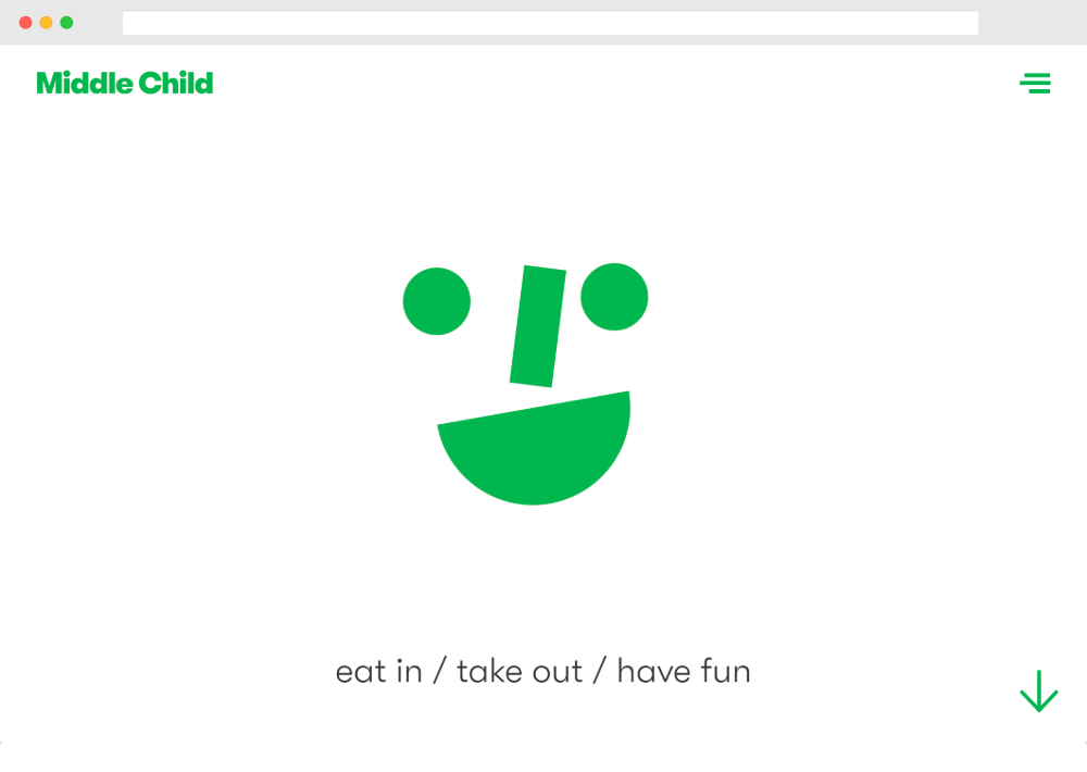
Middle Child is a Philadelphia sandwich shop with a creative, playful design that still does a great job of showcasing its food offerings.
14. Compliments
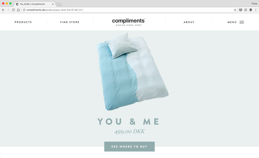
Compliments is an online home goods retailer with a simple yet beautiful website. Their products and the design of their website are very light and airy. It’s only fair that their website looks like this. Clean, simple with little bits of color was the right design choice.
15. Endeavour Capital
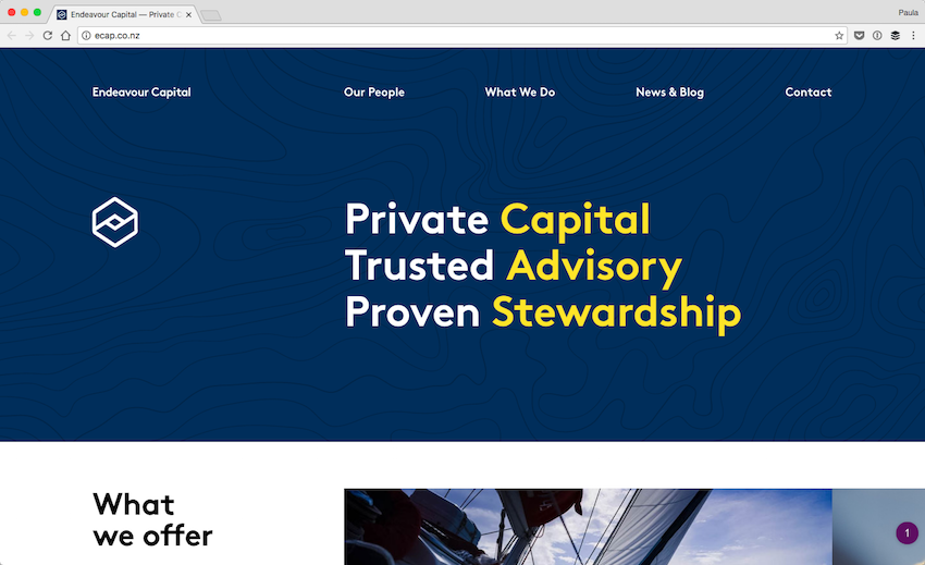
Endeavour Capital doesn’t have the most exciting design in the world. But, there is one element which I felt deserved it a mention. The headers of the pages are fantastic. There is a light use of pattern, too. There are different typography colors as well. The navy blue, crisp white, and slightly golden yellow work very well together. It’s a really nice header design.
16. Eginstill
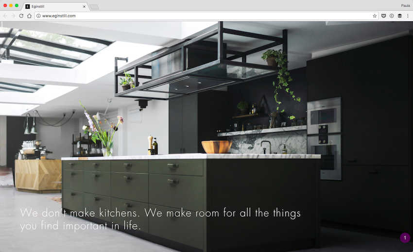
Alright, as you scroll down Eginstill’s website the images animate slightly. It’s such a nice design detail. It makes scrolling and engaging with the content easier. It also makes the content interesting and not all that static. Why are most websites have static contents on such an interactive medium like the web?
17. Cienne
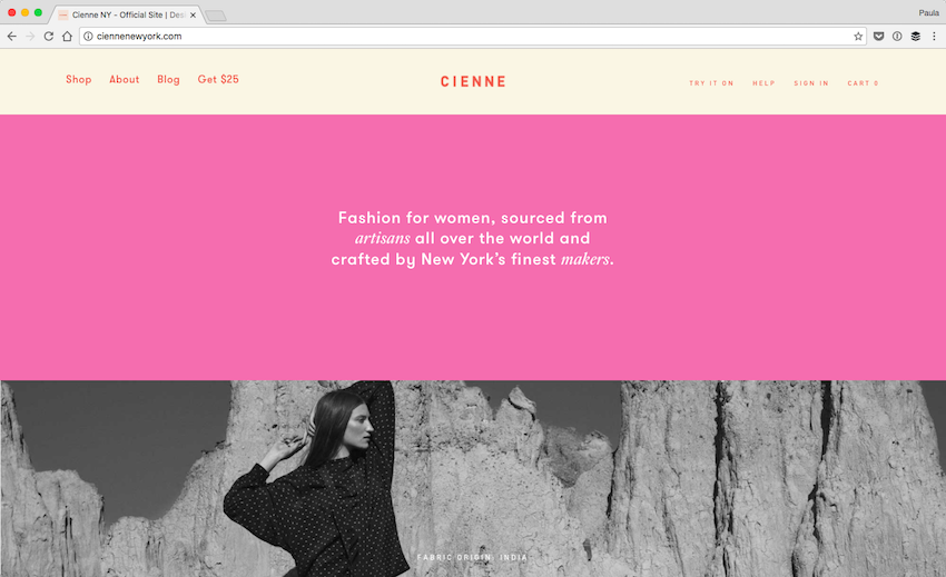
Cienne is a fashion retailer with a great website design. The design uses all sorts of colors for backgrounds and typography. It’s a colorful design filled with personality. They are a trendy and global fashion retailer. It only makes sense for their website to follow the same principles.
18. Stupid
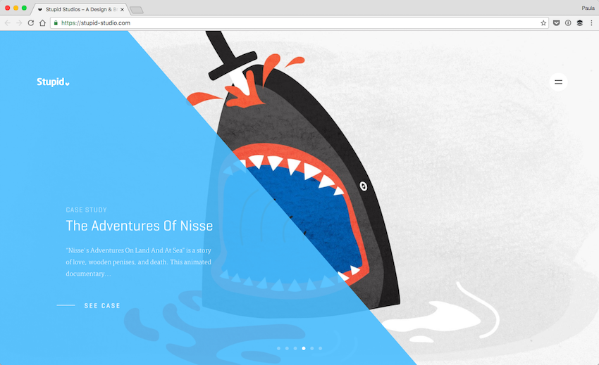
Here we have another creative agency. Their homepage is a good example of their creativity that hooks in users. Stupid knows how to use layout and layer different elements on top of one another. The design of their website shows a good attention to detail as well.
19. Y Agency
Y Agency is a creative agency with offices in Kiev and Los Angeles. They use WordPress to power their creative portfolio website.
20. Sisters of the Black Moon
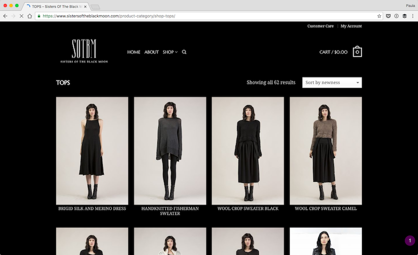
SOTBM uses a lot of black in their design, among other dark colors. It’s nothing something you will see everything, including on fashion retailers’ websites. But, with the name of their brand, it simply makes sense. They make good use of the darkness of their color palette. It helps create the appropriate atmosphere on their website.
21. Lavish Alice
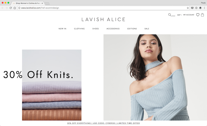
Lavish Alice has a simple web design. Yet, it’s filled with small little touches that take the user experience up a notch. For instance, the slight animation of items that fade in as you scroll. It’s really not a big deal but it makes the website a lot more enjoyable.
22. Huzi
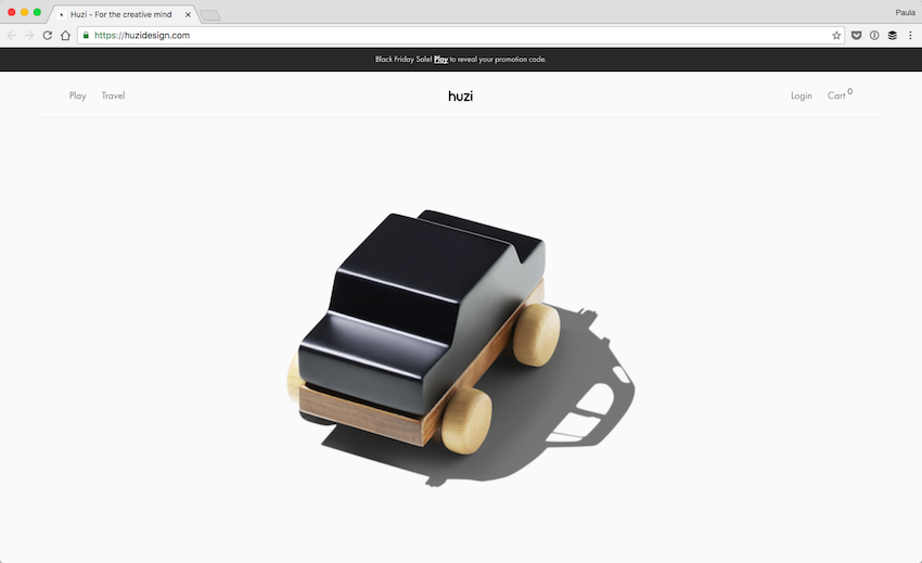
Huzi sells beautiful wooden toys. Their website is extremely minimalistic. It’s mostly made up of giant pictures of their products. It works very well for them. There are little distractions. There is little to question about the products they offer. The minimalistic approach lets the high quality and craftsmanship of their products stand out.
23. RSQ
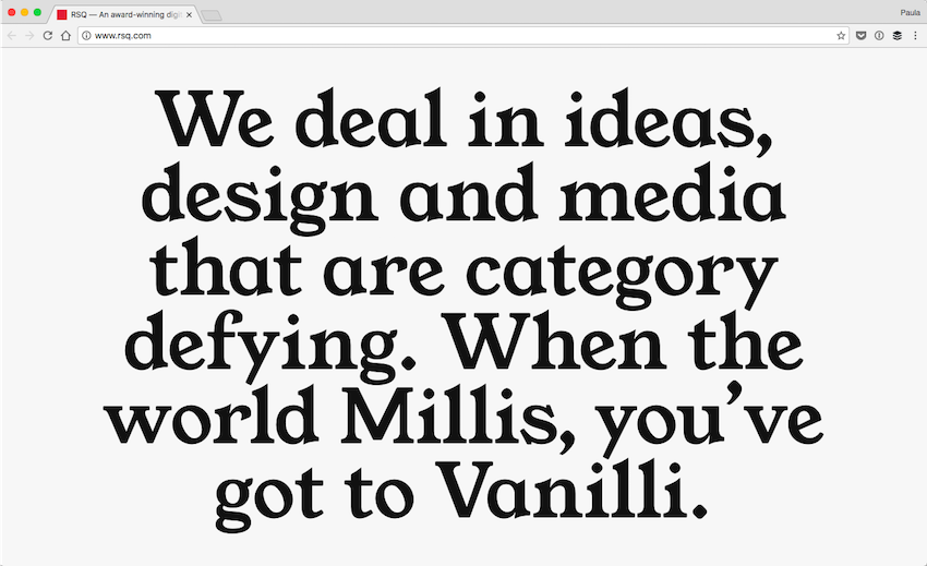
RSQ is a digital agency that knows how to get a visitor’s attention. Their homepage is mainly black and white. It’s quite different from most agencies’ website. They also use big and bold typography. It’s captivating to get on their website. It’s not what you’d expect from a digital agency. It works well for selling their message.
24. Letterwine
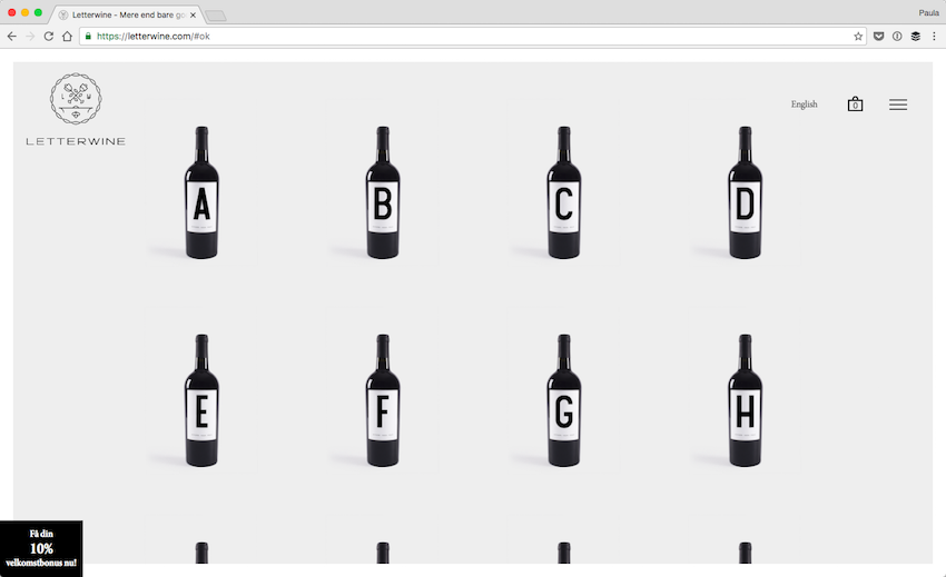
Letterwine sells wine bottles with lettering on them. It can be a fun product at parties and events. Their website is clean, simple, and minimal. It showcases their wine bottles and the different letters. There is little fuss about anything on this page.
25. Form.
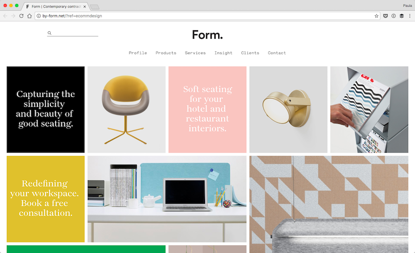
I love the design of Form. They use the grid almost religiously. It’s used well. I also appreciate the little pastel blocks of color. It makes the website interesting. The design reuses different elements to create an orderly design. For instance, all the colored blocks are for text-only content. It’s a really pleasant and well-done design.
26. We Virtually Are
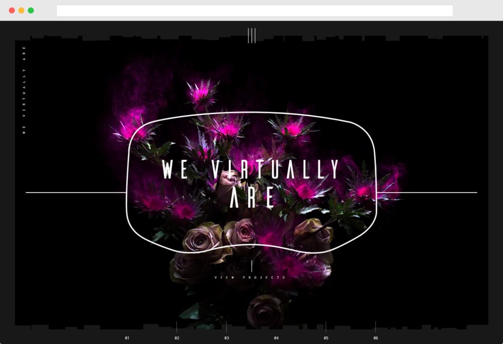
We Virtually Are is a creative agency that creates digital experiences to help people experience products in a more realistic fashion. It’s a creative concept, and their portfolio website doesn’t disappoint in communicating that.
27. Le Mugs
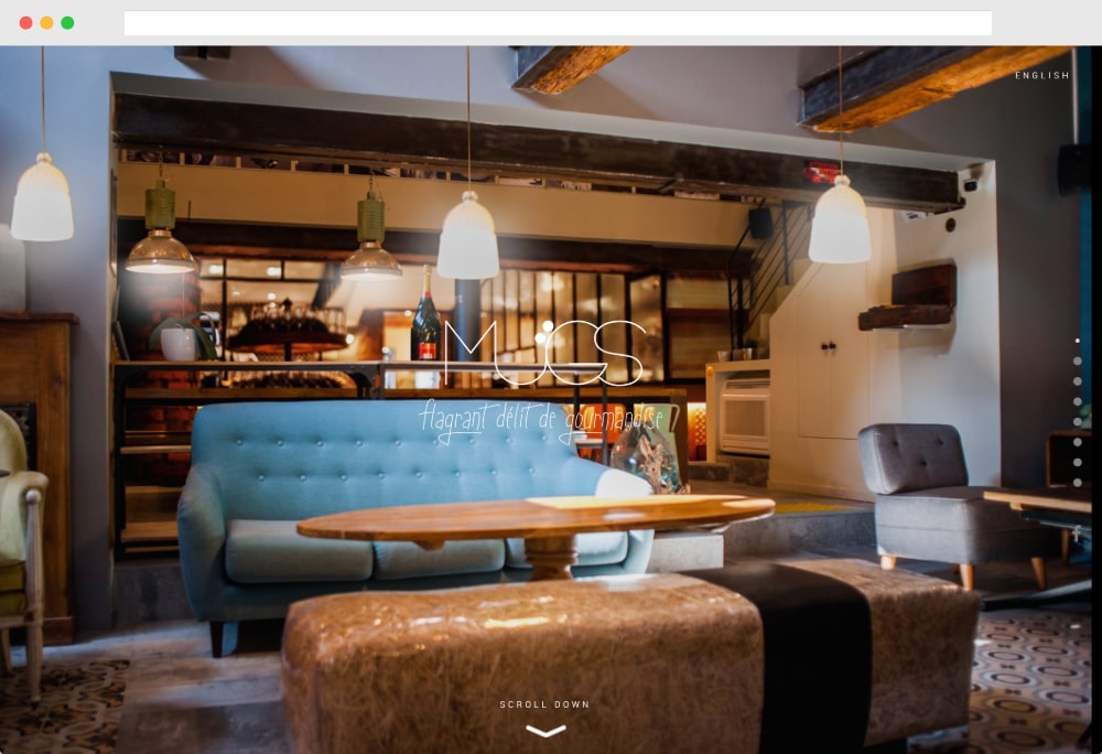
Le Mugs uses an interesting 3D effect for its full-width hero image at the top of the homepage. It also uses a one-page design with lots of interesting scroll effects as you move down the page, so make sure to scroll down.
28. Femme & Fierce
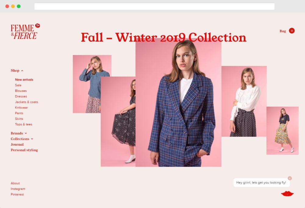
Femme & Fierce is a Dutch fashion label with a creative WordPress-powered store complete with lots of interesting scroll effects and animations.
29. noformat
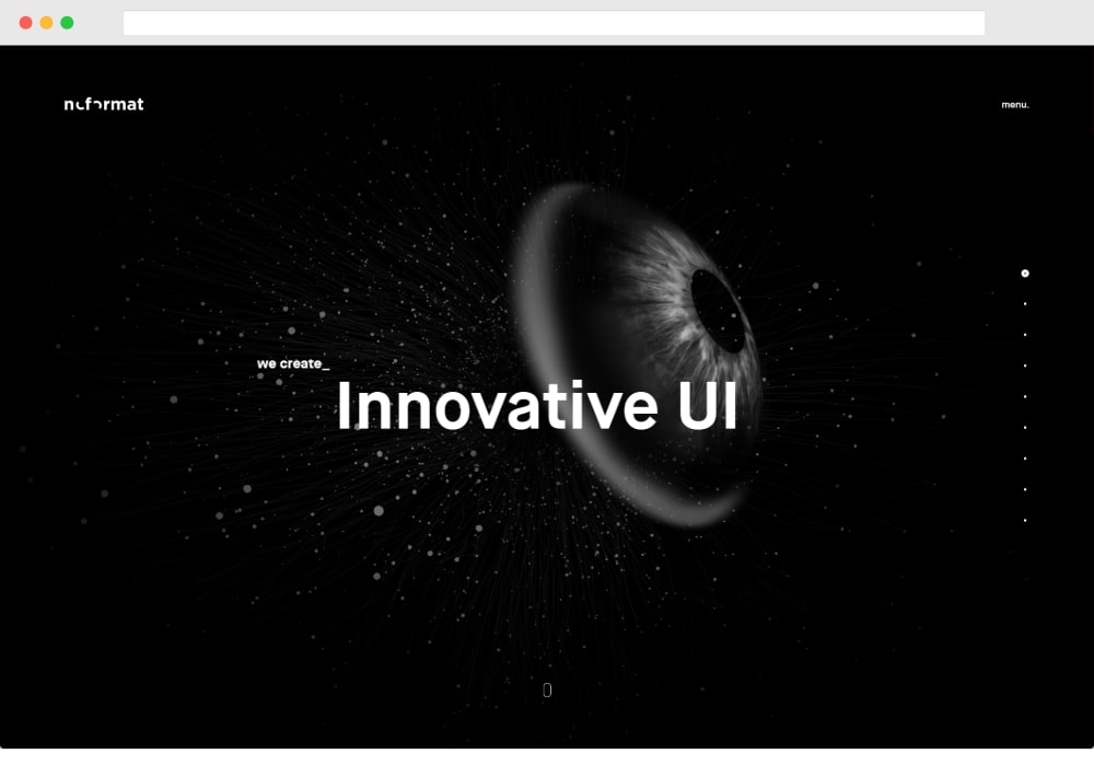
noformat is a strategic design agency with a portfolio site that uses a creative one-page WordPress design and tons of scroll animations.
30. Max Shkret
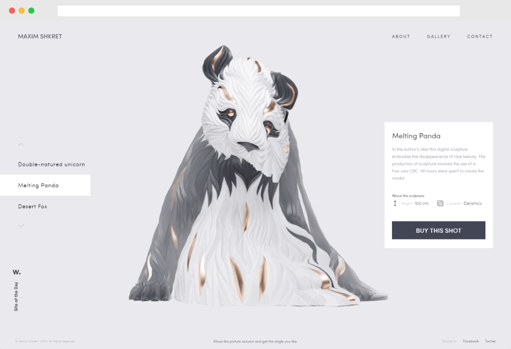
Max Shkret is a freelance digital artist who also sells his work directly. In the screenshot above, you can see his digital sculpture of a panda.
How to Make Your Own Creative Website With WordPress
Want to make your own creative WordPress website and earn your spot on this list? You don’t need to be a tech genius or a design guru to make a great-looking website with WordPress. Anyone can make a WordPress site and you’ll find tons of off-the-rack creative WordPress themes to help you manage your design.
To get started, you’ll need great WordPress hosting – we recommend SiteGround, which includes a setup wizard to help you get started.
If you want a detailed look at the full process of making a creative website, these two guides can help you get everything set up:
That’s all there is. How did you enjoy these 30 creative designs of WordPress websites?
Leave a Reply