5 Color Trends to Try
Color can be one of the most fun – and most frustrating – parts of planning a web design project. You want colors to reflect your brand, but you also want to establish a style that’s modern and trendy.
Color can set the tone for a project and connect with users immediately or fall back so that other content can carry the load. Today’s color trends lean more toward the bright, bold, in-your-face end of the spectrum with color as a dominant means of creating a memorable first impression.
There are plenty of ways to do that. We aren’t going to go into the details of creating a color palette here. (Hopefully, you understand the theories behind the color wheel for that.) What we are going to look at are color choices that are seriously on-trend so you can pick a palette that feels fresh and maybe a bit funky.
The biggest trends seem to be the return of gradients, light or white backgrounds, use of colors from the Material Design palette, Pantone’s color of the year (a perennial trend) and golden hues. Here’s a look at how to use the colors in your projects and examples of websites that have these color trends perfected already.
01. Gradients
One of the elements that disappeared when flat and Material Design came to the forefront was gradients. Thankfully, these two-tone fades are cool again.
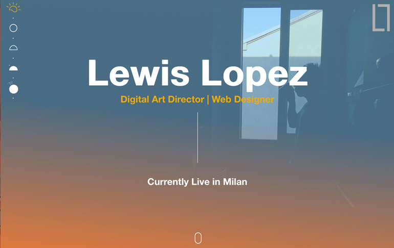
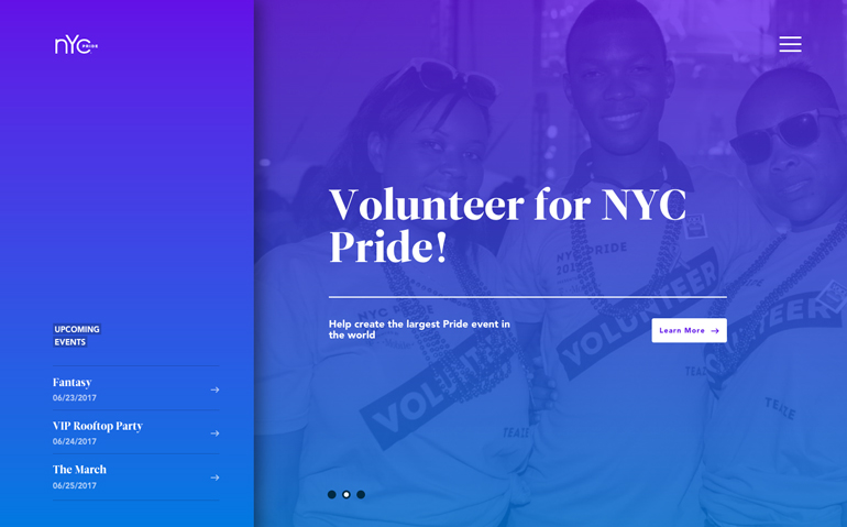
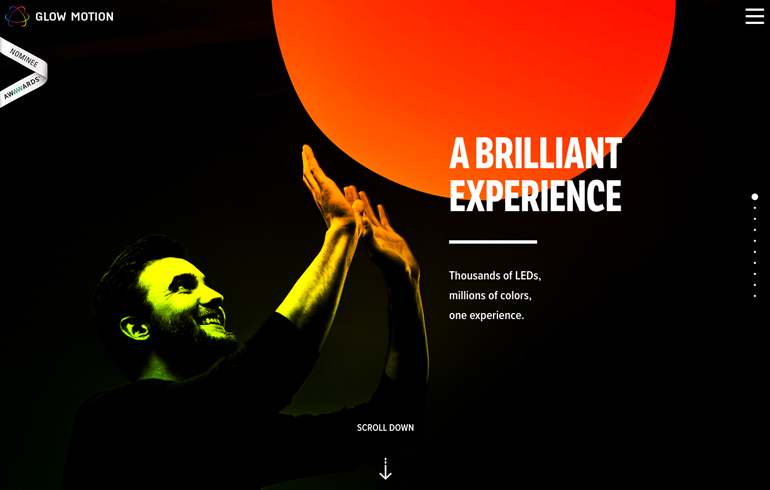
Many of the trending gradients aren’t part of subtle textures inside elements; they are full-color overlays that fill the screen. The color choices tend to be on the brighter, bolder side with opposites on the color wheel making excellent color pairs.
The liner style gradient is most popular with a change extending from opposite corners of the screen to meet and merge in the middle. Top to bottom and corner to corner gradient styles are the most popular.
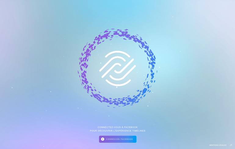
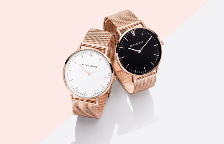
Most of the gradients we are seeing have an element of transparency as well. This is common with gradients that are used as color overlays on photos to add more visual interest. Pastel gradients are also rather popular as a background option, but without the photo overlay.
What’s nice about the gradient trend is that it can be pretty easy to incorporate into projects. You don’t have to completely redesign to use this trend. The toughest part of working with gradients can be finding just the right color combination.
If you need inspiration – or gradient-making help – try WebGradients. The site includes nearly 200 linear gradient combinations that are sure to help jump start your creativity. Many of the combinations include trendy hues so you won’t get stuck with something that looks like the gradient trend of five-plus years ago.
02. Light or White Backgrounds
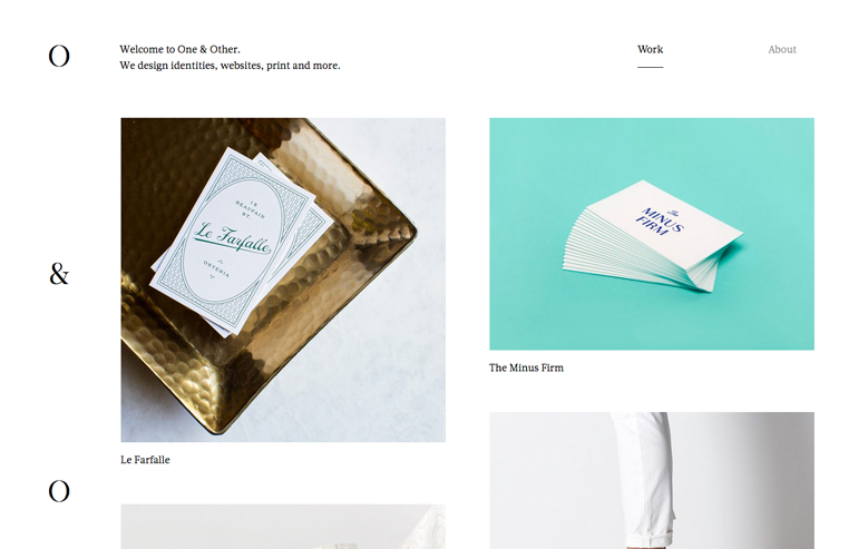
Use of light or white backgrounds is one of those color trends that seems to re-emerge the minute it starts fading away. Probably because the combination is so easy to work with. And most designers and users can agree on the clean, highly readable style of a light background for darker elements.
While stark black and white was the predominant choice for a while, more backgrounds have gray or other pastel looks. But these options are so light they are almost white.
When using light backgrounds, the design might include a textured or animated element as well. The trick with this color trend is not to wipe away all the color and leave something that’s too light or doesn’t provide a focal point for users.
The other big difference in the trend now is how the rest of the design comes together within the light or white background. When minimalism was all the rage, projects came with stark backgrounds and foregrounds. This time around, the rest of the design is more robust and busy, more in line with the prevailing trend of focusing on strong content and calls to action to engage users.
03. Material Colors
A lot of good has come from Google’s Material Design documentation. It has, at a minimum, made designers think about how they do things and how design, movement and user interactions overlap.
One of the biggest visual design concepts to take off from the design philosophy are the colors associated with the style. Bright, deeply saturated hues in seemingly mismatched combinations are dominating color palettes.
And it’s a good thing.
Projects using Material Design-based colors seem to exude positivity and good vibes. The colors are engaging and fresh and counter some of the more muted trends that had been dominating design for some time.
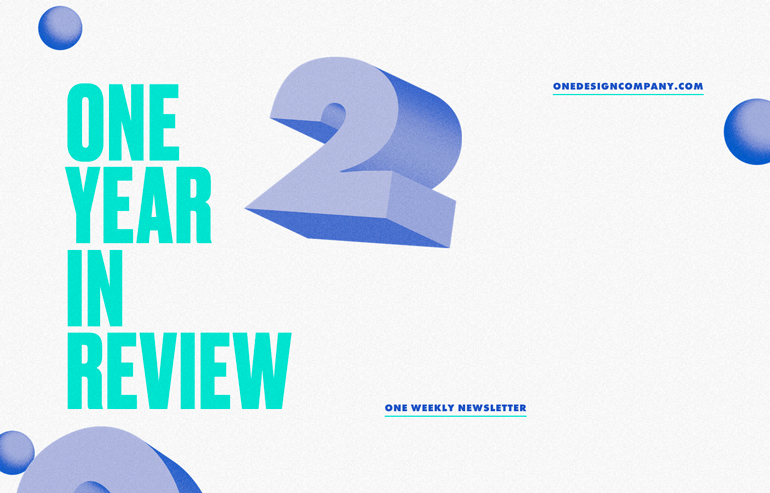
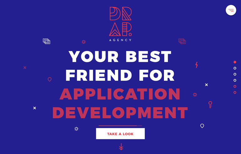
Projects have more reds, oranges and magentas than we have seen in a long time. And they are paired with bright blues, greens and purples. (Material Design colors are also popular choices for gradients.)
Find a full set of inspirational hues for projects in HEX and RGB from Material Design Colors.
04. Pantone’s Greenery
Pantone named Greenery, more specifically 15-0343, as the color of the year in late 2016. What we’ve seen in recent years is that the color of the year is an indication of a color trend that’s emerging and is getting ready to explode.
The light, yellowish green is clean and fresh. From Pantone, the color “evokes the first days of spring when nature’s greens revive, restore and renew. Illustrative of flourishing foliage and the lushness of the great outdoors, the fortifying attributes of Greenery signals consumers to take a deep breath, oxygenate and reinvigorate.”
From a design perspective, green is a great color choice. Green hues can be easy to use, aren’t as likely to offend as some other color choices and are highly usable.
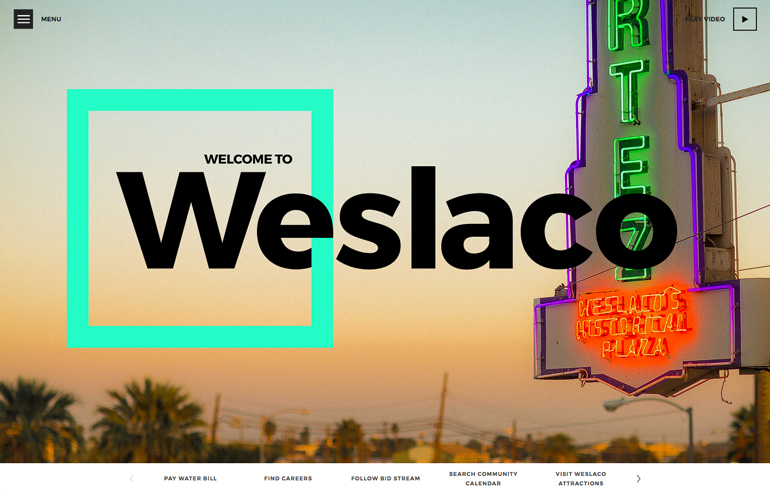
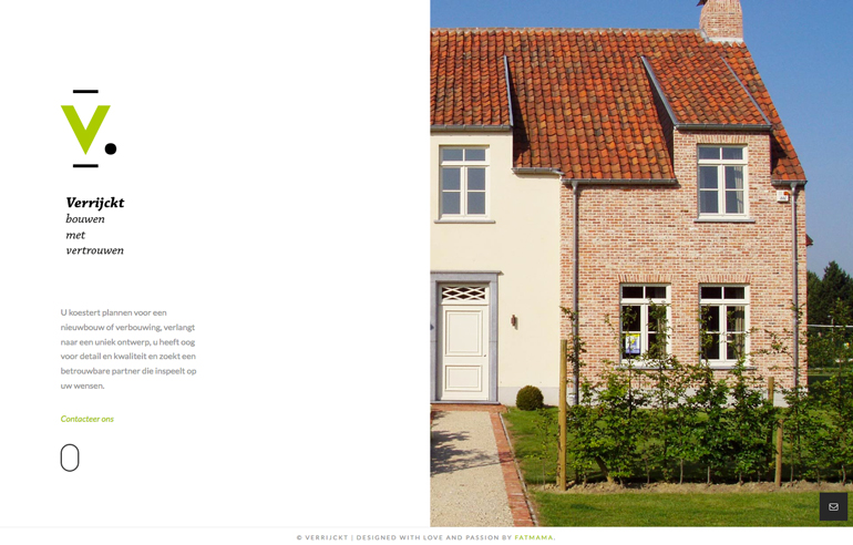
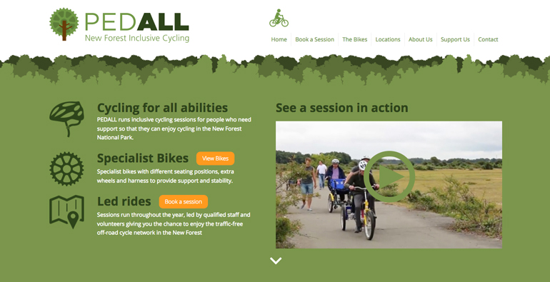
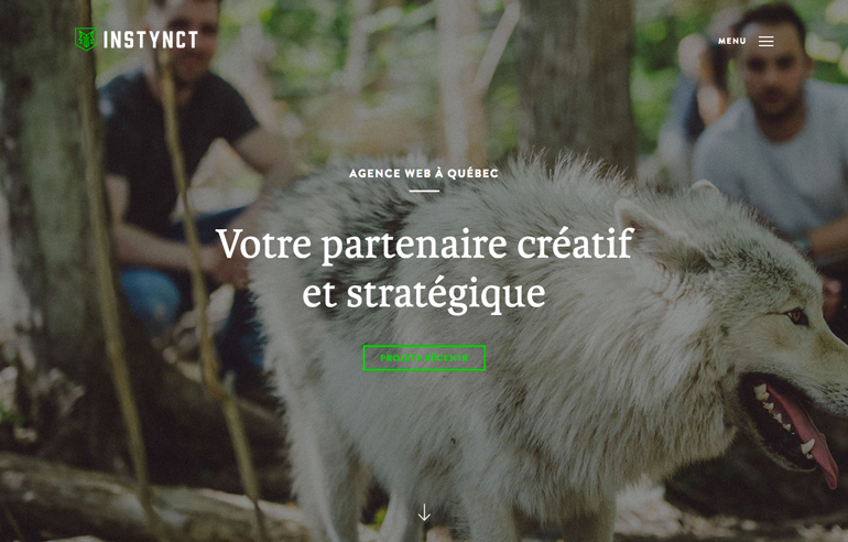
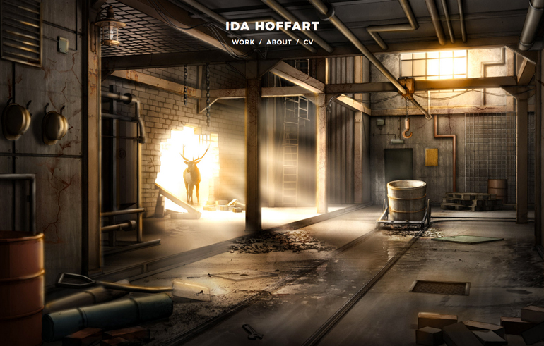
In the examples above you can see that some of the greens are more encompassing in the design while others are reserved for strong accents and imagery. Both uses of green can be visually stunning.
Everything you need to know about Greenery, including color mixes, pallet inspiration and even Pantone Greenery gear is in one place.
05. Golden Hues
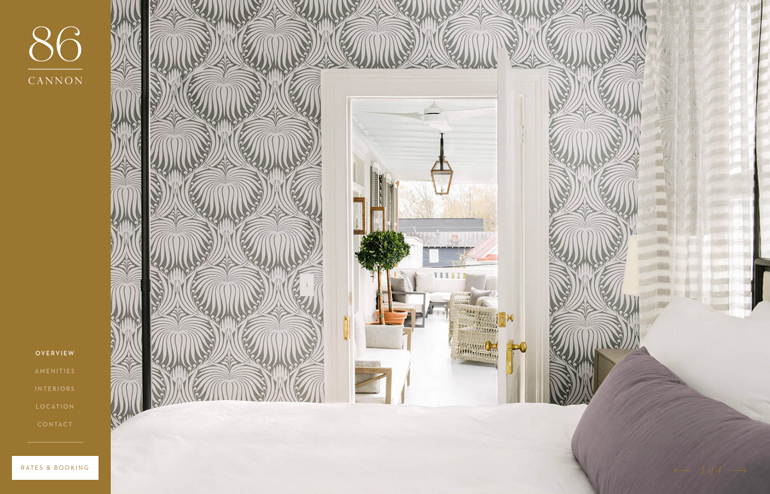
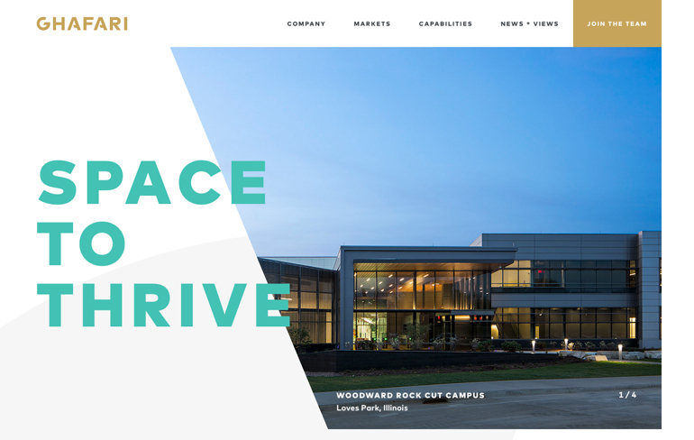
As a full-screen color option or for accents, golden hues feel regal and important. Maybe that’s why so many designs are going for gold.
While yellows are popular for designers wanting a Material Design look, golden hues are deeper, darker and less bright. The color can have a somewhat cheery feel, but most screen-based designs use darker variants to create enough contrast between the color and surrounding elements.
The darker gold has many of the same color association you would expect, as a color based on a precious metal. Gold represents wealth, grandeur and glamour. It’s also the color of courage, magic and wisdom. Use it with projects where stressing these factors is important.
Many of the designs that are using the gold color trend are for businesses that want to establish some of those messages. It hasn’t been as popular with personal websites, such as blogs or portfolios. (But that doesn’t mean you can’t try!)
The biggest challenge with gold is creating a hue that looks good on screens – it can be tough to do – without looking too dark, dirty or dingy. Too often golds turning into browns because that metallic effect isn’t easy to replicate.
Conclusion
Does your design need a fresh look? Try one of these color trends to set a need mood for a project or just bring an old design back to life.
Color trends can be easy to use, require just a few changes to your CSS in many cases and can provide instant spark. Start with a trend that makes the most of your brand or some variation of your existing color palette to make the transition as smooth as possible. Don’t be afraid to experiment. Color is supposed to be fun!

Leave a Reply