22 Black Websites for Your Inspiration (2021)
If you’ve spent any amount of time research WordPress themes or using them for your own web design business, you know that white space is not only a trend, but an obsession.
The idea behind the color white is that it creates breathing room for your content, while also letting off a clean and modern look.
Unfortunately, this leaves the color black in the dust, since for whatever reason, people tend to shun black, because it’s the opposite of white. The only problem with this reasoning is that the white color is not what’s making designs look clean and modern, but rather the amount of white that is used. When black is implemented properly it has the same effect as white space.
Not to mention, black websites let off an elegant and wealthy vibe, which both men and women are known to enjoy. Since dark websites offer wonderful ways to stand out from the crowd, we put together a list of the best black websites for your inspiration.
Use them to prompt creativity in your own designs, and feel free to save the suggestions as bookmarks for later.
01. env.studio

What better way to start this list than a creative studio’s stunning black website? Although not every single page of theirs is black, majority of it is.
Take, for instance, anv.studio’s about page. It features ample whitespace and crisp, white texts and black photography. All these different elements create a high-end, exclusive look but it doesn’t look forced or cluttered. Instead, these design elements create a stylish look and feel for the studio.
The photography on their about page is an excellent example to call out. It’s dark, without a doubt, but it’s exceptionally well-chosen.
It’s a great example because it shows that you don’t have to be limited by dark colors or dark photographs to achieve a high-end look and feel.
02. Hangar Door

The Hangar Door website has more of a gray/black background, with steel textures to coincide with the fact that the company sells hangar doors.
The website is a great example of a darker layout, since it correlates with the mission of the company and looks great with the nail graphics and branded social media buttons.
03. ABL Space Systems

Up next, we have a space and avionics company with another well-made, black website. Their site includes. background videos, photographs, transitions, among other design elements, that come together for a. creative and well-designed site.
As you scroll on the homepage, the site tells a great story of the company. Even though not every single section is black, the dark and light areas flow well together.
04. Anderbose

The Anderbose site isn’t exactly a solid shade of black, but it utilizes everything from black to brown and even white.
Anderbose provides a wonderful look into how you can use darker shades to display your own personal blog, where the blog feed sits to the right and the darkened colors put most of the focus on the written words.
05. 1MD
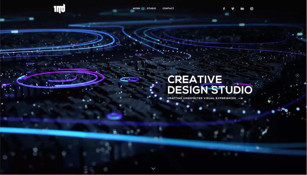
The 1MD website features a minimal, dark website design. On their homepage specifically, there isn’t a lot going on, there is no clutter. Each individual section has a specific purpose and intent. It’s easy, as a visitor, to focus on and understand these sections.
There are different color highlights used, animations. and transitions that add personality and interest to the. website’s design.
The individual portfolio work pages are also well-designed, clean and simple. They too use transitions and animations, a clean grid system and ample whitespace to create a great flow for their case studies.
06. Take the Walk

Take the Walk is a charity that strives to convince people to walk a mile in order to prevent AIDS and poverty. The majority of the background is covered in black, and accents are highlighted in red, displaying how black is one of the best colors to work with, since you can use just about any other color as an accent.
07. Apple Watch Series 6
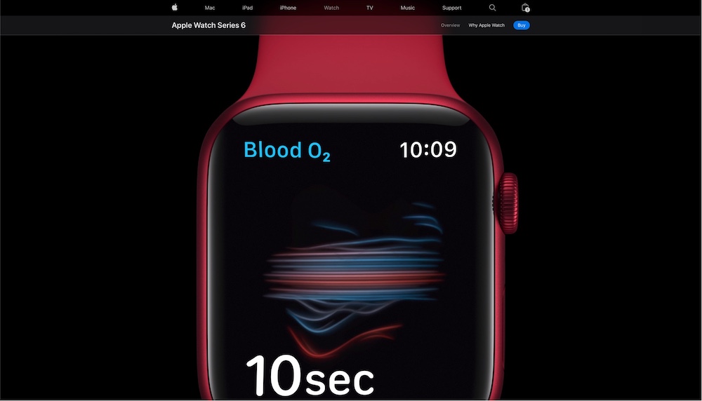
Apple often uses a black background to show off its products and its newest Apple Watch series is no exception. The dark background coupled of the large, close-up photographs greater a very intimate and exclusive look and feel as you’re viewing the page.
The Apple Watch’s screen’s background is also black which allows the details of the screen to stand out and get the viewer to really pay attention to the photographs.
The grid combined with ample whitespace, crisp typography, and well-executed photography all come together to form an elegant black page design.
08. Dropbase

The Dropbase website is a great example of a black website that doesn’t have too many thrills yet it is well-designed and presents the product well too.
Whether you’re on the blog, the pricing page, or the homepage, the Dropbase site sticks to its styleguide which includes large, white san-serif typography, a well-established grid, and even small use of accent colors throughout.
09. Delta Board

This next example is a little bit different because although the Delta Board website uses a dark background, the overall design is light and lively.
There are four big elements of this design that surely stand out: the dark. gray background, the light and minimal photography, the white typography, and the orange accent color.
Together these elements work very well which is why it’s a great example of a dark website that is lively without being visually overwhelming for the visitor.
10. Synthese

Synthese is another great black website example to add to our list today. That’s because this website comes together exceptionally well.
It uses both white and black backgrounds and in some sections, it uses black as an accent color as well.
The way the designers leveraged the black color within the design of the Synthese website makes it a worthwhile example to take. a look at!
11. Void

Void puts a focus on stunning space and time animations, bringing you through a story based solely on visuals. Each page is almost completely black, offering a sense of wonder and ominous feelings.
They complement the dark colors with tantalizing tones and music. You can then click around the website to enjoy the narrative.
12. Clover
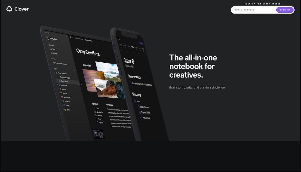
As you browse through Clover’s website, notice how light this dark design actually feels. It’s not crowded nor overwhelming.
It’s a perfect example of a stylish black website and a visual design look and feel often created with white or light website designs. The different shades of dark gray work well with one another.
The transitions and animation as a modern and slightly vibrant touch. At the same time, the white and purple color accents draw your eye towards different details of each section as you scroll.
13. Doran

Here we have a black online portfolio of a UI designer. The portfolio itself is another wonderful example of the designer’s skill.
The two two sections of the homepage of course have a black/dark gray background. However, it’s the headlines that is clearly the center piece.
This website example is fantastic because it shows that black backgrounds can act as accents and not as the main piece of a website’s design simply because of the color.
14. Blake Allen
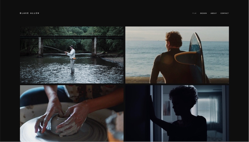
The Blake Allen website is another creative portfolio, this time of a cinematographer. The portfolio is all about simplicity. So many designers think they have to add loads of animations and elements to make their portfolio stand out. But, Blake Allen offers a different approach, with crisp and small white typography over a black background surrounded by ample whitesapce.
This is a wonderful site for inspiration since it only has a few links and minimal design components.
15. GoSqaured

The marketing automation landing page for GoSquared features a creative website design. Naturally, it has a black background (otherwise it wouldn’t have made it onto this list) which provides a wonderful contrast to the green, blue and purple colors used throughout this landing page.
Obviously, the use of color in this page design was highly strategic as it’s a big part of the storytelling and page flow.
The color contrast is used to capture the visitor’s attention as you scroll down the page learning about their marketing automation process and product.
16. Let It Bleed

Let It Bleed is a book website that places all eyes on the book cover by utilizing a significant amount of black in the background.
What’s interesting about this site is that the testimonials and quotes from the book are clearly visible because the large white typography stands out so much.
17. Blacks Who Design
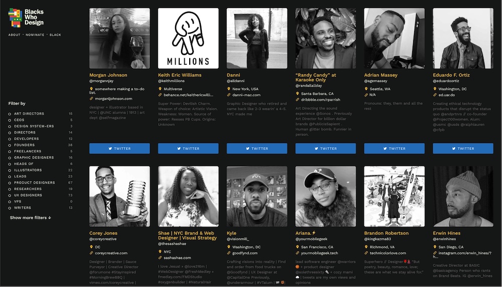
Blacks Who Design, as the name suggests, is a collection of profiles and portfolios of Black designers in tech.
This design didn’t miss their opportunity to create a black website to as a way to further emphases its mission and purpose. And, it works great! the black and white profile pictures of the designs don’t look overwhelming against the black background.
Instead, your eye is guided towards them. The text, links and buttons all use additional colors well which allows the different information from profile links to the site’s navigation to be easily noticed without overwhelming the visitors either.
18. Haptic
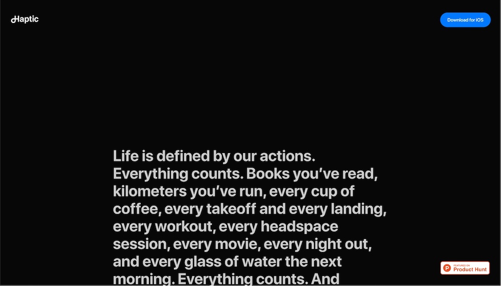
Haptic is a minimalist journal app for iOS. Naturally, the landing page for the app is also minimalistic. There are four main design elements at play here: the black background, the typography, the photos and the whitespace. Because of the black background and the whitespace, the text and photographic elements easily stand out and draw your attention as your scroll down this page.
19. Leah Haggar

The Leah Haggar portfolio has plenty of lighter areas, but the primary header and footer modules are darkened and powerful, using a combination of videos, large typography and even a wonderful About area in the footer that is quick and easy to read.
This About text is centered, adding to the usefulness of the black background, since nothing else is cluttering the space, and it simply looks like that’s exactly where your eyes are supposed to go.
20. Avocode
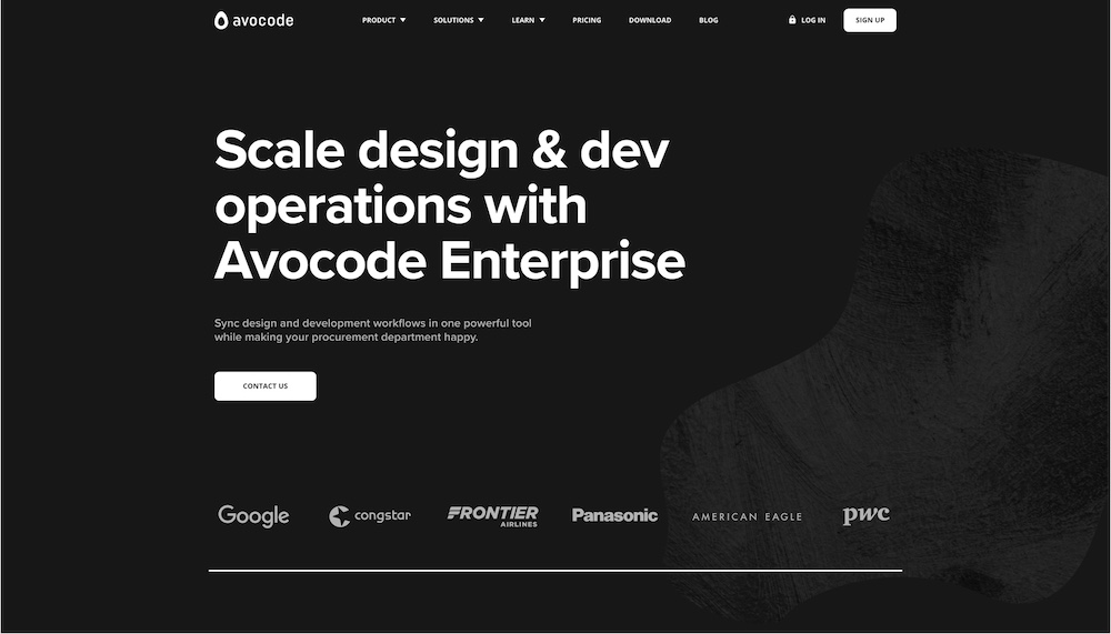
Avocode’s Enterprise page has a black background. Most of the website’s other pages aren’t.
Although Avocode’s branding isn’t the most colorful it is fun and creative. That’s what makes this a fantastic example for this list, as this page is dark but it’s still playful and whimsical.
There is a verity of different pastel colors in use as well as visual decorations through different shapes and photographs.
All in all, it works well together on this page and it fits right in with the whole website. Just because you have a black or a dark background doesn’t mean your design has to be serious, it can very well be playful, youthful, or simply fun.
21. CometChat
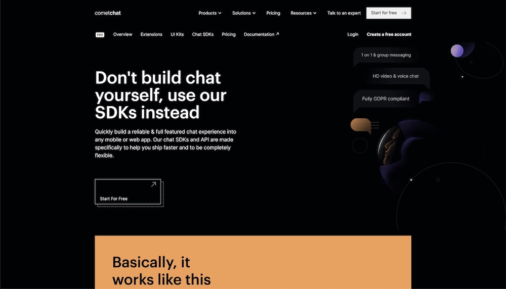
You definitely must check out this next example on our list, CometChat. That’s because black is well used within the company’s visual design style. The cometChat PRO landing page is all black.
There, you can easily see how the leverage black as part of their color scheme instead of just a background color.
For example, on the beige section, not only is the text black but so are the images. On this page, black and white seem to be the dominant colors within their branding while beige and purple are secondary.
22. Play

Play is a new mobile app prototyping tool with a black website. it features simple and minimal sections on the homepage where large images and large typography are the focus points.
The green, mint, and purple colors are seen throughout out but they are not the website’s main colors – white and black are.
The same visual design style continues on their career page too. The large photographs and texts are a big center piece every time you scroll past it which are fantastic design elements.
The app screenshots also follow the same visual design with a black background and green and purple highlights. All in all, the color scheme is well through out and exceptionally incorporated.
Over to You…
Now that you’ve had a chance to see some of the best black websites for your inspiration, let us know in the comments if you have any other black websites that get your creative juices flowing. Feel free to bookmark these pages for your own use, and jot down why they stand out to you.


Leave a Reply