
17 Beautiful Left Aligned Website Designs for Inspiration
In the early days of website design, it was quite common to have left-aligned websites for a variety of reasons.
First of all, it was quite challenging to style websites in the way that we see them today, centered in the middle of the browser with plenty of white space on the sides.
Additionally, because early websites were developed in Western cultures, where the left-aligned writing style is present, it further influenced how these sites were made.
By now, we know that in websites with left-aligned content and designs, there are common visual browsing patterns such as the F-shape, that further reinforced the use of not only left-aligned text but also left-aligned designs.
Design patterns
Even predating websites, with books, magazines, and newspapers, many were entirely left-aligned as well. Naturally, that pattern migrated over to website designs.
Today we see all sorts of creative websites. Part of it is due to technology. We can generate these creative, unique layouts that we couldn’t a couple of decades ago. However, that doesn’t mean that classical left-align websites are anywhere near out of style.
There’s still plenty of examples of well designed left-aligned websites that you can take a look at in this post.
![]()
Development patterns
Today, the trendy format for a website is to place most of the content in the center, moving the focus towards the middle, since it’s often considered to look nicer, but many companies still remain true to the left-aligned website, and there are some solid reasons for doing so.
A left-aligned website is much easier for people with varying device sizes to view. It’s similar to how modern responsive websites snap into place, except this doesn’t require any responsive elements, since the content is already shifted to the left, with space towards the right, allowing for some room when a smaller device is used.
Usage patterns
Many large companies have stuck with the left-aligned format because that’s how people have been shown to browse around on websites. Google is one of the best examples since it reveals its search results to the left.
Users already have their mouses towards the upper left-hand corner of their screen (punching in a URL) so it’s only logical that they move the mouse down slightly to begin their clicking.
In addition, people are known to read from left to right, so it’s cutting out the work they would otherwise have to do when searching for content that is centered.
17 left-aligned website examples
Overall, the left-aligned format website is still used quite a bit, so let’s take a look at some of the more beautiful left-aligned website designs to pull some inspiration from.
1. Good Books
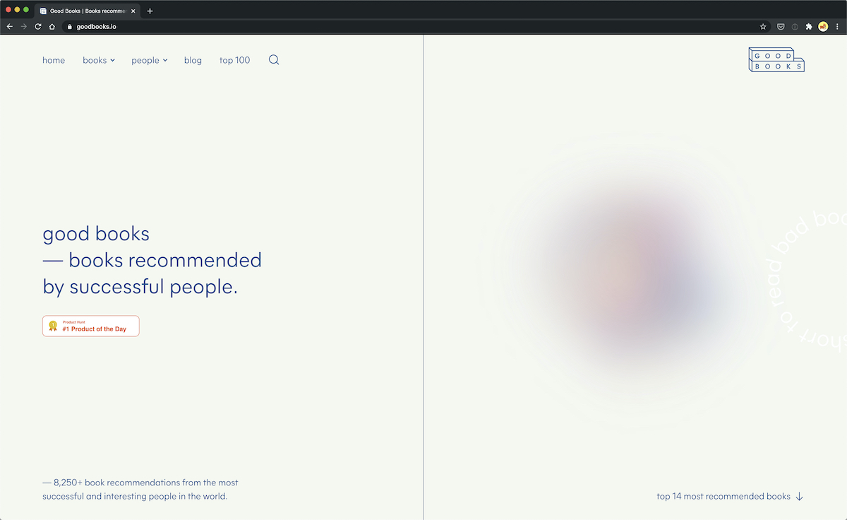
On the Good Books’ homepage, the hero section features left-aligned heading on a split page screen. This split is a very cool concept and is exceptionally minimal as well.
As you scroll down, design gains more whitespace, but you can still see the left-align concept throughout. This theme is present on other pages, not just the homepage. For example, it’s present on the individual book description pages too. It’s a great layout design that you’ll see in more upcoming examples.
2. Kavoon
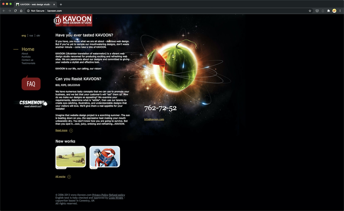
The Kavoon website utilizes the left-aligned layout, yet it doesn’t actually look like it’s too drastically shifted to the left. The website has a large graphic towards the right to make it look like most of the content is centered.
However, the navigational menu is smashed to the left of the page, helping people move their mouse to the links without any problems. We particularly enjoy that three language links are sitting in the left-hand corner since that’s most likely what everyone is going to want to click on first.
3. Abbotsford Convention
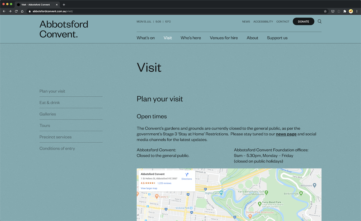
Abbotsford Convention is a community nonprofit with quite a creative website design. It has the essence of an old school left-aligned website, specifically when you consider the san-serif fonts, the iconography, or even the navigation details.
On the homepage, just about every single section is left-aligned, as are many other of their inner pages. When you visit a page, navigation is on the left and the content on the right. It was once a popular concept in the early web design days, which was possible with the use of iFrames or tables.
4. Typeform
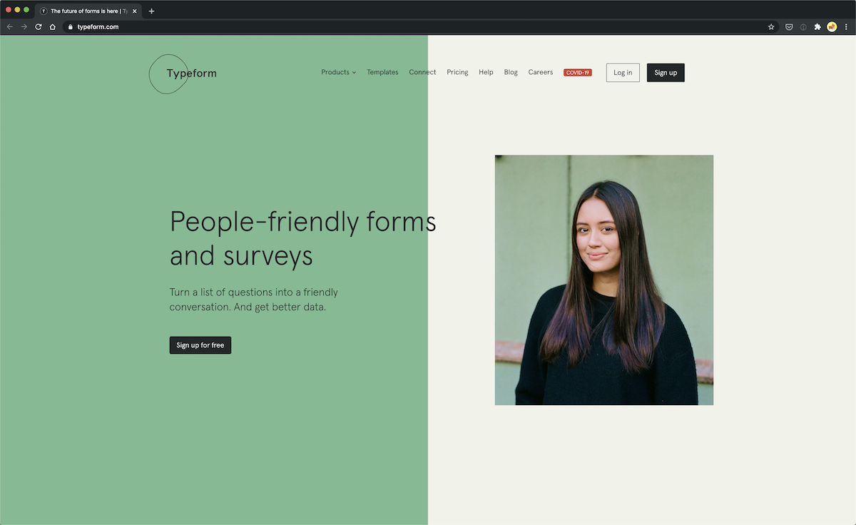
Typeform’s left-aligned homepage is extremely clean and modern. There’s plenty of animations and transitions going on. The starting point of the homepage features the left-aligned design concept. Keep in mind that this is a very modern design with plenty of whitespace and creative design elements. But, the basic idea is still there as we could expect something similar back then minus the modern renditions as padding or animations.
5. Area17
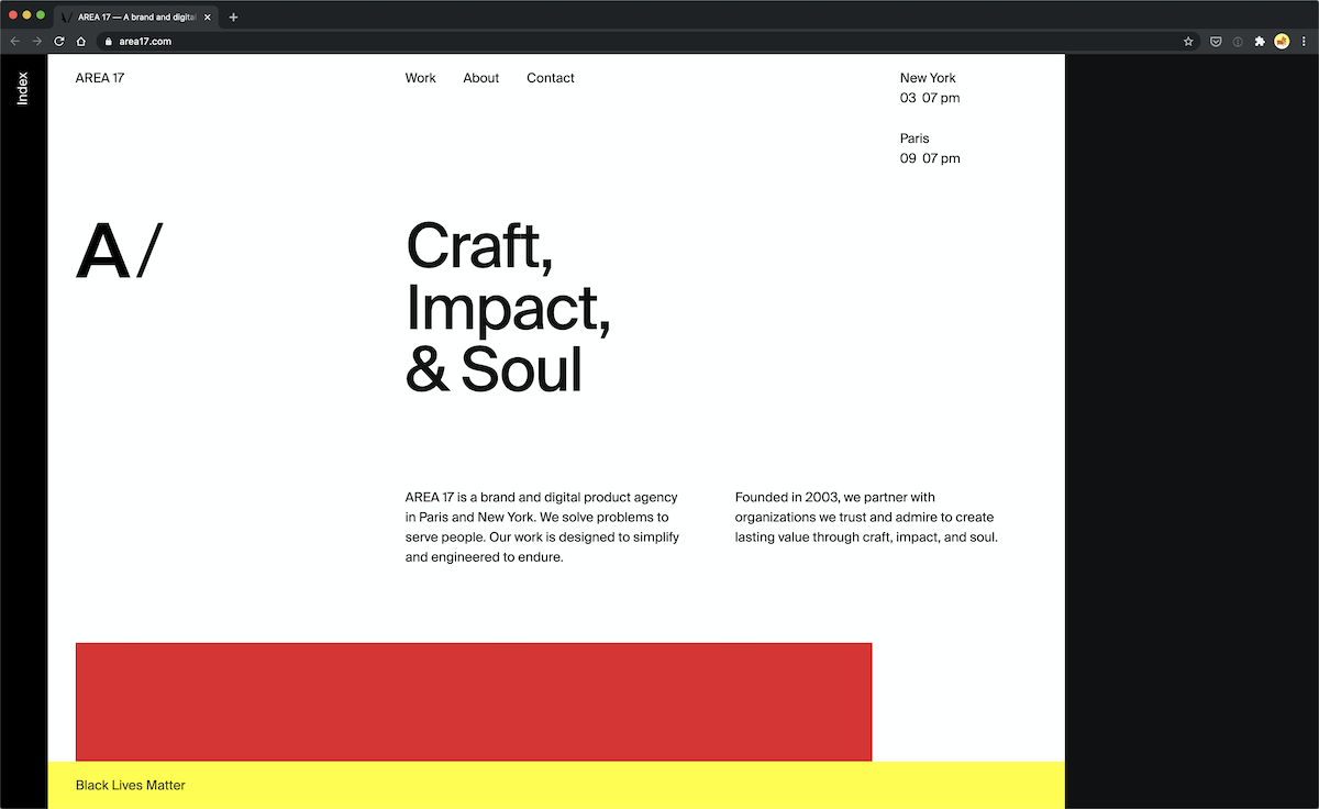
Area17 is an interactive agency, and its website takes left-aligned layouts to the extreme, using a large grey area towards the right to push most of the content to the left. This doesn’t seem to be a problem though, because it’s clear where visitors should go, and the portfolio images are clean and organized as you scroll down the page.
6. JT Grauke
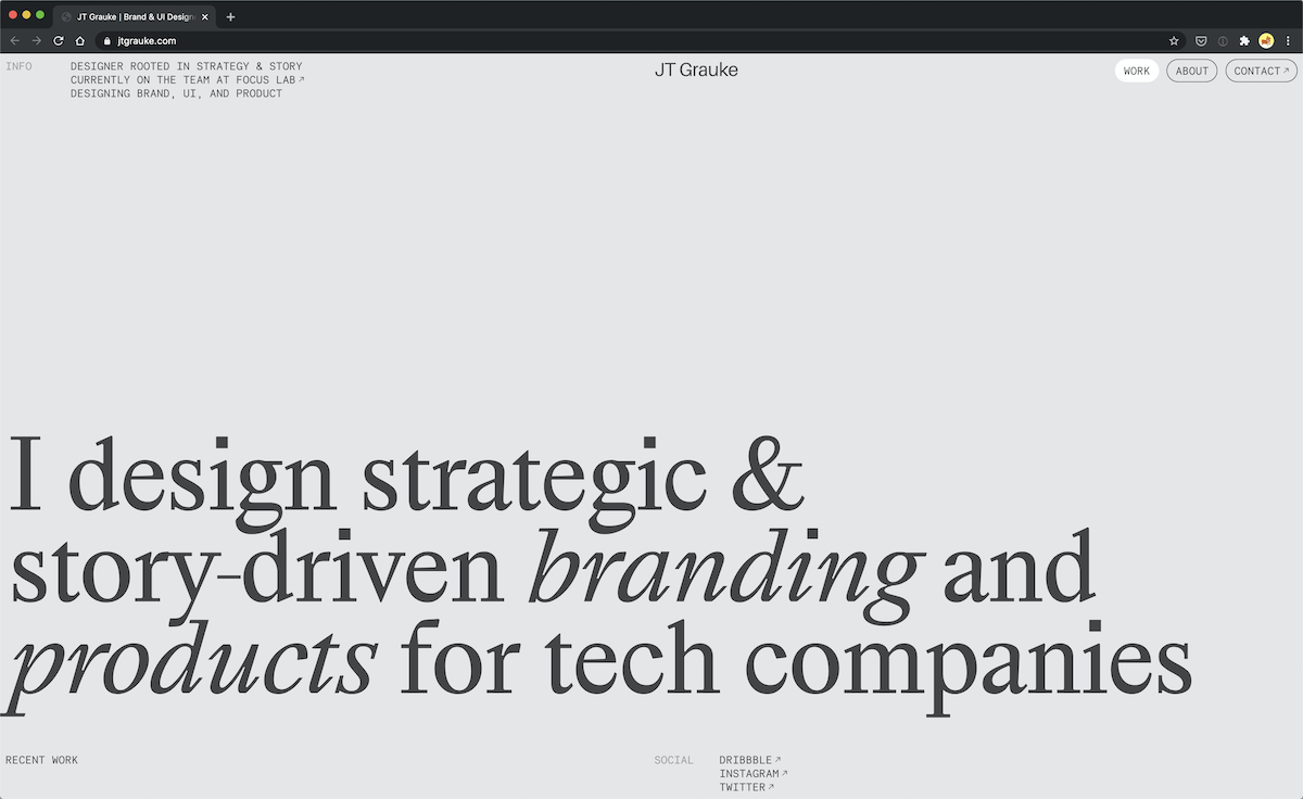
Up next, we’ve got the portfolio for JT Grauke, where the hero section is a perfect example of a typical old school left-aligned website. As you scroll down, you can see that the homepage’s grid is split into two sections that could have been easily achieved back in the day with tables.
The ‘About’ section is divided into two columns, a design concept typical of an old left-aligned page. If I had to pick a modern rendition of an old left-aligned website, this would definitely be one of the contenders.
7. Michael McManus
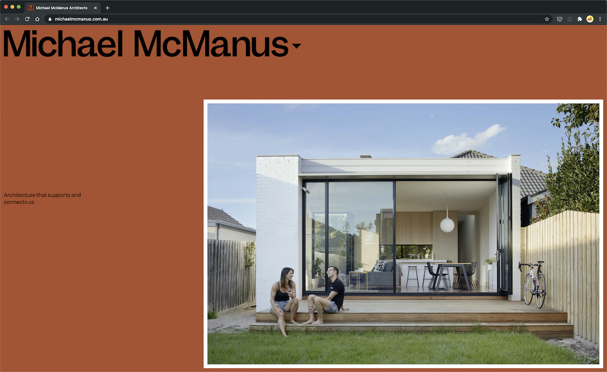
This architecture firm’s website is colorful, modern, and heavily focused on showing the photos of their work, but if you look past the large typography, the images, the whitespace, and the colorful backgrounds, you’re left with a left-aligned website.
8. Templeton Prize
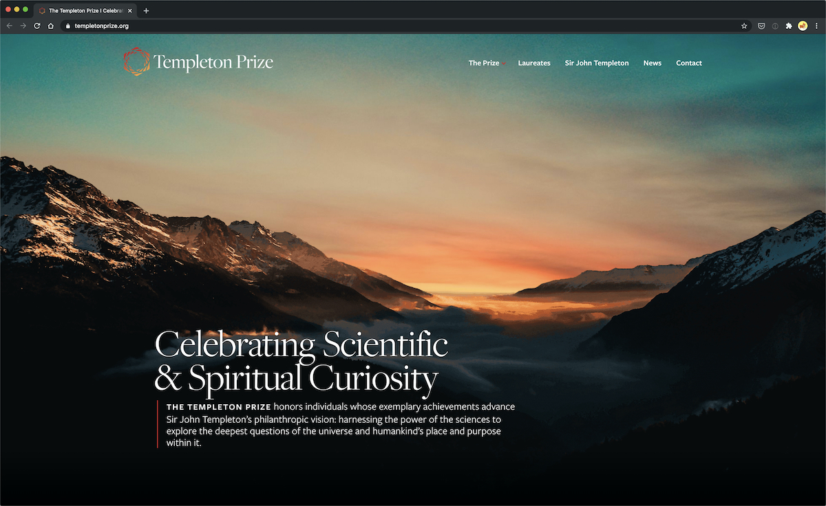
As you keep scrolling down Templeton Prize’s website, even though there is plenty of padding on the left and right sides, the layout is relatively simple and straightforward. The different sections feature a standard left-aligned layout. It’s a great example of a website design that utilizes typical layout conventions that work well.
9. Getty
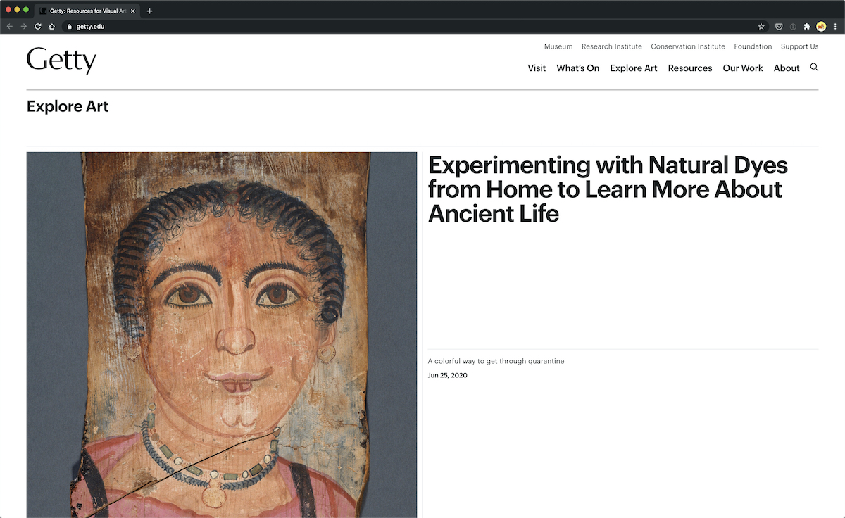
Getty’s website makes use of the browser’s full width, which was common in early website design. Many sections are divided into columns like you would with tables back then. I presume if the text was longer, it would also go edge to edge which is exactly what happened in old school websites.
On Getty’s site, we see that theme over and over again. If you look at the footer, its design could have been easily achieved back then to create this left-aligned design. Maybe there might be a little bit less padding around it, but it’s definitely something that could have been pulled off.
10. Squid Ink
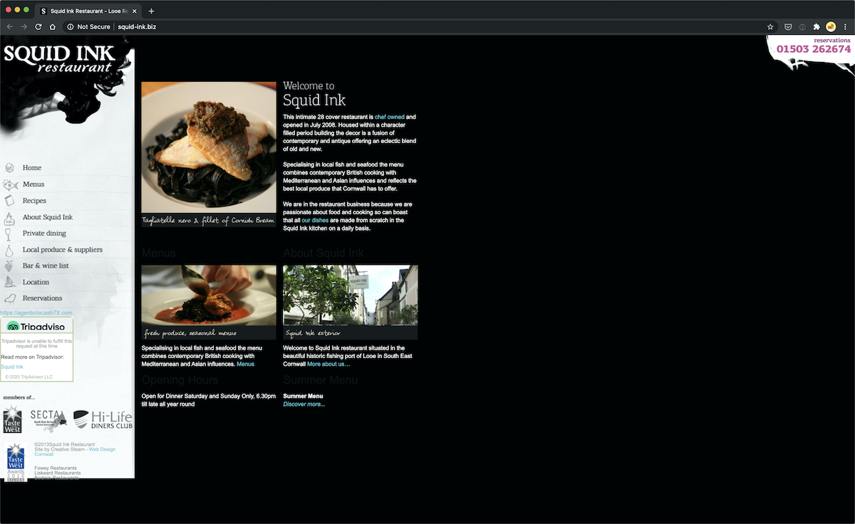
Squid Ink is a seafood restaurant that combines a left-aligned layout with a beautifully placed navigational menu to show customers exactly where they want to go when landing on the page. Menu, recipes, and reservation links are right where the user wants them to be, and the background is taken advantage of, with the implementation of a food image, adding some balance to the design.
You’ll also notice that the website has a reservation phone number in the upper right-hand corner, showing that the designer understands how to use all of the space on the screen, instead of simply leaving it blank. Along with stunning designs, powerful colors, and plenty of pictures of the cuisine, the Squid Ink website is certainly a nice piece of work for inspiration.
11. Photo Comma
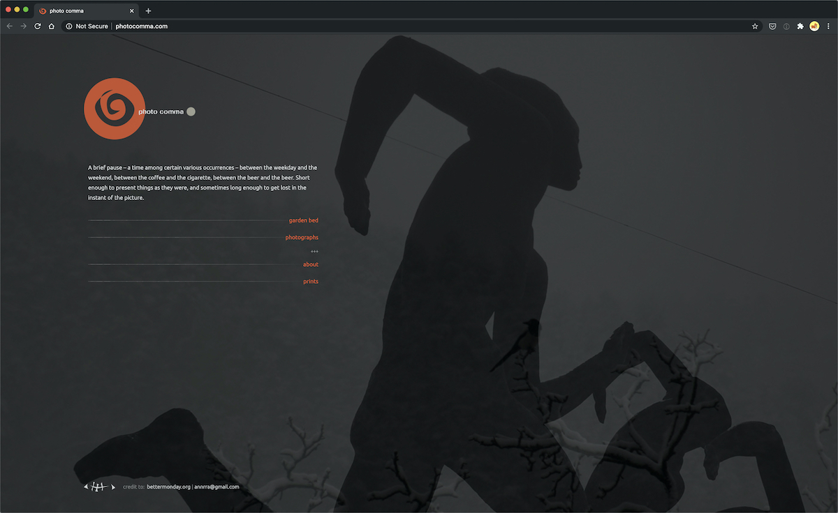
Check out the Photo Comma website if you’re interested in finding inspiration from a left-aligned page with simplicity involved. Not only does it offer a description for the website right where the user’s eyes fall first, but the gallery moves around when the user scrolls with the mouse.
This makes browsing through the photos a little faster, going with the whole right-aligned theme of creating a more user-friendly interface. We also enjoy that the designer takes advantage of a background image, evening out the visuals, and almost convincing the user that the site isn’t left aligned at all.
12. Momentum
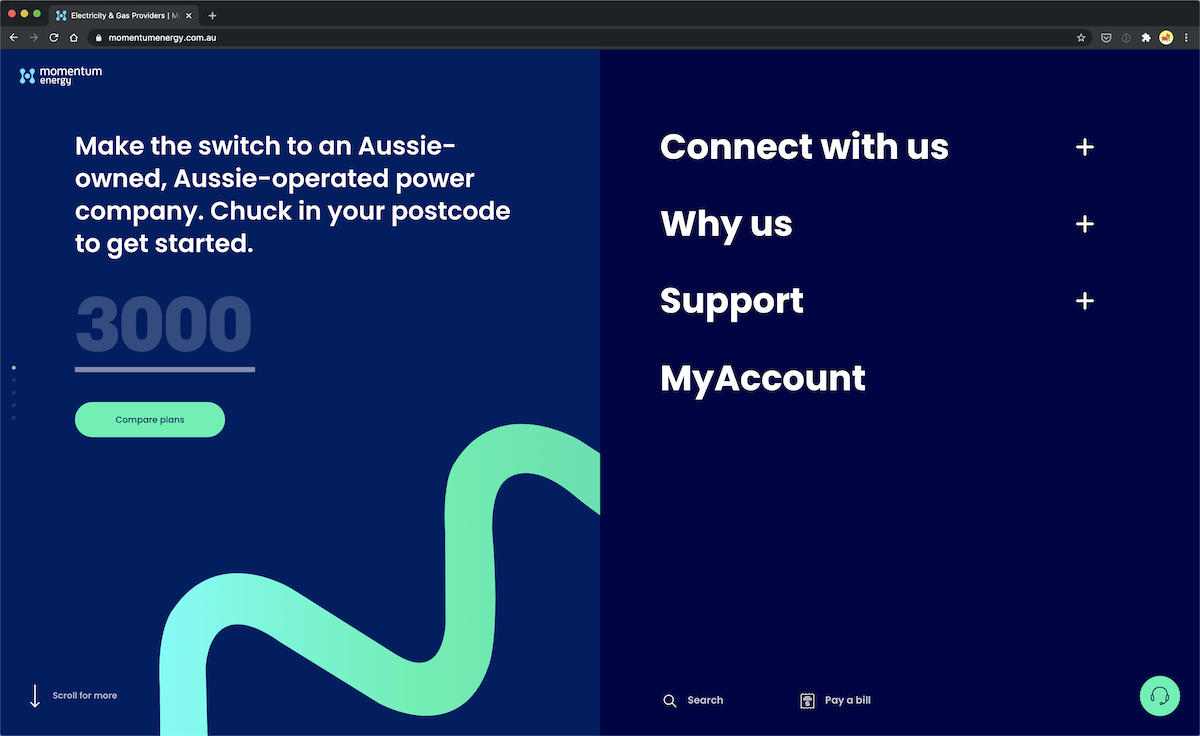
Momentum’s website is an interesting example; their homepage is split into two columns where the content is on the left and the navigation links on the right. It might be a stretch, but it is still an interesting example of a left-aligned website, quite literally too, since their content is only on the left-hand side of the screen. It wouldn’t have been too difficult to pull off this design with iFrames in the early days of web design.
13. Push Collective
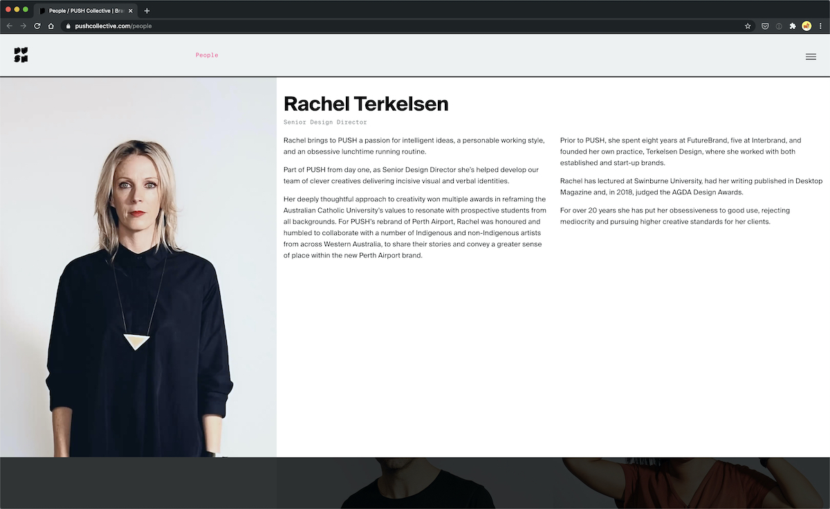
Number thirteen on this list is Push Collective’s ‘About’ page. The images of the employees are organized in a clean grid that would have been achieved with tables in a left-aligned website. This whole page features left-aligned grids, including when you click on an employee to learn more about them.
14. Digital Lead
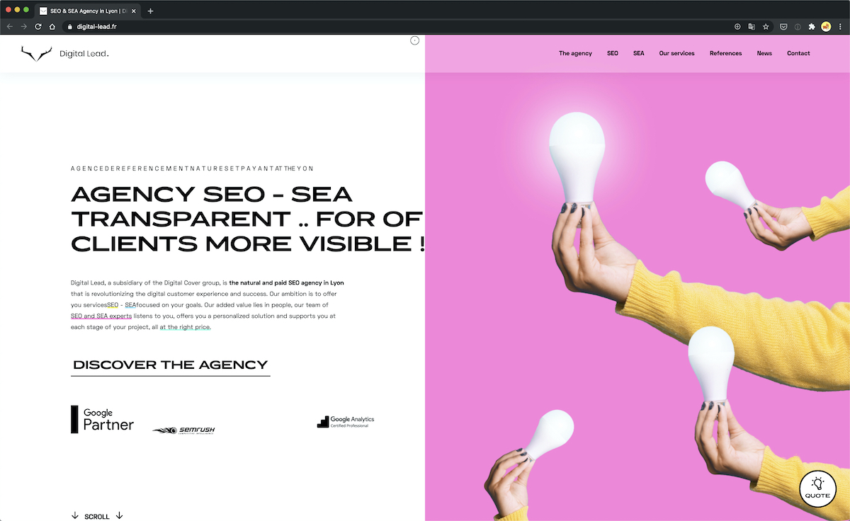
Digital Lead, an SEO agency, has a homepage that’s split into two columns. Copy on the left side, and creative imagery on the right. The design has an energetic and modern look to it. There’s nothing minimal about it, but it’s not overly cluttered. It’s a well-designed website, for sure. There are animations, various colors, and highlights – it’s quite a fun and creative homepage.
15. Mode Remote
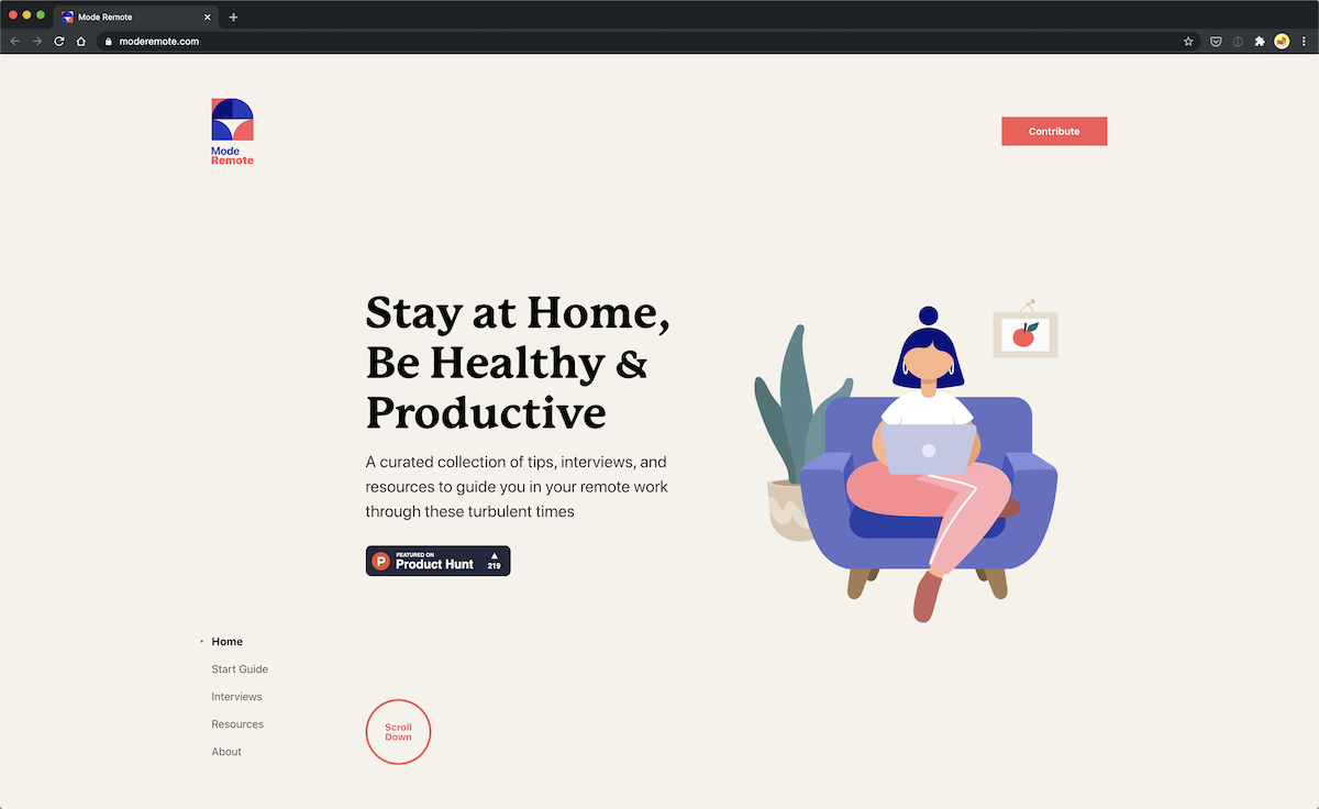
Mode Remote’s homepage has a left-aligned and fixed navigation. Granted, it’s aligned to the bottom of the page and not on top, but it still pays homage to the old-school left-aligned websites. It’s an example of a standard layout created with iFrames where the navigation is in the left column and the content on the right. The visual design itself is airy, breezy, and all-around spacious.
16. Shopify
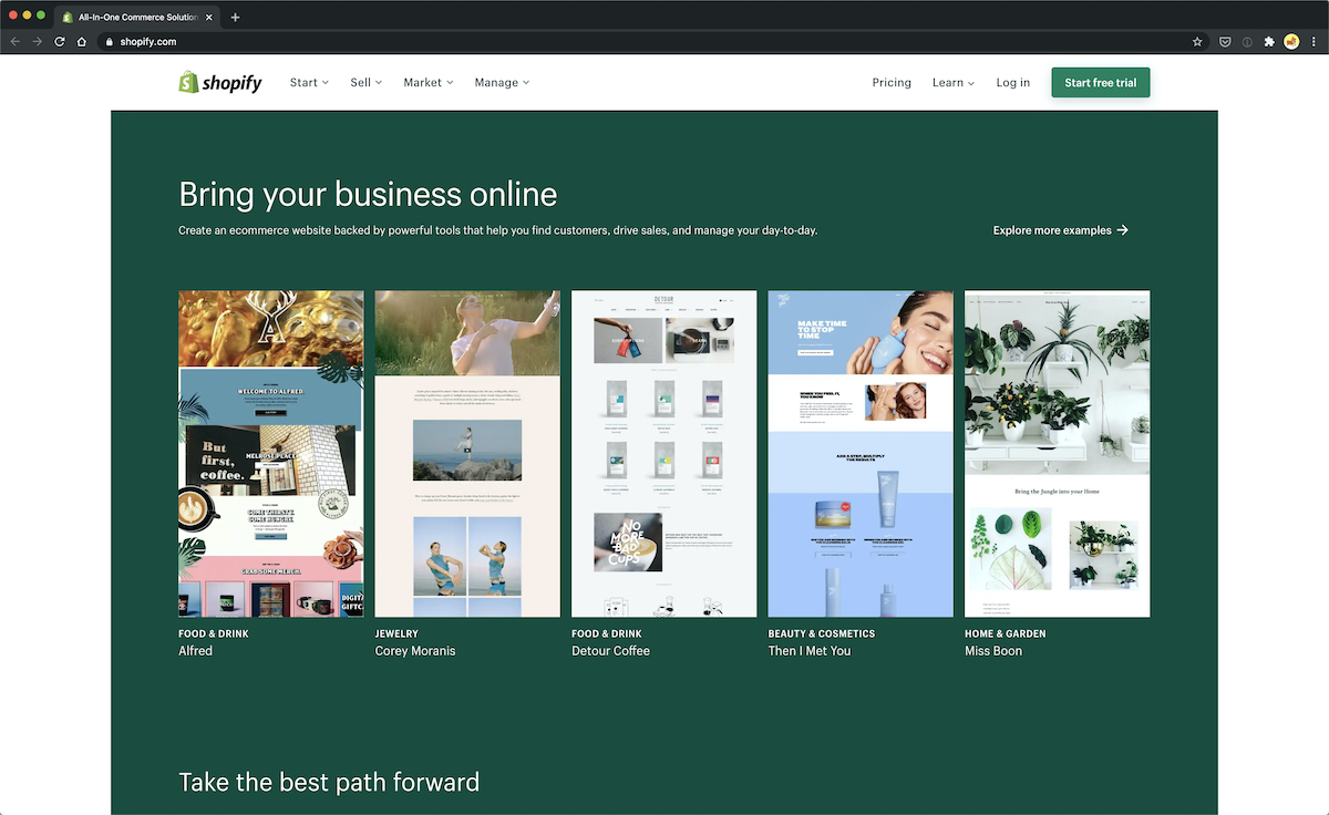
Shopify’s latest homepage design is quite boxy. The different sections and their contents are well-defined thanks to this left-aligned layout style. For the most part, many of the sections use a simple grid system to align the content which is quite reminiscent of the old-style left-aligned web designs.
17. Ekhart Yoga
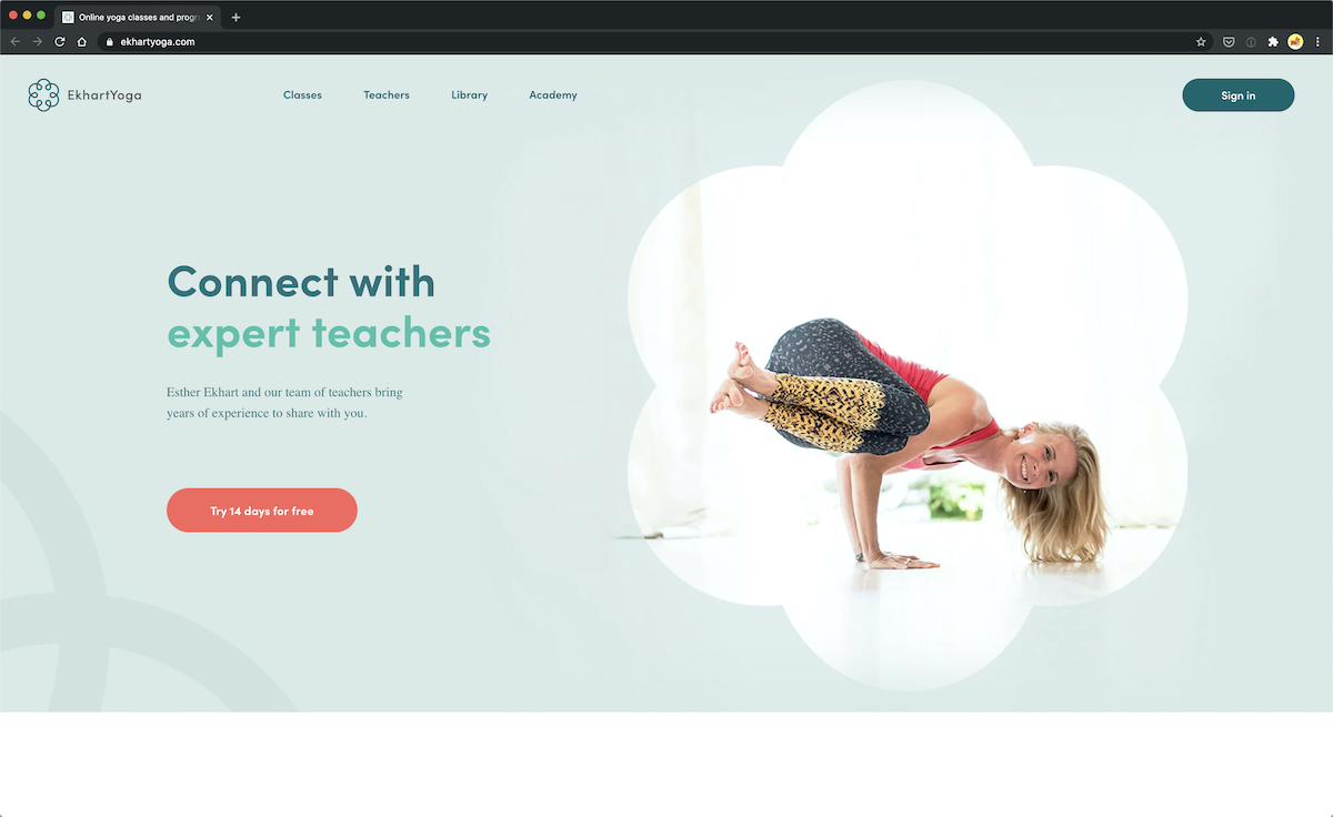
Let’s end this list with Ekhart Yoga’s website, an excellent example of the evolution of left-aligned websites. It does a great job, especially on their homepage, with the left-hand side texts and right-hand side content; the parallel is excellent.
There is plenty of space and padding in this design that would be difficult to achieve in easy website design. Each section on the homepage is easily clearly defined, and the content is well organized. It’s not the most creative website example, and that’s okay. There is no need to get overly creative when the typical design patterns or conventions are well utilized.
Over to You…
You’ve had a chance to look at some stunning left-aligned websites, and now you understand why so many companies are still utilizing the format. If you have any questions, or would like to chime in about why, or why not, left-aligned websites still have a place in this world, please leave a comment in the section below.
Otherwise, feel free to bookmark some of these websites for inspiration in the future, when a client wants you to create a left-aligned website for functionality purposes.
Nice cross section of work there
Nice post. It is good to see that left aligned site design is alive and well.
With the invention of adobe ICE
I have been drawn towards creating websites for clients with a left navigation.
And setting this area as a way they can maintain the site on there own adding and deleting links until their heart is content.
But I gotta admit I find that type of navigation very limited “creatively”
ahem until now thanks for such a great collection.
Thanks & Regards
Noel from nopun.com
a professional graphic design studio
really love the collection mix of dark and light websites.
i think im going to create a left aligned site due to dreamweavers AP Divs floating all over the place with a centre justified page. am i doing somthing wrong?
Dojo Design Studio is the best. At least from this list, I like the most.
I am wrestling with a left-aligned site at the moment. I want to do it, and it seems to suit mobile web better in terms of coding, which is equally important for my site. However my non-designer / non-developer partner (he’ll be writing the blog) doesn’t like it. not ‘usual!’.
http://lite.hk
…Maybe its just ugly? 🙂
Thank you, so I need it for work.
art and literary community
Check out surfimages! I think you will agree on their design was done very well.
E