Traditionally, most online browsing was done on desktop computers (and later on, laptops). These days, however, most people will pull out their phones when they want to look for a product or read an article. This has implications for how your website should be designed.
‘Responsive design’ is the practice of tweaking your website so that it looks just as good on both small and large screens. That way, your site’s users will have an excellent experience, no matter what device they’re using to pay it a visit.
In this post, we’re going to explain the basics of responsive design. We’ll talk about why it’s important, and point you in the right direction to start implementing it yourself. Let’s get going!
The Importance of Designing a Website With Mobile Devices in Mind
It probably comes as no surprise to you that mobile browsing is on the rise. The majority of online traffic now comes from phones and other mobile devices – and the gap is continuing to grow with no sign of stopping.
This matters, because it means that a significant proportion of your site’s visitors won’t be using a desktop computer. If you design your site using a large screen, and you never stop to check how well it looks and functions when viewed on a smaller device, you’re likely to encounter problems.
After all, the mobile browsing experience is unique. Not only is the screen size extremely small, but the default layout is vertical rather than horizontal. The input method is different too – mobile users will largely navigate your site by tapping on the screen, rather than with a mouse and keyboard.
Each of these differences can result in a site that works flawlessly on a desktop or laptop, but underperforms on mobile devices. Elements may be missing or broken, and your site’s layout might appear distorted or sloppy. In addition, navigational elements (such as menus and buttons) can be too small or hard to interact with. To avoid these issues and more, you’ll need to make your site ‘responsive’.
An Introduction to Responsive Design
Designers and website owners have come up with a few ways to tackle the problems mentioned above. For instance, some adopt a ‘mobile-first’ philosophy. This involves designing a website first and foremost for mobile devices.
While that approach can help you create a site that functions well on small screens, it often results in a poorer desktop experience. It’s important to keep the needs of all users in mind – not just those using one kind of device or the other.
That’s where responsive design comes into the picture. A responsive site pays attention to what kind of device each visitor is using (mainly in regards to its screen size and resolution). Then, the site adjusts itself to display and perform optimally on that device.
Let’s take a look at an example of this design in action. First, here’s a website you’re probably familiar with – Amazon.com:

On the whole, this is a well-designed but still fairly busy site. It includes various advertisements and prompts to check out specific categories of products. There’s a comprehensive set of navigation options at the top as well, and a large slideshow banner right below that.
Now, here’s what Amazon’s home page looks like on a standard mobile phone:

Most of the key elements are still there, but they’ve been rearranged and simplified. The navigation includes less options, and sections are stacked vertically and clearly delineated from one another. Some elements have been removed, in order to draw focus to the website’s most important parts. This includes a Sign in button that’s been made a lot larger. After all, users will have to tap it rather than clicking on it with a mouse.
In a nutshell, this is how responsive design works. You can start by creating one version of the site and then the other, or build both at the same time. Either way, the result should be two or more designs that are optimized for specific types of browsing experiences.
How to Get Started With Responsive Design
Developing one site can be challenging enough – putting together multiple versions may seem intimidating. While this will take some time and persistence, however, it doesn’t have to be all that difficult.
If you already have a site and you’d like to make it responsive, your first step is to find out just how well it currently works on mobile devices. You can start by simply vising your site on various devices, which is made a lot easier if you use an online emulator tool. A little experimentation should give you a pretty clear picture of what’s working and what isn’t.
It’s also a good idea to run your site through Google’s Mobile-Friendly Test. This free tool will analyze your site, and let you know how responsive it is:

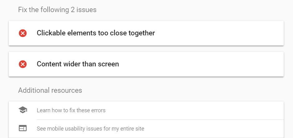
What’s more, it will also offer you a list of actionable steps you can take to improve your site’s responsiveness, along with links to more information:

Following the advice here is an excellent way to make your site more responsive quickly.
Whether you’re working with a new or an existing site, it’s also worth finding out if your chosen platform offers tools that can help with this task. For example, these days most WordPress themes are inherently responsive, and there are also plenty of plugins that make it easy to design a mobile-friendly site with little technical experience.
No matter what tools you use, here are a few basic principles to keep in mind as you work on this aspect of your site’s design:
- Less is more. Screen real estate is at a premium, and ‘clickable’ elements will need to be fairly large. Therefore, the mobile version of your site should be streamlined, and only contain the most essential sections and information.
- Your layout should be vertical. Sidebars and similar features don’t work well on mobile sites. You’ll want to stack elements and sections vertically, rather than placing them side-by-side as you might normally do.
- Make navigation clear and simple. Don’t overwhelm the visitor with too many menu options and other things to click on. You may want to consider using a ‘hamburger menu’ design for your primary navigation. This has become standard on most mobile sites, although it’s worth noting that the practice has its detractors.
- Primary Calls to Action (CTAs) need to be prominent and accessible. Most sites have some kind of primary CTA, whether that’s a login button, a sign-up form, or a purchase prompt. Either way, it needs to be large, centrally-positioned, and clearly distinct from the rest of the page, or you risk having visitors miss it entirely.
Building fully-responsive sites does take a little practice. However, it’s fairly straightforward if you keep your visitors’ experience firmly in mind. During the design process, take time to go through the site regularly as a brand-new user might. Along the way, look for anything that’s confusing, difficult to use, or cluttered. This is the best method for determining whether your site’s look and functionality are up to par on a small screen.
Conclusion
When designing any website, it’s vital to remember that not all of its visitors will be the same. Not only may they have different demographics and interests – they’ll also be using a wide range of devices and browsers.
To make sure your site looks good and performs well for everyone, you’ll want to ensure that it’s responsive. This can be accomplished through custom development, or by using platform-specific tools. You can also try out Google’s Mobile-Friendly test to find out how responsive your existing site is, and start making improvements.
Do you have any questions about how to design a fully-responsive website? Ask away in the comments section below!
Image credit: Max Pixel.

