A Collection of Fantastic Fonts to Try in Your Next Design
Sometimes I fall head over heels for a font and I don’t stop using it in every design I am involved with at that time. It can be really fun to incorporate the same typeface into various designs. However, it can also get boring quickly. I find the challenge of trying something new and making it work much more appealing.
That’s why I’ve made this list. I hope it will inspire and challenge you to explore a new font in your next – or current – design project.
I think seeing live examples of how a font is used on a production site can greatly help creative juices flow. So, that’s what I’ve done here for you. This is a list of 14 different fonts used on 14 different websites. Let’s get started!
01. Playfair Display
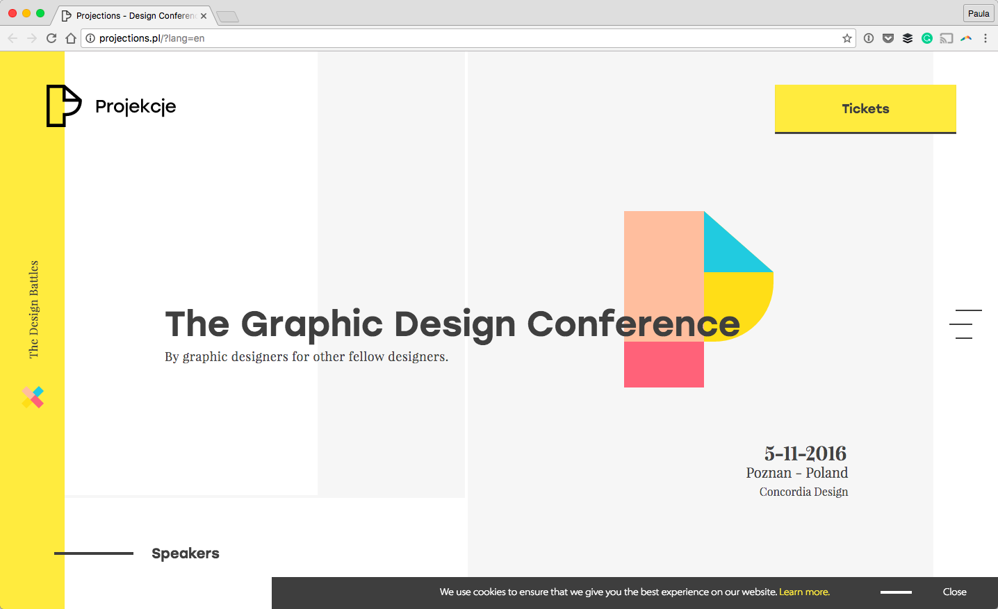
The first font in the bunch is Playfair Display. It is a great and elegant serif font—it was my go-to font a few years ago. The best part is that it’s completely free and available on Google Fonts.
The other great thing about the font is its looks. Projekcjie, a graphic design conference in Poland, uses the font as an accent on their website and it looks awesome! It doesn’t distract from the rest of the design. Actually, it complements it very well, since the rest of the design is modern.
02. Sentinel
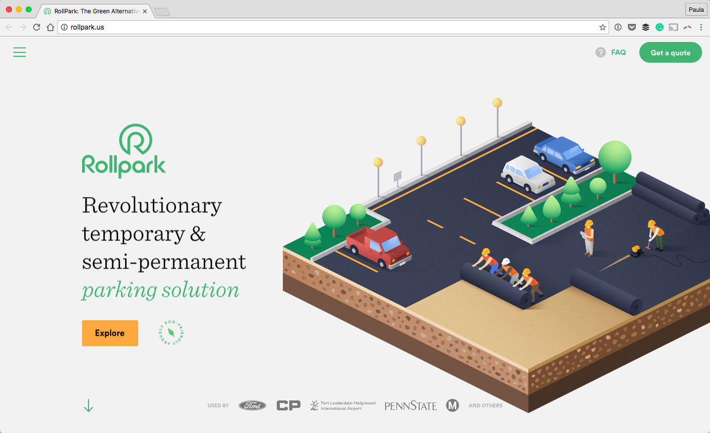
When I first saw the homepage of Rollpark, I fell in love with their use of Sentinel at once. The homepage has a great layout and uses balance well.
The font looks interesting; most landing pages stick to more common fonts. The design of Rollpark’s page, including the typography, catches visitors’ attention right after they land on the page. That’s exactly what happened to me as well.
03. Sang Bleu
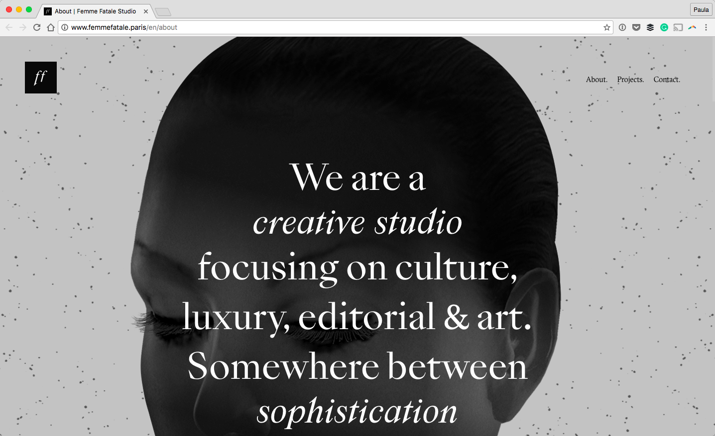
The serif fonts in this article are Sang Bleu. Femme Fatale is a Parisian creative studio with a killer website and an amazing font. Their art direction is fantastic as well.
They were obviously going for a unique and creative vibe. Their choice of a black and white palette makes the design sophisticated. This is also partly due to their use of a large and thin serif font, Sang Blue. The font choice is a cherry on top of this amazing design.
04. Sofia Pro
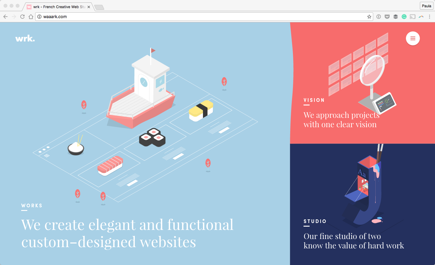
Sofia Pro is one of my favorite fonts. The strange thing is that I haven’t yet used it on a production site. So, I am rather trying to make you use it! This time, I’m showing you the website of wrk, another creative web studio with a fantastic sense of design.
Their portfolio is very colorful, interactive, and well-designed. One thing that makes this design great are the fonts. The site wouldn’t look this good without such strong font choices. Specifically, I am referring to using a sans-serif font as an accent. Here, Sofia Pro is not the primary font and that’s okay. It still looks fantastic in its own place.
05. Signal No1
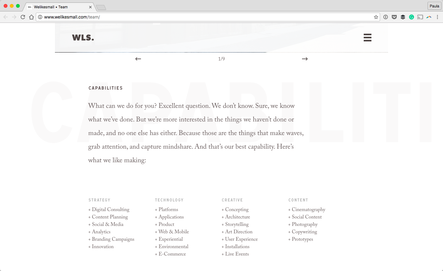
I love the Team page design from welikesmall. My favorite detail about this page is the balance between typography and layout.
Signal No1 is the sans-serif font used as an accent in this design. You can see it as a small heading at the top of the much larger serif paragraphs. Moreover, you can also see it as a very light and faded text in the background. The typography here is great. Specifically, the play between the small, medium, and giant fonts.
06. Trade Gothic
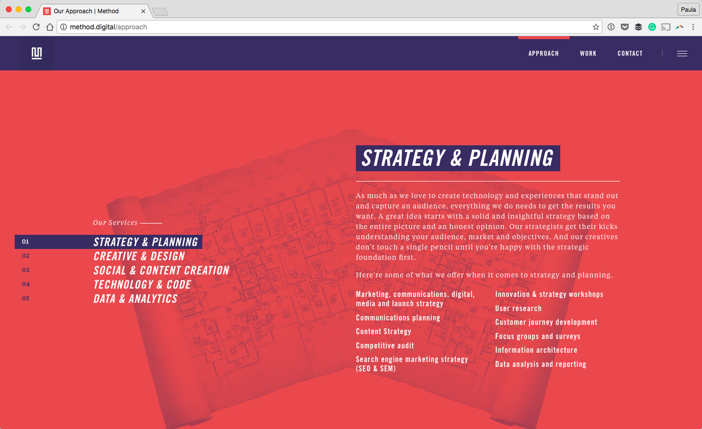
The main font on Method’s website is Trade Gothic. It’s a lovely sans-serif font used versatilely in this design. They use it in all-caps for the page titles. They use it in italics for the headings, too. It’s used in buttons in a much smaller font size as well.
A lot of fonts can’t handle such diversity in practice. Most fonts are created for a specific goal such as providing designers with a body font. But Trade Gothic is not like that; it works well for whatever design purpose.
07. Skg100
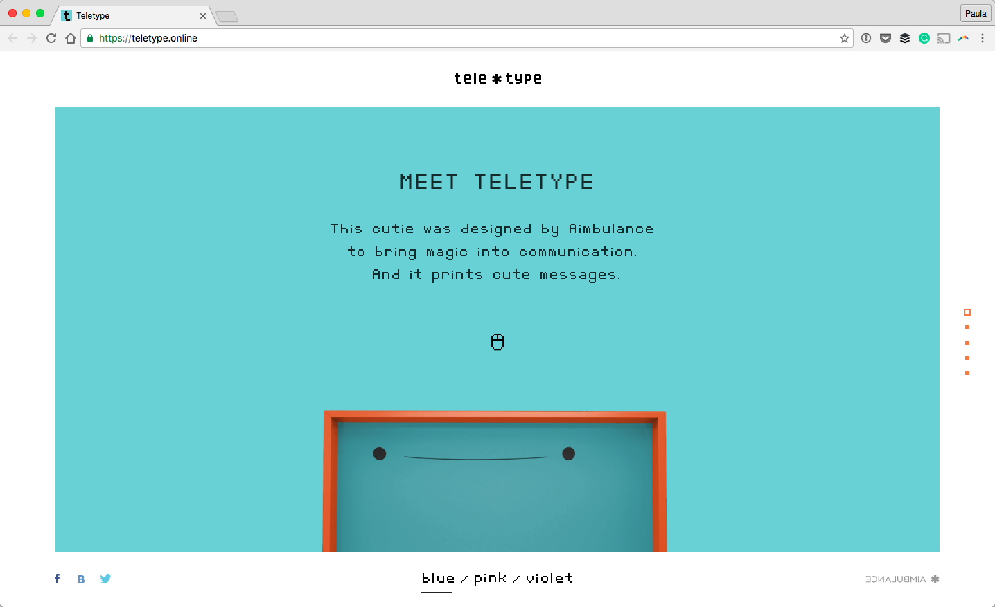
One of my favorites on this list is Skg100, a monotype font. Usually, I don’t work with designs that can handle a monotype like this. I think it’s cool and it’s fantastic to see it on Teletype’s website. It is a creative design and font choice because it gives the website a fun and upbeat feel. I don’t think the design would be as cool if the font was a serif.
A serif font is not right for the vibe of this design nor the product they are trying to sell. And, it wouldn’t be as powerful of a design if the font was a sans-serif, either. Using monotype and Skg100 specifically was a brilliant idea! I’m also a big fan of how simple and minimal the design is. This definitely helps bring more attention to the typography.
08. Tiempos Headline
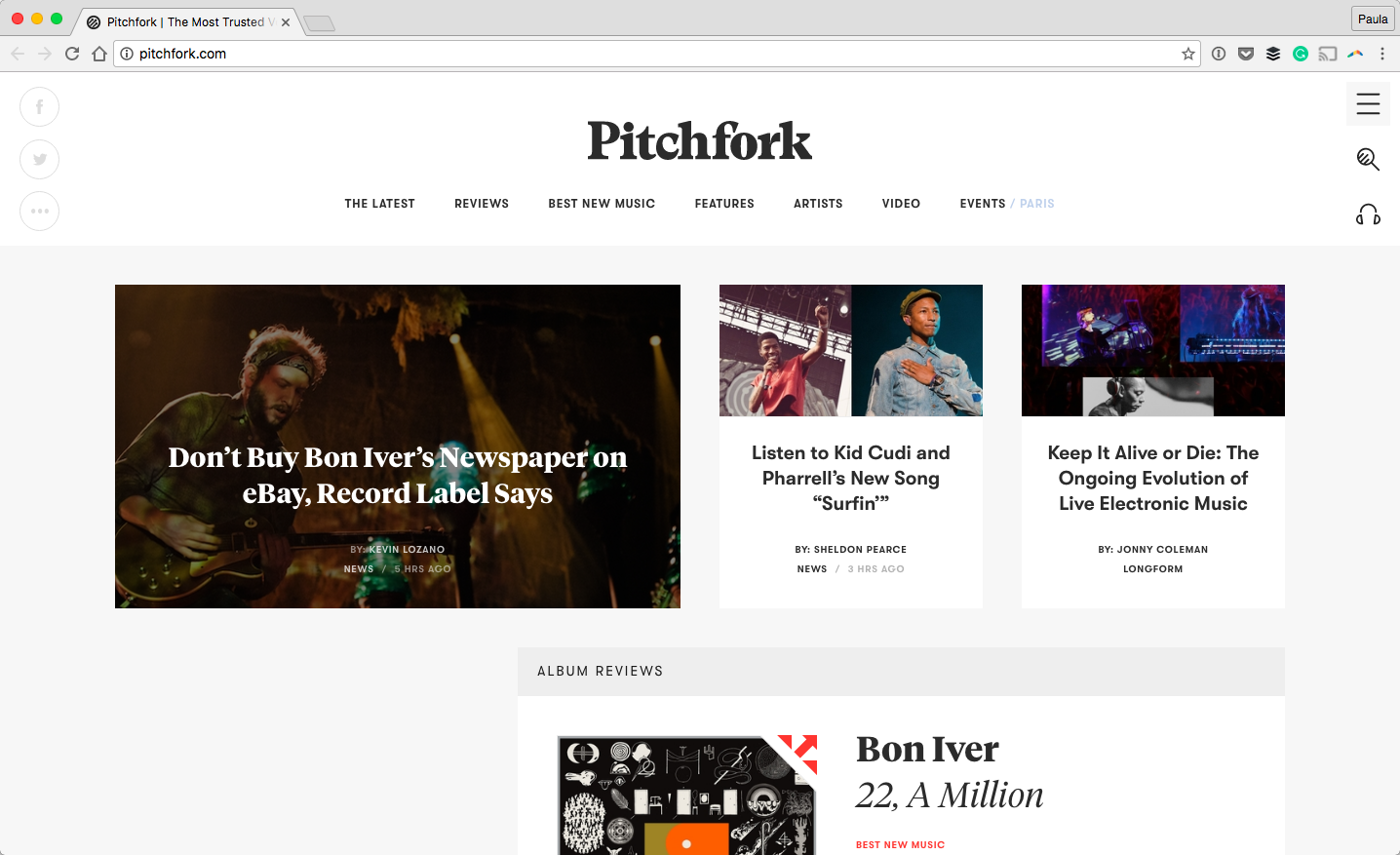
Tiempos Headline is the bold serif font used sporadically throughout the Pitchfork website. It uses Tiempos Headline just occasionally so that it is an interesting design detail that works very well for Pitchfork.
It draws just a little attention to itself and the article. It’s a great font you can use as an accent element. It looks good in bold as well. I don’t think I would appreciate the font if it was used more often in the design.
09. Montserrat
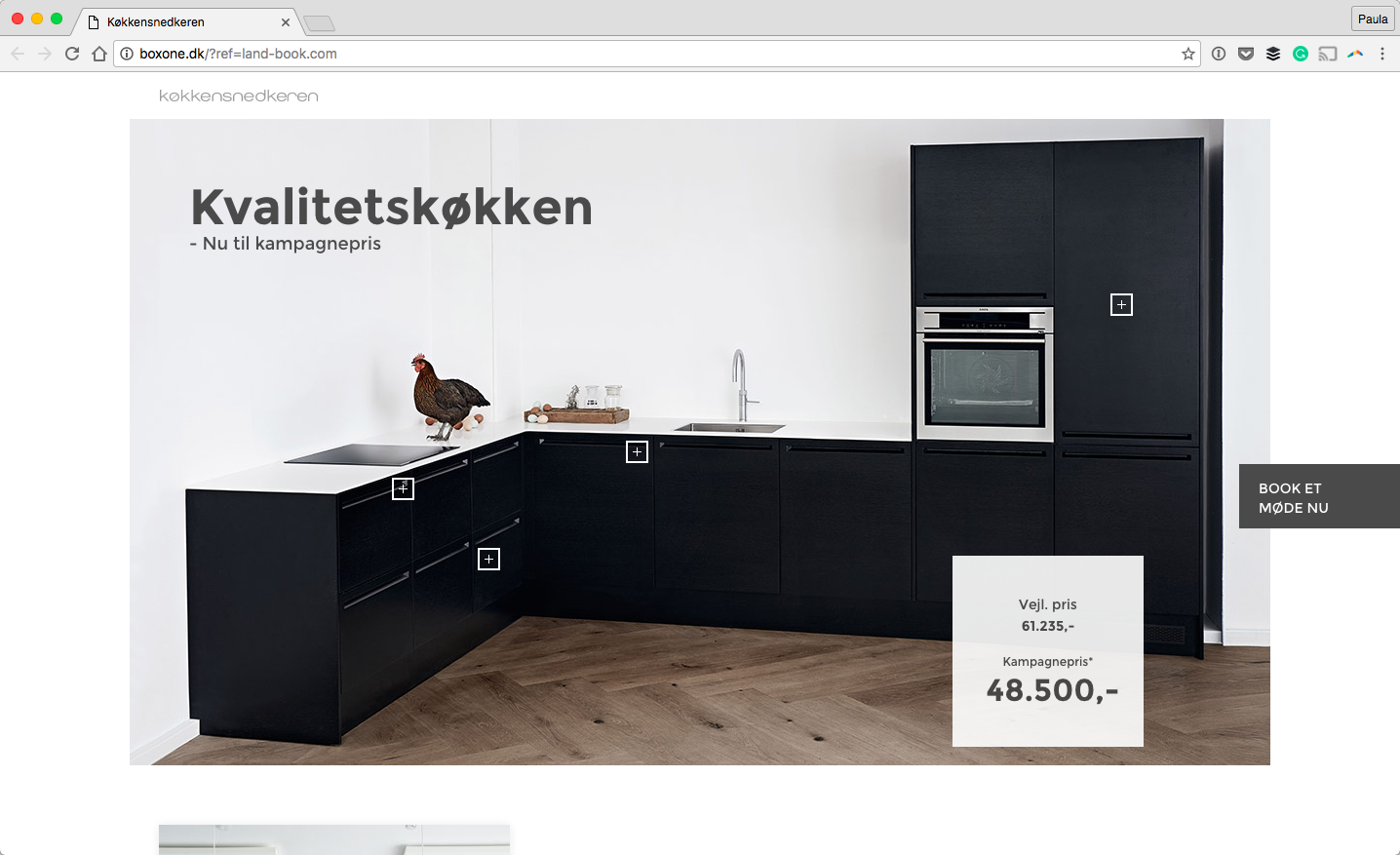
Montserrat is another free Google font. I think free fonts are a great start for any design. There is nothing wrong with not paying for a font. I am including Montserrat on this list because KøkkenSnedkeren brilliantly uses it to display numbers on their website.
Montserrat is used throughout their website but the heavyweight digits in the price tags look especially fantastic. The design of the numbers is great. What looks even better is Montserrat in a bolder format. Specifically, the “4” and “8” digits look really good! It’s a fantastic choice if you also want to display numbers in your next design.
10. Theano Didot
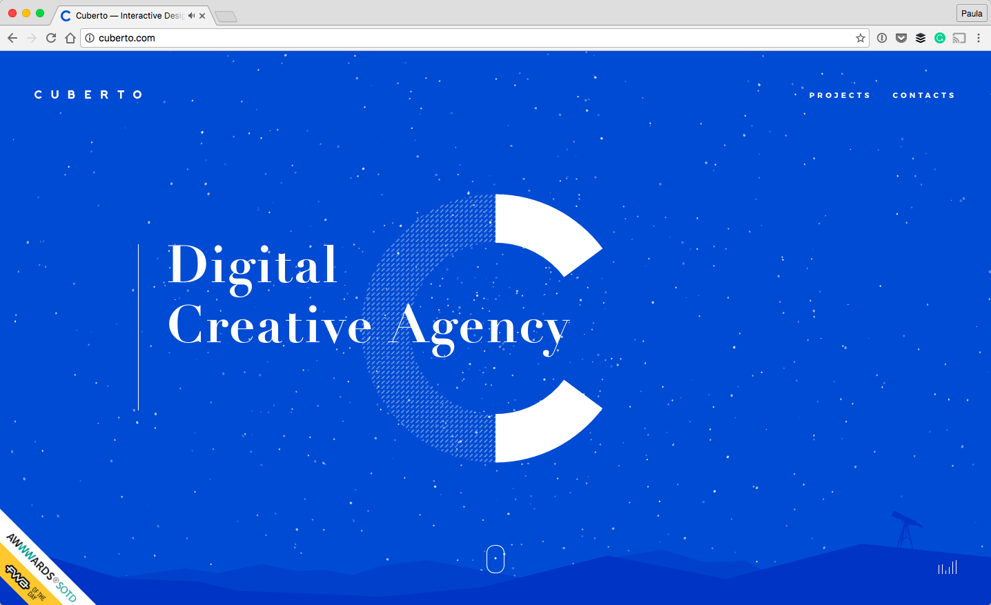
Cuberto’s design is amazing! The creative agency definitely knows what it’s doing when it comes to web design. I was intrigued by their use of Theano Didot as their primary font.
The font is used for headlines in a pretty large size that makes it much easier to spot the details of the font. Details such as the thin arms or feet of the type, as well as the much thicker stem. The makers of Theano Didot did an incredible job in designing a beautiful typeface, while Cuberto showcases the typeface very well for anyone who appreciates great typography.
11. Brandon Grotesque
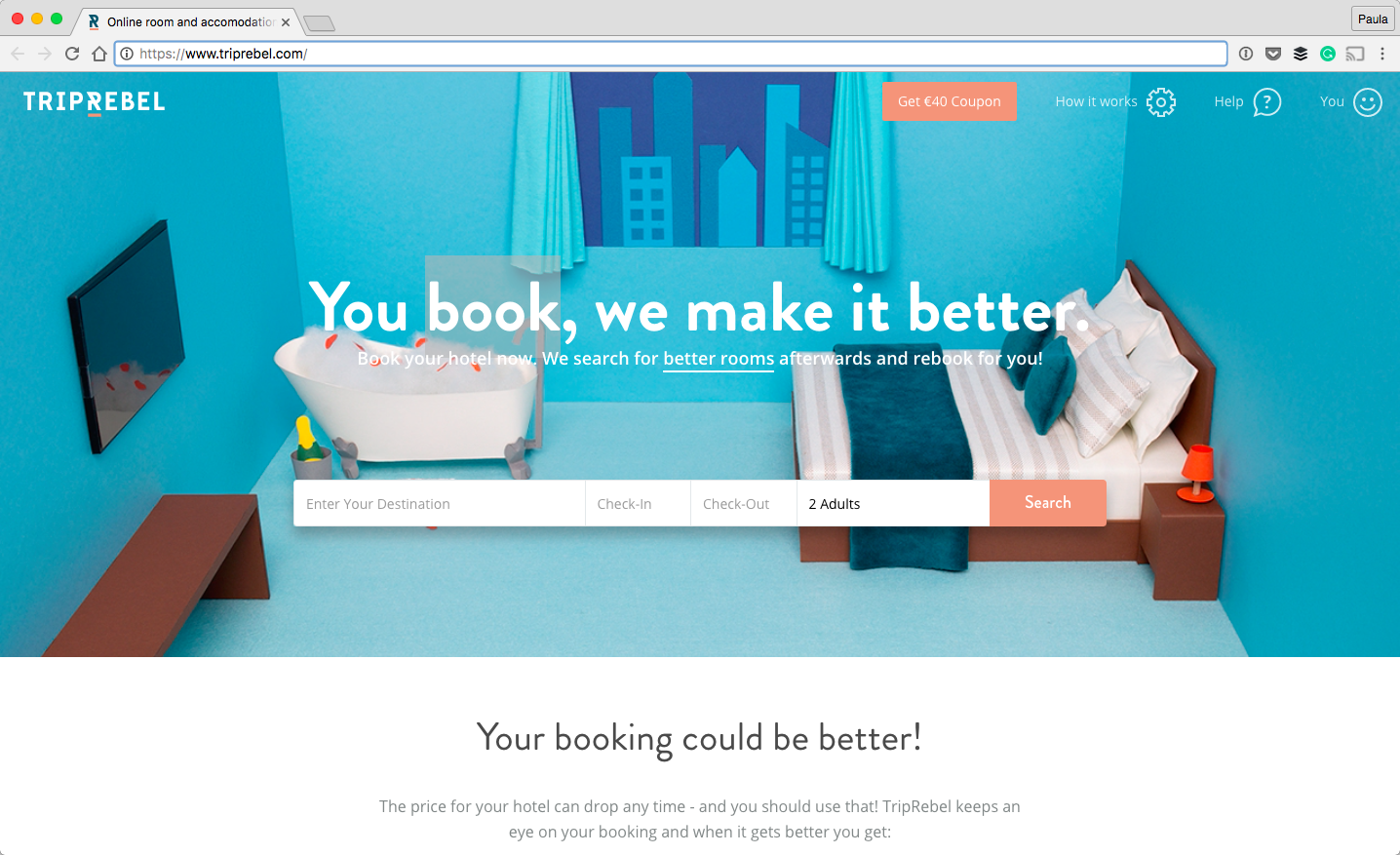
Trip Rebel has a beautiful, big, and bold headline in Brandon Grotesque on their homepage. Because the text is so large, you can easily see every detail that makes Brandon Grotesque a great font.
My favorite detail is bottom of the letter “b”. Its foot is not symmetrical, it cuts off a little before the bowl (the round part of the letter “b”). You wouldn’t be able to see and appreciate that if the font was smaller.
12. Brown
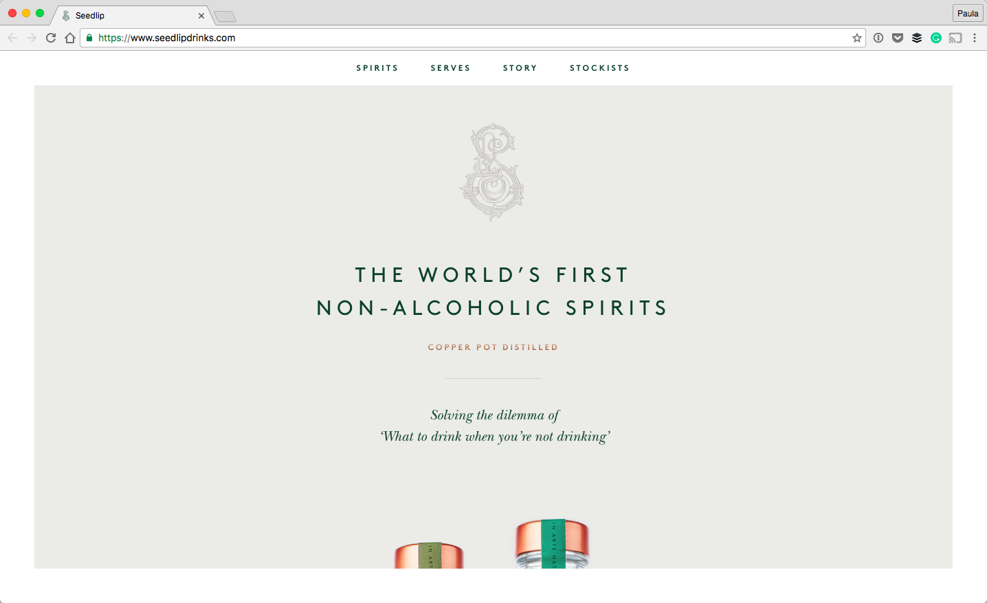 Seedlip is a non-alcoholic spirit with its own landing page. The website uses a couple of different fonts, the sans-serif on top of the homepage is called Brown.
I think it’s a strong choice for the primary font. It has a thin weight making it more pleasing for the eye and less intimidating when paired with the serif font as accent. Like I said, it’s a nice choice and it’s used very well in Seedlip’s design.
13. Apercu
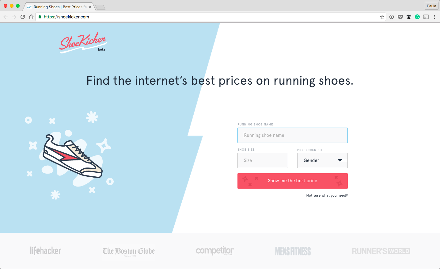
Apercu was meant to be a thin and tall headline, just like in Shoe Kicker’s design. When I first saw the homepage and the headline I was impressed with the font choice at once. On this website, Apercu is being presented and displayed quite smartly.
14. Avenir
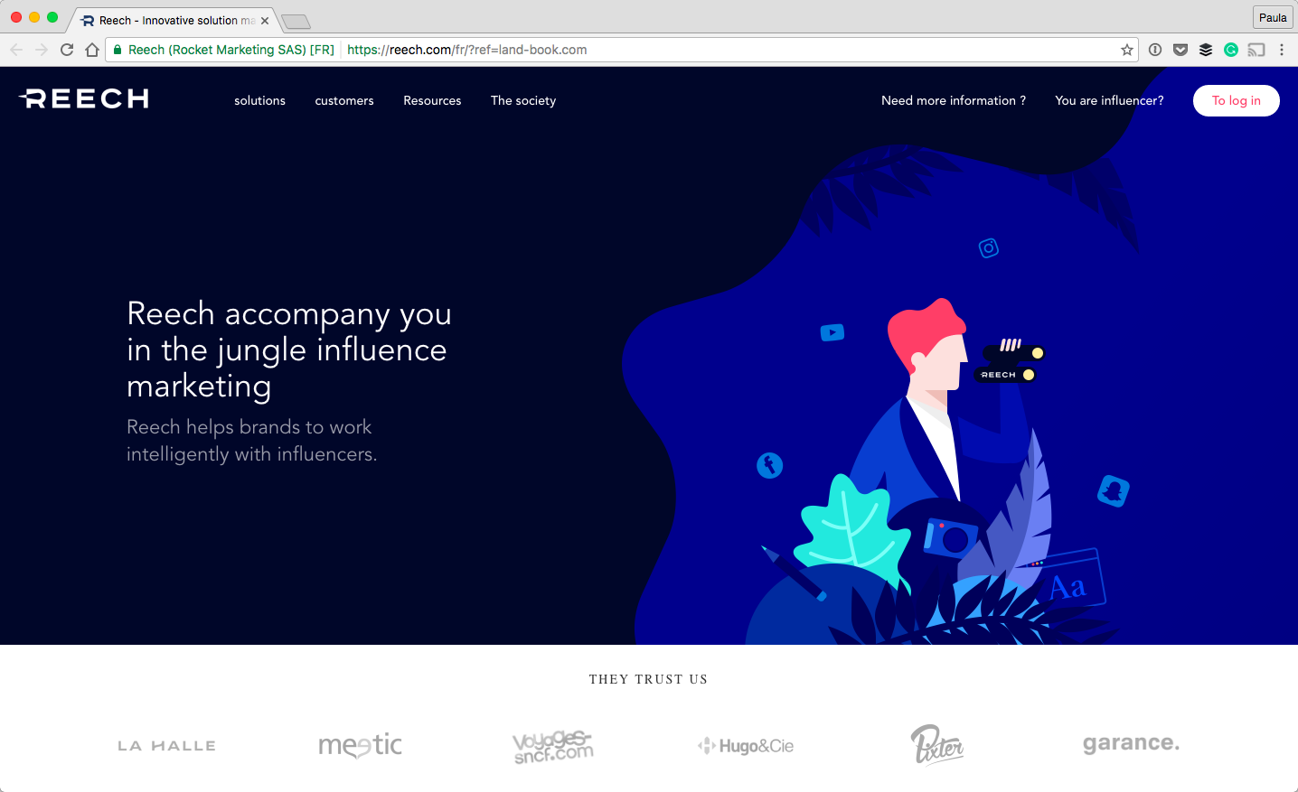
Our last example is of Avenir on Reech‘s website. I am madly in love with Avenir and wish it was a free font. I’d use it everywhere. The reason I am in love with it so much is its flexibility. The font looks great as a tiny footnote, as a paragraph font, and as a headline.
Although the font does come in various weights, the thinner version on Reech’s site looks great! The hero section of the homepage uses the contrast between the dark colors and the white text very well. The smart font choice helps a lot, too.
So, what fonts are you obsessing over right now?
Leave a Reply